Page MenuHomePhabricator

Make Echo follow overhauled color palette
Closed, ResolvedPublic

Description

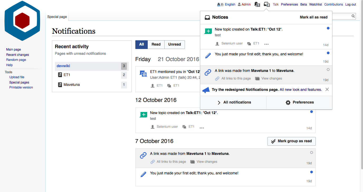
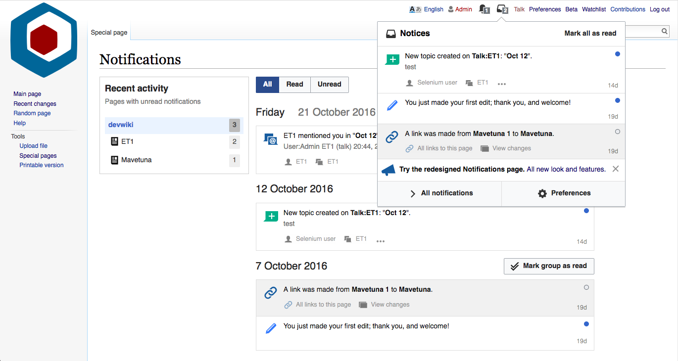
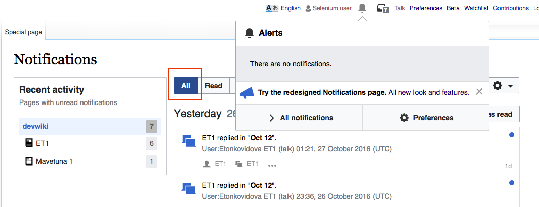
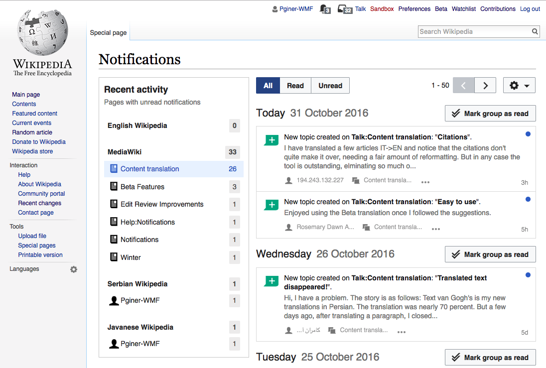
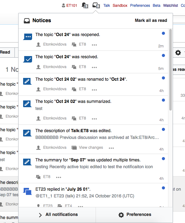
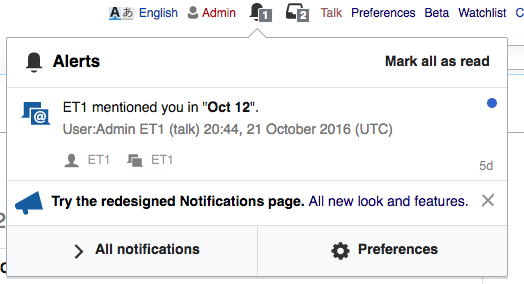
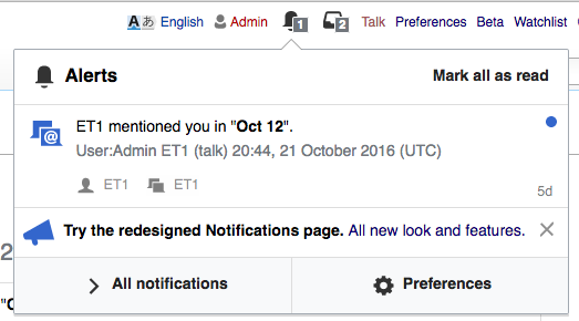
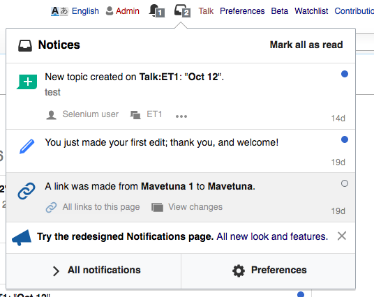
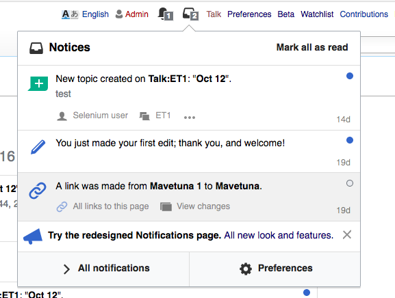
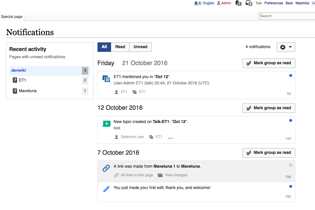
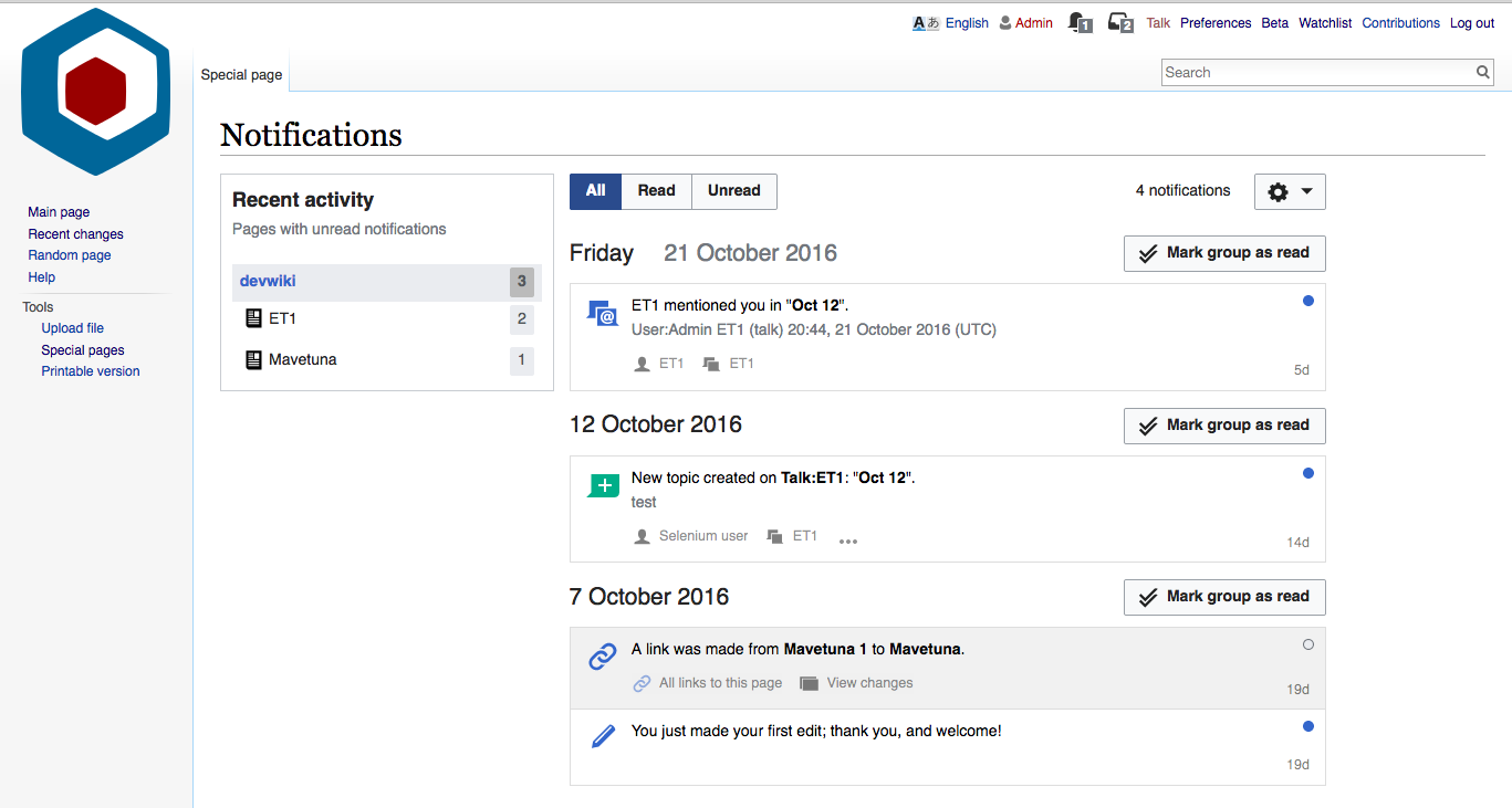
As our color palette got overhauled and improved (focus on WCAG 2.0 level AA compliance), we should bring the updated colors to our products.
Echo already uses several of those colors, that were updated for the notifications as one of the first products at WMF.
Let's amend the others as well…

BeforeWith patches
before_Alerts.png (284×524 px, 39 KB)
after_Alerts.png (290×523 px, 39 KB)
before_Notices.png (426×536 px, 57 KB)
after_Notices.png (436×577 px, 59 KB)
before_NotificationPage.png (729×1 px, 110 KB)
after_NotificationPage.png (731×1 px, 136 KB)

Event Timeline

Restricted Application added a subscriber: Aklapper. · View Herald Transcript

Change 316616 had a related patch set uploaded (by Pginer):
Updating icon colors to latest palette

https://gerrit.wikimedia.org/r/316616

Change 317750 had a related patch set uploaded (by VolkerE):
Follow overhauled color palette

https://gerrit.wikimedia.org/r/317750

As expected, most of the color changes involved very similar colors, so they look good overall and it is great to have them in sync with the standard palette (as of now and also easier to keep in sync to future changes thanks to the use of variables).

There is one small detail that I'd like to get some clarity on. The side menu on the Notifications Page was expected to use the standard OOJs menu colors which were recently using light blue to highlight active items. With the current patchset it seems we are overwriting it to use grey instead. I think it should use the standard color (light blue) and also adjust the badge color (which was set when the menu was grey, and needs adjustment once we get clarity on the underlying color used).

BeforeWith patches
before_NotificationPage.png (729×1 px, 110 KB)
after_NotificationPage.png (731×1 px, 136 KB)

@Pginer-WMF You're right, I've noticed this yesterday and haven't had time to comment yet.
This color change slipped through and should be the @background-color-primary variable with value #eaf3ff
Will amend the patch.

Concerning the new topic icons:

  1. What was the intention to make it use green? Should it continue to be green?
  2. And should we change it accordingly to the improved color palette as well?

@Pginer-WMF You're right, I've noticed this yesterday and haven't had time to comment yet.
This color change slipped through and should be the @background-color-primary variable with value #eaf3ff
Will amend the patch.

Concerning the new topic icons:

  1. What was the intention to make it use green? Should it continue to be green?

The guidelines for notification colors are captured here:

  • Blue is for updates. There is new activity for an element that already existed (e.g., new reply on an existing discussion topic).
  • Green is for new information and positive feedback. The creation of a new main information element (e.g., new topic created) and for positive feedback (e.g.,thanks) use green.
  • Grey is for "negative" events. Events such as reverts and deletions are shown in grey. Grey is used instead of red (used for this purpose in other contexts) to make the messaging more constructive: encourage a positive interaction to a revert as oppose to overreacting.

Color brings some diversity in the visual cues people receive when getting notification even if their activity is in a specific area (e.g., being involved in discussions and not much on editing). So I'd not restrict all notification icons to be of a single color. In other words, I'd prefer the green icons to remain green.

  1. And should we change it accordingly to the improved color palette as well?

I thought the green ones were already using the official green. If that is not the case, feel free to change them or let me know which is the official green to be used.

@Pginer I've found the issue: ThankYou icon still a PNG, which is suboptimal for several reasons. Filed T149352 for it.

BTW, from the Notifications' design guide: “Grey is for "negative" events” seems misleading for me, as the user avatar icon and the topic icon are grey too.

Selected item color changed back to light blue in patch set 3.
@Etonkovidova please review this on the recent activity box!

@Volker_E

(1) I reviewed the patch - except ThankYou.png T149352: Echo Notifications Thank You uses outdated PNG icon instead of SVG

(2) I assume it it's ok to have #36c for everything except the tabs color on Special:Notifications page? Tabs: All, Read, Unread have #2a4b8d.

Screen Shot 2016-10-27 at 4.05.47 PM.png (410×1 px, 91 KB)

@Etonkovidova Yes, that looks good to me. The button group widget's active state is in a darker blue shade, same like when the button is pressed. Compare OOjs UI demo.
Thanks for the review.
@Pginer-WMF any open questions from your side?

BTW, from the Notifications' design guide: “Grey is for "negative" events” seems misleading for me, as the user avatar icon and the topic icon are grey too.

I guess what I was trying to say was something along the lines of: even if you want to present an event that can be perceived as "negative" it is better to use a neutral color like grey (instead of red) to avoid scaring users or pushing them to overreact. I was suggesting for "negative" events to use grey, not claiming all uses of grey mean "negative" events.
I'll edit the description to clarify that. Thanks for pointing at this.

@Pginer-WMF any open questions from your side?

No. The only remaining adjustment is for the color of the active badge, that now is using a dark grey over the light blue which is a bit jarring. But that is worth a separate task.

@Pginer-WMF You can either file a new task or put your proposal here (my first reaction was “agreed” and maybe white background or completely get rid of background-color when chosen) as it's part of the palette alignment discussion.

@Pginer-WMF You can either file a new task or put your proposal here (my first reaction was “agreed” and maybe white background or completely get rid of background-color when chosen) as it's part of the palette alignment discussion.

Great. I think that the following would work:

  • Get rid of the background color when chosen
  • Use blue (#36c) for the number as text color when selected.

The result would look as shown below:

notif-page-blue-selection.png (739×1 px, 256 KB)

While checking this, I also noted another inconsistency: By default badges (".mw-echo-ui-pageNotificationsOptionWidget-count") use #EEE as background color which is not part of our palette. They should use #EAECF0 instead.

@Pginer-WMF Updated the patch, patch set 4 features the primary blue on selected items.
Regarding your comment on #eee – I think you must have been looking at the current code, not the patch set as it has already been changed there: https://gerrit.wikimedia.org/r/#/c/317750/3/modules/styles/mw.echo.ui.PageNotificationsOptionWidget.less line 41

I've found another occurrence of #eee in use as separator border color in crossWikiNotifications. This has been changed to #eaecf0 in patch set 5.

You are right. I was looking at the wrong place, but I'm happy to hear that my misleading comment helped to find another inconsistency.

Change 316616 merged by jenkins-bot:
Updating icon colors to latest palette

https://gerrit.wikimedia.org/r/316616

Change 317750 merged by jenkins-bot:
Follow overhauled color palette

https://gerrit.wikimedia.org/r/317750

@Pginer-WMF, @Volker_E
Is it correct that https://gerrit.wikimedia.org/r/#/c/316616/ does not change
flow-topic-renamed.svg, flow-topic-resolved.svg and flow-topic-reopened.svg? They are still #165CA0.

Screen Shot 2016-11-01 at 8.18.55 PM.png (724×600 px, 126 KB)

Change 319274 had a related patch set uploaded (by VolkerE):
Align colors to overhauled WCAG compliant palette

https://gerrit.wikimedia.org/r/319274

Thanks @Etonkovidova for pointing those out, as follow-up https://gerrit.wikimedia.org/r/#/c/316724/ has cared about other icons, but not Flow specific colors and icons.
Filed T149768 for this.

Change 319274 merged by jenkins-bot:
Align colors to overhauled WCAG compliant palette

https://gerrit.wikimedia.org/r/319274