Page MenuHomePhabricator

Design a way to present content changes in a rich text context
Closed, ResolvedPublic40 Estimated Story Points

Description

Reviewing changes made to content is an essential part of different processes on a wiki (e.g., review the effect of a recent change, provide feedback on your own edits, etc.).

Changes have been usually represented based on wikitext code diffs. However, for users manipulating the contents in a rich text environment (e.g., using Visual Editor) this produces a disconnect between the representation of content (rich text) and the representation of its changes (code).

This ticket aims to identify the aspects that would make changes in a rich text content to be intuitive and accesible, considerations to take into account, previous discussions in this context as well as examples on how similar problems have been approached in the past and elsewhere.

Current situation

On desktop, diffs are presented as side-by-side comparison of the code before and after the change. With blue and yellow highlights to emphasise changing paragraphs and specific text.

diff-example-desktop.png (1×823 px, 320 KB)

On mobile, diffs are integrated in a single view of the wikitext code. The removed code is highlighted in red and the added code is highlighted in green.

diff-example-mobile.png (708×908 px, 277 KB)

A previous initiative did some exploration in this area.

Aspects to consider

Some general aspects for a good solution in this context:

  • Intuitive. It should be immediately obvious to identify what changed in the content.
  • Accessible. Any solution should not rely only on elements that may be indistinguishable for some users (e.g., colors or very small symbols).
  • Work for different kinds of content Solutions need to consider how they work not only on text modifications but with rich formatting too (e.g., strikethrough text, addition of links, removal of images, etc.) and accommodate for those cases.
  • Not necessarily static. The solution is not only the static representation. Interactions such as allowing to easily switch between the original and modified versions may be part of the solution.

Event Timeline

Here are some thoughts and a quick exploration.
Thoughts:

  • Green and red bring intuitive associations with addition and substraction. they are used in other diff approaches (e.g., Github but also diffs in Wikipedia mobile) We can take advantage of them.
  • We don't need to treat additions and substractions the same way. We can use greyed-out text for removed content since it aligns with the idea of the content is now gone.
  • Additional indicators like using strike-through text can help to avoid relying only on color to convey information; which is not only useful or accessibility but also in a rich text context where we already have blue and red links. However, we need to be careful not to add more barriers to readability. Using different colors for the text and the strike-through line, making the line blend with some transparency or removing it on hover (when the user intent may be to read what's behind) may help.
  • Other aspects can help understand the diff. For example, having controls to quickly switch between the original, compared, and final versions can be helpful.

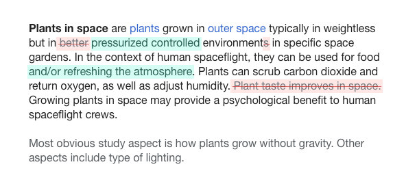
Here is the example I made based on the ideas above:

diff-text-style.png (269×608 px, 55 KB)

( you can check this codepen to try a different text or adjust anything else)

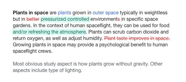
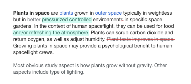
I've explored also some alternative versions with different levels of contrast between inserts and deletions:

diff-text-style-del-color.png (269×608 px, 54 KB)

diff-text-style-del-strike.png (269×608 px, 55 KB)

(comment copied from T149702#2768284)

As a reference, here is another example: In Google docs suggestions a thicker semi-transparent green line is used for removals, and green text is used for additions. Deleted strikethrough may not be easy to identify as strikethrough but I don't think it can be easily confused with regular strikethrough or added strikethrough text:

strikethrough-and-underline.png (249×1 px, 36 KB)

In a recent event with editors of the Catalan Wikipedia , a user who frequently reviews new contributions considered that the mismatch between Visual Editor being provided by default on Catalan Wikipedia and diffs being based on code may be one of the causes of the decline in reviewers they were experimenting.

Copying my comment from the previous bug:

The problem with using strikethrough/underline is that we are dealing with rich text, not plain text - so the text may already have that formatting. To avoid confusion, any formatting must be distinct from what you might reasonably find in a document.

I'm not sure how hard of a requirement that should be. If there were an approach that makes diffs a lot more readable in general, but it is based on a style that is used in a tiny fraction of content, it may be a good option to use the general approach and figure out a solution for the specific conflicting cases.

Not relying on a single signal can help also with such cases. In the examples above I have combined strikethrough text with changing the color for text (using a lighter grey or red), the strikethrough line (red), or the background.

As another example, this is from Google docs suggestions where a thicker semi-transparent green line is used for removals, and green text is used for additions. Deleted strikethrough may not be easy to identify as strikethrough but I don't think it can be easily confused with regular strikethrough or added strikethrough text:

strikethrough-and-underline.png (249×1 px, 36 KB)

As we aren't using a custom edit surface it won't be very easy to change the colour of the strikethrough, or have two strikethroughs.

As we aren't using a custom edit surface it won't be very easy to change the colour of the strikethrough, or have two strikethroughs.

That's something worth considering possible solutions. In any case, I'd like to start by identifying which is the ideal representation, and then think how we can stretch CSS to get closer to it. Just as an example, wider strike-through-like element can be simulated with an inset box shadow (and probably other approaches based on the current markup).

Jdforrester-WMF set the point value for this task to 40.
Jdforrester-WMF moved this task from To Triage to TR6: Visual diffs on the VisualEditor board.

@Pginer-WMF There are several additional things to consider IMO:

  • Does the solution work with major languages and scripts. It might be useful to look closer at for example CJK languages, if readability of strikethrough has an unwanted side-effect?
  • Is the readability generally sufficient? You've mentioned it in the description, but in the code example you've provided the box-shadow with 4 & 10px blur, it's hard to read for people with visual impairments (I've updated the example with 7 & 10px)
    • The blurred inset box-shadow seems to be in parts browser-dependent and visually not exact same in Chrome (8 & 9px appear as line) and Firefox (7 & 10px appear as line), which might lead to the situation, that box-shadow can't be the solution
  • A :hover supported effect isn't available in a useful way on mobile

@Pginer-WMF There are several additional things to consider IMO:

Good points Volker. Some comments below:

  • Does the solution work with major languages and scripts. It might be useful to look closer at for example CJK languages, if readability of strikethrough has an unwanted side-effect?

Definitely worth checking.

  • Is the readability generally sufficient? You've mentioned it in the description, but in the code example you've provided the box-shadow with 4 & 10px blur, it's hard to read for people with visual impairments (I've updated the example with 7 & 10px)
    • The blurred inset box-shadow seems to be in parts browser-dependent and visually not exact same in Chrome (8 & 9px appear as line) and Firefox (7 & 10px appear as line), which might lead to the situation, that box-shadow can't be the solution

Here the tension is between the clarity of indicating that content was removed and the readability of such content.
Ideally it should be obvious at a glance that content was removed while still being clear which content was removed. However it is hard to optimise both at 100%, we may need to either find a balance or provide ways to compensate the problematic cases.

As a side note, what I used in the box-shadow was the spread property, not blur (the box-shadow syntax is quite confusing).

  • A :hover supported effect isn't available in a useful way on mobile

This was one example of the compensation I mentioned above: initially the emphasis is on indicating the content was removed, and hovering allows to provide more clarity on the content. On mobile other strategies can be explored for that. For example, a quick switch to move between initial, diff, and final versions of content.

The box-shadow technique falls apart when the font size is changed:

pasted_file (53×535 px, 13 KB)

I had a look at some other techniques, but I think we might just have to treat genuinely struck through text as an edge case and use a normal strikethrough for our annotation.

Change 338619 had a related patch set uploaded (by Esanders):
VisualDiff: Strike through removed text

https://gerrit.wikimedia.org/r/338619

It's in my opinion necessary with proposed patch of text-decoration: line-through; above to see how to deal with this in Chinese, Japanese or Korean (see my comment above).

Change 338619 merged by jenkins-bot:
VisualDiff: Strike through removed text

https://gerrit.wikimedia.org/r/338619

Change 339481 had a related patch set uploaded (by Jforrester):
Update VE core submodule to master (813c586a6)

https://gerrit.wikimedia.org/r/339481

Change 339481 merged by jenkins-bot:
Update VE core submodule to master (813c586a6)

https://gerrit.wikimedia.org/r/339481

Jdforrester-WMF claimed this task.

We're going ahead for now with the single-column, strike-through for deletion, sidebar-for-annotations design ideas. Thank you all – especially @Pginer-WMF and @Volker_E for your input, it's helped Thalia, Ed and me a lot. :-) The next step once we get a few rounds of feedback from experienced users (who already 'know' what it's meant to tell them) is to user test the system with newbies, which might involve re-visiting some of the design decisions (of course), but I'm going to mark this task as Resolved and do that in follow-ups.