Red-green colorblindness is the most common type. Can we add <del> tags or some other method to indicate removed text from the diff?
Description
Description
Details
Details
| Subject | Repo | Branch | Lines +/- | |
|---|---|---|---|---|
| VisualDiffs: Use semantic del/ins tags | VisualEditor/VisualEditor | master | +183 -13 |
| Status | Subtype | Assigned | Task | ||
|---|---|---|---|---|---|
| Open | None | T143341 When re-starting a local draft, show the user a diff so they know what they're getting into | |||
| Open | None | T105173 HTML diffs of edits for everything | |||
| Resolved | Tchanders | T143350 Let users choose a visual or wikitext diff in the review-your-changes tab | |||
| Resolved | Jdforrester-WMF | T149702 Consider using semantic elements in addition to colours for visual diffs |
Event Timeline
Comment Actions
I'd like to consult design about this - I agree the red-green isn't ideal. The wikitext diff tool works with yellow and blue, although in a unified diff (as opposed to side-by-side) it might be difficult to tell what has been inserted/deleted, unless there are additional visual clues. <del> and <ins> tags could work on text diffs, but since they're inline we'd have to think of something else for block level diffs (e.g. removed paragraph, added list item).
Any thoughts @Pginer-WMF @Volker_E ?
Comment Actions
Let's not re-invent the wheel. The colours used for this in MW are carefully selected to be the most accessible. Certainly for using this in practice inside VE-MW and MW we'd want to re-use those colour variables, and probably use them upstream in VE itself.
However, the point @Whatamidoing-WMF makes (about wrapping the content in <del>s and <ins>s rather than "just" classed <span>s) is a good one, if we can do it. Thalia, thoughts on that? (Also, does that impact block-level changes differently?)
Comment Actions
Yes we can do it technically, but only around text changes since <del> and <ins> should only contain text.
Reusing existing colours is a good way forward, but since neither is intuitively associated with deletion or insertion we'll probably need something additional to highlight which is which. (It's not a problem in the wikitext diff because that's not unified.)
Comment Actions
@Tchanders Thanks for putting us in the loop. For the first part, use of semantic elements del and ins would be a good start for styling purposes and also special treatment of assistive technology.
Both elements can enclose flow content as well and do not affect paragraphing.
A possibility would be to add visually clipped text only exposed to screen readers as described at http://pauljadam.com/demos/css-line-through-del-ins-accessibility.html – the hurdle with the markup-wise even cleaner CSS generated content solution are translation issues.
On a design level the author features text-decoration: line-through for deleted and text-decoration: underline for inscribed text aside of colors.
Comment Actions
I agree that neither blue nor yellow is intuitively associated with either deletion or insertion. However, it's possible that a combination of old and new (e.g., yellow for removals and green for insertions) would work, especially when combined with strikethrough/other text decorations.
Comment Actions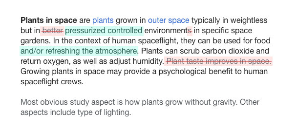
Here are some thoughts and a quick exploration.
Thoughts:
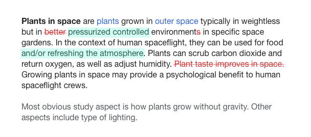
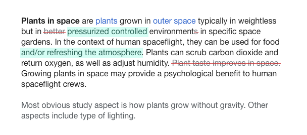
- Green and red bring intuitive associations with addition and substraction. they are used in other diff approaches (e.g., Github but also diffs in Wikipedia mobile) We can take advantage of them.
- We don't need to treat additions and substractions the same way. We can use greyed-out text for removed content since it aligns with the idea of the content is now gone.
- Additional indicators like using strike-through text can help to avoid relying only on color to convey information; which is not only useful or accessibility but also in a rich text context where we already have blue and red links. However, we need to be careful not to add more barriers to readability. Using different colors for the text and the strike-through line, making the line blend with some transparency or removing it on hover (when the user intent may be to read what's behind) may help.
- Other aspects can help understand the diff. For example, having controls to quickly switch between the original, compared, and final versions can be helpful.
Here is the example I made based on the ideas above:
( you can check this codepen to try a different text or adjust anything else)
I've explored also some alternative versions with different levels of contrast between inserts and deletions:
Comment Actions
Can I remind everyone of the fact that last time we paid attention to the color of this particular bike shed (diff styling) it was a HUGE issue that we spend multiple months on ? Just saying... kiss.
Comment Actions
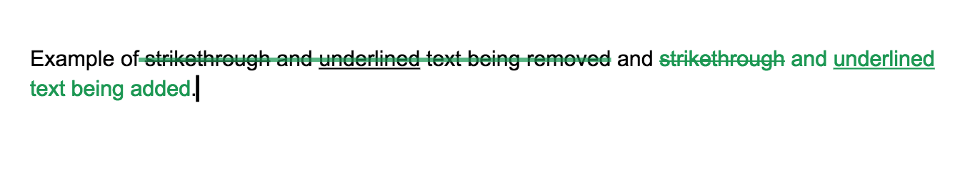
The problem with using strikethrough/underline is that we are dealing with rich text, not plain text - so the text may already have that formatting. To avoid confusion, any formatting must be distinct from what you might reasonably find in a document.
Comment Actions
Change 323255 had a related patch set uploaded (by Esanders):
VisualDiffs: Use semantic del/ins tags
Comment Actions

I'm not sure how hard of a requirement that should be. If there were an approach that makes diffs a lot more readable in general, but it is based on a style that is used in a tiny fraction of content, it may be a good option to use the general approach and figure out a solution for the specific conflicting cases.
Not relying on a single signal can help also with such cases. In the examples above I have combined strikethrough text with changing the color for text (using a lighter grey or red), the strikethrough line (red), or the background.
As another example, this is from Google docs suggestions where a thicker semi-transparent green line is used for removals, and green text is used for additions. Deleted strikethrough may not be easy to identify as strikethrough but I don't think it can be easily confused with regular strikethrough or added strikethrough text:
Comment Actions
There's lots of unresolved discussion here around colour and styling so let's leave this ticket open, renaming if necessary.
Comment Actions
No. People who want to talk about changing the colours are welcome to do so, but this ticket was always about using semantic tags in addition to anything else. Re-opening the massive effort to decide on the "best" way to style diffs that only closed a couple of years ago is possible, but not in scope here.
[Re-tagging as the merge commit didn't make wmf.4.]
Comment Actions
I agree that semantic markup is different from representation, and discussions about representation may deserve their own space. But, representing diffs on a rich text environment is a different context than diffs based on code and it is not only about picking colors. Has there been a discussion on how to better represent diffs in a rich text context before? Does anyone have links at hand to that discussion or the related ones that have been referenced in previous comments?
Comment Actions
I'm not aware of any discussions on wiki or involving the WMF, but https://www.mediawiki.org/wiki/Visual_Diff has some links to similar projects, so perhaps other groups have considered this.
Comment Actions
I created a separate ticket for the separate discussion: T152001: Design a way to present content changes in a rich text context.
Thanks for pointing to that info, @Whatamidoing-WMF. It's useful although I'm a bit surprised to see it is not easy to find a visual representation like a screenshot for such a visual topic.
Comment Actions
Colours were part of the initial description.
Re-opening the massive effort to decide on the "best" way to style diffs that only closed a couple of years ago is possible, but not in scope here.
As others have pointed out, the fact this is a visual diff, and more importantly a single column diff, means that more semantic colours may be appropriate.