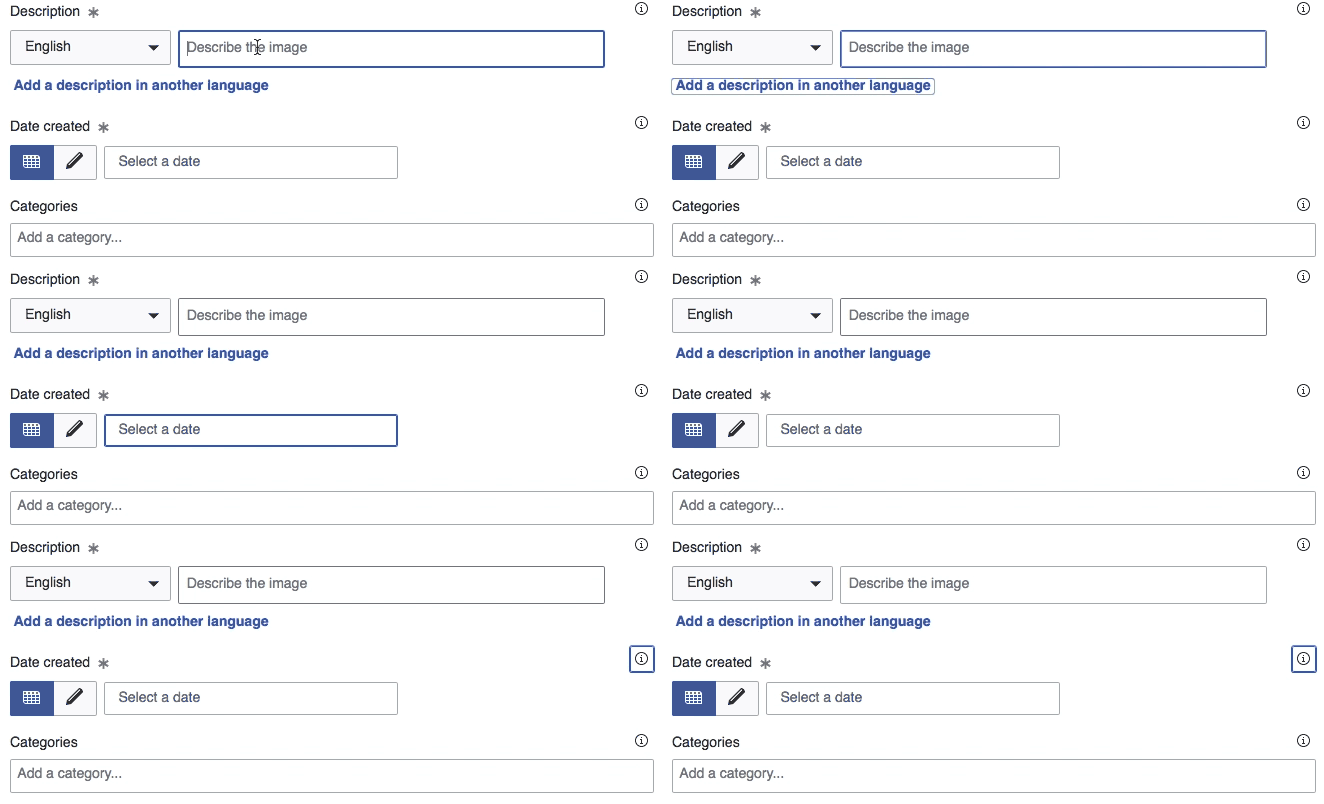
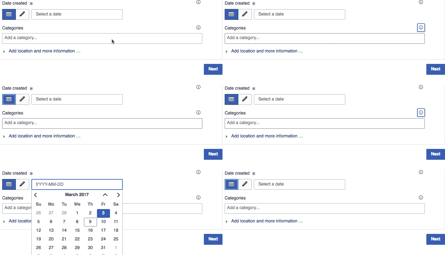
When using <tab> to navigate through the fields of a form, DateInputWidget does not have a highlight when it is the active field, so it is hard to tell whether it has been selected or not.
Description
Details
| Subject | Repo | Branch | Lines +/- | |
|---|---|---|---|---|
| mw.widgets.DateInputWidget: Highlight widget and open calendar on focus | mediawiki/core | master | +2 -1 |
| Status | Subtype | Assigned | Task | ||
|---|---|---|---|---|---|
| Open | None | T134802 Improve the curator workflow for reviewing new files | |||
| Open | None | T120453 Copyright violation detection tool for Commons | |||
| Resolved | None | T121870 Improve Special:NewFiles | |||
| Resolved | Sn1per | T13836 Easy date selection for Special:NewFiles | |||
| Resolved | Sn1per | T120733 Improve date range searches on Special:Contributions | |||
| Resolved | • Prtksxna | T159987 DateInputWidget isn't highlighted when <tab>-ing through a form | |||
| Duplicate | Feature | None | T31793 Check uploaded images with Google image search to find copyright violations | ||
| Duplicate | None | T123517 Automatically check Commons uploads for possible copyright violations | |||
| Duplicate | None | T230561 Create a ML model to score new files in commons for copyvio issues | |||
| Resolved | Samwilson | T145165 Investigation: Copyvio tools for Commons | |||
| Open | None | T132650 Copyright detection (acoustic fingerprint matching) for audio files |
Event Timeline
@Prtksxna Something you could look into? Could profit from similar measurement as on OOjs UI widgets. Reproducible in Special:UploadWizard.
There could be two solutions to this, one is to open the calendar widget as soon as the widget gets focus, and the other is to just highlight it and wait for user input (<enter> key) before opening the calendar.
| Highlight | |
| Open calendar | |
I prefer just the highlight option.
Change 341990 had a related patch set uploaded (by Prtksxna):
[mediawiki/core] mw.widgets.DateInputWidget: Highlight widget when tabbing through
My first reaction was highlight makes sense, but I think there are different ways forward further than the two options. Looking through our widgets, only CapsuleMultiselectWidget automatically opens the dropdown by default on :focus.
But it's also the only one which doesn't have an indicator (dropdown arrow) showing that there is more (UI) underneath as Dropdown*Widget or ComboBoxInputWidget do.
When is the field's datepicker dropdown shown? When highlighted (focussed) or when clicking enter? Is it also shown by pressing space?
Compare HTML5's <input type=date> behaviour in Chrome, where a dropdown arrow is shown on :hover. That's something we should consider as well.
Edge behaviour is kinda weird, regardless of an interesting pattern on the date selector
And unlike the CapsuleMultiselectWidget, the DateInputWidget is completely unusable without the dropdown.
When is the field's datepicker dropdown shown? When highlighted (focussed) or when clicking enter? Is it also shown by pressing space?
In the two options that I showed above, in (1) it shows up when you press enter or space, and in (2) as soon as the field is focussed.
I have updated the patch so that you can see the two options by uncommenting a line.
That's not quite true in my opinion, you could type a date without using the dropdown. Or what did you mean?
Ok, revisiting this: I think with our current implementation it makes a lot of sense to immediately show the calendar when focussing the field. Compare Chrome behaviour on native HTML5 type=date input, it doesn't show the calendar by keyboard, just because it doesn't need to. We're not there, the calendar is useable with the keyboard. Let's present it to our users.
Change 341990 merged by jenkins-bot:
[mediawiki/core@master] mw.widgets.DateInputWidget: Highlight widget and open calendar on focus

