The ProofreadPage quality "selector" for choosing proofread status looks ugly and out of place if viewed with OOUI activated
| Ninovolador | |
| May 8 2017, 3:23 PM |
| F16026084: image.png | |
| Mar 24 2018, 12:04 PM |
| F12828407: Screenshot-2018-1-27 Editing Page Canadian patent 135174 djvu 5 - Dev Wiki wiki1(1).png | |
| Jan 27 2018, 4:59 PM |
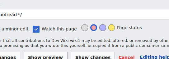
| F12808789: Screenshot-2018-1-26 Editing Page Canadian patent 135174 djvu 5 - Dev Wiki wiki1.png | |
| Jan 26 2018, 6:55 PM |
| F12808793: Screenshot-2018-1-26 Editing Page Canadian patent 135174 djvu 5 - Dev Wiki wiki1(1).png | |
| Jan 26 2018, 6:55 PM |
| F7985588: screenshot.png | |
| May 8 2017, 3:23 PM |
The ProofreadPage quality "selector" for choosing proofread status looks ugly and out of place if viewed with OOUI activated
| Subject | Repo | Branch | Lines +/- | |
|---|---|---|---|---|
| Convert the quality radio buttons to OOUI | mediawiki/extensions/ProofreadPage | master | +63 -27 |
| Status | Subtype | Assigned | Task | ||
|---|---|---|---|---|---|
| Open | None | T49145 Formally deprecate jQuery UI after we've stopped using jQuery UI in extensions and core | |||
| Open | None | T100270 Replace use of jQuery UI and MW UI with OOUI across all Wikimedia-deployed extensions and core | |||
| Resolved | Samwilson | T164753 ProofreadPage Quality selector needs to be transformed to OOUI |
@amritsreekumar It's maybe a task to add to your GSoC project as it's related to OOui and makes the Page: pages display UI looks quite bad.
Note that this was mentioned on https://meta.wikimedia.org/wiki/Talk:Tech/News#Increased_control_size_and_text_of_the_Wikisource_editing_page.
Change 406259 had a related patch set uploaded (by WMDE-leszek; owner: Samwilson):
[mediawiki/extensions/ProofreadPage@master] Convert the quality radio buttons to OOUI
@Samwilson Thanks for the patch, would you add a screenshot of the new treatment here?
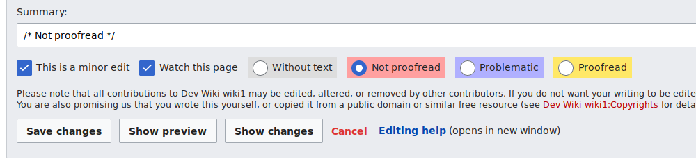
From this:
The new radio buttons aren't a RadioSelectInputWidget because we don't want each radio to be a FieldLayout (and we need to set title on each, etc.).
Thanks @Samwilson – quite some work was accomplished to make the radio inputs a well-rounded from a style guide harmony and, best-practice usability measurements. It seems problematic to change not only a standard, common interface element, but change various of its visual attributes.
One of the changed attributes in the current patch set is the increased selected radio indicator's size. This leads to following issues
Another topic is, when you're not providing widget labels, you make the form completely inaccessible for screenreader users.
@Ladsgroup I had the same idea, but this is better tackled in a separate task.
Good points.
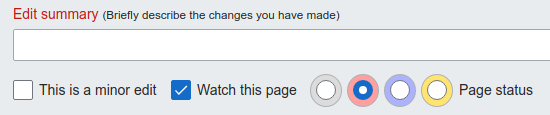
How should these radio buttons be displayed then? With their own labels, but all together on one line, or can they be put inline together on one line? And should they go on the next line under the minor edit and watch checkboxes? Do they also need a separate 'page quality' label?
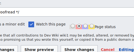
The colours being in the inside of the radios is okay isn't it (I mean, disregarding for now that the colours are wrong; and that can certainly be tackled in a separate issue).
There is definitely a usability problem with the old UI pattern (only radio buttons with a bit of color). Most new contributors do not the the labels because they ave to put their mouse on top of the radios (and it's not a common pattern).
I like your new design but we have to make sure it fits small screens and it seems to me that it's hard to see that the 4/5 options are connected together (they seems like 4 different inputs just like "watch" and "minor"). An other possible design would be to use a ButtonSelectWidget [1] with meaningful icons. But we need to have a fallback that do not requires JavaScript.
[1] https://doc.wikimedia.org/oojs-ui/master/demos/#ButtonSelectWidget
Could we have the radio buttons as default, and then in JS replace them with a ButtonSelectWidget that gets its info from the radios?
Or perhaps a better answer is to make it possible to create a ButtonSelectWidget from PHP? How much work would that be? (I've never played with OOUI in that way.) I guess it'd be a <select> element underneath, but rendered as a set of buttons?
Or, easierly, we could collapse the set of coloured-background radios together, so they form one visual block. Maybe even with a border. (Hm, although I guess that's deviating from OOUI design a fair bit, and getting closer to aping a button group!)
If I understood your question correctly, it's possible and rather straightforward. See https://www.mediawiki.org/wiki/HTMLForm or Check out the code for move action (it's a little bit complex and you can check some special pages like SpecialListProperties (in Wikibase repo).
Change 420248 had a related patch set uploaded (by Esanders; owner: Esanders):
[mediawiki/extensions/ProofreadPage@master] Use OOUI radios for page status, and improve appearance
Change 406259 abandoned by Esanders:
Convert the quality radio buttons to OOUI
Reason:
I800b74209a9c3855b3f3fe81b8f6eacce2d233d9 merged
A change implementing OOui quality selectors have been merged and is going to be deployed next Tuesday.