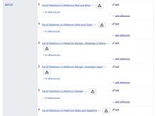
Two issues with the attention icon:
- Team members suggested that the number is not ideal. However, it is not clear if that is a problem of the number itself.
- It is not clear that it is interactive
- The attention icon visually merges into plain text:
we should investigate how/if both issues are actually problems and how we could solve those.


