Page MenuHomePhabricator

Review research on performance perception
Closed, ResolvedPublic

Description

We tend to point to guidelines like RAIL in performance discussions, but the figures put forward in these guidelines rarely, if ever, reference the underlying research. There might not be any data or study that actually prove the existence of the thresholds described or their values.

We should formally review what's been done to make up our own opinion about performance speed guidelines, or even come up with guidelines of our own, or create new studies that would fill the gaps.

It would be interesting to specifically look for studies based on real data/research that answers the following questions:

  • What's the speed threshold for what feels instantaneous? In what context?
  • What's the speed threshold for something so slow that it becomes frustrating to the user? In what context?
  • In what contexts has "faster is better" been demonstrated? Is there any other context where slower has been proven to be better?
  • What's the distribution of performance perception between different people?

We should be particularly wary of studies that take mental speed/time thresholds for granted. I've seen it to be quite common that previous research papers are referenced on that matter, but the original papers didn't base those thresholds on any research, they were actually part of their unconfirmed hypothesis. Some of the more recent papers are quite critical of that, observing that those "magic numbers" keep getting propagated but have not necessarily been proven.

Below is a working list of research papers of interest, that keeps expanding as we explore them and their citations. The starting point was the list quoted in the RAIL announcement, as well as searches for perceived performance keywords in google scholar.

It would be nice to put together a literature review at the end of this, summarizing the different papers read and drawing connections between them.
Related Objects

StatusSubtypeAssignedTask
Resolved Gilles
Declined Gilles
Resolved Gilles
Resolved Whatamidoing-WMF
Resolved Gilles
Declined Gilles
Resolved Gilles
Resolved Gilles
Resolved Gilles
Resolved Gilles
Resolved Gilles
Declined Gilles
Invalid Gilles
Resolved Gilles
Resolved Gilles
DeclinedNone
Resolved Gilles
Resolved Gilles
Resolved Whatamidoing-WMF
ResolvedSlaporte
Declined Gilles
Declined Gilles
Declined Gilles
Resolved Gilles
Declined Gilles
Resolved Gilles

Event Timeline

There are a very large number of changes, so older changes are hidden. Show Older Changes

"Oak: User-Targeted Web Performance" Flores, Wenzel, Kuzmanovic 2016

Not really applicable to us and not about performance perception, it's a system to automatically switch external providers (ads/analytics) or turn them off if their performance experience by a specific user is poor.

"What slows you down? Your network or your device?" Steiner, Gao 2016

A study by Akamai of the effect on performance of mobile networks and devices. This quote from the paper says it all:

Our analysis shows that the performance of the network on the PLT is less significant than the performance of the device. As an example, using a fiber-to-the-home (FTTH) connection (with wifi for the last meters) as opposed to a cellular network speeds up the PLT of a chosen website by 18-28% in median, but using a later generation phone, e.g. the Nexus 5 instead of the Nexus 4 will speed up the PLT by 24% or the Galaxy S4 instead of the Galaxy S3 by 30%. From one iOS version to the next, the median PLT improved by up to 56%.

The study was done with NavigationTiming RUM data, covering 2.5 billion requests to 92 million distinct URLs that Akamai served in March 2015. They narrow this down to the landing page of an e-commerce site optimized for mobile, for which they have 10 million samples. Then they limit their study to major US ISPs, further narrowing things down to 1.8 million samples.

I think the results are eye-opening reminder of how important mobile hardware is for performance. It's also very interesting to see that cellular networks (at least in the US and in France) are catching up with wired networks in terms of performance. In fact in France their results indicate that mobile networks have better performance than DSL.

We could probably get similar comparisons between phone generations and networks with our NavTiming data. And speaking of NavTiming, I think this shows how much the device mix (even more than the network mix) can affect the performance we measure there. To the point that gradual improvements over time might be accountable to the global pace of device upgrade. It might be interesting to somehow plot that, to see if our performance is following the trend of how fast devices are upgrading?

"Critical CSS Rules — Decreasing time to first render by inlining CSS rules for over-the-fold elements" Jovanovski, Zaytsev 2016

They use the top 1000 websites from Alexa, pass them through a tool they wrote that inlines critical CSS and measure TTFP with WebPageTest. The way they detect critical CSS is with PhantomJS. They pass all the CSS rules through it and locate the corresponding elements.

Unfortunately they don't explain the methodology to compare the existing sites and the modified sites in terms of controlling for bandwidth (they don't even mention how they serve the modified websites), nor do they verify that their process is non-destructive for the visual output or doesn't create FOUCs.

Overall this paper reads like an ad for their product, lacking all interesting information.

"Improving User Perceived Page Load Times Using Gaze" Kelton, Ryoo, Balasubramanian, Das 2017

This study looks at users' gaze while they're looking at a website and how that correlates to performance perception. The study has 50 participants, looking at 45 web pages.

They notice that patterns emerge for a given page as to where people focus most of their attention. Their tool then gives high priority (with HTTP/2 push) to the elements in that area. They use WProf to determine all the dependent elements required to be pushed for that particular area to load faster. They compare this to the baseline (no push) and "Klotski", an algorithm designed to push the most critical dependencies in order to maximize ATF performance (already on the reading list of this task).

They use video recordings shown to participants. The users are asked to press a button when they consider that the page is loaded. They correct of people's reaction time. They exclude responses that are abnormally early compared to First Paint or late compared to Last Visual Change.

A major initial finding in their study is that user-perceived page load time doesn't correlate well with onload or SpeedIndex (respectively 0.46 and 0.44 correlation coefficients).

The gaze-based push prioritization improves the time users consider the page to be loaded by 17% on average over the default version of the page. At the 95th percentile, it improves by 64%. Only 10% of the cases have the default considered faster than the gaze-prioritized version. In the cases that perform worse, they suspect that they were pushing too much, making the push counter-productive due to bandwidth hogging.

Finally, they acknowledge that while this work was successful on a desktop site, gaze tracking on mobile is challenging and this technique might not translate well on mobile, where screens are much smaller.

User data and videos are available at http://gaze.cs.stonybrook.edu/

I think the results are quite impressive. The fact that when people consider a page to be finished loading doesn't correlate well to SpeedIndex is further confirmation that what we're currently measuring is only a very rough approximation of users' performance perception. As for gaze detection, I think that the structure of wiki articles being so consistent for classes of articles, it would be interesting to do such a study on Wikipedias, as we might be surprised by what people focus on, and this might inform decision to prioritize the order of DOM content loading differently for the fixed UI, or even inform the community of the impact some of the community's CSS/layout choices in the body of articles have on reader perception.

"Klotski: Reprioritizing Web Content to Improve User Experience on Mobile Devices" Butkiewicz, Wang, Wu, Madhyastha, Sekar 2015

Pretty dense work. They use a custom proxy that leverages SPDY priorities to serve resources with more value first. They detect what resources are above the fold and prioritize these. To demonstrate that it's better than the baseline experience, they set a time budget (eg. 2 seconds) and measure how many high utility resources have been displayed in that timeframe with and without their priority algorithm.

Then they run a small user study asking people to mark what's important and what's not on the page to them. They see that these user preferences vary wildly. Again, they do the same thing as before for a given set of user preferences, set a time budget and see how many of the more important resources (as ranked by the user) they can deliver with reprioritization compared to the baseline.

The downside of this study is that it doesn't really study perceived performance. But assuming that having more, if not all, ATF elements loaded sooner is better, it does show that SPDY (and by extension, HTTP/2) priorities can have a huge impact on how fast critical elements are loaded. The approach of doing that with a proxy that constantly generates a priority list with regexps is quite interesting, as it works in a black box way, with the backend delivering the content remaining unaware of protocol priorities. However, this makes the dependency and priority detection complicated, and I wonder how effective if would be if developers were given the ability to set those priorities themselves.

This is a nice glimpse of what the future holds when application backends will have control over HTTP/2 priorities and can serve resources in the optimal order to users, to target a better SpeedIndex for example, or to render specific elements first.

It would be super interesting of we could do something like https://phabricator.wikimedia.org/T165272#3933730 -investigating when people "feel" the page is ready. Is it the text that is important, late incoming images or something else?

Yes, I think we should do that and we should also go as far as doing a gaze study on our content. That paper clearly showed that there's a strong correlation between giving a higher priority to the areas of most common visual interest and how soon people consider the page to be loaded. I'll add both ideas to the subtask.

"PAIN: A Passive Web Speed Indicator for ISPs" Marco Mellia, Idilio Drago, Martino Trevisan 2017

This paper looks into how an ISP, based on DNS and requests to TLDs, can estimate page loading speed as experienced by its users. It relies mostly on the support domains (analytics, ads, etc.) and their expected order.

They manage to create a metric with correlation greater than 0.5 with SpeedIndex and onLoad (correlation varies a lot by website).

Now, the limitations of this whole setup don't apply to us, as we have no external domains (the only support domain being upload.wikimedia.org) and we do have visibility on what users request. Which means we might be able to create even better server-side metrics informing us of client-side performance. I don't think this is very useful right now, but just a concept to keep in mind.

"Perceived Performance of Top Retail Webpages In the Wild: Insights from Large-scale Crowdsourcing of Above-the-Fold QoE" Gao, Dey, Ahammad 2017

From the abstract:

Our end goal is to create free open-source benchmarking datasets to advance the systematic analysis of how humans perceive webpage loading process.

In Phase-1 of our SpeedPerception study using Internet Retailer Top 500 (IR 500) websites [3], we found that commonly used navigation metrics such as onLoad and Time To First Byte (TTFB) fail (less than 60% match) to represent majority human perception when comparing the speed of two webpages. We present a simple 3-variable-based machine learning model that explains the major- ity end-user choices better (with 87 ± 2% accuracy). In addition, our results suggest that the time needed by end-users to evaluate relative perceived speed of webpage is far less than the time of its visualComplete event.

The study in this paper is made of side-by-side videos generated by a private WPT instance asking participants to pick the fastest one. Source code of the app built for the survey: https://github.com/pdey/SpeedPerceptionApp They also collected the HAR files corresponding to each video.

The video pairs were picked to have less than 5% difference in visual complete time. Within that they subgroup them by SpeedIndex buckets. And within each SpeedIndex bucket, they further divided in PerceptualSpeedIndex buckets. They also have some honeypot pairs to detect people who give invalid answers and filter them out. The final 160 pairs come from 115 different websites. I.e. people are asked to rank videos of 2 different websites, whose visual complete is about the same, but whose SI/PSI vary. All of this to verify the correlation of speed perception and SpeedIndex/PerceptualSpeedIndex. They recorded 5400+ sessions total, ending up with 40,000+ valid votes.

In the end, onLoad matches 55% of the votes and SpeedIndex 53%; It's unclear what kind of SpeedIndex gaps people were asked to rank, though (i.e. was there always a big difference between the two videos?).

They then try different machine learning models to predict user votes based on underlying visual metrics, which lets them achieve 87% accuracy. The metrics that work best as sources for the ML are modified versions of SpeedIndex and PerceptualSpeedIndex, that calculate the integral with the cutoff point being "time to click" instead of visual complete. Essentially it gives you the SpeedIndex/PerceptualSpeedIndex up to the point when the user makes their decision about which page is the fastest, which might be sooner than visual completion.

The main issue with that study is that it's about predicting which site users would consider to be the fastest. It's not really the organic experience people have when browsing a specific website and forming an opinion about whether or not that page on that specific website loaded fast. Nevertheless, it's interesting that it seems possible to reproduce people's opinion about speed comparison perception with a simple machine learning model fed by 3 visual metrics. It's unfortunate that they don't seem to attempt making the best ML model with only RUM metrics to see how well it could predict the human vote.

Gilles raised the priority of this task from Low to Medium.Feb 1 2018, 4:42 PM

I've written to the corresponding author to see if their code has been made available and if Wikipedia was part of the websites they tested in their study.

Zhiwei Zhao replied, and while their code is closed source (subject to patents, etc.), he was kind enough to provide a before and after HTML source of Wikipedia, which they did test in their research.

Oddly, it's the beta mobile site, the page is the enwiki homepage.

The diff is quite simple, their algorithm simply took the synchronous script tags from the head and moved them to the bottom of the document. I assume, however, that probably generates a FOUC (at least for logged-in users). Therefore, their performance gains are unfounded in this particular case. It's interesting nonetheless that no other HTML element is reshuffled, which would suggest that we're already using the correct order for them when it comes to loading the above-the-fold area.

"Stuck in traffic: how temporal delays affect search behaviour" David Maxwell, Leif Azzopardi 2014

In this study, the researchers set up a custom search engine and documents served in the results. For the baseline, no delays are introduced. Then they introduce 5 second delays for the search engine results, 5 second delays for loading a link from the search engine results, and both being applied at the same time. Whenever the delays are in effect, visual feedback tells the users that something is loading. All of this done on identical desktop computers. 48 students were the subjects, with a majority of male students studying science-based subjects (not the most diverse group, really...).

Unfortunately they added a bizarre monetary incentive to the task, where subjects are paid more if they find more relevant documents for a topic within a 20-minute window. Which in my opinion, completely invalidate the findings about people's behavior, since they were in essence told to get something done as fast as possible, putting unnecessary pressure on the speed of task completion.

"Search Result Prefetching on Desktop and Mobile" Ryen W. White, Fernando Diaz, Qi Guo, 2017

Not about performance perception, but interesting nonetheless.

This describes a system that estimates in real-time the likelihood that the user will click on a particular link on a search result page. On desktop, it's done by studying the trajectory of the mouse cursor. On mobile, it's done by studying the position of the viewport in relation to the page (conveniently their mobile page displays a single link per line). When the prediction for a link reaches a certain threshold, the link's content are prefetched. By default, before any cursor or viewport move happens, the links have different scores already, based on the known fact that some links (eg. higher in the list) have a tendency to be clicked more.

They use machine learning models to make these predictions, trained with real data collected on Bing users.

Desktop

The performance of their prediction is particularly high for what they call "navigational" queries, where people already have a specific website in mind they want to visit. It's less effective when people are looking for information ("informational" queries) and therefore opening different links in the results. Their prediction also degrades for people who spend a lot of time looking at the results in detail before deciding which link to open.

Still, even for the worst performing case, the various models have a false positive rate (prefetching something that isn't needed) between around 5% and 30%. And in terms of missed opportunities (didn't prefetch in time before the click), it ranges from 40% to 90%. Those qualities are inversely proportional, i.e. the more you pick a model that tries to avoid missed opportunities, the higher the chances of prefetching a false positive.

Mobile

The mobile results show the same predictable pattern of it being more efficient with "navigational" queries. In the case of mobile, they model the tradeoff differently, based on latency and wasted bandwidth. Latency represents how long the user has to wait to see the content they've clicked on. Just like before, the more you want to reduce latency, the more likely you are to waste bandwidth by prefetching the wrong content. In the worst case scenario of informational queries, the best you can achieve in terms of latency is to reduce it by 40% on average compared to not prefetching. But the tradeoff is that you're wasting on average the equivalent of 25% of the biggest landing page on average. On the most conservative side of the spectrum, you can achieve 10% latency reduction with average waste of 2% of the largest landing page.

While they don't measure the CPU consumption of the machine learning model on mobile, they make worst case estimates and it doesn't look like it would be significant. On a 3.2Ghz desktop machine it takes 0.006ms to score a sample.

All in all this is an interesting push for smarter prefetching, one that might be better implemented by browsers, although it is applicable as-is and we could consider doing something similar in areas of the wikis, particularly for search results. However, it's likely that in our case the share of informational queries is higher (unlike Bing, people don't use us to visit the websites they browse daily), and therefore we would be looking at lower predictive performance. The technique used here, compared to static models, is very interesting because it lets us tune the tradeoff between speculative prefetching and false positives. One could very easily see the ML model used to change depending on whether the user has requested bandwidth saving on mobile, for example.

"Vesper: Measuring Time-to-Interactivity for Modern Web Pages" Netravali, Nathan, Mickens, Balakrishnan 2017

Written by the same people we owe Mahimahi to.

By rewriting a page's JS and HTML, logging all interactions with JS variables and DOM elements, they measure Ready Index and Ready Time, based on when they consider the ATF area to be truly interactive (all JS event handlers for DOM elements above the fold loaded, etc.). They acknowledge the fact that for some websites, despite the possibility of interactivity, most users merely read the content. But according to their results, optimizing for Ready Index improves ATF/SpeedIndex as a side effect, which is what matters for a page consumed statically.

They review Google's definition of TTI. They criticize the fact that TTI can be reached even if ATF content hasn't all been rendered. And more importantly, TTI doesn't distinguish above and below-the-fold. And they also consider that 50ms lag limit of the TTI definition is too conservative and that people expect more responsiveness.

However, I think that they make a critical mistake in the definition of these new metrics, because they only look at javacsript execution above the fold. Which means that their metrics are blind to jank caused by JS unrelated to ATF elements' event handlers, unlike Google's TTI. The page can reach "Ready Time" and still be so janky it's unusable, and therefore, not what we could consider to be interactive. Assuming that one has solved all post-Ready Time jankiness issues by looking at the TTI, then maybe these new metrics are useful. In a sense, they assume that there's no highly inefficient JS elsewhere than in the code related to the ATF DOM elements.

Their instrumentation is done purely in JS, to make it work across browsers. To reduce the overhead of the detailed instrumentation, they do two pageloads. One heavily instrumented to determine everything about what is above-the-fold (DOM elements and related JS), and the second pageload lightly instrumented, inserting itself in only the specific ATF DOM elements and related code. That lighter pageload induces a median 1.9% PLT slowdown, 3.9% at the 95th percentile. Unfortunately they don't look at variance between runs on the same content, which would have given precision granularity.

Their Vesper prototype uses Mahimahi, to get rid of the effects of internet connectivity. For every experiment, they do 5 runs to mitigate differences between runs.

The slower the network, the bigger differences between PLT and RT. Meaning that PLT is more overestimated compared to the user's experience when dealing with slow networks. Same in the other direction with ATF, the slower the network, the more underestimating it does.

Following their study of how these new metrics compare to existing ones, they set out to optimize the pages for RT/RI. They use Polaris (on this reading list already), a tool that detects dependencies and change its prioritization algorithm to give a higher priority to objects that are above-the-fold and are interactive. They also make another optimization focused on SpeedIndex, prioritizing objects based on whether or not they're visible above-the-fold, regardless of their effect on interactivity. They both reduce all load metrics, but are each most effective with their targeted metric. Median RI drops by a median of 29%, RT by 32%. The other metrics decrease as well, PLT by 23%, ATF by 15% and SI by 12%.

Now the real interesting part for perceived performance, they acknowledge that those metrics are disconnected from real users and they set out to study the effect on user perception. 73 people were asked to press a key when they considered the page to be loaded. People ranked the SpeedIndex-optimized version as the fastest on 11 pages, and the ReadyIndex-optimized version for 4 pages. However in this case, users were merely asked to tell when the page looks ready, not interact with the page.

Which is why they run a second study on shopping websites, where user interaction is expected. In that case people are asked to perform a specific task, like search for "towels" with autocompletion. This part is a little skewed, as people are asked to wait specifically for JS-enhanced features, but they could have searched without waiting for autocompletion to appear, for example. In that second study 85 people interacted with those few websites. Users were asked to pick the variant that let them complete the predefined task the fastest. Quite predictably, 83% favor the ReadyIndex-optimized version.

As the researchers are from MIT and Harvard and they were responsible for open sourcing Mahimahi, I've asked them if Vesper is open source. Mahimahi is hosted on the main author's github, in fact.

While flawed because people were asked to perform a specific task, the interactivity study is interesting because it shows how much the way we frame the user perception can influence the conclusion. It would be interesting to figure out if people favor visual progress or faster interactivity the most, and if that depends on the type of page we're dealing with. One would assume for example that in the context of reading a wiki article, visual progress prevails. But in the context of opening the visual editor, interactivity is what matters. However, verifying that preference with real users might yield surprising results.

A little progress update to see where i'm at. The reading list currently contains 66 papers. It feels like I'm reaching the long tail and adding less and less papers that study performance perception. I've allowed myself to let some about performance (and not performance perception) sneak into the list when they look very high quality. But even that seems to slowly run out. I've reviewed 26 our of those 66, so should be on track to be completely by the end of the quarter.

"EYEORG: A Platform For Crowdsourcing Web Quality Of Experience Measurements" Varvello, Blackburn, Naylor, Papagiannaki, 2016

Platform available at https://eyeorg.net/

In this study they set out to create a platform to measure user quality of experience via crowdsourcing, comparing 100 trusted participants and 1000 paid participants. Unfortunately their study lets users drag a slider back and forth to pick the point where they consider the page to be ready. This allows them to rewind time, be aware of late-loading elements before the fact, etc. I think it's really quite different from the organic experience of loading a page, invalidating the results. People are asked to study the problem with time-travelling abilities, for a process they would normally be unconscious of. I'm not going to study this one in detail, because I think these mechanic invalidate the ability to extrapolate the results to how people really feel about the quality/performance of an organic pageload.

"User-Acceptance of Latency in Touch Interactions" Walter Ritter, Guido Kempter, Tobias Werner 2015

Two studies with only 10 people each. All had experience with touch screens.

In the first study people are asked to press a series of buttons, with more and more latency feedback, and then to point out which button represented their limit of delay acceptability. Then they had to complete a similar task with dragging. Half of the users were asked to perform the task as fast as possible, the other half to complete it slowly (why no corpus who wasn't told anything?).

In the second study they were asked to use a UI with buttons and sliders to complete a task. After completion they were asked to rate their acceptance level of the experience from 0 (best, no delay perceived) to 10 (worst).

Without surprise, lag is better tolerated on tapping than on dragging. Tap delays start being unacceptable at 600ms and drag delays at 450ms. Unfortunately they didn't ask people to grade when things were pleasant, and it's quite possible that a wide array of values below those acceptability thresholds are considered frustrating by users. At least, though, it gives a ballpark for a responsiveness maximum to avoid going over. The values are to be taken with a grain of salt, though, given the very tiny sample sizes and their lack of diversity.

Gilles updated the task description. (Show Details)

"Improving the Human–Computer Dialogue With Increased Temporal Predictability" Florian Weber, Carola Haering, Roland Thomaschke 2013

This study sets out to examine performance variability, particularly the trade-off of having lower variability at the expense of slower average response times. 22 paid students participated in the study. The task was to manage someone else's email, posing as their assistant. At first the inbox of the fake email software displays 2 emails. Participants need to decide if the first email is relevant or spam. Then they have to delete the spam and forward valid emails to their manager. These actions involved a delay to the recipient selection/deletion confirmation screens. In the high variability test, response times were 7 different values spread out between 300 and 3000ms. For the low variability case, response time was either 750 or 3000ms.

In addition to measuring user error rates, task completion time, etc. users were asked to fill a questionnaire after the test. They each did 2 different sessions in the same week, one with low and one with high variability. Order of tests was randomized. Before the two test runs there was a practice trial with no variability (always 500ms) for subjects to get familiar with the process.

The questionnaire showed no different between the two variants. Error rates aren't different either. With low variability, the complete task took longer because the interface was slower to respond, but the "human time" actually decreased. I think this merely suggests that when people were able to predict how long they were going to wait, thanks to the low variability, they were able to think about their next move ahead of time and spend less time on it. With high variability, if they attempted to use that time as thinking time, they would get randomly interrupted by low response times, or nor make use of the slow response times to think, because those were unpredictable.

Overall it's a very small study and its findings have to be taken with a grain of salt (a fact it acknowledges itself). As it stands, though, it seems like a trade-off between absolute task time and "human time". However, this study is limited by the fact that people can't context switch to something else. In the context of what we do, deliberately slower response time to achieve less variability, might result in users context-switching mentally or practically to something else. This is the sort of real-life effect that a lab study like this one can't reproduce.

"Towards Better Measurement of Attention and Satisfaction in Mobile Search" Lagun, Hsieh, Webster, Navalpakkam 2014

This study looks at gaze and viewport position, studying google search result pages; They focus particularly on Knowledge Graph and Instant Answers, where the search result page contains inline information about what people searched for. The rationale being that they can't measure the effectiveness of this, because people don't click on anything when the search result page provides the information they were looking for. The study is done on real mobile devices attached to a gaze-tracking apparatus. 30 adult participants, wide age range. Participants were given 20 questions and links to corresponding search result pages where the information they're looking for is to be found. Then they have a questionnaire to fill for each one.

They see that the presence of knowledge graph results increase user satisfaction when relevant, and doesn't decrease it when irrelevant. Interestingly, people spend more time looking at irrelevant knowledge graph information. Probably because it takes longer to dismiss irrelevant information than it does to accept relevant information. This is a very interesting fact: spending more time looking at something on the screen doesn't necessarily mean that this area contains the information you were looking for. The stronger test of relevance is whether the users stops there or keeps scrolling to look through more things.

They also find that the more people scroll on the page, the less satisfied they are. This reminds me of those JS snippets that detect rage clicking.

Very interestingly, people spend more time looking at the 2nd and 3rd results than the 1st. They theorize that this is due to the more progressive nature of scrolling on mobile, where those results being "in the middle" of the original viewport, will stay in view longer than the 1st when scrolling.

Lastly, they look at correlation between viewport position and gaze. Interestingly, the highest correlation they find is when looking at viewport time percentage, and not viewport absolute time. They theorize that people consume content at different speeds, but they will dedicate time proportionally to what's on the screen based on their viewport position.

They also render a gaze distribution picture and it shows that people focus most of their attention on the top half of the screen (68% of gaze time). When extending to the top 2/3rds of the screen, that represents 86% of gaze time.

This part about viewport vs gaze was used as the basis for the ML-based study I've reviewed before.

"The Impact of Waiting Time Distributions on QoE of Task-Based Web Browsing Sessions" Islam Nazrul, Elepe Vijaya John David 2014

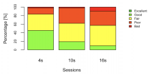
This study looks at the effect of performance variability on user-perceived performance. They set up a machine acting both as DNS and web server. A single client machine with Chrome. Network delays are introduced with KauNet, sitting between the server and the client. The delay patterns are predetermined and reproduced identically between different users. On the client they capture HAR files with Fiddler. OS and browser caches are disabled in the experiment and Chrome is set to Incognito mode. The website runs on a LAMP stack. The three 5-page browsing sessions have the following delay patterns: session 1 has 4s delay for every page, session 2 has a 10s delay on page 2 and 4, no delay otherwise, sessions 3 has a 16s delay on page 3, 1s delay otherwise. The goal being that the total is always around 20s of delays for the whole session. This is verified with the client-side page load time data collection.

Users rate their browsing session as a whole, using a standardized scale from 1 to 5 (ITU-T ACR, used in the other QoE studies I've seen before). The website is an e-commerce site where people are asked to buy a product. 49 young participants, 75% male (presumably people from the university, as usual). They end up keeping 42 result sets, eliminated people who rated everything the same.

The data shows that people are clearly more satisfied with the constant delay (4s on every page), the two 10s slowdowns come second, and the isolated 16s peak comes last:

Capture d'écran 2018-02-21 10.47.11.png (594×1 px, 80 KB)

Then they look at the effect of the order of the 3 sessions (which in effect becomes a meta session with all those delays). It shows that while the relationship in terms of preference ranking stays the same regardless of order, if people experience the "bad ones" first, they are less satisfied by the 4s delay one afterwards. However that might be explained that the other sessions contain pageloads faster than 4s. In other words, if people have experienced a faster pageload even occasionally, it increases their expectations going forward.

An interesting observation is that standard deviation increases over time. Suggesting that people's opinion gradually diverges, the longer they use the site. The author thinks that it's because people start off with an open mind with dealing with a new websites, but then will form stronger opinions later, that vary more between people.

The peak delay inversely correlates well with the user opinions of the session. However, maybe having only those 3 scenarios wasn't enough to be certain of that, as the gaps in terms of peaks for each were huge. 16 seconds to wait for a page to load is a very long time.

One might wonder if this tests done here would be just yielding noise if we were dealing with sub-second delay differences between the different sessions. The patterns that emerged in the study are very clear, but they're dealing with extreme values, particularly for the audience at hand (students in a Swedish university who are used to very fast internet on desktop). It would be interesting to perform an equivalent experiment on real users with much smaller delay differences between the different sessions, closer to real-world delays people really experience.

Selvidge, P., 2003, Examining tolerance for online delays. Usability News, 5(1).

101 participants in this study, a group of young adults and a group of 60+yo people. People were using a 800x600 resolution screen to browser the web (!). Pages were loaded from disk with a 45 second delay, to make sure it was frustrating.

Older participants are shown to be more tolerant of the delays, and people were more or less tolerant depending on the kind of internet speed they were used to at home (dial-up, broadband, etc.).

Obviously quite dated in many aspects, browsing the web was a vastly different experience 15 years ago. Nevertheless I think the home network correlation shows once again that people build an expectation of how fast a website should run, based on their own experience (speed of their own internet connection in this case).

I'm going to separate the remaining performance studies that aren't related to performance perception in a separate task, as they're out of scope for this quarter's goal.

"Are 100 ms Fast Enough? Characterizing Latency Perception Thresholds in Mouse-Based Interaction" Valentin Forch, Thomas Franke, Nadine Rauh, Josef F. Krems 2017

This study sets out to verify whether the frequently used magic number of "less than 100ms" being indistinguishable from instantaneous for users is really true. 20 students participated. The task was to drag a square back and forth on the screen with a mouse. The true latency experience by users was measured by a high-speed camera pointed at the screen.

The latency perception threshold varied greatly between participants, between 34 and 137ms (median 54ms). People who had a habit of playing action video games had a lower threshold than others who didn't.

While mouse latency is far from our web performance concerns (aside from when jank happens), this is mostly interesting in seeing that even in a socially cohesive group (all young students), the threshold for what feels instantaneous varies wildly, and the median is much lower than the 100ms magic number that people have been referring to for the past 50 years, mostly coming from Miller's essay. It's quite possible that people's expectations are increasing over the time, with faster devices becoming ubiquitous.

"Perception of Delay and Attitude toward Feedback Display: An Exploration into Downloaders’ Demographics" Chatpong Tangmanee, Pawarat Nontasil 2014

The study collected its data with a survey on a Thai file hosting website. 2160 responses were recorded. During the download, users were presented with a percentage-based progress display of the download, along with the filename. Once the download was finished, they play a bell sound to alert the user that it was done. They ran their survey on file download sizes between 3 and 15MB.

The different demographics breakdown confirm what has been seen elsewhere, i.e. that the younger the users are, the less tolerant of slow performance they are. Similarly, female users are shown to be more patient and more tolerant of long download times. Also, the less experienced they were with the web, the less tolerant they were of slowness. This might suggest that "fast internet" natives are more sensitive to performance, as they take the fast experience for granted, having never experienced a previously (globally) slower internet.

"A methodology for the evaluation of high response time on E-commerce users and sales" Nicolas Poggi, David Carrera, Ricard Gavaldà, Eduard Ayguadé, Jordi Torres 2012

The study is based on logs provided by a travel website where people can purchase things (flights, restaurant bookings, etc.). They use machine learning to predict, seasonality included, what the sales figures should have been if the performance of the site didn't degrade, and compare it to actual sales when response times peaked due to capacity overload. They focus their study on flights, which are expensive to produce results for, thus leading to longer response times, even when performance of the site is nominal. It also makes the study work because in that case the biggest time is probably spent server-side, which is the only data they have access to.

I can't really the review the quality of the ML methodology, not knowing anything about that topic, but they claim that response times for flight search between 3 and 11s represent a tolerating span, where some sales are lost, and that beyond 11s the frustration phase kicks in, with a loss of an extra 3% of conversions for each additional second of slowness.

The effect of page performance on sales has been proven many times, https://wpostats.com/ is full of those. However I'm still skeptical that they can be translated to the experience of visiting wikis. People going to an e-commerce website probably have a preconceived notion of what they want to buy, and once they've made up their mind, they want to get through that process as quickly as possible. And if they don't get what they want fast enough, they can go to a competitor to buy the same thing. Whereas people learning on wikis don't always know exactly what they're looking for, nor to they necessarily have a specific "task completion goal" when they start out, that they would rush to achieve.

Nevertheless, if we consider that "success" for us is more traffic or longer sessions, it would be interesting to consider building a predictive seasonal model of what our traffic/session length *should be*, based on periods where our performance was best, and compare it to periods where our performance was degraded (which can be done on purpose). The challenge being in picking what we consider to be our success criteria, which I think is still very unclear.

Rose, G.M., Evaristo, R. and Straub, D., 2003, Culture and consumer responses to web download time: a four-continent study of mono and polychronism. IEEE Transactions on Engineering Management, 50(1), 31-44.

This study compares "monochronic" cultures (US/Finland) and "polychronic" cultures (Egypt/Peru) and their reaction to download times. This blog post explains these terms. They run the same lab experiment in 4 universities in those countries. Students make up the group, with no significant economic or demographic differences between groups. Participants go through 5 page views, subject to delays ranging from 15 to 90 seconds.

Subjects from polychronic cultures were better at estimated long wait times, while subjects from monochronic cultures underestimated the long wait times significantly (polychronic underestimated too, but were much closer to reality). Overall longer download times affected attitude negatively, regardless of culture. However, subjects from polychronic cultures had a less negative attitude towards delays than subjects from monochronic cultures.

It's refreshing to have a study looking at vastly different cultures and their perception of delays. It seems to both confirm that waiting is universally negative, but that the degree of negative impact on the user experience depends on the culture, meaning that people who care less about degraded performance might care more about other aspects of their interaction with a website. The significant differences in time perception between cultures also prove once again that magic universal numbers are unlikely to have any basis in reality, and that each person is likely to have different thresholds for what feels instantaneous or frustrating.

Galletta, D., Henry, R., McCoy, S. and Polak, P., 2002, Web site delays: how slow can you go?” Presented at the First Annual Pre-ICIS Workshop on HCI Research in MIS, 14 December 2002 forthcoming in Journal of Association for Information Systems.

A bit difficult to review since I could only find the slides, but basically they had 168 students use CD-based fake websites (one familiar, one unfamiliar) with random page load delays in 2s increments between 0 and 12 seconds. The longer the delays, the less test subjects completed the task, and the worse their attitude towards the website became. Maximum degradation reached around 4s. With the exception of degradation of attitude towards familiar sites, where the maximum degradation was reached at 6-8s. This would suggest that users are more tolerant to delays on familiar sites. Although, as usual, the be taken with a grain of salt considering this is very dated.

(I'm removing old studies that have happened on such different mediums and timelines they are irrelevant - like people waiting for a flight or in line in a store)

Jacko, J.A., Sears, A. and Borella, M.S., 2000, The effect of network delay and media on user perceptions of web resources. Behaviour and Information Technology, 19(6), 427-439.

127 subjects from a university, given a text-only and a text+ graphics website with the same text content. Short (500ms), medium (3.5s) and long (6.7s) delays are introduced when browsing between the different pages of the website. People are asked to find information on the site to answer 20 questions. Once done they are given a survey to fill.

Surprisingly, when asked about information quality, users rated the text-only website much higher than the version with graphics. And while the information quality scores degraded for the graphics version as delay conditions increased, the scores actually improved with longer delays for the text-only version.

The authors' theory is that users look for what to blame for the slowness, and in the case of a full-fledged website they would blame graphics, which are the site publisher's responsibility. Without them, they are more likely to blame factors outside of the website publisher's control, which means that it doesn't affect their rating of the website.

Guynes, J.L., 1988, Impact of system response time on state anxiety. Communications of the ACM, 31(3), 342-347.

Looks at how students with "type A" and "type B" personalities respond to system response delays. Type A is "composed primarily of competitiveness, excessive drive and an enhanced sense of time urgency". Type B is everyone else. 93 subjects in the study. Test subjects are asked to edit a text file that contains errors. The group with "good" response time had a consistent 5s response time, the "variable" group had random from 0 to 9s with high variability and the "poor" group had relatively constant responses taking between 5 and 10s. People are given 20 minutes to complete the task, which takes a minimum of 53 transactions to complete.

The study doesn't find any difference between personality types, both experiencing what they call an increase in "state anxiety" when faced with poor performance in the "variable" and "poor" groups.

I'm now going to start writing the synthesized review based on all my notes here, at https://www.mediawiki.org/wiki/Wikimedia_Performance_Team/Perceived_Performance

I'm done with the wiki page, please take a look.