Page MenuHomePhabricator

Create an XTools logo
Closed, ResolvedPublic3 Estimated Story Points

Assigned To
None
Authored By
MusikAnimal
Jun 7 2017, 7:45 PM
Referenced Files
F12185110: IMG_20180101_163015.JPG
Jan 1 2018, 11:03 AM
F8540296: Screen Shot 2017-06-27 at 10.34.26 PM.png
Jun 28 2017, 2:36 AM
F8533593: xtools5.svg
Jun 26 2017, 11:49 PM
F8533568: xtools4.svg
Jun 26 2017, 11:32 PM
F8517585: xtools3.svg
Jun 24 2017, 1:34 AM
F8517583: xtools.svg
Jun 24 2017, 1:34 AM
F8517584: xtools2.svg
Jun 24 2017, 1:34 AM
F8516272: Screen Shot 2017-06-23 at 2.36.54 PM.png
Jun 23 2017, 6:42 PM
Tokens
"Orange Medal" token, awarded by Krinkle.

Description

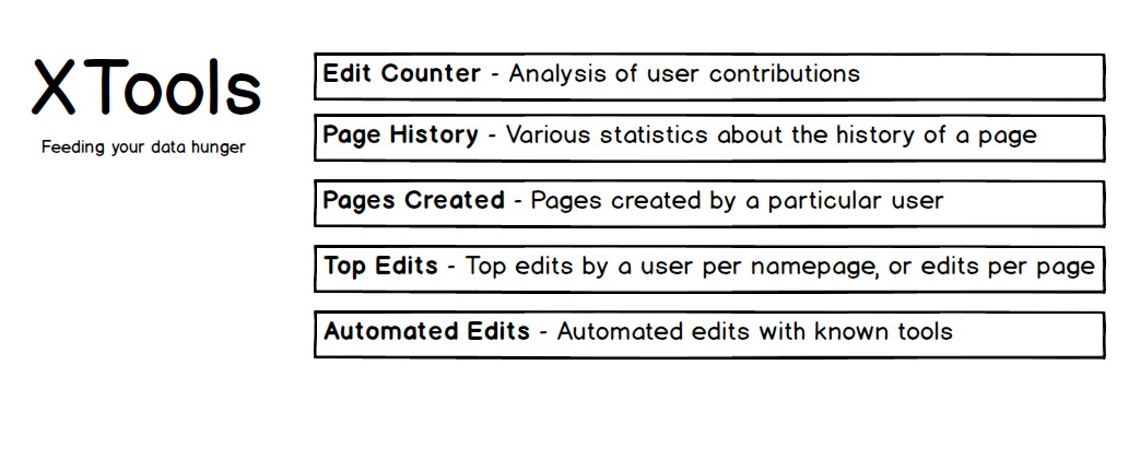
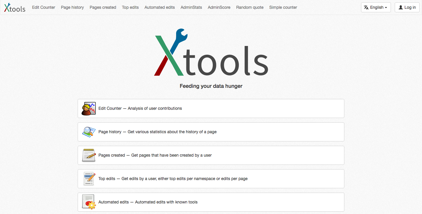
Currently the new XTools homepage is quite unappealing: http://tools.wmflabs.org/xtools-dev/

To coincide with the long-awaited rebirth of the XTools suite, I think it would be great if we got a designer to come up with a logo. Doesn't have to be anything fancy, even if it's just the text "XTools" in a fancy font. Something like Quarry, which has a simple text logo and a cute little icon to go with it. The icon could also serve as the favicon.

As a first step, we need to settle on which capitalization we want:

  • xtools
  • xTools
  • XTools
  • Xtools
  • XTOOLS!!!

...and with or without a dash (x-tools, X-Tools, etc.), a dot (x.tools), a underscore (x_tools), ...

Event Timeline

MusikAnimal added subscribers: Samwilson, Matthewrbowker.

To put in some !votes, I like "XTools" the most, but I'm not married to it, and I believe @Matthewrbowker likes "xTools" and @Samwilson prefers "Xtools". We're on our way to a consensus! =P

I thought we settled this at the hackathon, with me as tiebreaker. I vote for XTools.

I think it should be "eggs' tools", like tools for eggs, because who thinks of the eggs?!

In more general terms, I'm also happy with XTools.

@Niharika suggested that we get people to bid on UpWork (formerly oDesk). Apparently, you can get a bunch of people to create logos for you and then you just pay whoever has the best one. Alternatively, we can get a WMF designer to design it (although it means we will have fewer choices).

We will need both a largish logo and a small square favicon version (preferably as a vector graphic).

kaldari set the point value for this task to 3.Jun 13 2017, 11:17 PM

Apparently we can get 3 logo designs for $69 at https://worthylogollc.com/.

Apparently we can get 3 logo designs for $69 at https://worthylogollc.com/.

Dead link?

As we posted the link, the link worked. Now it does not work for me too.

Here's a shitty logo design for $0

Have there been attempts to reach out to potential folks in the Wikimedia community, e.g. dropping a line on the design mailing list or on IRC?

Here's a shitty logo design for $0

Not bad in my opinion! This doubles as a text logo and the same X design could be the favicon. Thoughts @kaldari, @Samwilson, @Matthewrbowker?

Have there been attempts to reach out to potential folks in the Wikimedia community, e.g. dropping a line on the design mailing list or on IRC?

Great idea! Wasn't aware of such a mailing list. There's no harm in getting more candidates but I'd like to know what people think of the above logo first.

Here's what I've got for a splash page: https://xtools-dev.wmflabs.org/ Hopefully it doesn't look that stupid... (I love the logo, by the way, that's not the stupid part!)

"Feeding your data hunger" is more of a placeholder, not the real slogan. We don't have to have a slogan either, maybe instead just a short description of what XTools is, but I'd like to put some text below that giant logo.

Here's what I've got for a splash page: https://xtools-dev.wmflabs.org/ Hopefully it doesn't look that stupid... (I love the logo, by the way, that's not the stupid part!)

How about making the logo a little smaller? I'd prefer it all fit in one screen instead of having to scroll.

How about making the logo a little smaller? I'd prefer it all fit in one screen instead of having to scroll.

What device/dimensions are you using to view it, if I may ask?

I tried to adjust the size of the logo based on the viewport, but it's going by width and not height, assuming there is some standard ratio (browser's width is somewhat greater than height).

We could still probably make it a little smaller, though, I was just hoping the width of the logo would be close to the width of the buttons.

... assuming there is some standard ratio (browser's width is somewhat greater than height).

For desktop, I mean. On mobile the logo should shrink accordingly (and holding your device upright the height is definitely greater than the width in that case)

MacBook 15". Here's a screenshot of what I see:

Screen Shot 2017-06-23 at 9.50.53 AM.png (1×2 px, 1 MB)

I like the logo but I don't see a point to having it be that huge instead of just in a corner like in Copypatrol.

I like the logo but I don't see a point to having it be that huge instead of just in a corner like in Copypatrol.

Well, unlike CopyPatrol, we don't have a default view. The user has to decide what tool they want, so we get an opportunity to throw a big flashy logo at them and advertise the available tools in detail. I'm not too worried about having to scroll, as even if we downsized the logo, once all the tools are in place you'd still have to scroll. I thought you meant the logo itself was cut off and you had to scroll to see all of it.

Actually the logo was smaller but I broke the CSS rule. Try it now (you may need to clear your cache). Still a little flashy but I personally like that. The thing I was more unsure about was the list of buttons with the goofy icons.

That logo is crazy big. It's a nice logo, but what you really want people to focus on are the tools.

What do you think about this?

XTools interface 2017-06.jpg (431×1 px, 92 KB)

What about this:

Screen Shot 2017-06-23 at 2.36.54 PM.png (731×1 px, 343 KB)
I downsized it a bit more. I don't think that's too obtrusive? I couldn't get it to look right with the logo on the left, and with the Bootstrap grid system it consumes space needed for the tool descriptions. We also have to account for smaller screens, where the logo would end up on the top anyway.

Also: I thought it was XTools?

I did too. Perhaps @Ricordisamoa is able to make it look just as fancy with an uppercase T? Also it looks like maybe the blue wrench is slightly misaligned with the red line.

The logo still looks pretty huge to me (although I'm on a small screen). Can we shrink it a bit more? Also, as long as I'm bike-shedding... I think I would prefer the tool listings without the icons and with the tool names in bold, similar to Danny's mock-up. I think it would look a bit cleaner.

Perhaps @Ricordisamoa is able to make it look just as fancy with an uppercase T?

With uppercase T:

Do you think the T should take part in the metaphor?

Also it looks like maybe the blue wrench is slightly misaligned with the red line.

That is a remnant of the original font (Source Sans Pro) and I retained it because of the slightly 'unbalanced' touch.

Blue wrench aligned with red line:

Original design, now with tweaked red line:

Please replace the current logo with xtools3.svg, which fixes the alignment issue. Also, the logo is still way too big.

@Ricordisamoa Is it possible to get xtools3.svg but with an uppercase T? Thanks so much for your help! We will be sure to give you credit on the About page :)

@Ricordisamoa Is it possible to get xtools3.svg but with an uppercase T? Thanks so much for your help! We will be sure to give you credit on the About page :)

With uppercase T, blue wrench aligned with red line:

Be sure to credit https://commons.wikimedia.org/wiki/File:Wrench_icon-72a7cf.svg (and yourself, for the wrench alignment I don't want to be associated with :-P)

With Overpass font:

I like the curving better on this one (xtools5 with Overpass font). The previous one has a more handwriting-like lowercase "l" which feels out of place with the other letters, especially in a logo.

Here's what I've got now, using the xtools5.svg logo (I also favour the Overpass font), dropping the icons, and using a horizontal layout:

Screen Shot 2017-06-27 at 10.34.26 PM.png (603×1 px, 305 KB)

Currently live at https://xtools.wmflabs.org

Now that looks beautiful!

Now that looks beautiful!

Awesome :) Now we just need to come up with a slogan (or brief description) for XTools. Any ideas? Or is "Feeding your data hunger" catchy enough?

The Overpass Font Software is dual licensed under the SIL Open Font License and the GNU Lesser General Public License, LGPL 2.1 : http://www.gnu.org/licenses/old-licenses/lgpl-2.1.en.html OFL 1.1 : http://scripts.sil.org/OFL

Since we're only using the font, not distributing it or creating a derivative font, we don't technically have to worry about the licenses (as they only cover distribution and modification of the "font software", not use of the font).

Awesome :) Now we just need to come up with a slogan (or brief description) for XTools. Any ideas? Or is "Feeding your data hunger" catchy enough?

It works for me, I think it's cute.