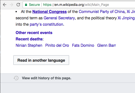
The main page in mobile view has no language selection icon at the top. Instead the language button is at the bottom of the page. It's contextual more than inconsistent.
The treatment is different on the main page as the main page does not show a title or page actions bar.
Many main pages are designed very differently from other pages, for example Hindi Wikipedia:

Showing a page actions bar on the main page has a variety of problems, which vary depending on the wiki:

To take Hindi Wikipedia as an example:
- On Hindi Wikipedia, black icons on gray background (accessibility problems not easily fixed by making white background alongside gray)
- Edit icon that will always be locked (given most main pages are protected)
- Surplus unnecessary information - e.g. "Main page"
- Redundant features (it is useful to watch the main page given it is protected?)
- If language icon is the only feature, could push down more useful content
To quote @Nirzar
... main page design has a lot more problems than just language selection.
We can design a better experience for language selection and other relevant page actions for main page but they are likely to be deprioritized because we are a small team
I can design a better solution if anyone else is interested in building it
Vector
From T288647:
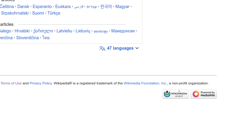
In T276140, the language switching button was moved to the bottom of the page.
There is no good reason to put it there.
It should be at the same place as it is on all other articles. T276140 says that main pages don't have headings, but other than that, they are mostly the same as articles. The placement should be consistent. This consistency consideration alone should be a reason to move the button to the top.
In addition, the main page is usually the most popular page in any given wiki. It is the page that user arrive to when they search for "wikipedia" in their search engine. However, the search engine often doesn't give the user the main page of the Wikipedia in the language they wanted, and the user wants to switch to another language. In this very frequent scenario, switching the language should be easier, not harder. This is another reason to put the language switcher at the top.
Not having a heading is not a problem. Just add some empty space without any text. Or maybe put the word "Wikipedia" there.
T276140 also discusses how main pages in some languages have lists of some other languages near the bottom. It's true, but is this actually a good design? To whom is it useful to see them there? To whom is it useful to see them sorted by the number of articles? It may be interesting to some Wikipedians, but most readers don't need that. Most readers want to find a language in which they can read.
So please, put the language switching button on the main page at the same place where it is on other wiki pages.