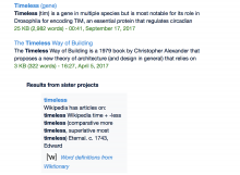
The search results from sister sites are aligned underneath the main search results. This seems consistent across all various width variants.
Description
Details
| Subject | Repo | Branch | Lines +/- | |
|---|---|---|---|---|
| Add explicit padding and margins for all ul elements | mediawiki/skins/Timeless | master | +5 -0 |
Related Objects
Event Timeline
Example URL of the problem: https://en.wikipedia.org/w/index.php?title=Special:Search&search=timeless&fulltext=Search&useskin=timeless
Seems to be caused by .mw-searchresults-has-iw #mw-interwiki-results having an additional, unnecessary and unwanted margin-left: 8% -- removing that makes the problem go away and the search results look nice 'n' tidy (at least on my setup: IE11/Win7, 1440x900px screen resolution).
@Isarra @matmarex Thoughts? Should I just apply something like .mw-searchresults-has-iw div#mw-interwiki-results { margin-left: 0%; } to Timeless' screen-common.less in order to fix this?
Actually no that one is intentional. This is because the <ul> element has --webkit-padding-start: 40px. I'm assuming IE has similar implicit user agent styling.
On vector, we force all ul elements to padding:0 explicitly, but not with Timeless, there we only force it to 0 on: .mw-content-ltr ul
But search results are not inside .mw-content-ltr, we should probably change that to reflect the entire content area of timeless, and not just to rendered wikicode fragments.
Also, seems the normalise.css library isn't entirely complete :)
Change 428284 had a related patch set uploaded (by Evad37; owner: Evad37):
[mediawiki/skins/Timeless@master] Add explicit padding and margins for all ul elements
Change 428284 merged by jenkins-bot:
[mediawiki/skins/Timeless@master] Add explicit padding and margins for all ul elements
