Page MenuHomePhabricator

add link on membership form to wm.de
Closed, ResolvedPublic2 Estimated Story Points

Description

As a user,
I want to inform myself about wikimedia,
so that I can apply for a membership on a well informed basis.

Acceptance Criteria:

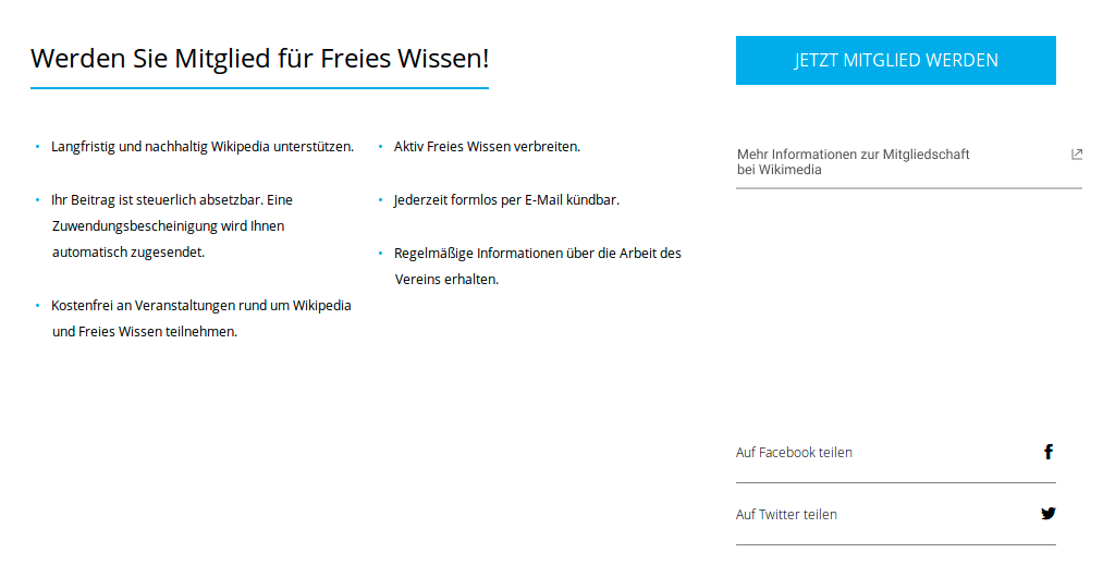
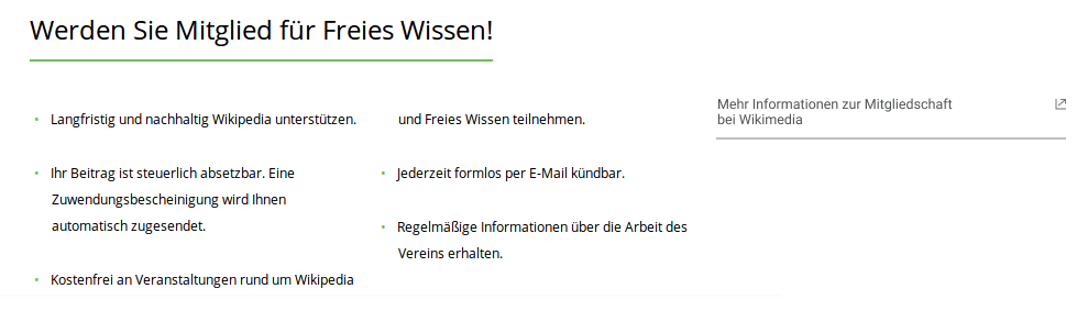
  • In wider viewports, there is a link right of the list of "incentives", leading to our public website.
  • In narrow viewports, the link is displayed below that list.
  • The link opens in a new browser tab.

The design team proposed the display of the link as follows:

image.png (303×989 px, 26 KB)

Background: We know that quite a few people click on the link for further information about memberships that we offer on the right side of 10h16.

image.png (67×189 px, 2 KB)

Users get redirected to https://wikimedia.de/wiki/Mitgliedschaft after clicking and some of them return to our membership by clicking on the provided link.

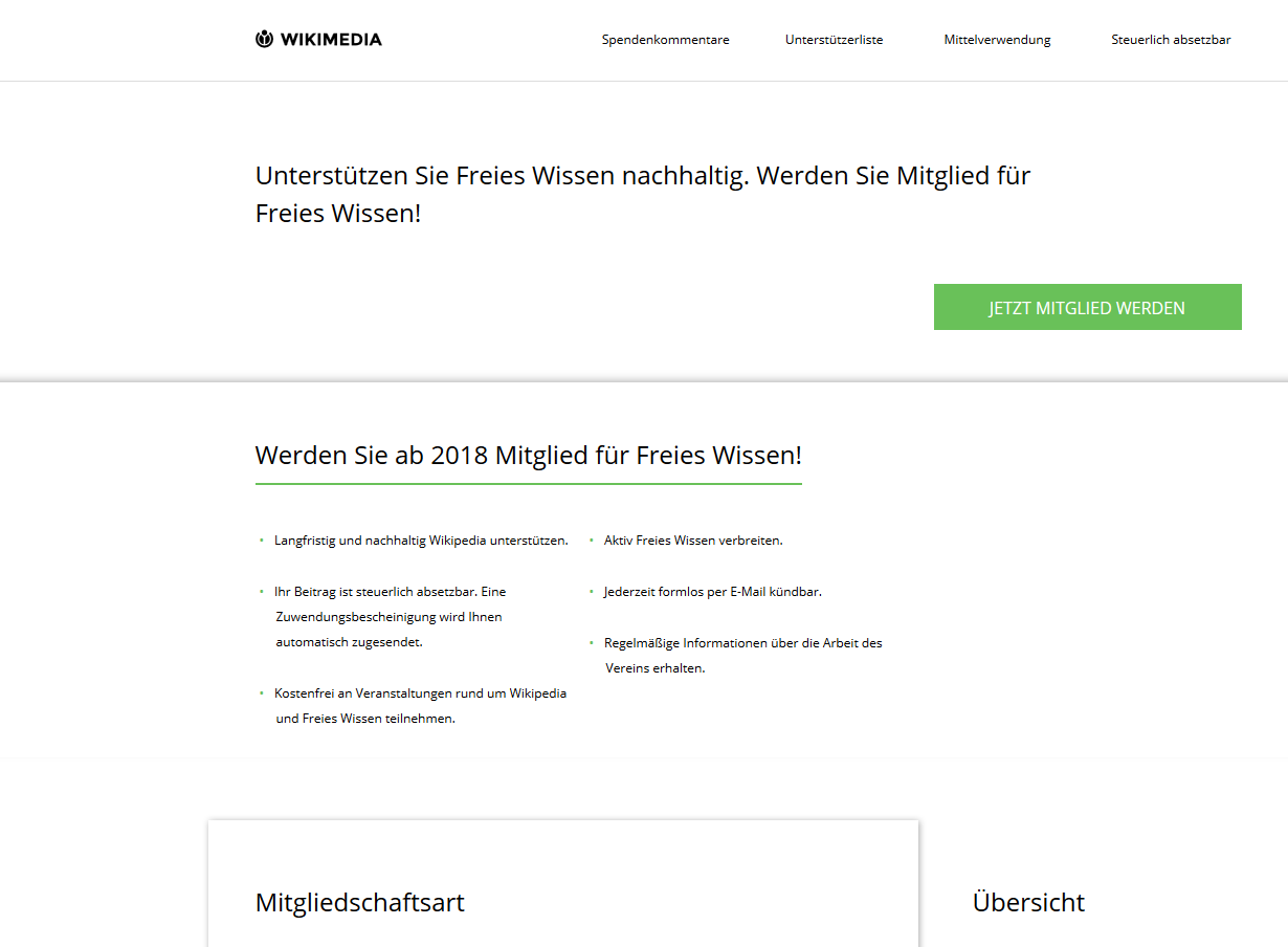
On cat17 this link is missing.

Due to the donation receipt mailing which will be delivered around Mar 12th, we need a quick fix of this problem.

Event Timeline

The link may be part of the section containing the "pros of becoming a member". We could also put it into an area right of that element. In either case, on narrower screens, this link would be displayed below that list.

WMDE-Design Can you give a recommendation that keeps the thin line between visibility and distraction in mind?

  • UX looks for a place to put this
  • UX will suggest a improved wording (since "mehr" is not best practice)

We strongly suggest: To track if that link does not more harm than good

We suggest: Review the target page to ensure that interesting information is there – currently it seems to be similar to the infos on the donation page.

@Tobias_Schumann_WMDE:

The link tracking is enabled by default in our Piwik instance. Please have a look.

@kai.nissen: Yes, though it is really hard to get it in the schedule for us.
@Tobias_Schumann_WMDE @kai.nissen : What is the result of the Piwik Tracking?

I can put the link at a standard position. However, I am concerned that we don't have a way to get rid of it again, which I find important, since it could do more harm than good.

My suggestion is to put the link in the top menubar:

image.png (128×1 px, 9 KB)

The disadvantage is, that this is the only link that directs to a non …spenden… page.

Another is to put it in the footer (though I like this less). We could add it at a temporary position there and rework it in case we decide to add Kontodaten and address to the footer.

image.png (239×883 px, 15 KB)

Same disadvantage, though. So I assume the Mitglied werden might be a candidate to actually be on the Spendenseite.

mhh. I dont think that any of those two solutions are suitable. They all lack that the "further information" is far away from the form (incl. header). This first one "disapears" on smaller screens and is generally only needed on the membership form and not the donation form (I think the header stays the same). The second one might be not visible enough for the user. Who checks for more information in the footer?

Could we use the somehow useless membership button above the form for the more information link instead? that somehow makes sense, it is an eye catcher once you start to scan the page and it is easy to remove again. @Jan_Dittrich @kai.nissen

@tmletzko yes – I was assuming the link should be permanently in the sidebar. Misunderstanding.

Could we use the somehow useless membership button above the form for the more information link instead?

Can you provide a screenshot for which button you mean?

Considering the button should be close to the form, it makes most sense to attach them to the existing information:

image.png (519×1 px, 41 KB)

image.png (303×989 px, 26 KB)

On mobile the link could be pushed below the form

ahh, actually we talking about two different pages here. You seem to have the confirmation page in mind whileas I think of the actual membership page. Your proposed solution might work on the membership form aswell, right? We need to find a solution that works on both pages

membership form.PNG (904×1 px, 45 KB)

Here you can find the green button aswell. But my proposal is close to yours.

the proposals are for the two different pages,

image.png (303×989 px, 26 KB)
is the "green button page"

I would not kill the green button since it is needed on mobile and removing it could have rather annoying ripple effects through the design.

I am not saying to kill it. My idea was to have the link below or besides the button. But it is just another idea. I like yours better anyway. Btw. I think the only functionality of this button is to get redirected to the first part of the form but on mobile it is sure important.

Some notes:

The membership link goes along with an icon indicating new tab. That icon was not present in the existing set/font used by the app. The adding of the new icon was a bottleneck. Step by step guide was added as a comment in the codebase just in case we need new icons in the future. I'm pasting the contents in case someone thinks it's not clear enough and/or has ideas how to improve it:
" Default font style file as @generated by icomoon. If you ever want to change it

  • go to icomoon.org
  • upload assets/fonts/wikimedia/icomoonwikimedia.svg
  • add/change icons per requirement
  • change icomoon settings to include variables.scss in download
  • keep the "icon-" prefix for generated (s)css
  • name the iconset icomoonwikimedia
  • download zip file
  • extract variables.scss & style.scss to components/fonts/icomoonwikimedia
  • extract fonts to assets/fonts/wikimedia/
  • ensure that selectors in components/fonts/icomoonwikimedia/delta still match your icon names / are still needed "

The contents of the .svg icomoon font contain the glyph html tag. According to Mozilla Docs that tag is deprecated and should be changed if possible. Might be something we need to take care of? @kai.nissen

p.s. Many thanks to @Pablo-WMDE for the help

@Tonina_Zhelyazkova_WMDE Sorry, there is a rough (and maybe outdated) documentation about adding more icons to the font files on the wmde/fundraising/wiki. Obviously, it's not in the right place.

I'm fine with putting the documentation into the code for now, but I want to raise the question, whether this is the first place to look when devs want to change the content of the font files. We could also put it as a README into the asset folder and maybe also link to it from the root level README. I will update T190267 with the other approaches we discussed today.