NOTE: Please see Zeplin links for most up-to-date mocks
Why are we doing this?
iOS 11 included an update to typographical styles, with a focus placed on large headers.
Additionally, we currently utilize a mix of old and new search bars throughout the app, we would like to standardize the search bar style.
Designs
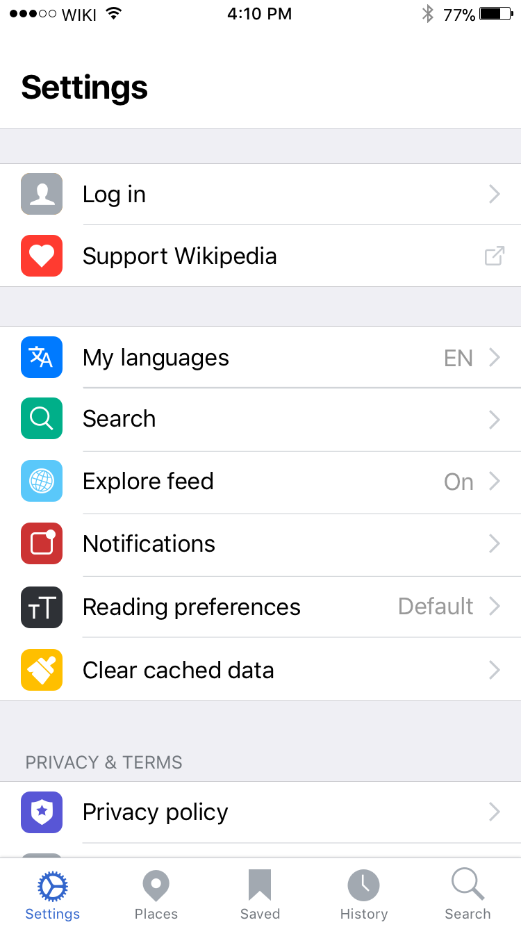
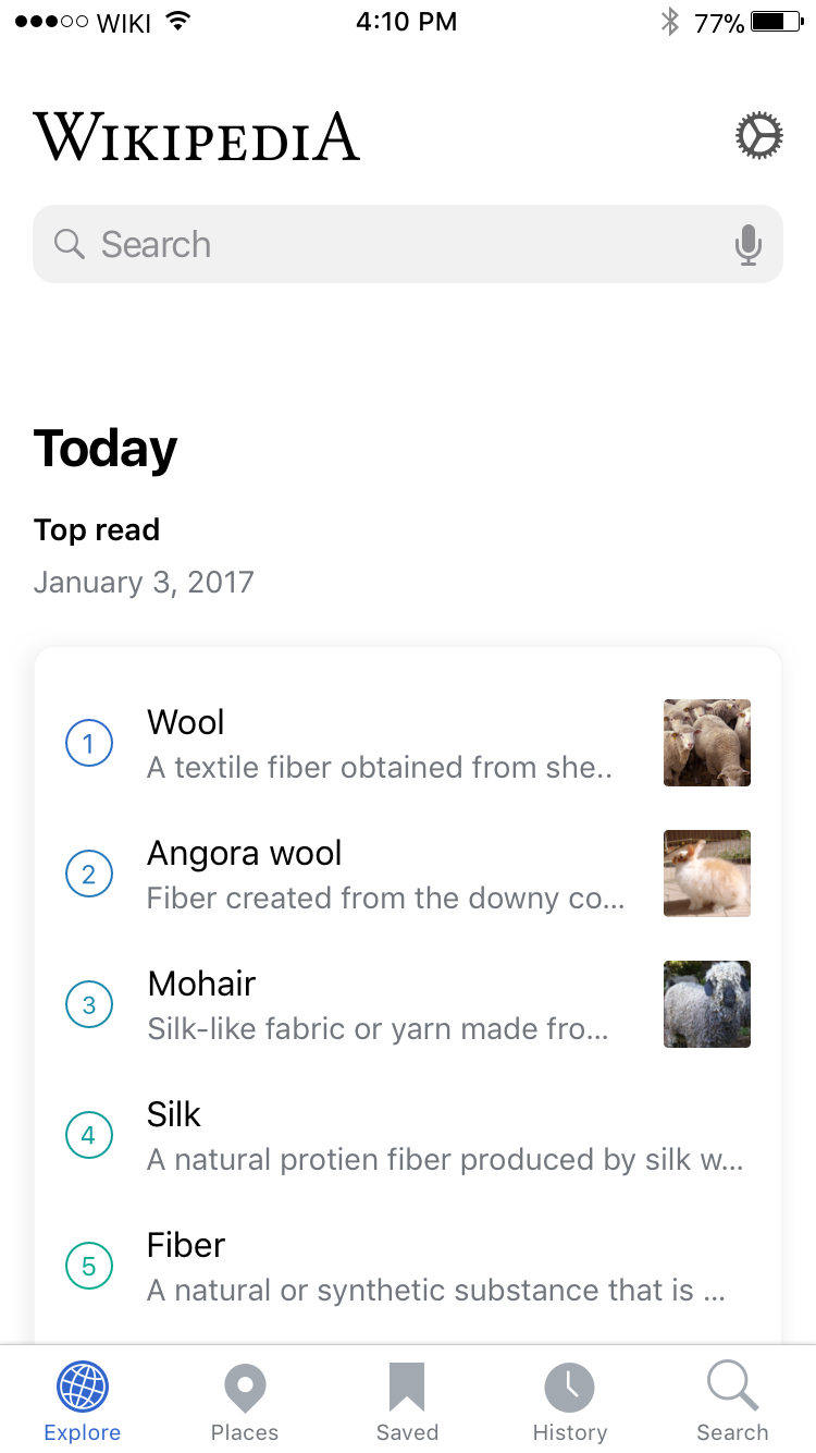
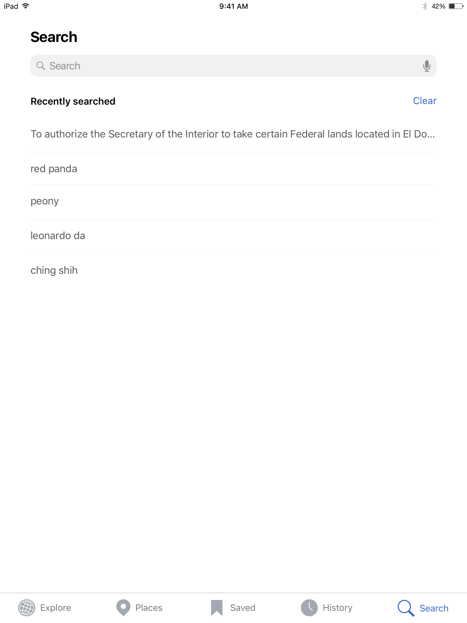
iPhone
| Explore | Detail view | Places | Saved | Search tab (new) | History | Settings |
|---|---|---|---|---|---|---|
 | 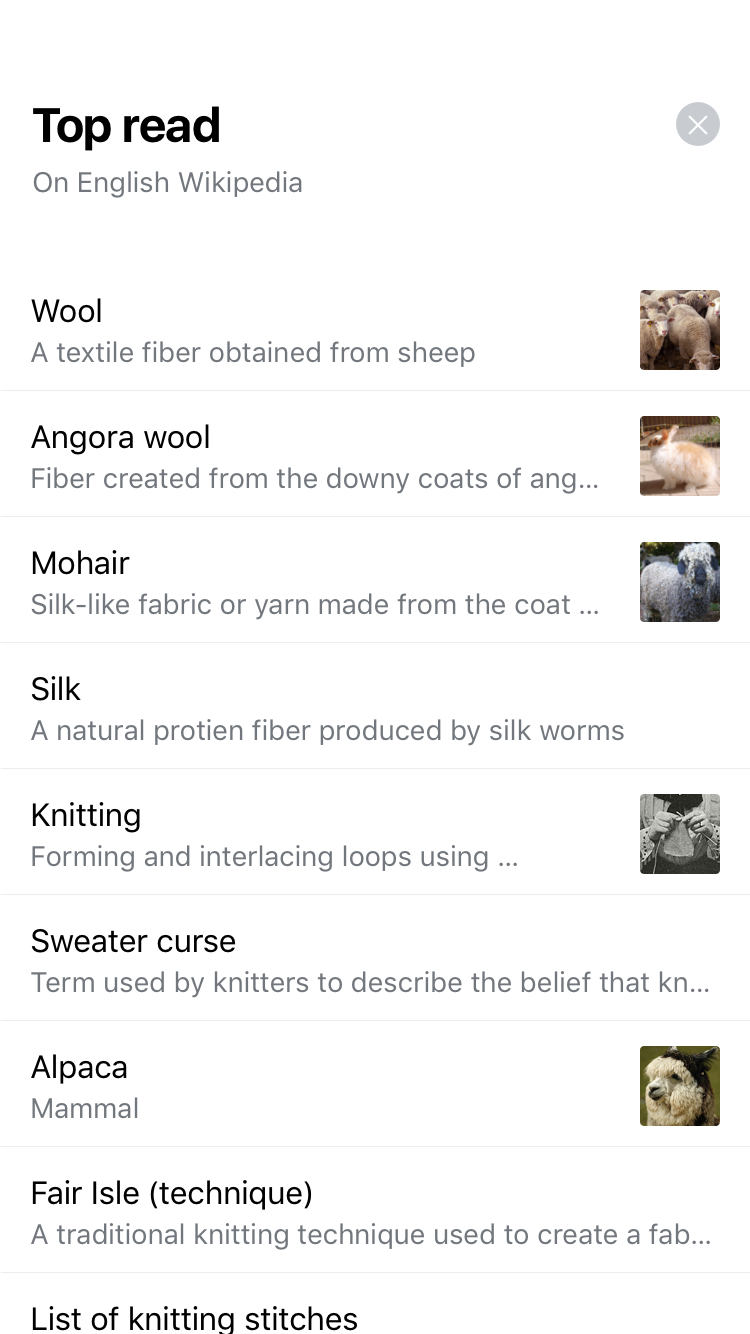 |  | 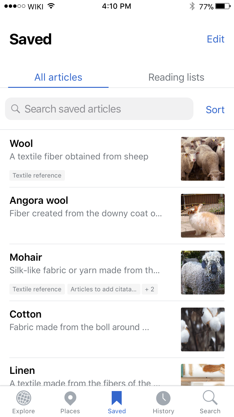 | 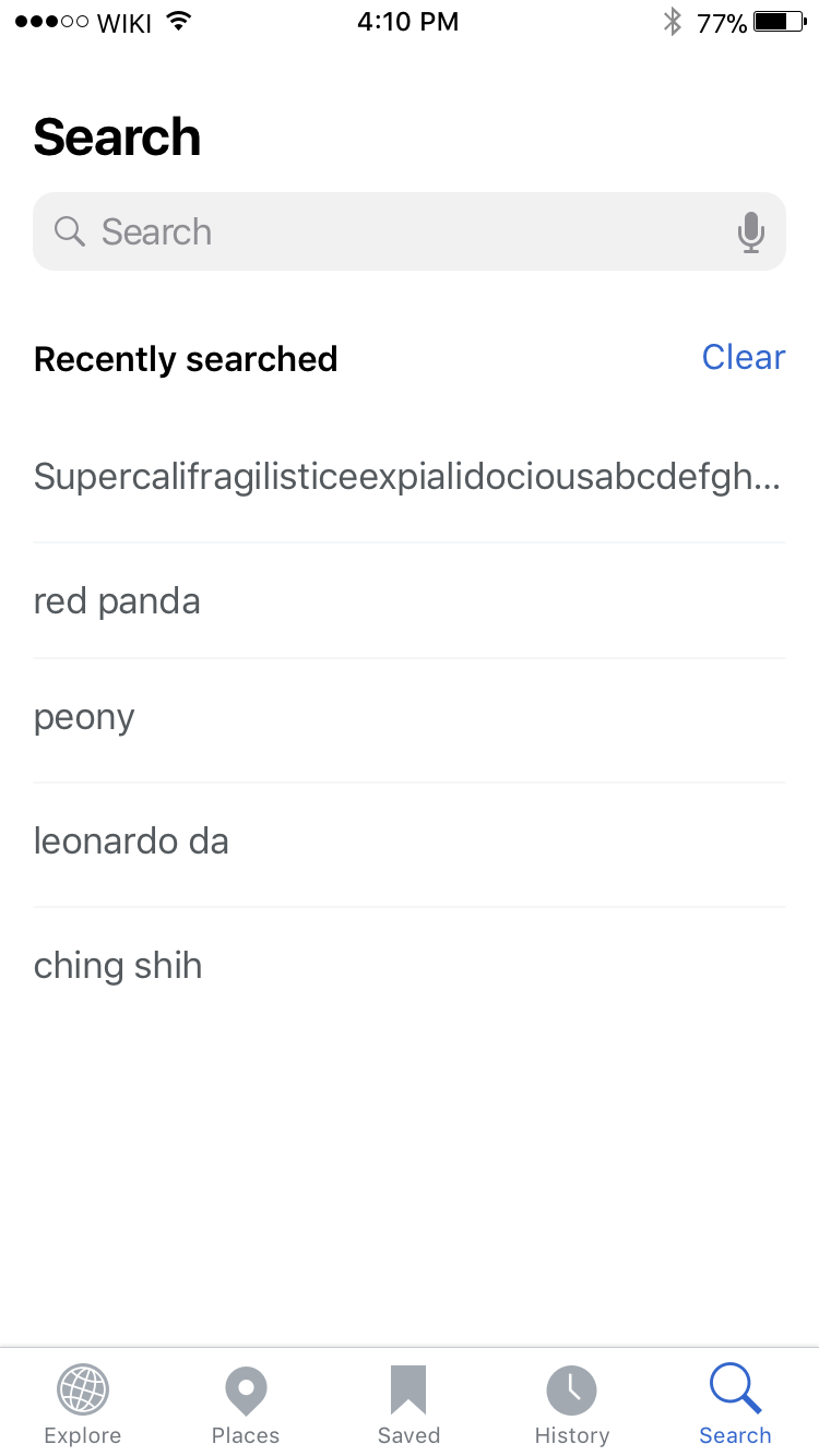 | 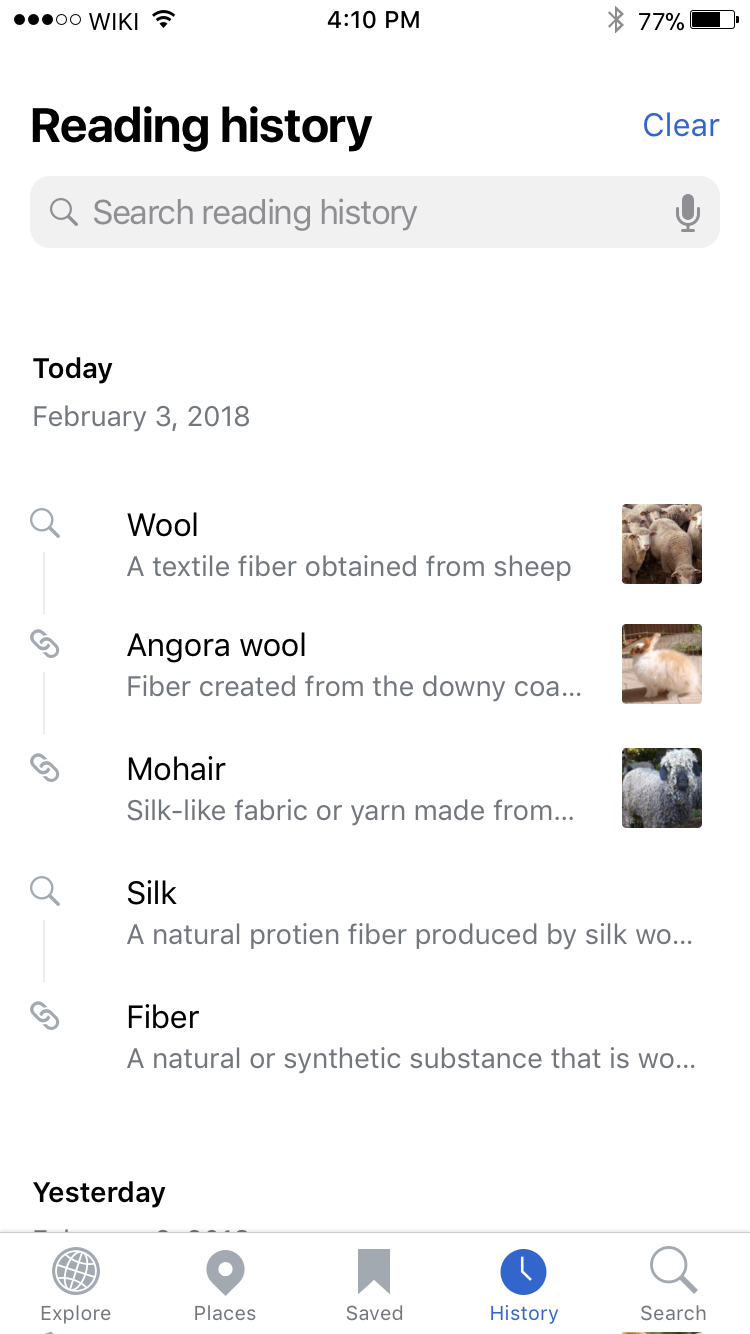 |  |
| https://zpl.io/aBjY87K | https://zpl.io/aXGdvWM | https://zpl.io/aN4XqA9 | https://zpl.io/bzyDZ57 | https://zpl.io/aBjYpDA | https://zpl.io/2vBJ9We | https://zpl.io/aBOjWoe |
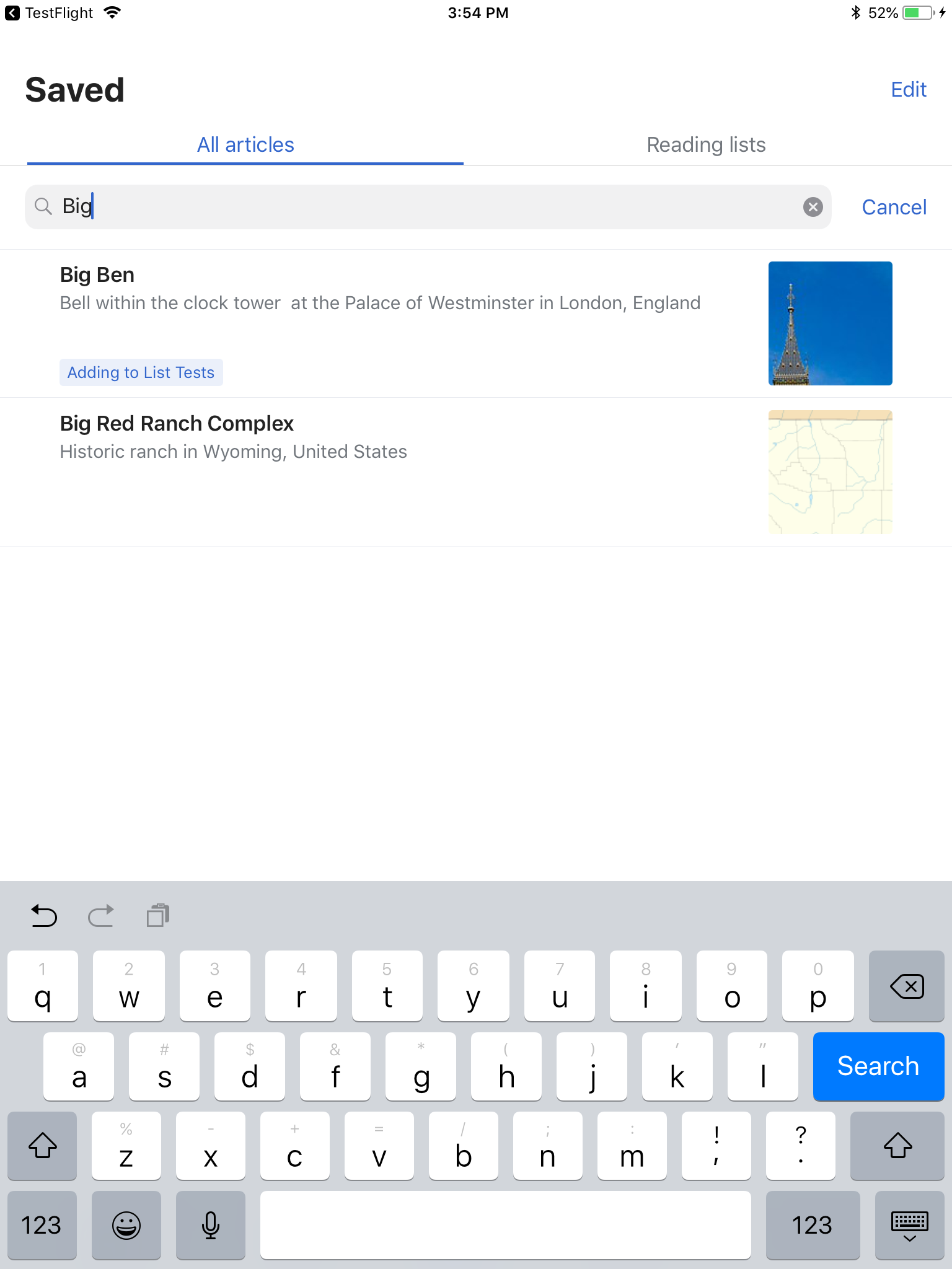
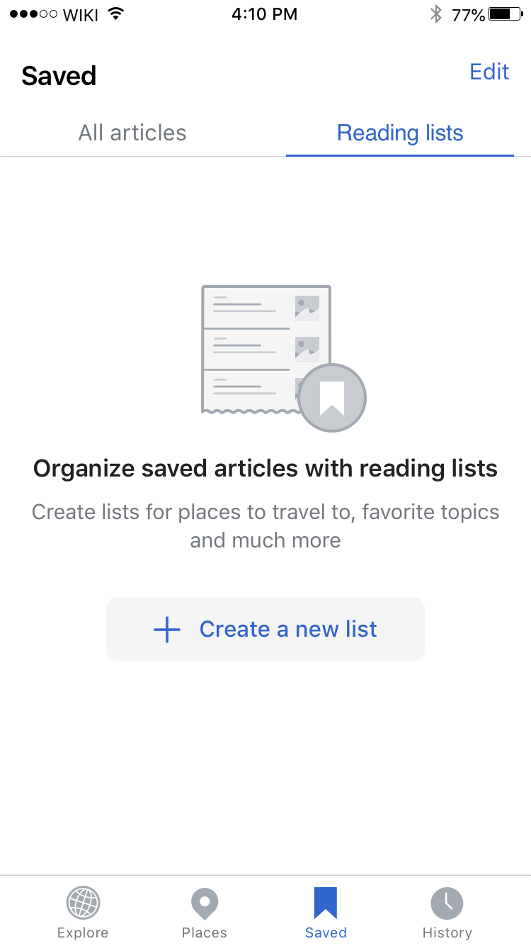
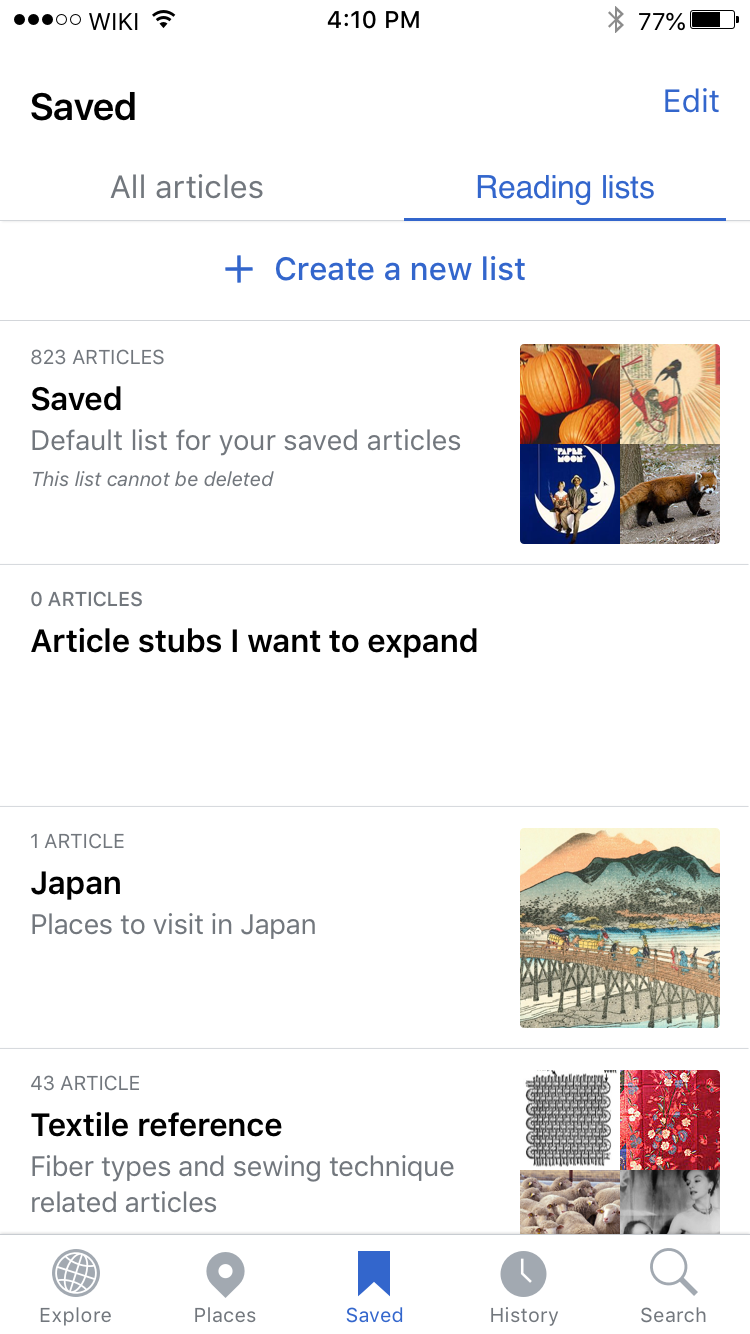
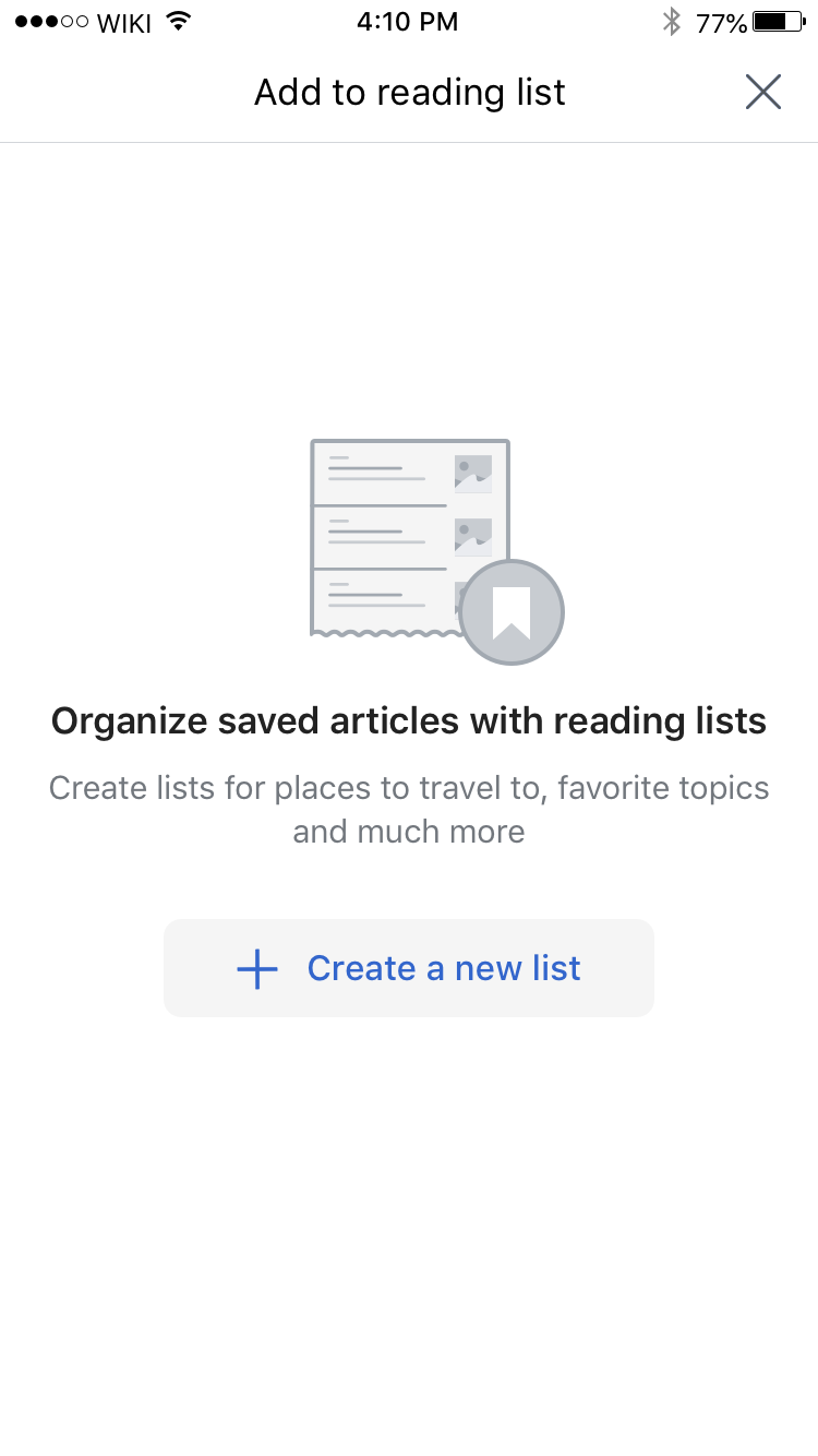
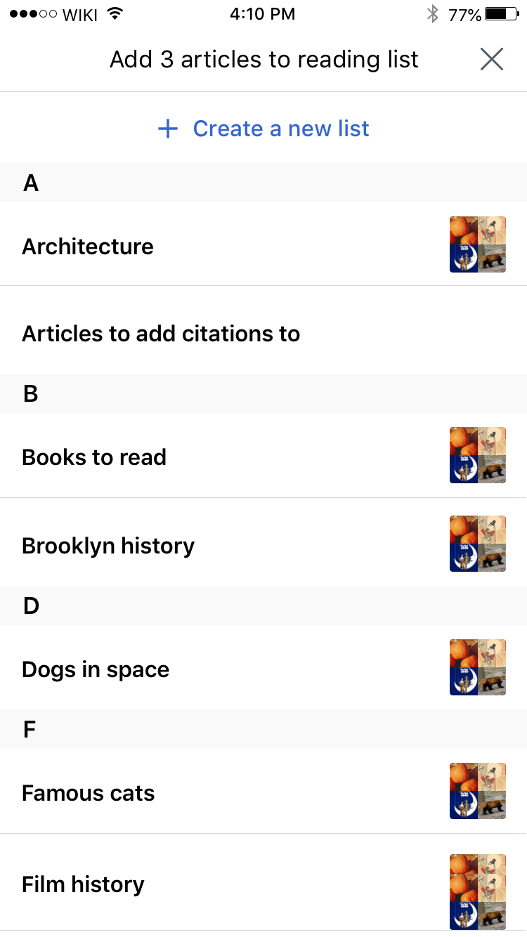
Update to Saved screens
| Reading list empty state | Reading list view | Add to reading list empty state | Add articles to reading list |
|---|---|---|---|
 |  |  |  |
| https://zpl.io/V41BxZz | https://zpl.io/anKJ4OQ | https://zpl.io/a8K04j4 | https://zpl.io/VOkG8NQ |
iPhone scrolling down on detail views
| Detail view |
|---|
 |
| https://zpl.io/VYW9EJp |
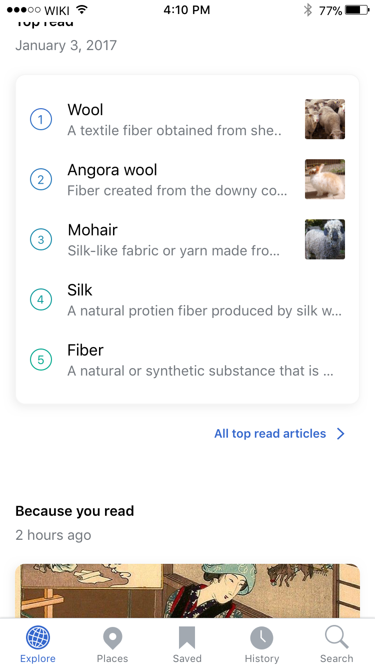
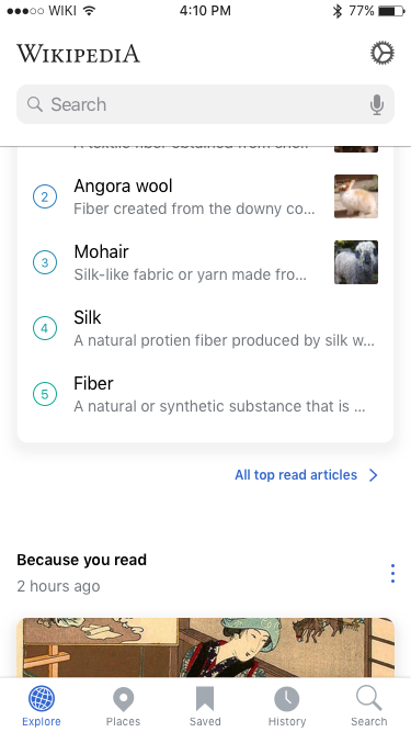
iPhone scrolling behavior on Explore
| Top of feed | Scrolling down | Scrolling back up |
|---|---|---|
 |  |  |
| https://zpl.io/aBjY87K | https://zpl.io/2yJp9Y9 | https://zpl.io/agn74RA |
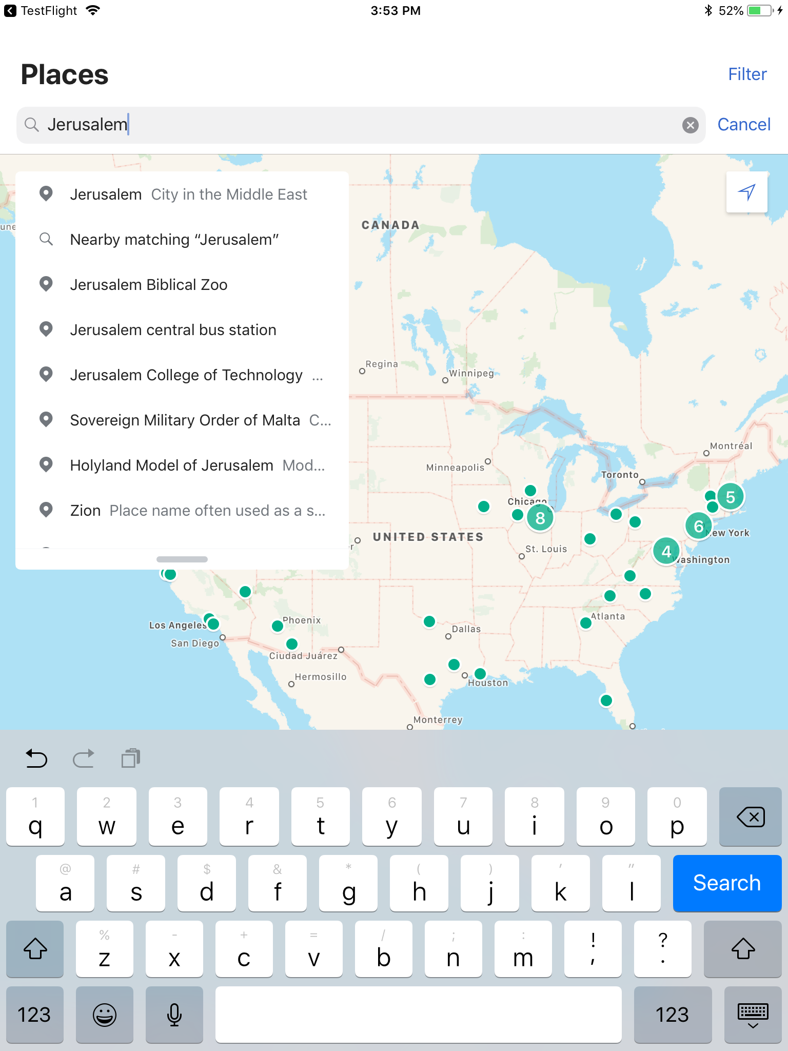
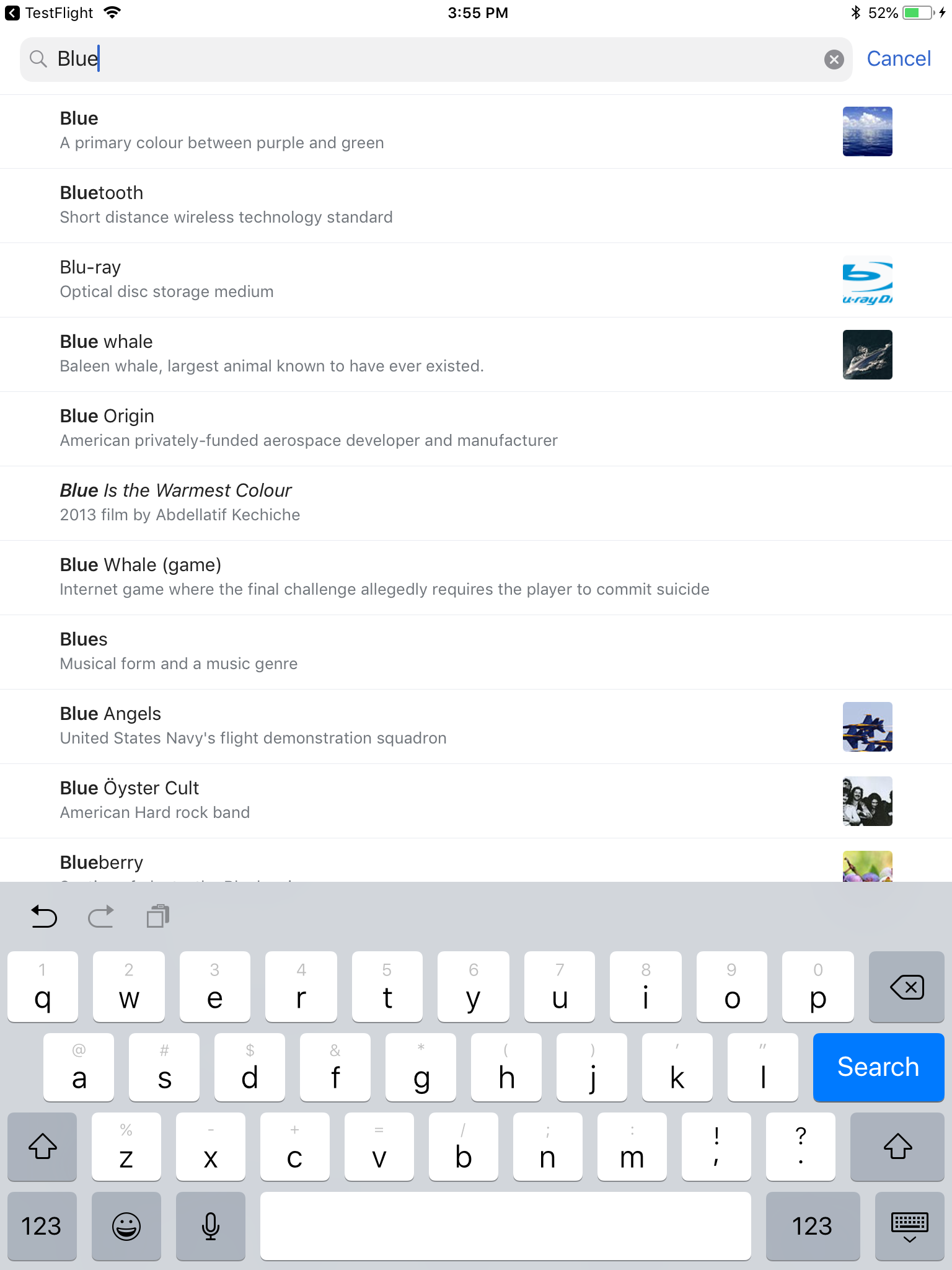
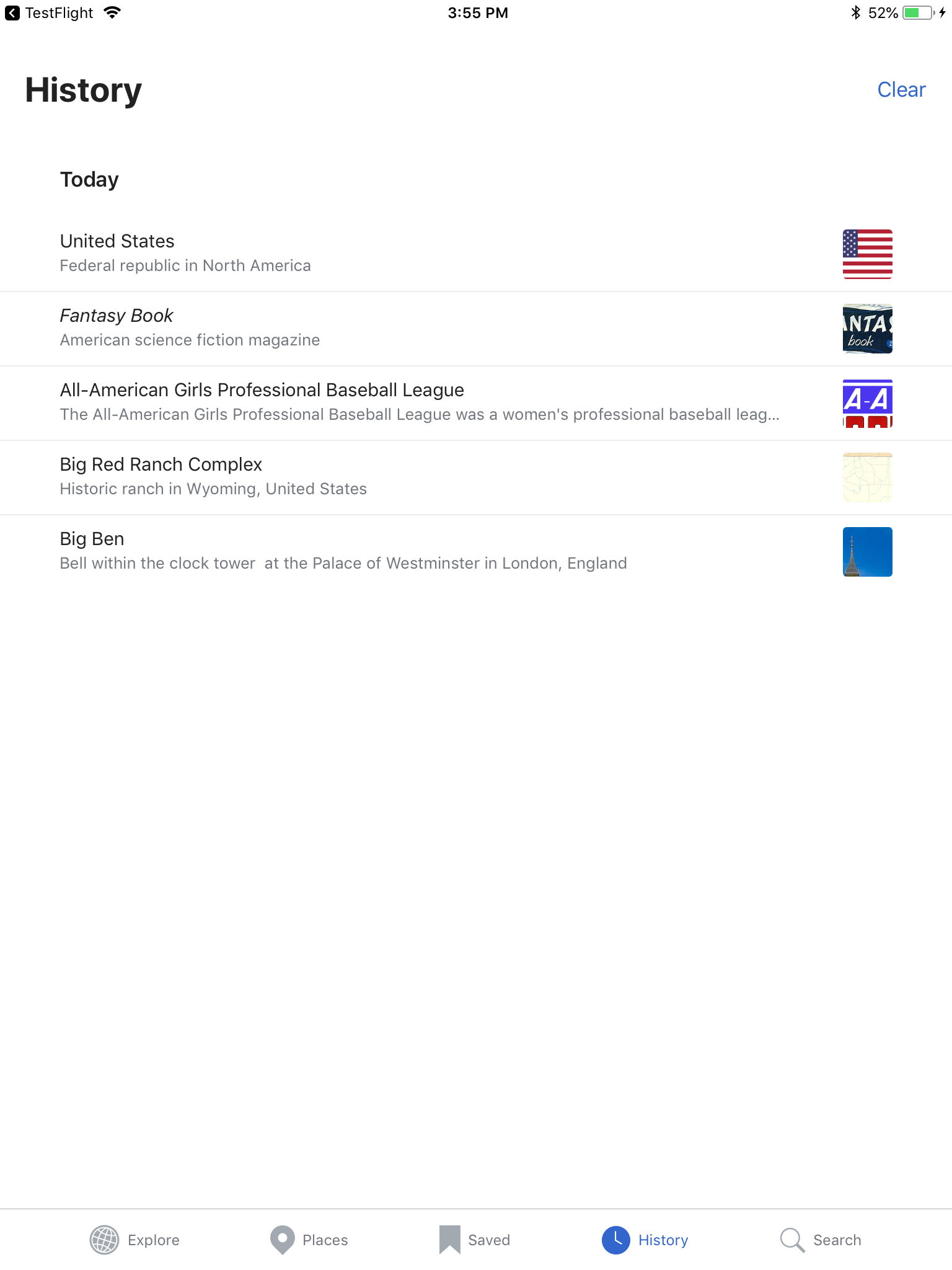
iPad
| Explore | Detail view | Places | Saved | Search tab (new) | History | Settings |
|---|---|---|---|---|---|---|
 |  | 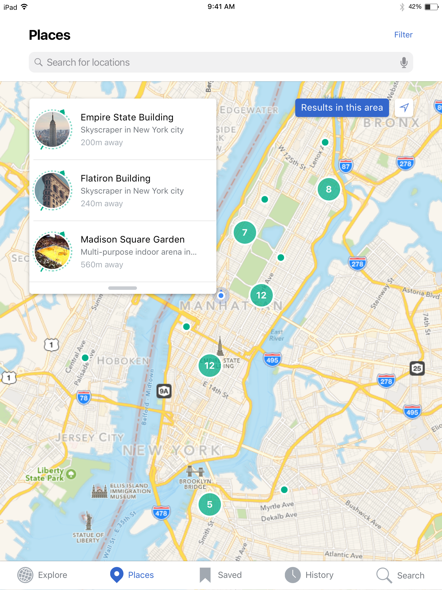 |  |  |  | 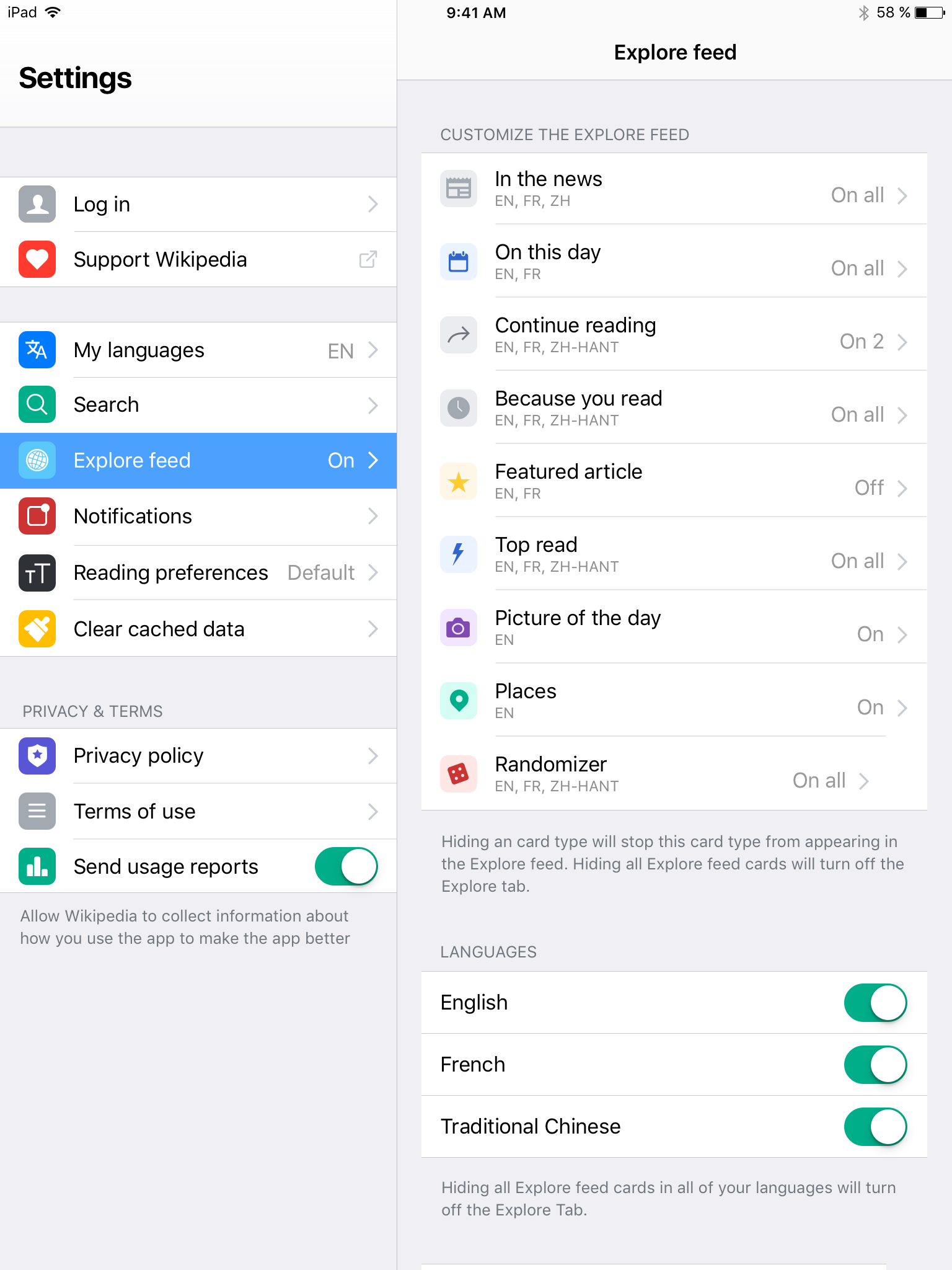 |
| https://zpl.io/boB7mRv | https://zpl.io/aBE3zqL | https://zpl.io/VQq3Nvk | https://zpl.io/bzMz3WG | https://zpl.io/2y7RgxG | https://zpl.io/be4x3jB | https://zpl.io/VQqz5x4 |
Design details
- All views / tabs except for the Explore tab have a header in SFUI-Bold (24pt) at the top of the view / tab
- Scrolling down on all tabs except for the Explore tab will shrink (20pt) and center the header
- Scrolling down on the Explore feed will hide the top header
- Scrolling back up from lower in the Explore feed will expose a smaller version of the header with an exposed search box and a centered wordmark