Page MenuHomePhabricator

Links should not be clickable in mobile page issue element
Closed, ResolvedPublic2 Estimated Story Points

Description

Problem

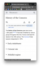
The intended UX for the mobile page issues element is that the user can tap anywhere on the element to learn more about the issue. However the mobile page issue text (e.g. "This scientific article needs additional citations to secondary or tertiary sources") for various page issues currently contains links. So currently some taps lead to other destinations. Here is a screenshot of me tapping on the word "verification"

IMG_0045.PNG (1×750 px, 111 KB)

Testing

Visit https://readers-web-master.wmflabs.org/wiki/History_of_the_Comoros with new issue treatment (close and reopen the browser tab until the new treatment shows).
"verification" link in the issue should not be clickable

Acceptance criteria

  • When clicking a link we should ev.preventDefault the behaviour. It should be possible to right click. If I click verification in "History of the Comoros" I see the issues overlay
  • Links should not look like links (as is now the case)

Previous Proposal

Strip all <a> tags from the page issues text when displaying it on the page (the text in the modal should retain links). We talked about this but I was concerned about adding technical debt that interfered with the HTML structure of the page.
Event Timeline

Jdlrobson renamed this task from Improve UX of links in mobile page issue element to Links should not be clickable in mobile page issue element.Jun 25 2018, 7:14 PM
Jdlrobson updated the task description. (Show Details)
Jdlrobson set the point value for this task to 2.Jun 26 2018, 4:29 PM

Change 442996 had a related patch set uploaded (by Niedzielski; owner: Stephen Niedzielski):
[mediawiki/skins/MinervaNeue@master] WIP: Links should not be clickable in mobile page issue element

https://gerrit.wikimedia.org/r/442996

Vvjjkkii renamed this task from Links should not be clickable in mobile page issue element to 4baaaaaaaa.Jul 1 2018, 1:02 AM
Vvjjkkii removed Niedzielski as the assignee of this task.
Vvjjkkii updated the task description. (Show Details)
Vvjjkkii removed the point value for this task.
Vvjjkkii edited subscribers, added: Niedzielski; removed: gerritbot, Aklapper.
CommunityTechBot renamed this task from 4baaaaaaaa to Links should not be clickable in mobile page issue element.Jul 2 2018, 10:27 AM
CommunityTechBot assigned this task to Niedzielski.
CommunityTechBot set the point value for this task to 2.
CommunityTechBot updated the task description. (Show Details)
CommunityTechBot edited subscribers, added: gerritbot, Aklapper; removed: Niedzielski.

Change 442996 merged by jenkins-bot:
[mediawiki/skins/MinervaNeue@master] Links should not be clickable in mobile page issue element

https://gerrit.wikimedia.org/r/442996

@Niedzielski looks good. I tried a few different templates that have links in them.

The link element is still selectable via tabbing, thoughts on avoiding that?

Screen Shot 2018-07-10 at 1.10.42 PM.png (1×1 px, 320 KB)
using tab to navigate to a hidden link in a page preview

It's also still right-clickable which came up in code review. @alexhollender, @Jdlrobson, do we want to handle these cases?

Alex we get into really hacky land if we want to disable tabbing and right clicking. Personally I'd rather we avoided this if we can.

If we do want to disable this we would have to flatten all links in the issues. We could do this via Javascript or as part of the PHP mobile formatter. As we saw when developing the page summary endpoint and moving the lead paragraph above infoboxes this can be done but comes with the expectation of lots of unplanned edge cases and follow up tasks.

I'm inclined to say that we should strip the links entirely. Hiding/disabling them (as we're currently doing) seems a bit hacky to me in the first place. I'm weary of adding more cost here. Unplanned edge cases are obviously hard to identify in advance, but any inclinations of what we'd potentially have to deal with if we flattened them?

I'm inclined to say that we should strip the links entirely. Hiding/disabling them (as we're currently doing) seems a bit hacky to me in the first place. I'm weary of adding more cost here. Unplanned edge cases are obviously hard to identify in advance, but any inclinations of what we'd potentially have to deal with if we flattened them?

Okay, if this is the case, I suggest cutting a new card or putting this card back in "needs analysis" in the backlog for another round of analysis and estimation. This is going to carry a lot more risk, so we'll need to work out what to do there and estimate differently.

Given we need to show the links in the overlay, we'd likely need to do this in JavaScript to retain those links. The JavaScript would flatten the links so momentarily (until JS has loaded) those links would be in the page. We'd have to be careful to only strip links and to retain characteristics of those links. We hit similar challenges with lazy loading images so we'll want to think through those before going ahead with this approach.

@alexhollender is the existing patch an improvement we want to keep or should we revert it?

Ok. Going forward I will be more clear about the expected behavior. I'm still a bit new to thinking about accessibility, including keyboard navigation. My apologies for not calling that out explicitly.

We could count the existing patch as a temporary improvement but I'm not sure it will be useful after the deeper fix.

The real problem here is the content we are printing has links (whether we like it or not). This is not going to change unless we talk to editors about that. If we don't talk, any solution we come up with is going to involve accessibility or performance problems or tech debt or all three of those things.

The advice to editors might be: "Don't put any links inside the issue field of the ambox template. Please only put them in the "fix" section.

@Jdlrobson ok - it's helpful to outline what the ideal case would be as you did above. How do we handle this for page previews? It seems like a similar situation.

In page previews we have a cached api with lots of complexity and corresponding tests. Regarding links we traverse the DOM and replace them with spans copying over all the elements on them. We could add similar code in to mobile web and in javascript rewrite the banner DOM. Note there may be edge cases that are not obvious so we would expect/ need to do some further QA. Would you like me to create a task for doing all that?

@alexhollender, I hope you don't mind but since you're at Wikimania this week and likely very busy, we're going to keep pushing this card as is through the pipeline. Please feel very welcome to open a new card for continued work.

ABorbaWMF subscribed.

Looks good to me on master. Tested a few mobile browsers. The entire thing is clickable.

ovasileva subscribed.

tested on staging, looks good. @Niedzielski - it wasn't up on readers-web-master though.

I just checked and this change is on readers-web-master. Maybe you just got the old treatment? The A/B test resets every time a new browser tab is opened.