Page MenuHomePhabricator

[EPIC] Improve article notes
Closed, ResolvedPublic

Assigned To
Authored By
Nirzar
Aug 22 2016, 2:10 AM
Referenced Files
F4614180: iPhone 7 Copy 10.png
Oct 17 2016, 11:15 PM
F4614181: iPhone 7 Copy 11.png
Oct 17 2016, 11:15 PM
F4614178: iPhone 7 Copy 9.png
Oct 17 2016, 11:15 PM
F4614186: iPhone 7 Copy 6.png
Oct 17 2016, 11:15 PM
F4614188: iPhone 7 Copy 8.png
Oct 17 2016, 11:15 PM
F4614190: iPhone 7 Copy 7.png
Oct 17 2016, 11:15 PM
F4582867: iPhone 7 Copy 10.png
Oct 10 2016, 10:55 PM
F4582872: iPhone 7 Copy 9.png
Oct 10 2016, 10:55 PM

Description

User story

As a reader, I want the ability to view only the most important portions of article notes, so that they do not distract me from reading content

def: Article notes
Page issues, redirect notice, and disambiguation notice are collectively referred to as article notes in this task

Goal

Some of these notes are important and should be designed. they should be consistent. they should not overpower the content

Examples:

redirect
issues


Solution

Page issues are important pieces of information and sometimes essential to reading. hatnotes provide relationships between pages.
Both of these will be surfaced after the first paragraph of reading. getting readers eyes on the first paragraph is paramount to the reading experience with one exception. the exception of "serious" page issues.

Here's the top of the article layout.

default-top-of-thepage.png (1×750 px, 49 KB)

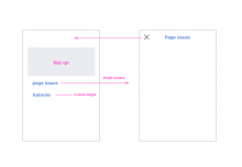
Flow for what will happen when you tap on page issues or hatnotes.
We can make them modular like notices so they can be on their own or together.

notes-flow.png (1×1 px, 56 KB)

Examples
Note: the examples use fake content here. I have taken short article so we can see how the hatnotes look.

Cases

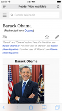
  1. Only hatnote for article

iPhone 7 Copy 10.png (1×750 px, 144 KB)

iPhone 7 Copy 11.png (1×750 px, 160 KB)

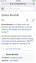
  1. page issues + hatnote

iPhone 7 Copy 9.png (1×750 px, 143 KB)

Page issues

Page issues will have 3 levels of severity

  1. regular page issues for e.g. stub, reference cleanup
  2. medium level of issues - for e.g. entirely missing any citations
  3. serious level of issues - (above the first <p>) - hoax, marked for deletion etc.

Note: I would like for editors to come up with these buckets above

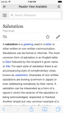
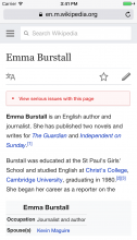
Level 1

iPhone 7 Copy 6.png (1×750 px, 146 KB)

Level 2
Same position - only color distinction

iPhone 7 Copy 8.png (1×750 px, 147 KB)

Level 3
red, above all content
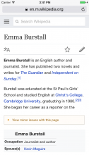
iPhone 7 Copy 7.png (1×750 px, 146 KB)

Related Objects

StatusSubtypeAssignedTask
ResolvedJdlrobson
ResolvedJdlrobson
Resolvedovasileva
Resolvedphuedx
DuplicateNone
Resolvedovasileva
ResolvedJdlrobson
InvalidNone
ResolvedCKoerner_WMF
InvalidNone
Resolvedovasileva
Resolved alexhollender_WMF
Duplicate alexhollender_WMF
Resolved alexhollender_WMF
Resolvedovasileva
Resolved alexhollender_WMF
ResolvedRyasmeen
ResolvedRyasmeen
Resolved Niedzielski
Resolvedovasileva
ResolvedNone
Resolvedovasileva
ResolvedABorbaWMF
Resolved alexhollender_WMF
DuplicateNone
Resolved Niedzielski
Resolvedovasileva
Resolvedovasileva
Resolvedphuedx
Resolved Tbayer
Resolvedovasileva
Resolved Niedzielski
Resolved Tbayer
Resolved Tbayer
Resolved Tbayer
Resolved Tbayer
Resolvedovasileva
Resolved Tbayer
Resolvedphuedx
Resolvedovasileva
ResolvedJdlrobson
ResolvedJdlrobson
Resolved Tbayer
Resolved Tbayer
Resolved Niedzielski
DeclinedNone
Resolvedovasileva
ResolvedNone
ResolvedJdlrobson

Event Timeline

There are a very large number of changes, so older changes are hidden. Show Older Changes
Nirzar renamed this task from [UX Debt] Improve article notes to Improve article notes .Aug 23 2016, 7:06 PM
Nirzar updated the task description. (Show Details)
Jdlrobson subscribed.

@Nirzar to improve the title and can you provide something actionable.

@Jdlrobson this is almost a placeholdernow. i haven't worked on actual design but wnated to keep it here next time we decide what ux task to work on.

which column do you think this use-case fits the most?

Awesome. I think we could win some more space by making an icon in the action bar, like a ℹ️

Some time ago, @TheDJ dropped a link to a proposal about emphasising certain warning templates in IRC that has some support. That proposal is definitely relevant here.

@phuedx the link doesn't work, is the proposal archived? anywhere i can see it?

@phuedx thanks. this is very useful and i will incorporate it in the design. any idea what happened to the conversation? it doesn't a conclusion.

Nirzar updated the task description. (Show Details)

@ovasileva updated the description with actual solution. I will create subtasks for these.

Feedback from @ovasileva

  • The treatment might be heavy
  • one collapse, one modal might be confusing
  • should be after introductory paragraph and not first <p>

Action; Design to update the description with final mocks.

@ovasileva updated the mocks with new treatments. i think making the collapsable widget grey and the modal blue (without chevron) resolves all the confusion. thoughts?

Re: 3 levels of severity, and "Note: I would like for editors to come up with these buckets above" -


Re: the discussion @phuedx linked above, as mentioned there the template:mbox family all has the small=left option (https://en.wikipedia.org/wiki/Template:Ambox#small) - I wonder if that could be utilized somehow? It's not currently very widely used (i.e. not all templates have a small-version already written - only 25% of the examples worked), however...
The main benefit is it could allow a design that actually embeds the messages directly within the initial view, rather than requiring 1 or more clicks and page-loads to access... This would be hugely preferable.

@Quiddity Showing there is an issue in a better way is priority right now. on mobile, we need to think about space and context more than desktop.

I think it makes sense to keep the first implementation (style change) and then begin discussions with editors on how/if they're interested in bucketing. I'm assuming we would have to manually place templates into buckets which could be a long road indeed, although could be worth it in the long run.

Please consider the case of "page issues" that pertain to a section rather than the whole article. We don't want them losing their context or, even worse, getting lost entirely.

Jdlrobson renamed this task from Improve article notes to [EPIC] Improve article notes .May 21 2017, 11:26 AM
Jdlrobson claimed this task.

Closing per discussion with Alex. All subtasks are complete.