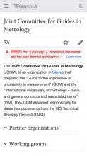
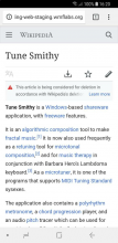
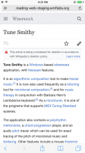
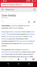
Page MenuHomePhabricator

Mobile page issues - allow page issues to display different severity levels
Closed, ResolvedPublic3 Estimated Story Points

Description

Update: 08/14/18
We synced around this task and it was expressed that the code is becoming difficult to read and thus its hard to pinpoint the remaining bugs. Code was moved to Minerva and concerns separated by splitting out code relating to overlay and event logging.

Update: 08/08/18 One open bug and one open question (maybe other open bugs) for Jon to answer. We had started with the idea of issues type/severities, but these definitions were not well defined. Alex, Olga, Stephen had to sit down and understand and define these. In future we should be more careful with defining our task descriptions before working on them. This led to building a issue parser, increasing the scope and complexity of simply adding/changing icons.


Background

We would like to display issues with different severity (based on ambox type) differently

Precursors

T191303 should be done before tackling this task.

User story

As a reader, I want the ability to distinguish between severe, moderate, and low priority issues on a page, so that I can gauge the overall reliability of the article

Acceptance criteria

Create severity logic by ambox type

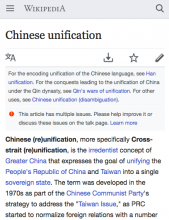
Severity - severity will be set according to ambox type(https://en.wikipedia.org/wiki/Template:Ambox#type) as follows:

  • High: type=speedy, type=delete
  • Medium: type=content, type=pov
  • Low: type=style
  • Notice: type=notice, type=move, type=protection

All other templates will display with normal severity

Issues will change position and styling based on severity level (as defined in design criteria below)

Severity logic for multiple issues

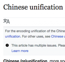
  • Issue severity level will be derived from the severity levels of the individual issues. If an article contains the template {{Multiple issues}}, the issue level of the article will be the highest issue level available

Example: if template {{Disputed title}} has level high, the article https://en.wikipedia.org/wiki/Chinese_unification will have issues appear at high level

  • Each multiple issue level will receive unique copy, appearance, and position within the page (as defined below). Individual descriptions for issues will not be used.

Design criteria

Default Icons

Each severity level has a default icon. For cases where we can't identify the severity level see unknown below.

severity leveldefault iconcolorin OOUI?example
high#DD3333yes (alert)
severe.jpg (1×754 px, 601 KB)
medium#FF5D01yes (notice)
medium.jpg (1×754 px, 439 KB)
low(in svg)no
low.jpg (1×754 px, 587 KB)
notice#54595dyes (alert)
notice.jpg (1×754 px, 613 KB)
unknown#54595dyes (alert)
unknown.jpg (1×754 px, 651 KB)

Specialized icons

For some templates there are specialized icons which should be used instead of the defaults.

templateseverity leveliconcolorin OOUI?example
povmedium#54595dno
pov.jpg (1×754 px, 601 KB)
movenotice(multiple, in svg)no
move.jpg (1×754 px, 434 KB)

Multiple issues

Use the default icon of the issue with the highest severity level among the multiple issues. For example: if the highest severity level of the multiple issues was medium, the issue would look like this:

multiple-medium.jpg (1×754 px, 434 KB)

Notes and questions

enwikieswikijawikiruwikiitwiki
parameter nametypetipotypetypetipo
Severespeedy, deleteserioSame as enwikiSame as enwikiimportante
MediumcontentcontenidoSame as enwikiSame as enwikicontenuto
LowstyleestiloSame as enwikiSame as enwikistile, struttura
Noticenotice, move, protectiontipo=fusionar, tipo=desarrollo, tipo=avisoSame as enwikiSame as enwikiavviso, generico
https://en.wikipedia.org/wiki/Template:Amboxhttps://es.wikipedia.org/wiki/Plantilla:Metaplantilla_de_avisoshttps://ja.wikipedia.org/wiki/Template:Amboxhttps://ru.wikipedia.org/wiki/%D0%A8%D0%B0%D0%B1%D0%BB%D0%BE%D0%BD:Amboxhttps://it.wikipedia.org/wiki/Template:Avviso

QA steps

Bucket yourself into the A/B test. Since you will need to visit en.wikipedia.org to find examples, be careful when testing that youtest on http://reading-web-staging.wmflabs.org/ or http://rreaders-web-master.wmflabs.org/

When running all tests, ensure the icon in the article matches the one inside the issues overlay (the thing that shows when the banner is clicked)

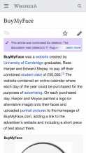
  1. Check articles for deletion are marked as "severe" (dark red triangle icon)

Visit https://en.wikipedia.org/wiki/Wikipedia:Articles_for_deletion/Log/2018_July_31 and navigate to today's date. From the list, visit the associated article on http://reading-web-staging.wmflabs.org/ (type in the address manually e.g. for article with title A visit http://reading-web-staging.wmflabs.org/wiki/A)

  1. Check high priority issues

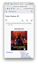
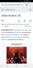
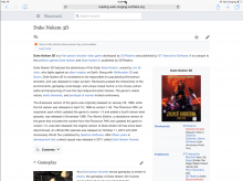
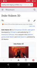
Visit http://reading-web-staging.wmflabs.org/wiki/Duke_Nukem_3D and check marked as "high" (red circle icon)
Find other test examples listed here:
https://en.wikipedia.org/w/index.php?title=Special%3AWhatLinksHere&target=Template%3AUnreliable+sources&namespace=
(make sure to check equivalent page on http://reading-web-staging.wmflabs.org/ and please ignore any which have "multiple issues")

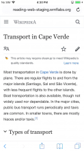
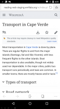
  1. Check sweep icon

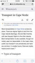
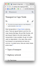
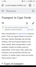
http://reading-web-staging.wmflabs.org/wiki/Transport_in_Cape_Verde
More examples can be found in https://en.wikipedia.org/w/index.php?title=Special%3AWhatLinksHere&target=Template%3ACleanup&namespace= (please ignore any which have "multiple issues")

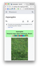
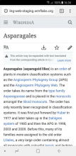
  1. Grey triangle warning

http://reading-web-staging.wmflabs.org/wiki/Asparagales
More examples: https://en.wikipedia.org/w/index.php?title=Special%3AWhatLinksHere&target=Template%3Aexpand+spanish&namespace= (please ignore any which have "multiple issues")

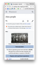
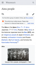
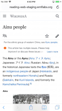
  1. Multiple issues

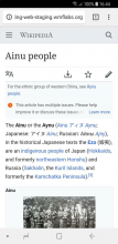
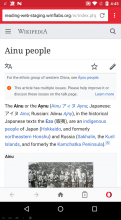
http://reading-web-staging.wmflabs.org/wiki/Ainu_people
More examples: https://en.wikipedia.org/w/index.php?title=Special%3AWhatLinksHere&target=Template%3Amultiple+issues&namespace=

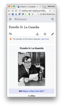
  1. Neutrality balance icon (scales)

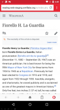
http://reading-web-staging.wmflabs.org/wiki/Fiorello_H._La_Guardia
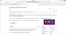
http://reading-web-staging.wmflabs.org/wiki/Australian_Catholic_University
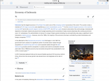
http://reading-web-staging.wmflabs.org/wiki/Economy_of_Indonesia
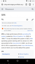
http://reading-web-staging.wmflabs.org/wiki/XFS#Disadvantages
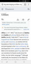
http://reading-web-staging.wmflabs.org/wiki/Ulfilas
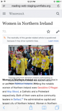
http://reading-web-staging.wmflabs.org/wiki/Women_in_Northern_Ireland
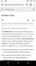
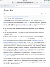
http://reading-web-staging.wmflabs.org/wiki/Golden_Rule
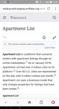
http://reading-web-staging.wmflabs.org/wiki/Apartment_List

More examples: https://en.wikipedia.org/w/index.php?title=Special%3AWhatLinksHere&target=Template%3APOV&namespace=
(please ignore any which have "multiple issues")
Event Timeline

There are a very large number of changes, so older changes are hidden. Show Older Changes

Change 444951 had a related patch set uploaded (by Niedzielski; owner: Stephen Niedzielski):
[mediawiki/core@master] Update: allow ResourceLoader selectorWithoutVariant to be overridden per image

https://gerrit.wikimedia.org/r/444951

Change 444952 had a related patch set uploaded (by Niedzielski; owner: Stephen Niedzielski):
[mediawiki/skins/MinervaNeue@master] Update: page issue icons

https://gerrit.wikimedia.org/r/444952

Change 444951 abandoned by Niedzielski:
Update: allow ResourceLoader selectorWithoutVariant to be overridden per image

Reason:
Thanks for checking this out, Bartosz. I'm abandoning this patch for the time being until we're certain we need it.

https://gerrit.wikimedia.org/r/444951

@alexhollender / @ovasileva, if you have the time to take a quick peek at this before it's reviewed, I've posted the latest revision up here: http://reading-web-staging.wmflabs.org/.

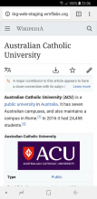
@Niedzielski looking good. Here are some screenshots of the icon logic working correctly:

High.png (865×512 px, 150 KB)
medium.png (865×512 px, 220 KB)
low.png (865×512 px, 111 KB)
notice.png (865×512 px, 257 KB)
multiple.png (865×512 px, 165 KB)
highmediumlownoticemultiple (correctly displaying the icon of the higher severity issue)

Regarding the specialty icons, it seems like they are displaying in the modal but not in the banner:

Screen Shot 2018-07-12 at 5.08.13 PM.png (865×512 px, 153 KB)
Screen Shot 2018-07-12 at 5.08.15 PM.png (865×512 px, 68 KB)
Template:POV, bannerTemplate:POV, modal

I'm realizing that I never gave you a list of which templates to associate with the specialty icons.

  • POV - I searched through Jan's page for all templates that use the Unbalanced scales.svg icon. There are 14 matches that seem appropriate:
    • Template:COI
    • Template:Coverage
    • Template:Criticism section
    • Template:Fringe theories
    • Template:GenderPOV
    • Template:NPOV language
    • Template:Paid contributions
    • Template:POV
    • Template:Pseudo
    • Template:Systemic bias
    • Template:Unbalanced
    • Template:Unbalanced section
    • Template:USgovtPOV
    • Template:Geographical imbalance (this one uses the scale as a secondary icon)
  • Move - I searched for move/moved, there are 7 matches that seem appropriate:
    • Template:Converted
    • Template:Copy to Wikibooks
    • Template:Copy to Wikiversity
    • Template:DabprimaryExpand
    • Template:Dicdef
    • Template:InterTransWiki
    • Template:Not English (questionable)

@ovasileva @Niedzielski do these lists feel appropriate to you?

mw-ui-icon-minerva-issue-severity-medium-mediumColor looks blurry to me when rendered as a small icon

Screen Shot 2018-07-12 at 3.01.38 PM.png (241×253 px, 29 KB)

Is that intentional?

mw-ui-icon-minerva-issue-severity-medium-mediumColor looks blurry to me when rendered as a small icon

that's odd, the color also looks off (too dark)

that also reminds me, @Niedzielski would this be the appropriate ticket to talk about minor CSS tweaks to the icon element? Just changed this to 75% and the icons being slightly bigger looks nice:

.mw-ui-icon.mw-ui-icon-small:before {
    background-size: 75% auto;
}

mw-ui-icon-minerva-issue-severity-medium-mediumColor looks blurry to me when rendered as a small icon

Screen Shot 2018-07-12 at 3.01.38 PM.png (241×253 px, 29 KB)

Is that intentional?

it looks blurry to me as well, but the color seems fine. Everything else is looking really nice.

Screen Shot 2018-07-13 at 12.21.37 PM.png (531×408 px, 103 KB)

Regarding the specialty icons, it seems like they are displaying in the modal but not in the banner

Dang, I think I misunderstood the requirements. Fixed!

I'm realizing that I never gave you a list of which templates to associate with the specialty icons.

Updates below!

POV

  • Template:COI .ambox-COI, already covered.
  • Template:Coverage - Unsupported, no distinguishing CSS class.
  • Template:Criticism section - Unsupported, no distinguishing CSS class.
  • Template:Fringe theories - .ambox-fringe-theories, added. I did not notice any equivalent non-enwiki templates on Jan's chart.
  • Template:GenderPOV - .ambox-POV, already covered.
  • Template:NPOV language - .ambox-npov-language, already present.
  • Template:Paid contributions - .ambox-COI, already covered.
  • Template:POV - .ambox-POV, already covered.
  • Template:Pseudo - Unsupported, no distinguishing CSS class.
  • Template:Systemic bias - .ambox-systemic-bias, added. I did not notice any equivalent non-enwiki templates on Jan's chart.
  • Template:Unbalanced - Unsupported, no distinguishing CSS class.
  • Template:Unbalanced section - Unsupported, no distinguishing CSS class.
  • Template:USgovtPOV - Unsupported, no distinguishing CSS class.
  • Template:Geographical imbalance (this one uses the scale as a secondary icon) - Unsupported, no distinguishing CSS class.

Move

  • Template:Converted - Unsupported, no distinguishing CSS class.
  • Template:Copy to Wikibooks - .ambox-move, already covered.
  • Template:Copy to Wikiversity - .ambox-move, already covered.
  • Template:DabprimaryExpand - Unsupported, no distinguishing CSS class.
  • Template:Dicdef - .ambox-move, already covered.
  • Template:InterTransWiki - .ambox-move, already covered.
  • Template:Not English (questionable) - I can identify this but the CSS class, .ambox-not_English, seems like it's going to differ on most wikis.

CSS tweaks

It seemed like an easy change so I just rolled it in!

blurry

Does "high.svg" need the same special low resolution integer considerations you made for the interwiki icons? See how they look at 75%.

..And I think that's it! The latest and greatest is up on reading-web-staging.wmflabs.org.

Change 444952 merged by jenkins-bot:
[mediawiki/skins/MinervaNeue@master] Update: page issue icons

https://gerrit.wikimedia.org/r/444952

@Niedzielski, I am having some trouble finding articles with the different severity levels on Beta and Devwiki. Is there some sort of search I can perform or do we have a list of representative articles on Beta or Devwiki?

@ABorbaWMF, I don't have a list for the beta cluster or devwiki but any page can be copied from enwiki to the beta cluster. Can you use readers-web-master? It's less stable (it resynchronizes every 15 minutes and may be unavailable during this time) but mirrors enwiki.

Jdlrobson added a subscriber: Ryasmeen.

I'll try and curate a list of articles to test on readers web master....

Jdlrobson updated the task description. (Show Details)

I've added QA steps hope these are helpful.

@Jdlrobson found some bugs:

I'll look into these.

Change 450278 had a related patch set uploaded (by Niedzielski; owner: Stephen Niedzielski):
[mediawiki/skins/MinervaNeue@master] Fix: page issue icon type determination

https://gerrit.wikimedia.org/r/450278

Not seeing scales icon on http://reading-web-staging.wmflabs.org/wiki/Fiorello_H._La_Guardia

Fixed.

Lots of issues with balanced templates+icon combo

In retrospect, I'm not sure what @Jdlrobson was alluding to. Would you mind clarifying this point and I'll check it out? Link to original discussion to help jog your memory.

Lots of issues with balanced templates+icon combo

This problem is impacting articles in item 6 of QA steps. Even with the latest merged patchset, the balanced icon is not showing on a couple of examples. I believe the heuristic for what constitutes a balanced template is broken.
There remain issues with 2 more articles:

Change 450278 merged by jenkins-bot:
[mediawiki/skins/MinervaNeue@master] Fix: page issue icon type determination

https://gerrit.wikimedia.org/r/450278

Change 451664 had a related patch set uploaded (by Niedzielski; owner: Stephen Niedzielski):
[mediawiki/skins/MinervaNeue@master] Fix: add a few more POV templates to issue parser

https://gerrit.wikimedia.org/r/451664

Change 451664 merged by jenkins-bot:
[mediawiki/skins/MinervaNeue@master] Fix: add a few more POV templates to issue parser

https://gerrit.wikimedia.org/r/451664

@Jdlrobson, should be fixed now. I didn't realize this earlier but I was able to edit the remaining requested templates and didn't need to touch the underlying ambox logic, although it would ideally use the name parameter to generate a unique class name. Not a sustainable approach but at least we're starting to get some the data structure into the templates themselves.

Loaded on reading web staging. Over to you @alexhollender

Issue 1

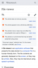
Alas, there seems to be a snag with multiple issues icons. The logic, as described above, "Use the default icon of the issue with the highest severity level among the multiple issues" was not specific enough (my fault). There are three unique cases of multiple issues:

1. all issues are within the multiple issues template2. some issues are within the multiple issues template and some aren't3. no issues are within the template
multiple-contained.png (1×750 px, 417 KB)
multiple-partially-contained.png (1×750 px, 181 KB)
multiple-uncontained.png (1×750 px, 162 KB)
the icon should correspond to the highest level issue within the groupfor the multiple issues banner the icon should correspond to the highest level issue within the group, any stray issues should keep their own iconsall issues should keep their own icons

The only caveat to this might be if we've got worked planned to somehow deal with cases 2 & 3 above at a higher level (such as forcing the stray issues into the multiple issues template). @Jdlrobson any idea if that's the case? If so it might not be worth fixing these here.

Issue 2

Secondly, there's are some background and text highlight colors that seem to have slipped through our dragnet:

Might also be worth stress testing Template:No political diagram and Template:Copypaste

I recognize that this doesn't really fit in the scope of this task. Currently we don't have a general styling task, however I'm more than happy to make a separate ticket for this issue (which isn't critical) and so we can keep this moving along.

Change 452573 had a related patch set uploaded (by Niedzielski; owner: Stephen Niedzielski):
[mediawiki/skins/MinervaNeue@master] Hygiene: move page issues A/B test logging to file

https://gerrit.wikimedia.org/r/452573

@alexhollender, I'm still digging through the code to respond to your feedback. I've had to restructure some things to understand them better and hope to have answers tomorrow.

Change 452683 had a related patch set uploaded (by Niedzielski; owner: Stephen Niedzielski):
[mediawiki/skins/MinervaNeue@master] Hygiene: don't hardcode page issue header selector

https://gerrit.wikimedia.org/r/452683

Change 452700 had a related patch set uploaded (by Niedzielski; owner: Stephen Niedzielski):
[mediawiki/skins/MinervaNeue@master] Hygiene: move page issue overlay to distinct file

https://gerrit.wikimedia.org/r/452700

Change 452573 merged by jenkins-bot:
[mediawiki/skins/MinervaNeue@master] Hygiene: move page issues A/B test logging to file

https://gerrit.wikimedia.org/r/452573

New task created for the background color issue T202024

Change 452683 merged by jenkins-bot:
[mediawiki/skins/MinervaNeue@master] Hygiene: don't hardcode page issue header selector

https://gerrit.wikimedia.org/r/452683

@Niedzielski not sure if this is helpful, but I believe this page verifies that the multiple issue logic isn't surfacing the icon from the highest level issue among the multiple. In this case the issue displayed in the banner doesn't match either of the issue icons in the modal: https://reading-web-staging.wmflabs.org/wiki/Musical_film

In T191528#4508264, @alexhollender wrote:

@Niedzielski not sure if this is helpful, but I believe this page verifies that the multiple issue logic isn't surfacing the icon from the highest level issue among the multiple. In this case the issue displayed in the banner doesn't match either of the issue icons in the modal: https://reading-web-staging.wmflabs.org/wiki/Musical_film

@alexhollender, @Niedzielski - I think this is correct behavior. I would expect the behavior to display the default icon for the severity level we are looking at, rather than the icon itself. For example, if there's two multiple issues that have the same severity, it would not make sense to distinguish them with only the icon of one of the issues, but rather with the default icon of the severity.

Spoke with Olga on Slack and just wanted to clarify: in the case above (https://reading-web-staging.wmflabs.org/wiki/Musical_film) the icon on the multiple issues banner should be a broom.

There is an additional point that wasn't addressed in my table here T191528#4499627, which is, in case #1 what if the highest severity issue is one that uses a speciality icon (e.g. POV, which is a "medium" level issue)? In that case would it be confusing for the multiple issues banner to take on the speciality icon? From a design perspective it would be great if we could fall-back to the generic icon for that severity level in the case of the multiple issues banner, but not sure how much additional complexity that introduces.

On a related note, @Jdlrobson @ovasileva do we currently have a plan to deal with situations #2 and #3 listed here T191528#4499627?

On a related note, @Jdlrobson @ovasileva do we currently have a plan to deal with situations #2 and #3 listed here T191528#4499627?

By editing the article. Long term T200880 would help address this problem

There is an additional point that wasn't addressed in my table here T191528#4499627, which is, in case #1 what if the highest severity issue is one that uses a speciality icon (e.g. POV, which is a "medium" level issue)? In that case would it be confusing for the multiple issues banner to take on the speciality icon?

Yes, that sounds confusing to me. I would expect it to show the medium severity icon
e.g.
https://phab.wmfusercontent.org/file/data/defxb3xelimvquo2ufgf/PHID-FILE-v46nfkimnncgvjqoxlqr/medium.jpg

Let's talk about the remaining issues on this task today.

@alexhollender having reviewed https://phabricator.wikimedia.org/T191528#4499627 I think the issues here relate to editors failing to use the "Template:Multiple issues". When this is not used, the code is subject to bugs. If these are deal breakers, let's follow up in T202349. I think this is a sufficient creep in scope for this task.

The issue you raise in https://phabricator.wikimedia.org/T191528#4515454 is not ready for development, I've created T202351 to talk more.

The problem with lumping all this work into this task, is making it hard to keep track of work, so let's wrap this task up provided those are the only 2 remaining issues.

@alexhollender having reviewed https://phabricator.wikimedia.org/T191528#4499627 I think the issues here relate to editors failing to use the "Template:Multiple issues". When this is not used, the code is subject to bugs. If these are deal breakers, let's follow up in T202349. I think this is a sufficient creep in scope for this task.

I agree. Let's discuss this part separately.

Change 452700 merged by jenkins-bot:
[mediawiki/skins/MinervaNeue@master] Hygiene: move page issue overlay to distinct file

https://gerrit.wikimedia.org/r/452700

ovasileva claimed this task.

Looks like we're done here! Thank you for the thorough QA @ABorbaWMF! This task was a lot of work.

Also thank you @Niedzielski, @Jdlrobson, @alexhollender, @Jdrewniak for all your work here. This was one of the biggest 3-pointers ever :)