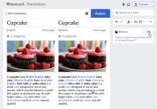
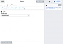
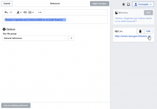
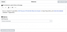
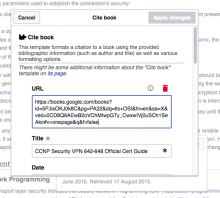
Modal dialogs are used to edit complex content such as references or image galleries. Currently the dialog isolates its contents from the tools sidebar, and it is not always intuitive that the tools present in the sidebar can affect the content in the dialog.
This ticket proposes to keep the document-sidebar metaphor also when editing dialogs. Dialogs will be presented as documents by adjusting the sizing of the dialogs to fill all the current viewport except the sidebar. In this way, the document the user was editing gets replaced by a new document on top.
This prototype and the mockups below illustrate a sequence where a reference is edited, the details view appear, and a link is selected showing the link card as a result.
Some considerations:
- This representation, more aligned with the mobile version, can also help with smaller screens.
- Button overlap. Cancel button appears where the option to go back usually is, this is good to establish the area as the way to go back. However, the "Apply changes" button appears where the "publish" button is, which despite being aligned in terms of moving forward can cause accidental clicks. We may need to think how to reduce the chances of accidental clicks (e.g., transition the publish header back into active with a slower transition).
