Page MenuHomePhabricator

Refreshed skin v4
Closed, ResolvedPublic

Assigned To
Authored By
MtMNC
Jul 25 2018, 12:42 AM
Referenced Files
F27773658: toolbox_demo_big.png
Jan 2 2019, 4:56 AM
F27773676: toolbox_demo_small_v3.png
Jan 2 2019, 4:56 AM
F27773663: toolbox_demo_small.png
Jan 2 2019, 4:56 AM
F24975889: image.png
Aug 15 2018, 4:05 PM

Description

This started as thinking about changing the dropdowns. But if we're redoing the dropdowns, we may as well change the dropdown icons. And if we're making some nontrivial PHP changes to change those, we may as well think about refactoring the PHP so it's easier to change in the future, etc.

So here are some ideas on where can can take Refreshed in the future... potentially for a Refreshed 4 release down the road?

  • Redo the dropdowns so they don't rely on JS (T134851) and are more consistent visually (T142537). Based on previous discussions, perhaps a white opaque background by default with shadow underneath? If I'm not mistaken we could ditch JS in favor of a dropdown that uses CSS :hover and :active rules. I suspect this might also resolve T145314.
  • Switch from WikiFont, which is no longer maintained, to OOUI icons (T155083). We could use inline SVG for this instead of pseudoelements. This would start chipping away at T151429 since we could use OOUI to fill in some of the icons we haven't picked yet.
  • Use the OOUI icons in more places, like a magnifying glass in the search bar (T136527) and a tag icon by page categories. Maybe the TOC too
  • Rearrange the page actions and tools. We could pull a few pages from Timeless on this. Specifically, we could have talk and discussion links could be on the top left of the article, then the actions be separate on the top right. Also, instead of grouping a bunch of unrelated tools together into one dropdown like we have currently, we could separate them, again a la Timeless. (Notice "Print/export," "Wiki tools," "Userpage tools," and "More" are all separate sections of the sidebar.) We could have dropdowns like "Page actions" (move, delete, etc.), "User tools" (contributions, block, etc.), and "Advanced tools" (what links here, printable version, etc.). on the top right hand side of the article. Then we could put "Wiki tools" (special pages) and "Languages" in the sidebar.
  • Refactor the PHP files so functions do more of the work like generating dropdowns. Hopefully this would make the skin easier to maintain in the future.
  • Potentially switch from CSS to LESS to make things easier to maintain. (Monobook and Vector have done this already.) In the process we could remove Lato, resolving T142157. (Note: use mixins for things like flexbox and box-shadow.)
  • Refactor JS
  • Adjust the breakpoints between different skin sizes (see T162653)
  • Hide the sidebar behind the hamburger menu on medium

Thoughts? More ideas?
Event Timeline

This all sounds like a good plan to me. Taking Refreshed towards another milestone would be an important step as there's been a backlog of UX and accessibility changes that need to be made with no particular order in which we're working on them. Setting a roadmap and plan for a next major release (4.x) would be a good idea I think.

Sounds like you've got a nice v4 roadmap here. :)

There's a fair bit of Technical-Debt in Refreshed, such as the WikiFont stuff etc. you mentioned and menus not working without JavaScript is a very real and a rather annoying Accessibility issue, given that it's perfectly possible to have menus which don't require JS (Aurora, ShoutWiki's default skin, has such menus, for example). Furthermore dropping the WikiFont dependency makes Refreshed a lot easier to install and might even fix a CI-related task or a few (I know there's been some issues related to the CI stuff because of Refreshed's use of the WikiFont submodule).

Timeless is a great skin so taking a few pages out of its book is always a good idea!

Cool, sounds like a plan then. I made the refreshed4-beta branch, we can start work there.

After some more thought/testing I think we should stick with dropdowns triggered by click rather than hover.

If we use a hover dropdown, the dropdown should behave differently when hovered over with a mouse vs. hovered over with a touchscreen (that is, tapped). When the user hovers over the dropdown trigger button with a mouse, the intuitive behavior (in my opinion) is that the dropdown should always open. However if the user hovers over the dropdown trigger button with a touchscreen (that is, the user taps the button), the intuitive behavior (again my opinion!) is that the dropdown state should toggle. So for a successful hover dropdown, we need to distinguish between mouse and touchscreen users.

However, I haven't found a good cross-browser, CSS-only way to determine whether the user is using a mouse or touchscreen. (The pointer and hover media queries would be nice, but they don't have good enough support yet.) The situation is made even more confusing since there are computers where you can use a mouse or touchscreen.

Meanwhile, click dropdowns intuitively behave the same way with mice and touchscreens: clicking the trigger button toggles the dropdown. A lot easier to manage.

Finally, here's a note on CSS-Tricks on the subject. It's a couple years old but still good to consider.

@MtMNC I agree completely, personally I don't like the header dropdowns being triggered on-hover. Clicking seems much more intuitive and less annoying, and like you said translates to a coherent and similar touchscreen experience as with the mouse experience.

Switched to click dropdowns as of the latest commit.

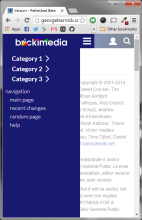
Another issue not touched on earlier is how to deal with header categories on mobile. Some ideas:

Medium: Replace the header category dropdowns with an "explore" dropdown where each entry represents a header category. Clicking each entry would open a submenu containing the links for that header category. (Or is hovering over each entry better in this case?)

Small: Stick the header categories in the sidebar as proposed in T151430. However each header category (and each normal sidebar section) is contained in an expand/collapse box like the FAQ box shown on CSS-Tricks.

What are your thoughts?

@MtMNC: The Medium "explore" idea would work for me. Do you think we could create some form of logic within the header that determines the width of the header categories and if it would need an "Explore" button? If for example there are only two really narrow header categories, they should be able to fit in the Medium header. If we do this, that same logic could be implemented on Big too, if for example someone wanted to add 10 header categories that just wouldn't fit on most normal screen resolutions. However if we do this, it really comes down to the end-user, because this same kind of "logic" could just be implemented into the formatting of the header categories, if for example someone knew they needed 10 categories, they could just make "Explore" the parent category. I guess this really comes down to how many levels of nesting do we want Refreshed's header categories to support, because this idea starts to push into the boundaries of "Should we just support 3 levels of header categories instead of just 2?". Your idea for Small as proposed in T151430 is perfect, this would be a great time to finally implement that:

image.png (680×440 px, 69 KB)

I've found a pure CSS way to replace the header category buttons with the explore button when the viewport is too narrow for all the header category buttons. It's not perfect though. When the buttons get replaced, any open dropdown trays stay open. So there are ghost dropdown trays floating there without the buttons they're attached to. I think we'll need JS to avoid that.

So, how about we have two versions? When JS is disabled, the header category buttons are always hidden. We always show the explore button instead. Users would still be able to navigate fine with the explore button, and there'd be no ghost dropdown trays.

When JS is enabled, we use the header category buttons or the explore button, depending on width. Then using JS, whenever the window is resized, we hide all the dropdowns that are attached to currently hidden buttons.

I'd have to see this in action but that sounds fine to me if it works well in execution

As of the latest commit (R1893:cb09065e1d63019e2413eb807d9960fd99e1bd22), the toolbox has been redone with separate toolboxes for page actions and user actions. However those toolboxes aren't yet optimized on smaller screens. See the screenshots below:

toolbox_demo_big.png (284×2 px, 157 KB)

toolbox_demo_small.png (404×716 px, 72 KB)

Does anyone have thoughts on how the toolboxes could be set up on small screens? Should we use icons like in Refreshed 3 (as shown below) or opt for something else?

toolbox_demo_small_v3.png (574×782 px, 130 KB)

Also, how would we go about making the refreshed4-beta branch the default branch on here and on GitHub? More than once people have pushed changes to master, perhaps not realizing that active development is actually going on in refreshed4-beta. (In fact I suspect that the issue in T205600 has been resolved in the refreshed4-beta branch totally independently of work done for the ticket.) If we make the v4 branch more visible, we may get more feedback to guide development, and hopefully contributors would direct their efforts toward v4 as opposed to v3.

Restricted Application changed the subtype of this task from "Deadline" to "Task". · View Herald TranscriptJan 2 2019, 4:56 AM
MtMNC renamed this task from Refreshed skin: thoughts on the future (Refreshed 4?) to Refreshed skin v4.Jan 11 2019, 6:07 PM
MtMNC updated the task description. (Show Details)

It's been a while since I've provided an update. Sorry about that. The skin has been used on BS01 for several months with no issues. I'm going to make one more substantive change, which is adding an empty LESS file so that users can customize Refreshed with actual LESS without installing Extension:Theme. Then I'll update the docs, and I think Refreshed 4 will be ready!

MtMNC claimed this task.

Released!