Page MenuHomePhabricator

[Design] Add a max-height to the Participants container and make it scrollable
Closed, ResolvedPublic1 Estimated Story Points

Assigned To
Authored By
Niharika
Jul 27 2018, 5:20 PM
Referenced Files
F25817125: Screen Shot 2018-09-13 at 15.32.54.png
Sep 13 2018, 7:37 PM
F25503241: Screen Shot 2018-08-29 at 17.04.55.png
Aug 29 2018, 9:14 PM
F25479576: panel-scroll.png
Aug 29 2018, 4:20 AM
F25297337: withscroll-y.png
Aug 24 2018, 6:27 AM
F25297268: withoutscroll.png
Aug 24 2018, 6:27 AM
F25297269: withscroll.png
Aug 24 2018, 6:27 AM

Description

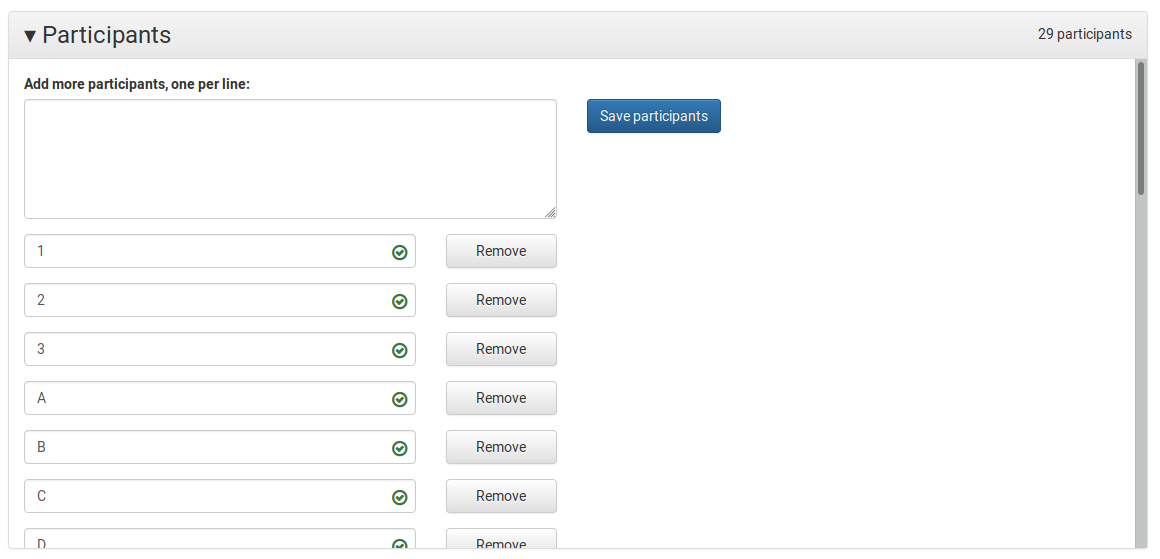
Some events have a lot of participants and scrolling all the way down is difficult. We should limit the container height and make it scrollable.

I'd prefer if at least 10 participants showing up in the window by default before I need to scroll. Let's set the max-height accordingly.

The textbox and the 'Save participants button should remain sticky while the saved participants should be scrollable.

Event Timeline

Niharika triaged this task as Medium priority.Jul 27 2018, 5:31 PM
Niharika set the point value for this task to 1.Jul 31 2018, 7:49 PM
Niharika moved this task from Needs Discussion to Up Next (June 3-21) on the Community-Tech board.

The vertical scrollbar takes up a bit of space at the side, so the 'remove' buttons have to come in a bit. Should this extra space still be shown when there's no need for the scrollbar? e.g.:

This is when there are more than 400px of participants:
withscroll.png (754×658 px, 37 KB)
When there are fewer, we can show a gap:
withoutscroll.png (427×716 px, 21 KB)
Or a non-scroll scrollbar:
withscroll-y.png (435×681 px, 20 KB)

Maybe @Prtksxna could take a look and help us decide about the gap on the side of the Remove buttons.

@Samwilson, would it be possible to have the scroll on #panelBodyParticipants, and keep the .event-add-participants and .save-participants-btn fixed? This way the scroll target will become larger, and the clutter of the scrollbar will move all the way to the right edge.

Just a quick note, Mac OS and Android don't show scrollbars till you're actually scrolling. They don't need extra space either IIRC.

Yes, I played with putting the scroll on the panel body; it works well I think. I'm not sure how to fix the textarea and button though (and still have them scroll with the outer page).

This is with an 80vh max height on the panel body:

panel-scroll.png (559×1 px, 31 KB)

This is with an 80vh max height on the panel body:

panel-scroll.png (559×1 px, 31 KB)

The scrollbar moved to the right edge looks nice!

Yes, I played with putting the scroll on the panel body; it works well I think. I'm not sure how to fix the textarea and button though (and still have them scroll with the outer page).

We could put wrappers around the textarea and button, then another wrapper around the list of participants. Something like:

<div class="col-sm-6 event-add-participants form-group">
    ...
</div>
<div class="col-sm-6 save-participants-btn">
    ...
</div>
<div class="participant-rows-wrapper">
    <div class="col-sm-6 participant-rows">
        ...
    </div>
</div>
.participant-rows-wrapper {
    clear: both;
    max-height: 400px;
    overflow-y: scroll;
}

This will move the scrollbar to the far right, and the textarea and save button won't move with it. I think it looks okay...? It's a little confusing on MacOS because you can't tell where the scrollbar starts (it's actually below of the textarea). You might also have that problem where you're scrolling within in the participant list when you mean to scroll the whole page (cursor/touch focus would need to be outside the panel).

Screen Shot 2018-08-29 at 17.04.55.png (674×1 px, 85 KB)

It's a little confusing on MacOS because you can't tell where the scrollbar starts (it's actually below of the textarea). You might also have that problem where you're scrolling within in the participant list when you mean to scroll the whole page (cursor/touch focus would need to be outside the panel).

Yeah MacOS is notorious at showing scroll bars. But this still increases the overall scroll target, and that is good.

I've updated the PR to make that whole lower area of the panel scrollable with a max hight of 400px.

PR merged, and the staging site updated. I'm sure there's still room for discussion! :) And anyway, maybe we're going to move the participants editing into the event editing page (in T204009)? So this panel would be redone.

This looks good to me. Let's push it to production.

MusikAnimal moved this task from QA to Q1 2018-19 on the Community-Tech-Sprint board.

Deployed

The overflow: auto CSS rule hides the autocompletion dropdown :(

Screen Shot 2018-09-13 at 15.32.54.png (303×573 px, 24 KB)

In this example I had a single username that I was trying to edit.

The overflow: auto CSS rule hides the autocompletion dropdown :(

Screen Shot 2018-09-13 at 15.32.54.png (303×573 px, 24 KB)

In this example I had a single username that I was trying to edit.

I see this happen only for the bottom-most name. Can we make the auto-complete dropdown appear on top of the dialog (increase the z-index)? Might be good to have this logged as a separate bug ticket.