Page MenuHomePhabricator

Do away with inputs in add/remove forms, and use trash icons instead of Remove buttons
Closed, DeclinedPublic

Description

Similar to issues raised at T201710

The status quo:

Screen Shot 2018-09-12 at 17.33.38.png (473×1 px, 70 KB)

There are several UI issues here:

  • The green icons make it look like those usernames are saved, when they may not have been (say you added those at the same time as the invalid one, you must fix the invalid one first and re-submit).
  • The Remove buttons almost look like Submit buttons. So if you fix the username, you might hit Remove by accident.
  • There's no pretty-ish way to link to the user's userpage on-wiki (since it's an input box)

What I propose is to do away with the inputs for saved/pending-save items, and use a trash icon instead of a Remove button. Something like:

Screen Shot 2018-09-12 at 17.54.08.png (444×737 px, 55 KB)

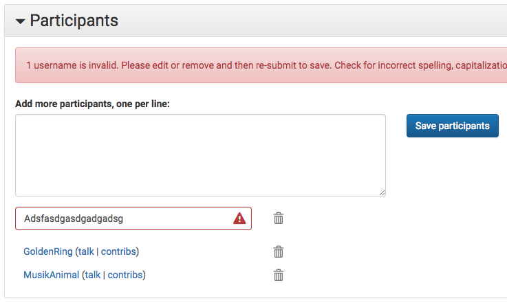
How does that look? The idea here is you probably don't change usernames that often, except the ones that are invalid, so there's really no need for input boxes in those cases. This then allows us to link to the user page/contribs/etc., which we will want (see T204009). Meanwhile the trash icon is probably more familiar visually, clearly indicating what it does.

The category form would follow the same design, and allow us to link to the category so that the organizer can see subcategories and pages therein.

Finally, the no-input-box concept means the list will be more compact. It's pretty bulky as is, hence why T200541 was done (though we'd still want a max-height).

Event Timeline

The green icons make it look like those usernames are saved, when they may not have been (say you added those at the same time as the invalid one, you must fix the invalid one first and re-submit).

Agreed. In this design (looking at second screenshot), will the ones that were correct in the input be saved automatically or should they be represented differently? In other words do we still have three states:

  • Saved
  • Unsaved but correct
  • Unsaved and incorrect

Yep, it's the same situation with the proposed redesign. Nothing saves until errors are fixed, but this is pretty typical for websites and we've attempted to make that clear in the error message. I think the green ticks not being there helps, though.

One possible issue... it might not be obvious that you have to hit Submit after removing participants, too. For that I propose graying out the item:

Screen Shot 2018-09-12 at 18.41.20.png (329×736 px, 33 KB)

We could instead use AJAX to remove the participant as you click on the trash icon, but that gets a little weird where you're in the "unsaved" state with an invalid item. No happy medium, it seems, but I think overall this is an improvement.

I think this one can be declined since we're redesigning the event page anyway, no?

@jmatazzoni I imagine tickets that are in the Freezer column on Event Metrics are not going to be worked on in the near term. I am taking these tickets off the Community-Tech board in order to clean it up. Feel free to add them back once they are ready to be worked on. This is similar to what I do for all our other projects to keep the backlog manageable. We can talk more about this in our 1:1.