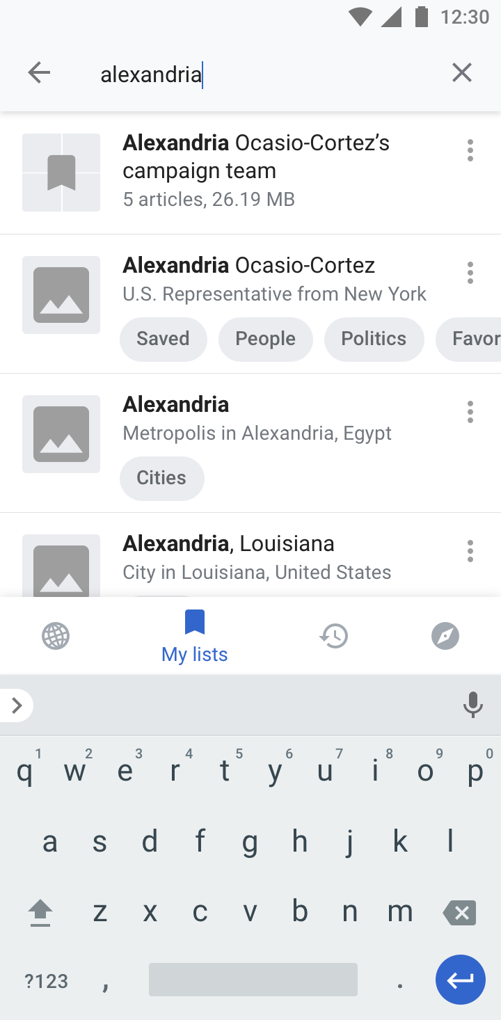
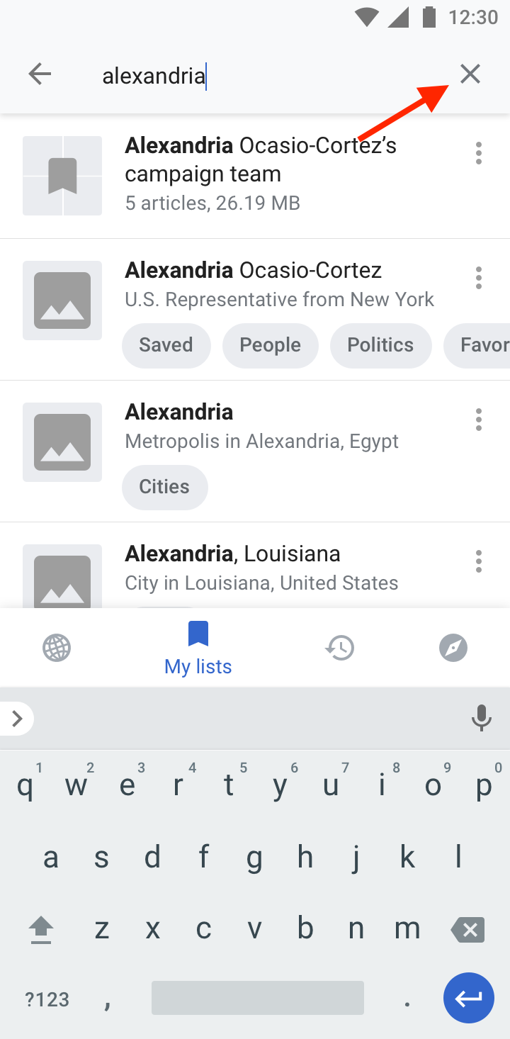
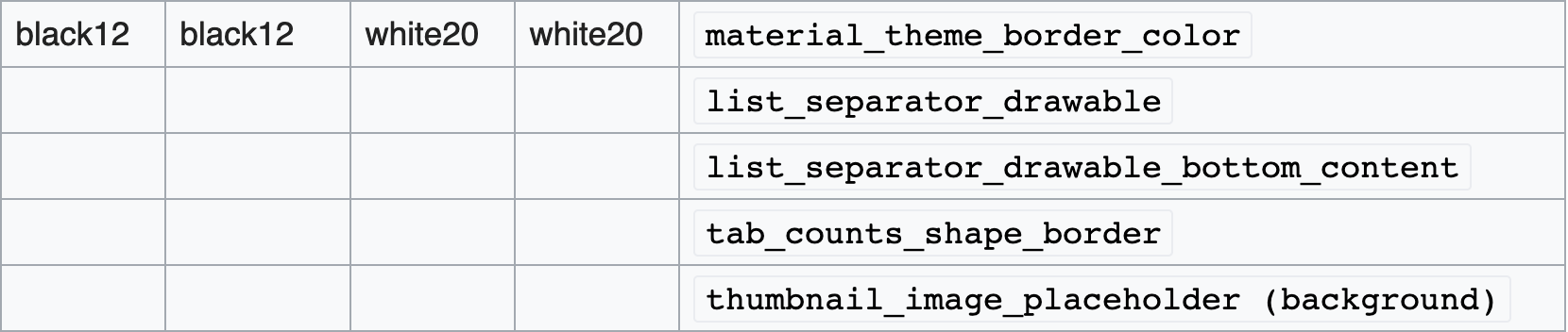
Page MenuHomePhabricator

Show lists + list items in same list based on search term
Closed, ResolvedPublic5 Estimated Story Points

Description

Design

👉 Search in “My lists“ | T214505 on Zeplin

Flow

https://overflow.io/s/QEVP3O/?node=72a041d1

Key aspects

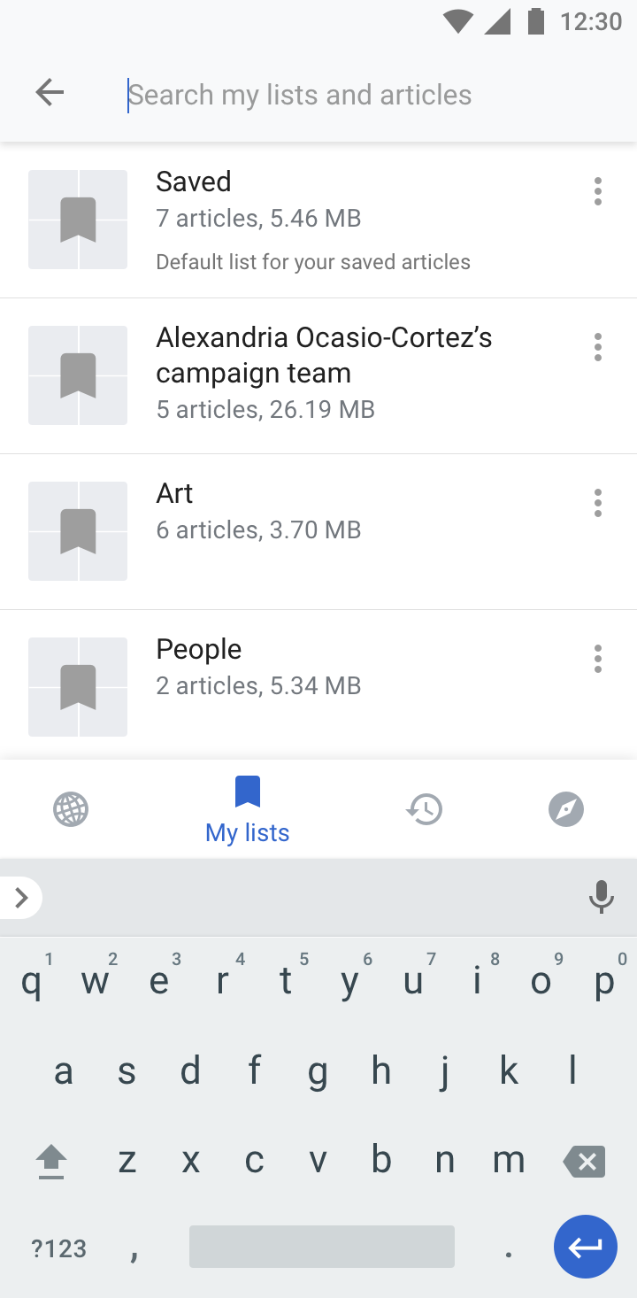
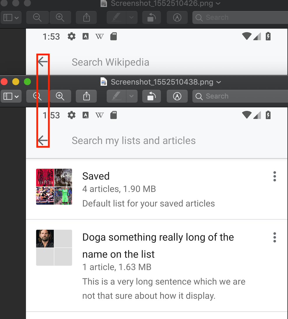
  • The search in “My lists“ now searches lists and articles.
  • Search results from lists, more specifically list names that match the search term are listed first in search results.

Event Timeline

Charlotte created this task.

@schoenbaechler cc @Charlotte

Does the search function inside a list also be able to search both all lists and articles?

For example, clicks on "Saved" list and click on the search icon after in the "Saved" list.

Change 486409 had a related patch set uploaded (by Cooltey; owner: Cooltey):
[apps/android/wikipedia@master] [WIP] Enhance the reading list search function

https://gerrit.wikimedia.org/r/486409

@schoenbaechler cc @Charlotte

Does the search function inside a list also be able to search both all lists and articles?

For example, clicks on "Saved" list and click on the search icon after in the "Saved" list.

That's an interesting one, @cooltey. My instinct is that the search from within a list should still be able to search all lists and all articles (not just the articles that are inside the list they clicked search from) - but @schoenbaechler can say if he disagrees.

Just chiming in. I just happened to see an issue with the search icon seen inside a reading list.

  1. Open the app
  2. Go to 'My lists'
  3. Tap on the 'Saved' list (make sure there are some articles in it so that it can be scrolled)
  4. Tap on the context menu that appears.

Expected behaviour
The replacement text for the 'Search' icon in the context menu is 'Search Reading lists'

Actual behaviour
The replacement text for the 'Search' icon in the context menu is 'Search Wikipedia(which is clearly wrong).

Screenshot_2019-01-29-12-36-16.png (800×480 px, 95 KB)

Thanks for the feedback, @Kaartic. I've created a patch of fixing the incorrect text for the search icons.
https://gerrit.wikimedia.org/r/#/c/apps/android/wikipedia/+/487963/

Does the search function inside a list also be able to search both all lists and articles?

Great catch @cooltey. And I totally agree with @Charlotte, the search should search all articles and lists within reading lists.


And thanks @Kaartic for your feedback, two comments:

  • Related to the features that are outlined in this task: The new placeholder copy will be: “Search my lists and articles“
  • I was wondering about the font in your screenshot. It looks like Comic Sans. May I ask if you’re using a custom system font or so? Thanks.

@schoenbaechler In my guess, I think @Kaartic is using a 3rd party launcher (e.g.Go Launcher) that allows user to customize the UI font.

In T214505#4927636, @schoenbaechler wrote:

And thanks @Kaartic for your feedback, two comments:

  • Related to the features that are outlined in this task: The new placeholder copy will be: “Search my lists and articles“

That looks fine for the feature outlined.

  • I was wondering about the font in your screenshot. It looks like Comic Sans. May I ask if you’re using a custom system font or so? Thanks.

Yeah. I do use a custom system font called 'Rosemary'.

@schoenbaechler In my guess, I think @Kaartic is using a 3rd party launcher (e.g.Go Launcher) that allows user to customize the UI font.

Actually, I do use a 3rd party launcher but the font is not a feature of it. It's a feature in the system itself. I say it's a feature of the system as I can change it in the system's settings and I've used the custom font even when I use a different launcher.

Thanks for the feedback, @Kaartic. I've created a patch of fixing the incorrect text for the search icons.
https://gerrit.wikimedia.org/r/#/c/apps/android/wikipedia/+/487963/

Thanks for the patch to fix this!

Change 486409 abandoned by Cooltey:
Enhance the reading list search function

Reason:
Moved to GitHub

https://gerrit.wikimedia.org/r/486409

Excited to see the feature in action!


Positioning

DesignvsImplementation
My_lists_search_02.png (1×720 px, 149 KB)
vs
Screenshot_20190301-141702.jpg (2×1 px, 370 KB)

margin-left of the input field/placeholder is off in the implementation. It should be 72px from the left side or 32px from the back icon), please check Zeplin for the exact values.

Related: Can we harmonize search from “My lists“, “Explore“ and “History“?

  • All three searches should basically look like the “My lists“ search designs on Zeplin
  • Back arrow is positioned slightly different in the “Explore“ search
“Explore“ search“My lists“ searchList search in “My lists““History“ search
Screenshot_20190301-141638.jpg (2×1 px, 174 KB)
Screenshot_20190301-141702-1.jpg (2×1 px, 370 KB)
Screenshot_20190301-152352.jpg (2×1 px, 409 KB)
Screenshot_20190301-141720.jpg (2×1 px, 269 KB)
Plus, the status bar is cut off here

Thumbnails

DesignvsImplementation
My_lists_search_03.png (1×720 px, 178 KB)
Screenshot_20190301-152330.jpg (2×1 px, 291 KB)

Article thumbnails should be 56px x 56px as well


Typography

Please make sure to use the same font-size and line-height definitions from the designs on Zeplin.

  • 16px (line-height: 20px) for titles
  • 14px (line-height: 16px) for descriptions and list infos
  • 12px (line-height: 16px) for “Default list for your saved articles“ in “Saved“

Article thumbnails should be 56px x 56px as well

@schoenbaechler If we change the size of this thumbnail, it will impact the other places where this component appears, e.g. History items, Search results, Feed list items, etc. Do we want to proceed with this?

Hi @schoenbaechler, the patch has been merged. Please download the latest version of the alpha APK to check the changes.

Regarding the inactive nav icon color we've talked about: T194327#5005938, it is also available to be checked.

Navigation icon colors are perfect! (T194327#5005938)

In regard’s to the list feature, we’re almost there @cooltey, it works as designed. There are some remaining visual issues, listed below.


Incorrect search placeholder color per theme

image.png (292×1 px, 200 KB)

LightSepiaDarkBlack
#000000 38%#000000 38%#FFFFFF 50%#FFFFFF 50%

Incorrect list image placeholder color per theme

(as previously defined in T194327)

image.png (436×1 px, 157 KB)

LightSepiaDarkBlack
#000000 12%#000000 12%#FFFFFF 20%#FFFFFF 20%

Image container size for lists and images differs

image.png (1×938 px, 574 KB)

The article search result image seems to be 1 pixel smaller than the list image. Please adapt the article image to the size of the list image.


Thanks!

Thanks for checking, @schoenbaechler, the new patch has been merged.
Please download the latest version of the alpha APK to check the changes.

Search placeholder looks good.

But image placeholder colors are still off. I guess it has something to do with the background-color. Can you please verify the following @cooltey:

LightSepiaDarkBlack
Definition#000000 (12%) on #FFFFFF#000000 (12%) on #F8F1E3#FFFFFF (20%) on #2E3136#FFFFFF (20%) on #000000
Design (correct)
light.png (100×100 px, 640 B)
sepia.png (100×100 px, 642 B)
dark.png (100×100 px, 641 B)
black.png (100×100 px, 638 B)
Alpha (incorrect)
app-light.png (100×100 px, 638 B)
app-sepia.png (100×100 px, 641 B)
app-dark.png (100×100 px, 639 B)
app-black.png (100×100 px, 638 B)

Oh and just noticed, the X for closing the search is missing in the designs @cooltey, could you add it please? It should appear after typing (same as in “Explore“. Sorry for spotting it so late.

close_search.png (1×720 px, 183 KB)

This comment has been deleted.

As discussed on Slack @cooltey, the search in “Explore“ uses a different positioning of the back button and placeholder color. Can you adapt the “Explore“ search so it’s using the same styles as used for “My lists“ and “History“? Here’s a comparison of the search:

ExploreMy listsHistory
Screenshot_20190308-190348.jpg (2×1 px, 186 KB)
Screenshot_20190308-190315.jpg (2×1 px, 365 KB)
Screenshot_20190308-190303.jpg (2×1 px, 230 KB)

Also, I suggest to change the label on “Explore“ from Search... to Search Wikipedia to make it more clear.

But image placeholder colors are still off. I guess it has something to do with the background-color.

@schoenbaechler Can you please specify the meta-color (according to our Theme Guidelines page) to use for the thumbnail background?

@schoenbaechler To clarify, the color you specified seems to correspond to paper_color, but with a shaded opacity on top of it. That's not quite the way it works: we need the total combined color value for each theme. It sounds like we might need to create a new meta-color such as paper_color_shaded that provides these color values.

Hey @Dbrant, I’m currently updating the theme guidelines (T218102).

I saw some attributes that use that exact same color combination on the theme guidelines page:

image.png (352×1 px, 60 KB)

Does that help? (CC @cooltey)

HI @schoenbaechler

In the new patch, the final color of a thumbnail is combined by the following layers:

<item name="placeholderImage">?attr/material_theme_border_color</item>
<item name="backgroundImage">?attr/paper_color</item>

The base color is paper_color, and the actual color of the image is material_theme_border_color. I think it would be better to create a new meta-color that combines with two colors (material_theme_border_color + paper_color)

Please correct me if I am wrong @Dbrant

@schoenbaechler Well actually, in the current code itself, it looks like we have all the correct values that should be there.
And in fact, I'm a bit confused about where this color is coming from:

Alpha (incorrect)

app-light.png (100×100 px, 638 B)

It has a color value of #C4C4C4, which is technically ~23% black (which might indicate that the 12% black is being applied twice somewhere).
Can you post a screenshot where this color is seen? (I'm probably confused by what you mean by "image placeholder colors are still off." Which images?)

Hi @Dbrant, I think I can answer the question.

Can you post a screenshot where this color is seen? (I'm probably confused by what you mean by "image placeholder colors are still off." Which images?)

screenshot_20190308-163836.png (2×1 px, 361 KB)

and the screenshot below shows how the color should be (which you can see in my patch):

screenshot_1552066005.png (2×1 px, 570 KB)

Aha, my confusion ran deeper than I thought. I believe I understand the whole issue now, and will reply on the patch.

Hi @schoenbaechler, the patch has been merged. Please download the latest version of the alpha APK to check the changes.

Thanks @cooltey, all good, let’s move it to “Ready for signoff“.


There’s still a minor difference in positioning of the back button on “Explore“ and “My lists“, check this video:
https://www.dropbox.com/s/ruwk9ieinuy8ooh/back-arrow-movement.mov?dl=0
But let’s tackle that in another task!

There’s still a minor difference in positioning of the back button on “Explore“ and “My lists“, check this video:

Not sure how that happened 😂 What I see from my side is: https://www.youtube.com/watch?v=jQ_OLQ1uAMk&feature=youtu.be

You can notice even switching between history page and reading list page can have a minor movement on the arrows, and I think it might come from the problem of screenshots.

What I did before was using the screenshots with a rectangle line to see the difference.

arrows.png (1×988 px, 313 KB)

Thanks @cooltey for your attention to detail! 👁

Ok, you’re right, it might be caused by the screenshots. Let’s leave it like it is!