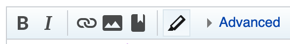
The toggle state for syntax highlighting in the WikiEditor toolbar is very subtle (slight change in icon colour and faint border). Could this be improved to be more obvious? It has caused confusion at https://en.wikipedia.org/wiki/Wikipedia:Village_pump_(technical)#Syntax_highlighting (permalink).
Off:
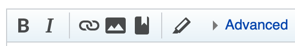
On: