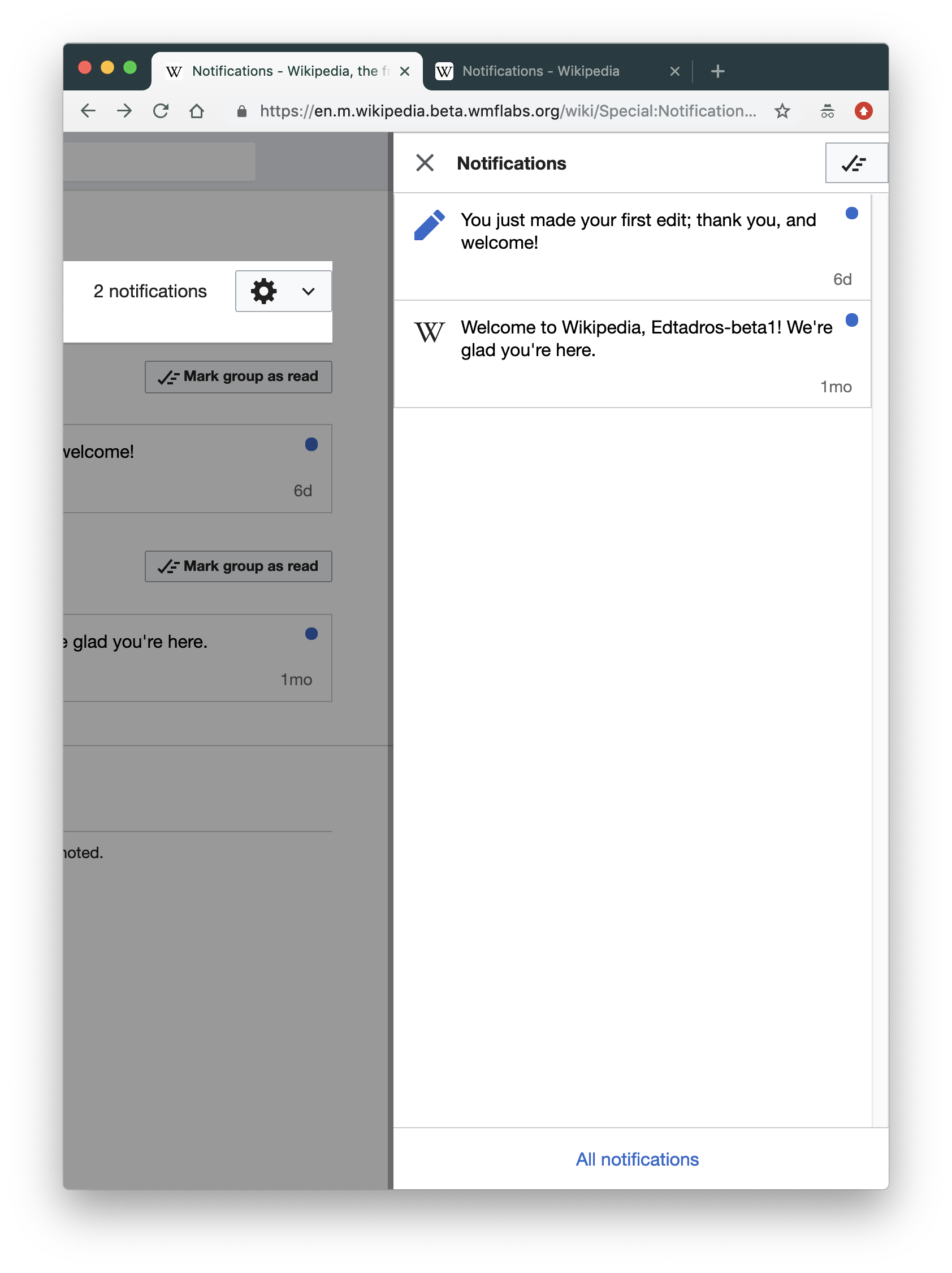
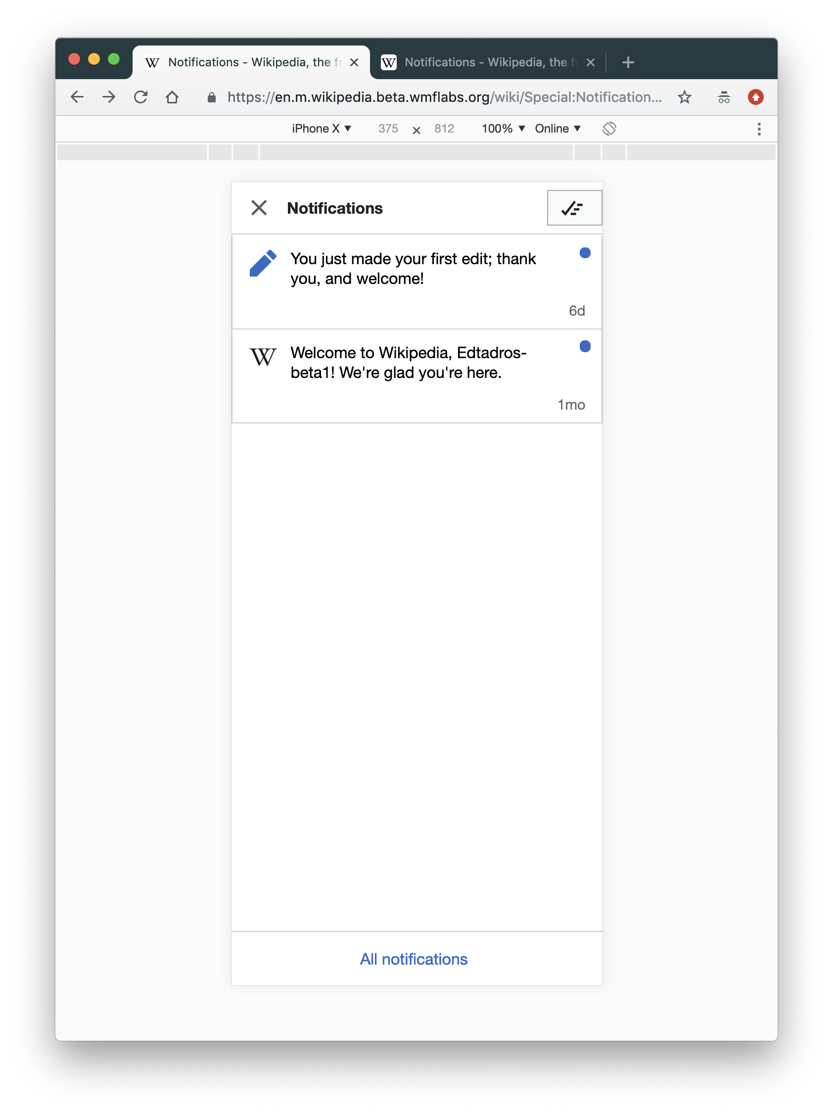
Visit https://en.m.wikipedia.beta.wmflabs.org/wiki/Special:Notifications#/notifications
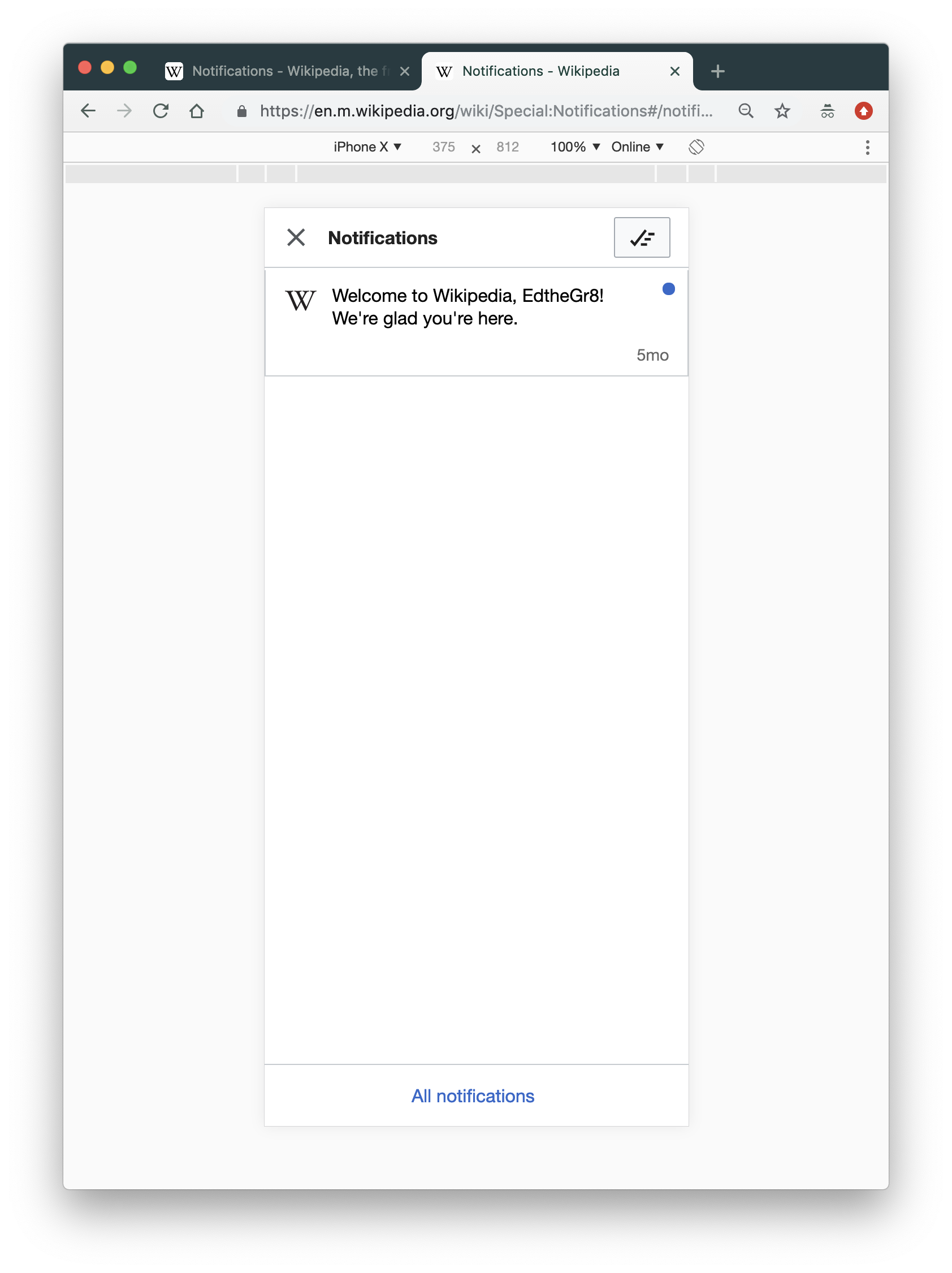
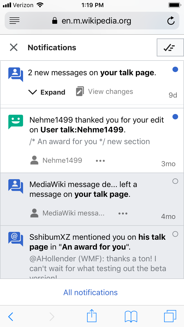
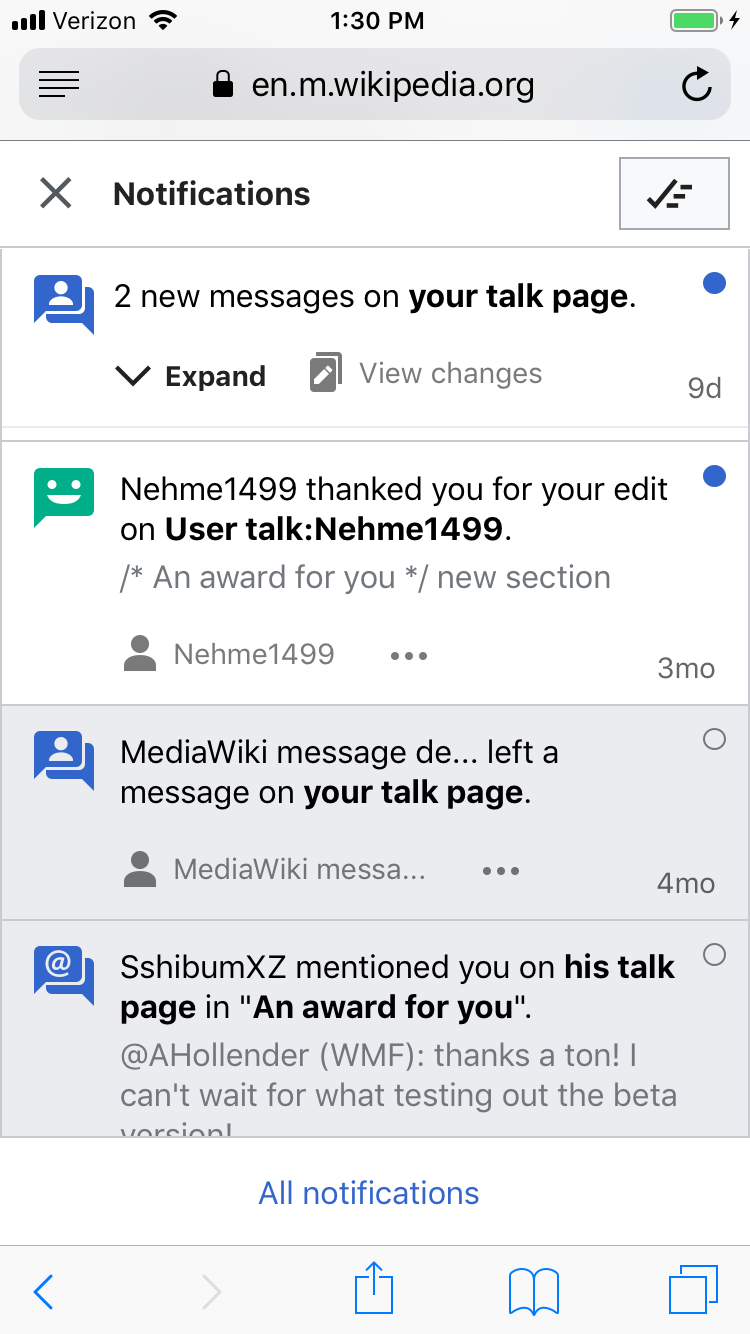
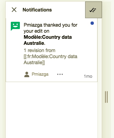
On mobile:
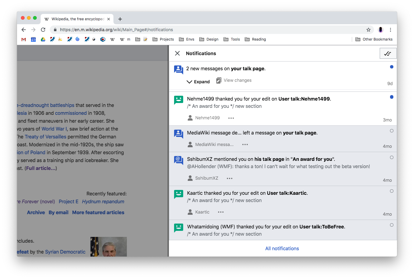
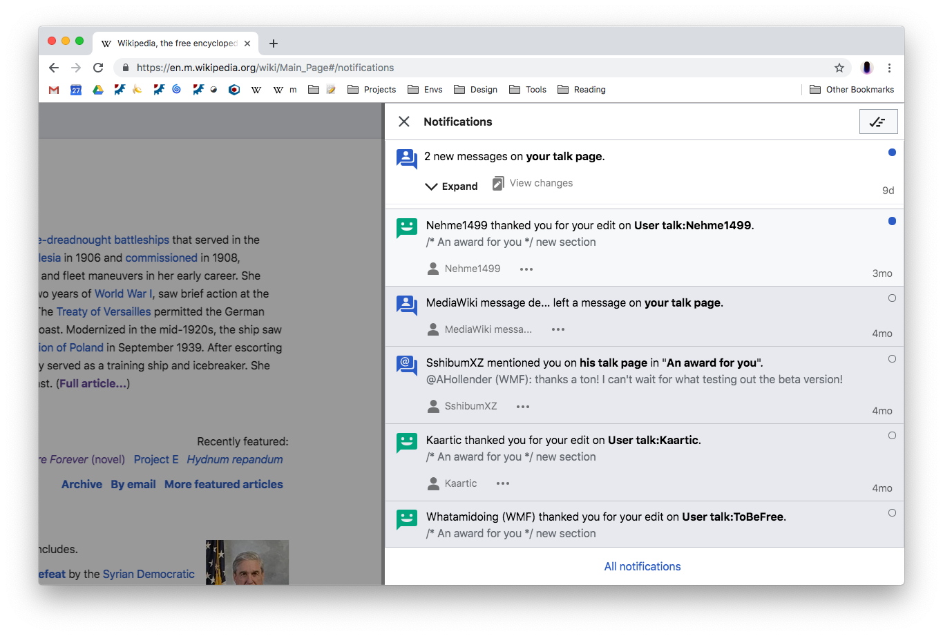
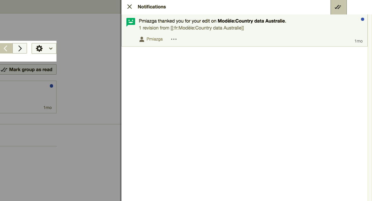
On desktop:
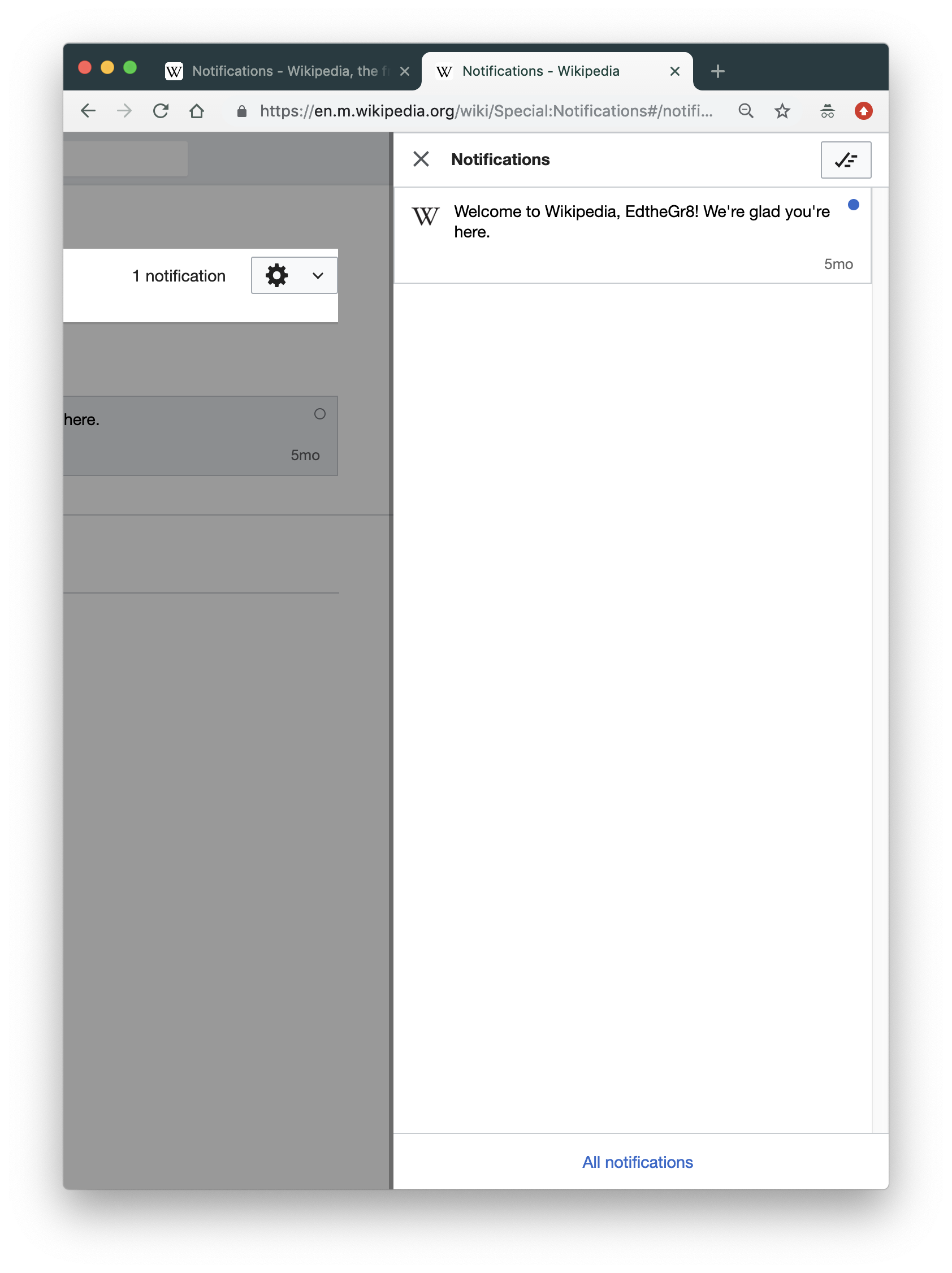
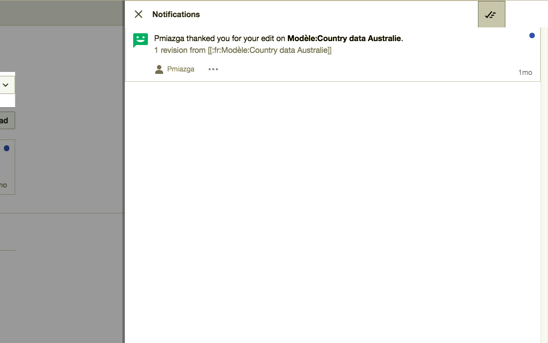
Compare with production:
Expected:
- Button should align right on desktop
- Button should fit into header
QA steps
- Visit https://en.m.wikipedia.beta.wmflabs.org/wiki/Special:Notifications#/notifications on desktop and confirm it matches Alex's description - T218731#5063012
- Resize browser to check mobile looks the same as well
QA Results
| Status | Details |
| ✅ Passed | T218731#5110101 |