Page MenuHomePhabricator

Tab-navigation when adding depicts statements on Wikimedia Commons is counter-intuitive
Closed, ResolvedPublic

Description

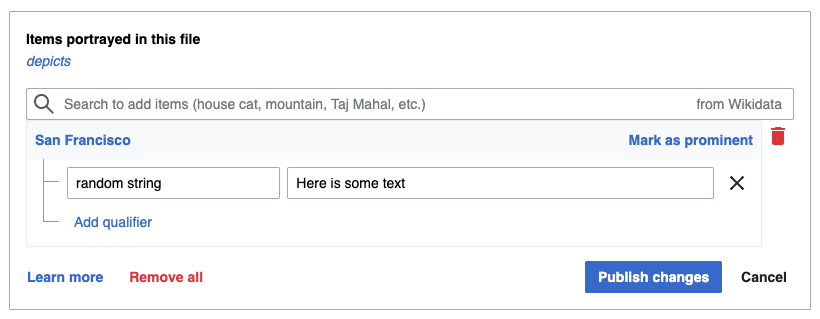
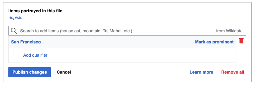
Wokflow when using the keyboard to add a statement:

  • With mouse, navigate to the “ Search to add items ” search box
  • Type in something − get autocompletion
  • With ↓, select the correct item
  • With Enter, validate
  • Publish changes:
    • Enter does not save
    • Tab goes to the Qitem just added
    • second tab goes to “Mark as prominent”
    • third Tab goes to the delete bin
    • fourth tab goes to « Learn more
    • fifth tab goes back to the top of the page, to the ULS

To navigate to « Publish changes » one needs to Shift-tab.

I think a more natural tab order, like when adding statement to Wikidata, would help.

Event Timeline

Restricted Application added a subscriber: Aklapper. · View Herald Transcript

HI @JeanFred - could you explain a little bit more what you mean by a natural tab order? What about this is causing problems? What is making it difficult? Would love more information as I look into this.

HI @JeanFred - could you explain a little bit more what you mean by a natural tab order? What about this is causing problems? What is making it difficult? Would love more information as I look into this.

Indeed, that was missing from my report :)

@LucasWerkmeister framed it very well on [[Commons talk:Structured data]]:

As a Wikidata editor, I expect that after adding a depicted value, I can press Enter on the empty input field to save my edits. Here, that’s not possible – I first have to move the focus to the “publish changes” button (Shift+Tab), or click it using my mouse.

I would expect to either be able to use “Enter” directly from the field, or to use “Tab” (one or a couple max) to move to the “Publish changes” action.

Thank you, @JeanFred! Will be looking into this early next week & discussing with the team.

@PDrouin-WMF: Did that discussion take place? If it did, any outcome to share? :)

After I last checked in on it, we changed the placement of “Publish changes” to the lower right to match Captions… which has been great in terms of consistency for most users, except that it means more tabbing to actually publish any changes. @egardner, is it possible to enable “Enter” to publish the change after it’s been validated?

Hey @PDrouin-WMF, I was hoping to get your thoughts on some possible solutions here.

I think to solve these issues we need to do 2 things:

  1. Ensure that the tab order of the buttons at the bottom of a statement is sensible, meaning the Publish changes button comes first when tabbing into the actions
  2. After a user adds an item, place the focus on the new item so they're close in the tab order to the Publish changes button

For the first item, I think we will need to change the physical order of the action buttons. We could mess with the tab order but keep the buttons in the same order, but this doesn't sit well with me as the markup, visual appearance, and tab order would not be consistent. For a user navigating with the keyboard and also looking at the screen, this could be confusing and it would be counterintuitive to tab in order to reach a button to the left.

I would propose we do one fo the following:

Option 1: Change order of Publish and Cancel

We could swap the order of Publish and Cancel, and when the user tabs into the actions section, they will land on Publish changes first. This still has the issue that the Learn more and Remove all links come before Publish/Cancel visually, but would come after them in the tab order.

swap publish and cancel.png (319×820 px, 35 KB)

Option 2: Change order of button groups

We could also swap the order of the button groups, placing the primary actions on the left and the secondary actions on the right. I'd prefer this from a semantics point of view since the tab order would be natural here, but this would represent a pretty big change from the current design.

swap button groups.png (276×823 px, 31 KB)

I'm sure there are other options too – please let me know what you think!

Thanks for working on this, Anne!

I think this runs into design style guide patterns, and it'd be best to bring @Volker_E in on the discussion. Volker, what are your thoughts on the two proposed options? We'd like to reduce the tabbing to make the widget more keyboard-friendly.

Hey @Volker_E, do you have any thoughts on my comment above on how to improve tab navigation for this form? I'd like to get this fixed this month if possible while my team has time to make improvements to WBMI, and we are, unfortunately, without a designer at the moment.

Hello @Volker_E we could use your expertise on this ticket so we can close it out 😺

Hi @Ramsey-WMF and @AnneT, thanks for pinging again. Former ping was during my sabbatical leave.
Without knowing the full context, Option 2 seems more useful as primary button would be first button in tab order. We've got similar button orders, with the primary button, the first in line in a few places, like Special:Preferences:

image.png (262×1 px, 27 KB)

Or the WikiEditor 2010

image.png (468×984 px, 54 KB)

Thanks, Volker! I've consulted with Anne and it looks like we're unblocked now. 👍🏼

Change 576050 had a related patch set uploaded (by Anne Tomasevich; owner: Anne Tomasevich):
[mediawiki/extensions/WikibaseMediaInfo@master] Switch action button order for improved keyboard navigation

https://gerrit.wikimedia.org/r/576050

Change 576050 merged by jenkins-bot:
[mediawiki/extensions/WikibaseMediaInfo@master] Switch action button order for improved keyboard navigation

https://gerrit.wikimedia.org/r/576050

We've changed the button grouping ordering to make the tabbing easier, as described in the comments in this ticket.