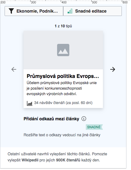
Presently the info button on mobile is larger than expected, which is also causing it to not appear vertically centered with the task type label.
Expected: icon is 20x20px  | Actual: icon width is 22.84px  | |
| Etonkovidova | |
| Jan 21 2020, 6:24 PM |
| F35816495: image.png | |
| Nov 23 2022, 9:18 PM |
| F31532103: image.png | |
| Jan 24 2020, 11:53 AM |
| F31532090: image.png | |
| Jan 24 2020, 11:53 AM |
| F31531695: Screen Shot 2020-01-23 at 5.33.09 PM.png | |
| Jan 24 2020, 4:00 AM |
| F31519852: Screen Shot 2020-01-21 at 10.11.19 AM.png | |
| Jan 21 2020, 6:24 PM |
| F31519849: Screen Shot 2020-01-21 at 10.10.46 AM.png | |
| Jan 21 2020, 6:24 PM |
Presently the info button on mobile is larger than expected, which is also causing it to not appear vertically centered with the task type label.
| Expected: icon is 20x20px | Actual: icon width is 22.84px | |
It seems that the placement of info icon at the end of the label has been done already along with the patch -
https://gerrit.wikimedia.org/r/565717 - that fixed the placement of difficulty label on one line. So, this phab ticket can be closed, I suppose.
Yes, think this appears fixed now in terms of the icon position at the end of the type label, but there is still visual design items polish in the alignment of the icon and labels, so I'd like to keep this task open for those fixes. See the updated description.
