Page MenuHomePhabricator

Newcomer tasks: medium difficulty label goes out of background in Czech
Closed, ResolvedPublic

Assigned To
Authored By
Urbanecm
Nov 14 2019, 12:00 PM
Referenced Files
F32379582: Screen Shot 2020-10-09 at 11.04.49 AM.png
Oct 9 2020, 6:15 PM
F31532115: image.png
Jan 24 2020, 12:00 PM
F31532113: image.png
Jan 24 2020, 12:00 PM
F31532111: image.png
Jan 24 2020, 12:00 PM
F31519841: Screen Shot 2020-01-21 at 10.03.47 AM.png
Jan 21 2020, 6:27 PM
F31519843: Screen Shot 2020-01-21 at 10.10.55 AM.png
Jan 21 2020, 6:27 PM
F31473669: image.png
Dec 12 2019, 1:14 PM
F31068984: image.png
Nov 14 2019, 12:00 PM

Description

At https://en.wikipedia.beta.wmflabs.org/w/index.php?title=Special:Homepage, I see this:

image.png (783×557 px, 49 KB)

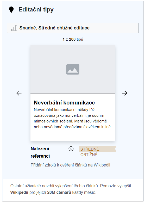
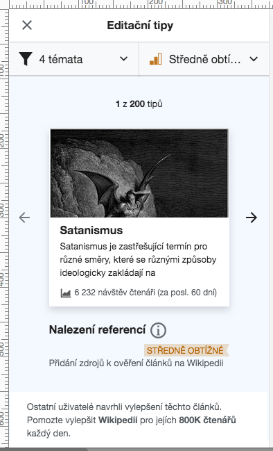
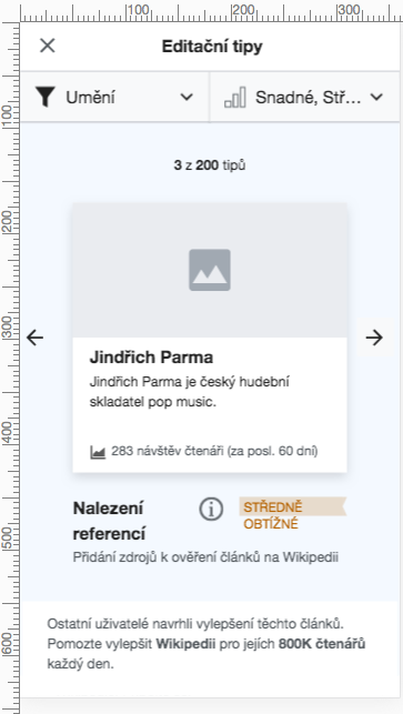
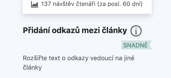
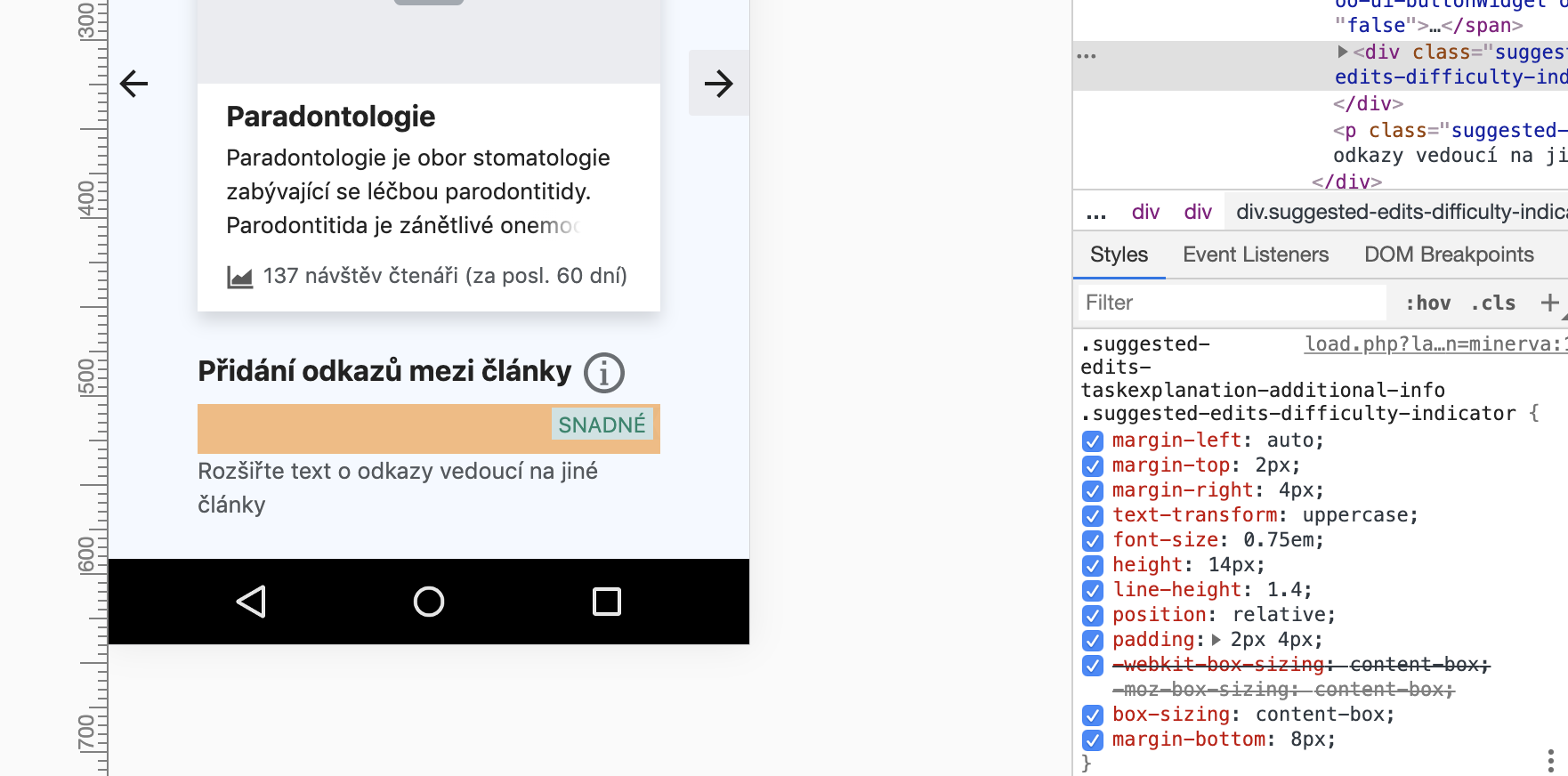
"Středně obtížné" should be both under the background color.

I posted a proposed fix to this that was lost on another task comment (T238322#5676329). Here it is again with updated css so that the tag background shape extends to fit the whole difficulty label and wraps below the task type:
Amending the css on the class .suggestededits-taskexplanation-additional-info to fix this issue even for longer text copy:

.suggestededits-taskexplanation-additional-info {
  flex-wrap:wrap;
  justify-content:flex-start;  /* change from justify-content: center; */
}

image.png (1×1 px, 166 KB)

Event Timeline

Urbanecm renamed this task from Medium difficulty label goes out of background to Medium difficulty label goes out of background in Czech.Nov 14 2019, 1:06 PM
MMiller_WMF renamed this task from Medium difficulty label goes out of background in Czech to Newcomer tasks: medium difficulty label goes out of background in Czech.Nov 15 2019, 1:50 AM
MMiller_WMF added subscribers: Catrope, kostajh, Tgr and 3 others.
RHo updated the task description. (Show Details)

Change 565717 had a related patch set uploaded (by Gergő Tisza; owner: Gergő Tisza):
[mediawiki/extensions/GrowthExperiments@master] Suggested edits: Keep difficulty indicator on a single line

https://gerrit.wikimedia.org/r/565717

Change 565717 merged by jenkins-bot:
[mediawiki/extensions/GrowthExperiments@master] Suggested edits: Keep difficulty indicator on a single line

https://gerrit.wikimedia.org/r/565717

@Tgr - on iPhone 6S (and browser emulators) the label is moved to the end of the line
betalabs

Screen Shot 2020-01-21 at 10.03.47 AM.png (649×394 px, 104 KB)

vs current production

Screen Shot 2020-01-21 at 10.10.55 AM.png (643×363 px, 69 KB)

Yeah, when all the text does not fit on a single line, it's handled by moving the difficulty label to a separate line. We can handle it differently if that's preferred (e.g. do the same but align it left; keep the label multi-line but expand the background to match it; keep the difficulty label on one line, even if that means the task name becames narrow and might turn into a weird "tower"); I don't see an obviously correct solution here that would stand out from the rest.

The move of the difficulty label to thje separate line is expected and this looks right except for the info icon size which @Etonkovidova captured on T233307, and also if we can add 8px between the task description and the difficulty label when this occurs:

Current

image.png (362×786 px, 35 KB)

Update to

image.png (316×690 px, 31 KB)

And may I propose this can be done by adding margin-bottom: 8px to the class .suggested-edits-taskexplanation-additional-info .suggested-edits-difficulty-indicator?
image.png (872×1 px, 217 KB)

also if we can add 8px between the task description and the difficulty label when this occurs:

And may I propose this can be done by adding margin-bottom: 8px to the class .suggested-edits-taskexplanation-additional-info .suggested-edits-difficulty-indicator?

The proposed rule would apply regardless of whether the last flex item is pushed to a second row. Are you saying you want the 8px bottom margin to only be set in this specific case, or you want it applied at all times, whether or not the last flex item (difficulty indicator) is pushed to a second row? (And we want the updated rule for desktop as well as mobile?)

@Catrope or @Tgr might know more but AFAICT from looking at what's possible with flexbox, I don't think we could add that rule conditionally.

also if we can add 8px between the task description and the difficulty label when this occurs:

And may I propose this can be done by adding margin-bottom: 8px to the class .suggested-edits-taskexplanation-additional-info .suggested-edits-difficulty-indicator?

The proposed rule would apply regardless of whether the last flex item is pushed to a second row. Are you saying you want the 8px bottom margin to only be set in this specific case, or you want it applied at all times, whether or not the last flex item (difficulty indicator) is pushed to a second row? (And we want the updated rule for desktop as well as mobile?)

Yes, I mean the 8px should be applied universally.

De-prioritizing off the sprint board in favor of other priorities.

Etonkovidova added a subscriber: Urbanecm.

@Urbanecm - there were recent changes in the info icon positioning and the issue seems to be fixed (although there is still some issues - T261448). And, for variant C/D (a wider SE module) the issue would not be present.

I checked in cswiki wmf.10 (current production) both desktop and mobile and I'm closing the task as Resolved. If there something still missing (or I missed something), please re-open the taks.

Screen Shot 2020-10-09 at 11.04.49 AM.png (677×439 px, 157 KB)