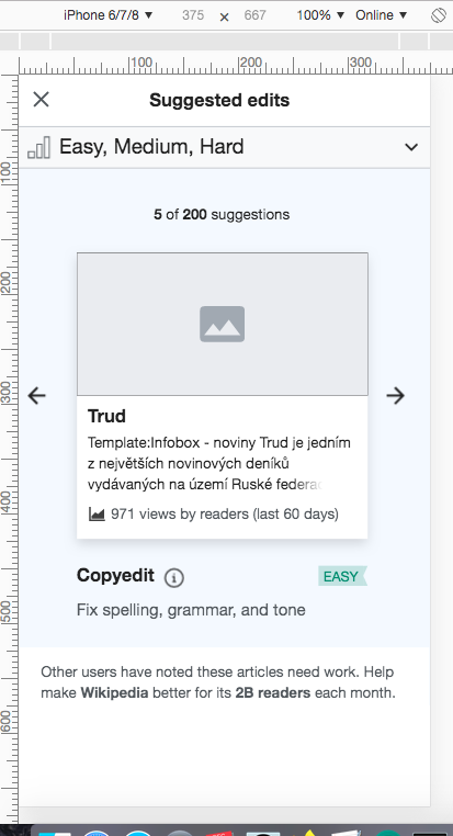
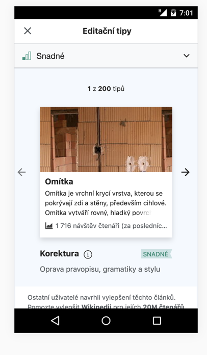
@RHo recorded a set of styling issues to be fixed on the mobile version of the suggested edits module:
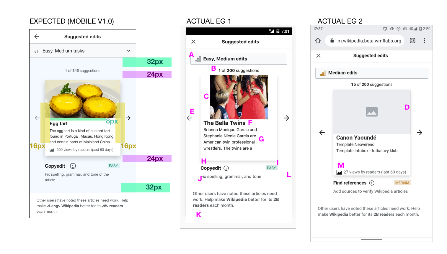
A. Filter issues ticketed separately in T238460: Newcomer tasks: difficulty filter styling issues on mobile
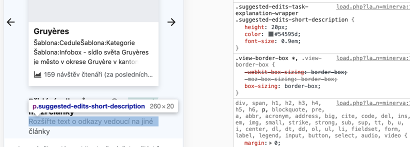
B. Suggested edits pager text should be…
( patch )
- font-size: 12.8px / 0.8em.
- have with 32px padding-top on mobile (between it and the filter)
- have with 24px padding-r on mobile (between it and the filter)
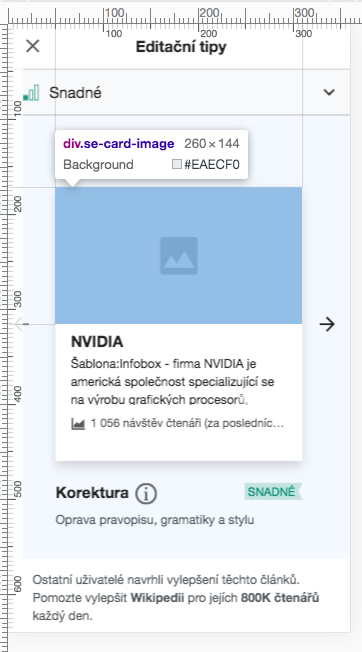
C. Image should be…
( patch )
- scaled to be full-width of card (See bottom of description for example of when this does not happen)
- height is 128px (ratio 1:2 with image width)
- is there any rules or algorithm used by Page Previews to center image previews on a person's face? Instead of cutting off faces?
D. Placeholder image should not have dark borders on the edges
( no longer an issue per T238280#5698220 )
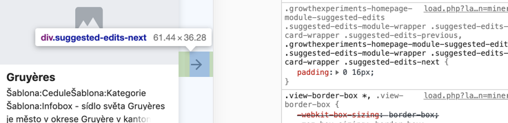
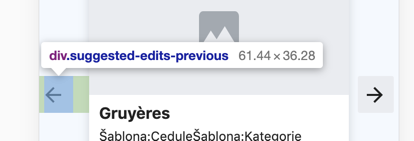
E. Left and right arrow icons should be 16px from left and right edges of card respectively, and sized 20x20px.
( patch )
F. Article text title should…
( patch )
- be font-size: 16px
- have 8px top padding (between it and the image)
- have 16px left and right padding
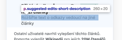
G. Article text extract should…
( patch )
- be font-size: 12.8px
- have 4px top padding (between it and the title)
- have 16px left and right padding
- have line-height: 19.2px
H. Suggested task explanation section should…
( done, can't find patch link at the moment)
- have padding-top 24px (between task type and bottom of card)
- have padding-bottom 32px (between task type short description text and card footer section)
I. Difficulty level tag should end with ribbon points ending flush against RHS edge of card (possibly fixed by adding to class .suggested-edits-difficulty-indicator { margin-right: 4px; }
( patch )
J. Task type short description text should be font-size 12.8px and line-height: 19.2px
( done, can't find patch link at the moment )
K. Card footer text should be font-size 12.8px and line-height: 19.2px
( patch )
L. Only the card footer is white, the rest of the Suggested edits module background-color should be rgba (234,243,255,0.5).
( patch )
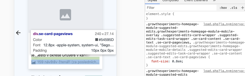
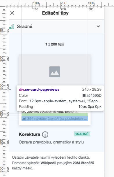
M. Pageviews icon and text should…
( patch )
- be vertically center aligned to each other (since text should only be kept to 1 line)
- have the text at font-size:12px
- have the icon at 16x16px (80% icon size)
- have the icon be coloured #54595d (or else #222 at opacity:0.75)
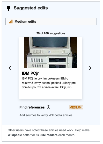
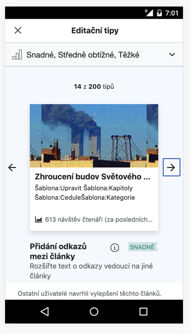
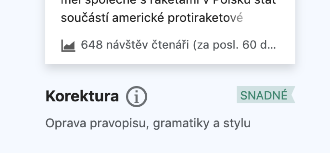
Example of image not being full width
When this article is a suggested edit: https://cs.wikipedia.org/wiki/IBM_PCjr
Its image ends up with white bars on the sides: