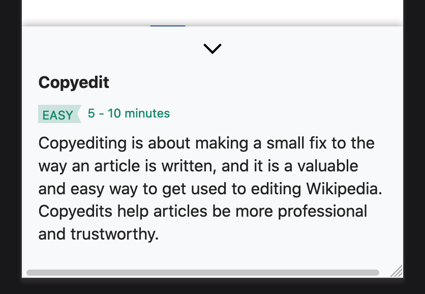
Currently on mobile, the task explanation widget is a popup like on desktop:

It should be a MobileFrontend Drawer component as shown in this mockup, here in Zeplin, and below.
| MMiller_WMF | |
| Nov 12 2019, 10:56 PM |
| F31464336: image.png | |
| Dec 9 2019, 9:01 PM |
| F31458878: IMG_8621.PNG | |
| Dec 5 2019, 11:08 PM |
| F31314693: image.png | |
| Nov 27 2019, 12:20 PM |
| F31290966: image.png | |
| Nov 26 2019, 11:23 AM |
| F31111699: image.png | |
| Nov 20 2019, 11:41 AM |
| F31059504: image.png | |
| Nov 12 2019, 10:56 PM |
| F31063492: image.png | |
| Nov 12 2019, 10:56 PM |
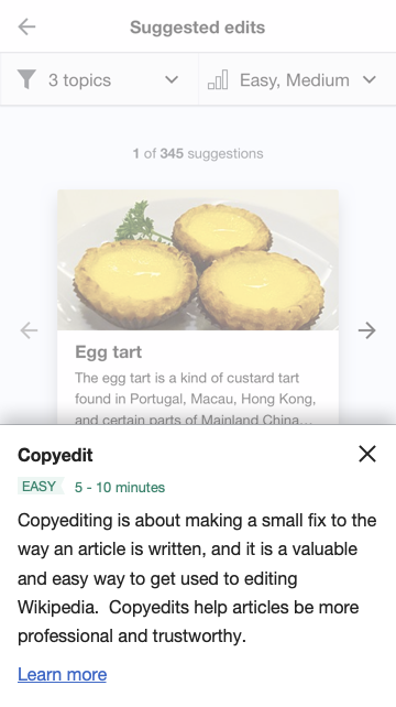
Currently on mobile, the task explanation widget is a popup like on desktop:
It should be a MobileFrontend Drawer component as shown in this mockup, here in Zeplin, and below.
| Status | Subtype | Assigned | Task | ||
|---|---|---|---|---|---|
| Resolved | MMiller_WMF | T227728 [EPIC] Growth: Newcomer tasks 1.0 | |||
| Resolved | kostajh | T232423 Newcomer tasks: suggested edits module | |||
| Resolved | Catrope | T235046 Newcomer tasks: task explanation widget | |||
| Resolved | kostajh | T238164 Newcomer tasks: Use Drawer component for mobile UI |
@MMiller_WMF I changed from toast to bottom sheet or dialog, since "toast" suggests it goes away by itself after some interval, but this dialog/sheet stays until the user taps on the X or outside of it.
@RHo Kosta pointed out elsewhere that the design is similar to the drawer component of MobileFrontend, but when the MF drawer is open, the rest of the page is dimmed (and inaccessible) but in the mockup here the top navigation bar is still accessible. Would it be OK to use the standard drawer UX? Dimming only parts of the page might be complicated even if we use a custom component, and it would be nice to avoid the code duplication.
hi @Tgr - yes I have updated the mocks so the nav bar is now also dimmed and we can use the standard drawer component. Thanks!
Change 552816 had a related patch set uploaded (by Kosta Harlan; owner: Kosta Harlan):
[mediawiki/extensions/MobileFrontend@master] Add Drawer to mobile.startup
Change 552817 had a related patch set uploaded (by Kosta Harlan; owner: Kosta Harlan):
[mediawiki/extensions/GrowthExperiments@master] (wip) Suggested Edits: Use Drawer component on mobile
Change 552816 abandoned by Jdlrobson:
Add Drawer to mobile.startup
Reason:
My bad. I see this came before https://gerrit.wikimedia.org/r/#/c/mediawiki/extensions/MobileFrontend/ /552614/ which I've just 2ed. They both achieve the same but the other seems to have the correctly built assets.
Hi @kostajh - for the sake of simplicity I think that's fine.
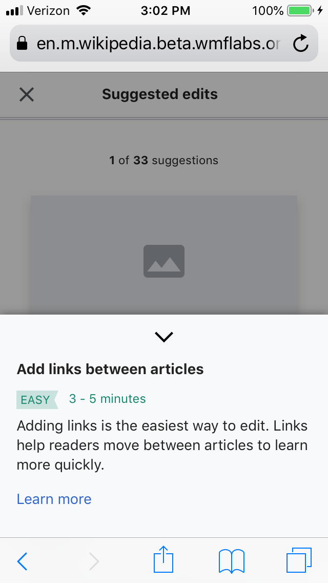
Unrelated(?): Is there a horizontal scroll happening inside that drawer, and if so can we remove it?
Unrelated(?): Is there a horizontal scroll happening inside that drawer, and if so can we remove it?
You're right that there is horizontal scroll, but it's not caused by the addition of the drawer (it's currently reproducible on beta), so we should probably deal with that in T238280
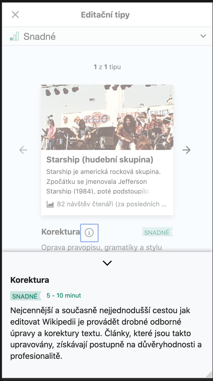
@RHo how does this look?

As discussed the down arrow is used in place of the X. The heading seems to be slightly different from the mock, and the link doesn't have an underline as in the mock. Do you want any adjustments to those?
Thanks for the changes @kostajh - It's ok for the link to not have the underline, but the title should be a bit larger and the same size as the article title in the card (16px) on mobile – but it's a little hard to tell if because that is still requiring some UI tweaks noted on T238280. Similarly the slightly misaligned baseline for the MEDIUM tag text and the time on task ("15 - 20 minutes") text may be resolved on that task.
Thanks for the changes @kostajh - It's ok for the link to not have the underline, but the title should be a bit larger and the same size as the article title in the card (16px) on mobile – but it's a little hard to tell if because that is still requiring some UI tweaks noted on T238280.
From what I can tell, the task type label with is already 16px, while the article title is 19.2px. Do you want the "Find references" to also be 19.2px?
Similarly the slightly misaligned baseline for the MEDIUM tag text and the time on task ("15 - 20 minutes") text may be resolved on that task.
Agreed, let's deal with that in a separate task.
Ah the article title should be 16px on mobile (same as the task type label) as per the Zeplin http://zpl.io/2ZmBXqq so it's only article title that needs to be fixed on T238280. This should be good then, thanks!
Change 552817 merged by jenkins-bot:
[mediawiki/extensions/GrowthExperiments@master] Suggested Edits: Use Drawer component on mobile
For @RHo review - functionality-wise, all seem to be in place.
Thanks @Etonkovidova - yes, you're right, the dimming expected is a white overlay @ 50% opacity, but this is using rgba(0,0,0,.8) @ opacity:50%.
@kostajh – is this effortful to customize? Would be good if this is relatively easy to change so it seems less 'heavy' an interaction.
^ That's what it looks like with a white background. I can push a patch for it, but is it a problem that this component is then inconsistent in appearance from the other Drawer component implementations?
Change 556058 had a related patch set uploaded (by Kosta Harlan; owner: Kosta Harlan):
[mediawiki/extensions/GrowthExperiments@master] Suggested edits: Lighten the dimming effect on Drawer component
Hmmm, I've thought about it and agree that on balance it is better to keep the semi-transparent black for consistency with other mobile drawers (like when tapping on references on articles). Sorry for the runaround!
Change 556058 abandoned by Kosta Harlan:
Suggested edits: Lighten the dimming effect on Drawer component
Reason:
Per T238164#5725842