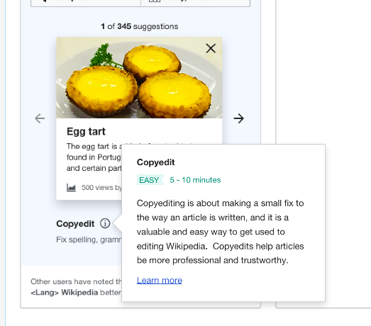
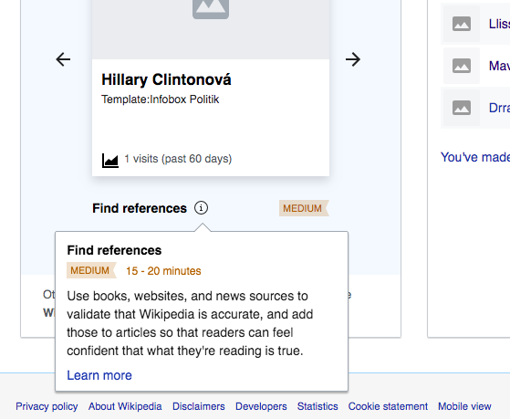
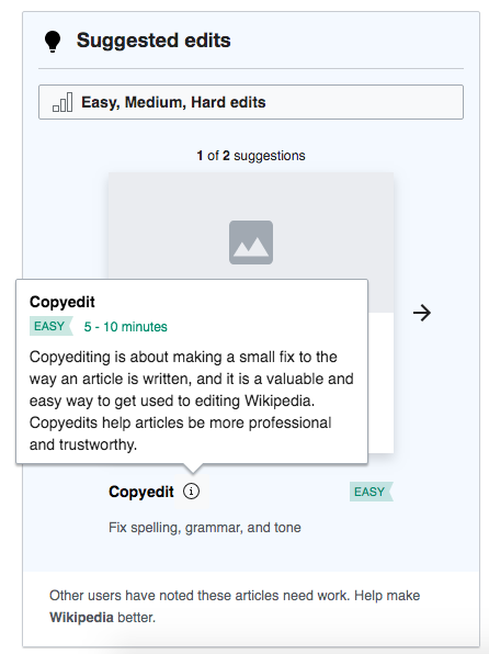
Currently, the task explanation widget is opened on hover, but only closes when the user clicks the "x" to dismiss or clicks away:
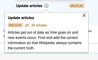
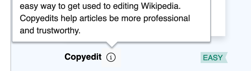
The widget should be dismissed just by the user moving their mouse away from the "i", with no "x" needed. Shown in this mockup and screenshot from mockup below: