NOTE: UI issues should be fixed according to the mobile mocks. For quick reference see the Invision mocks here, and redline specs see the Mobile Suggested edit mocks in the Growth Zeplin board (App link: zpl://project?pid=5bd0b069495b5d0a002e7eb6 or Web link)
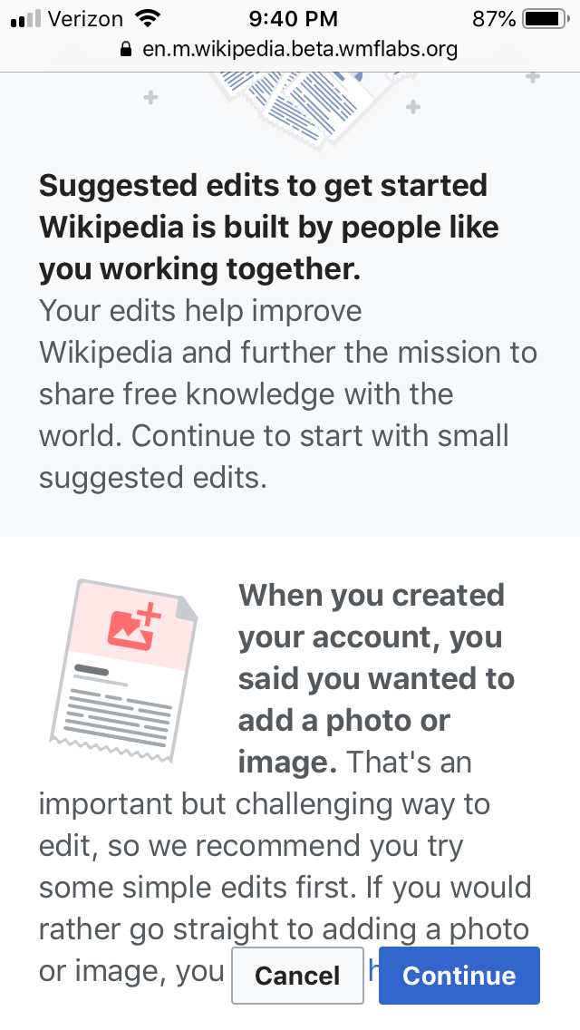
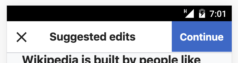
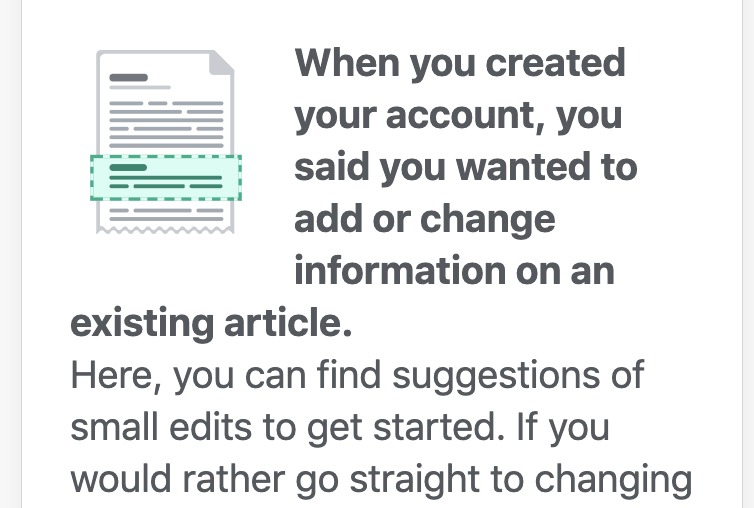
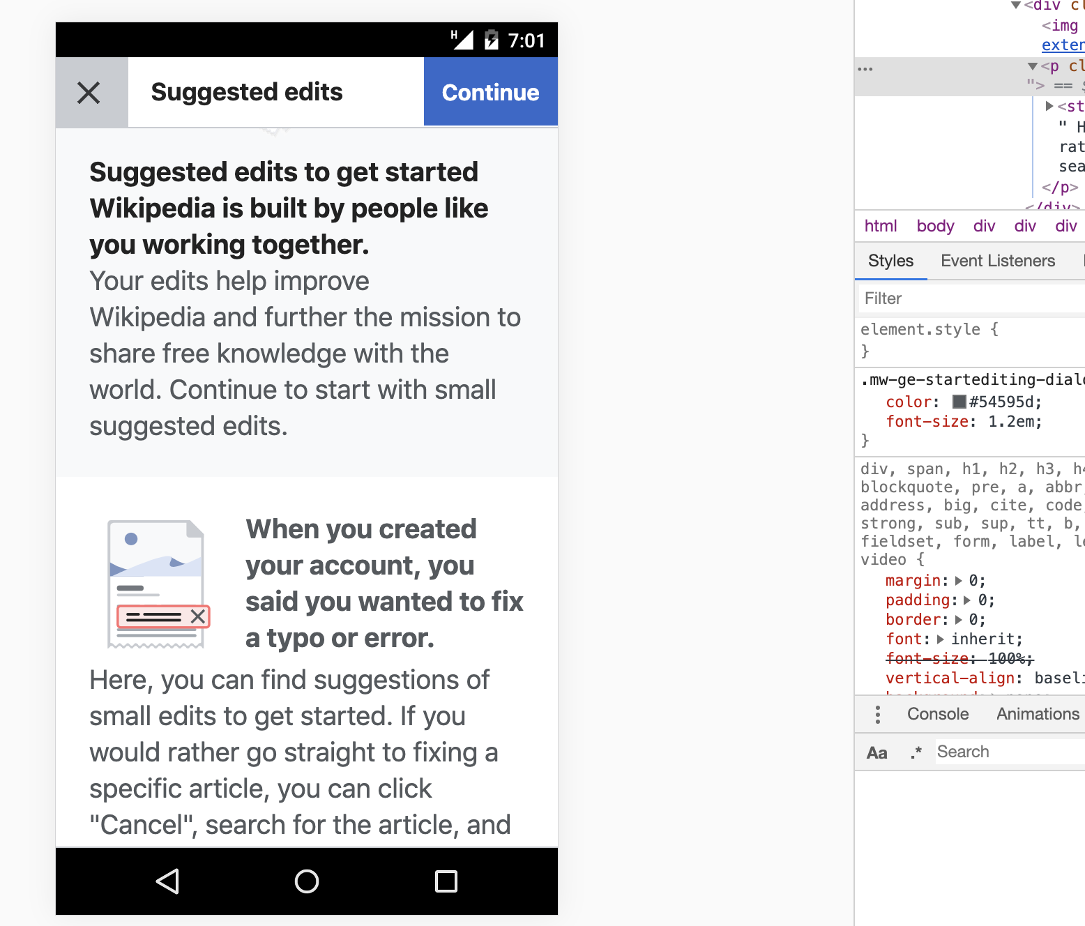
(1) Mobile Intro overlay display issues
- The link at the bottom of the intro screen cannot be clicked since it cannot be scrolled into the view
- CTA buttons should be sticky in the dialog header on mobile.
- Bold text headers should be a separate paragraph.
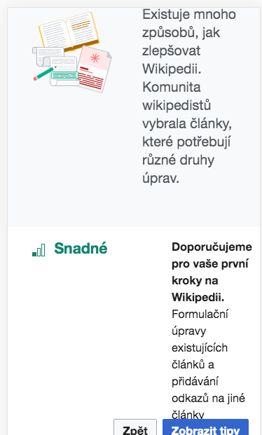
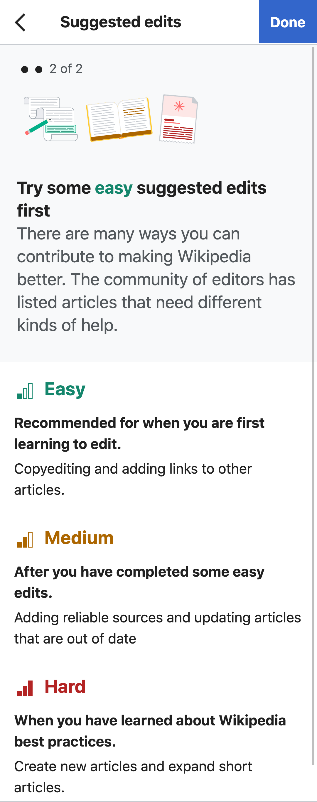
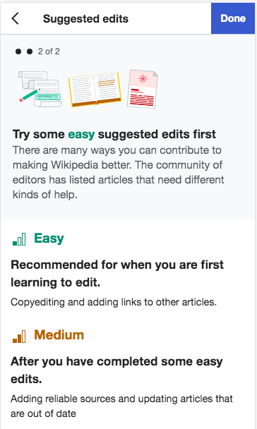
(2) Mobile version of Difficulty overlay should be a single column.
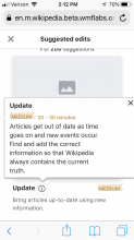
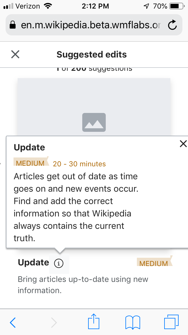
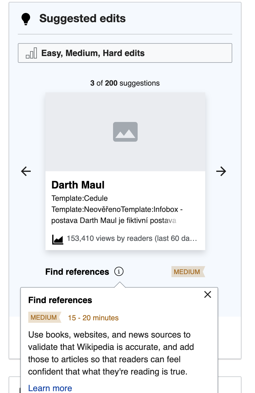
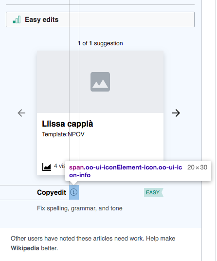
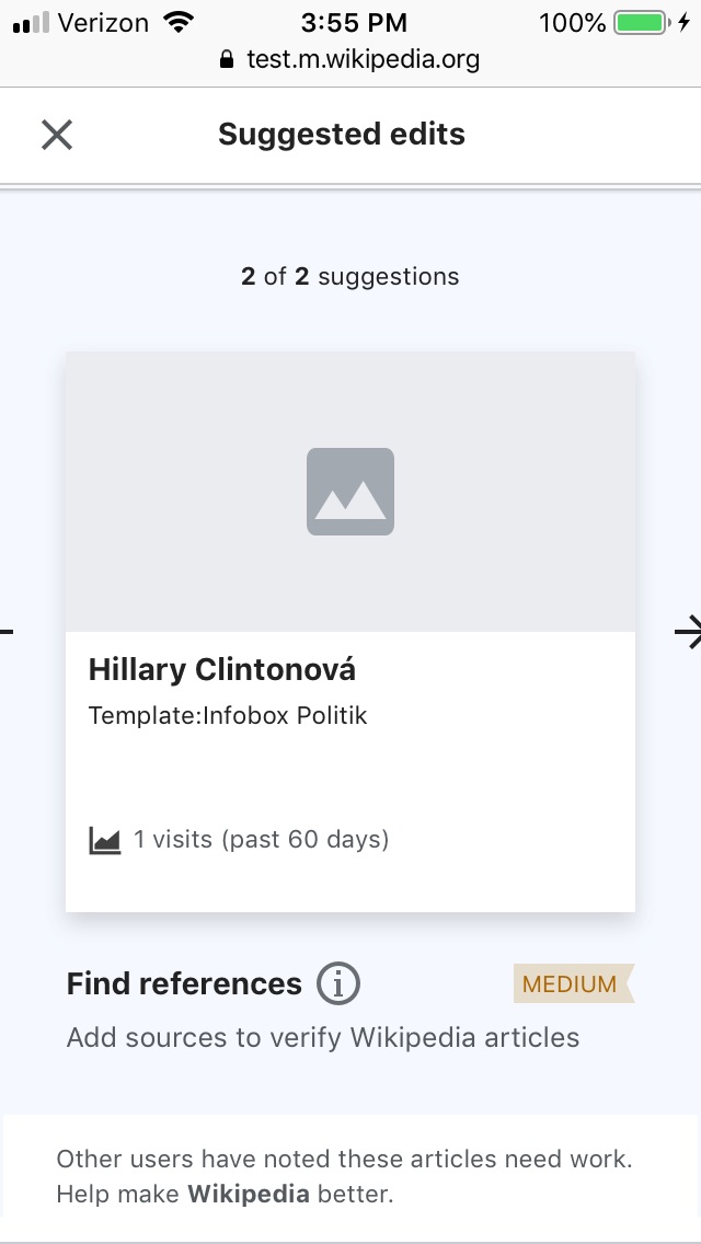
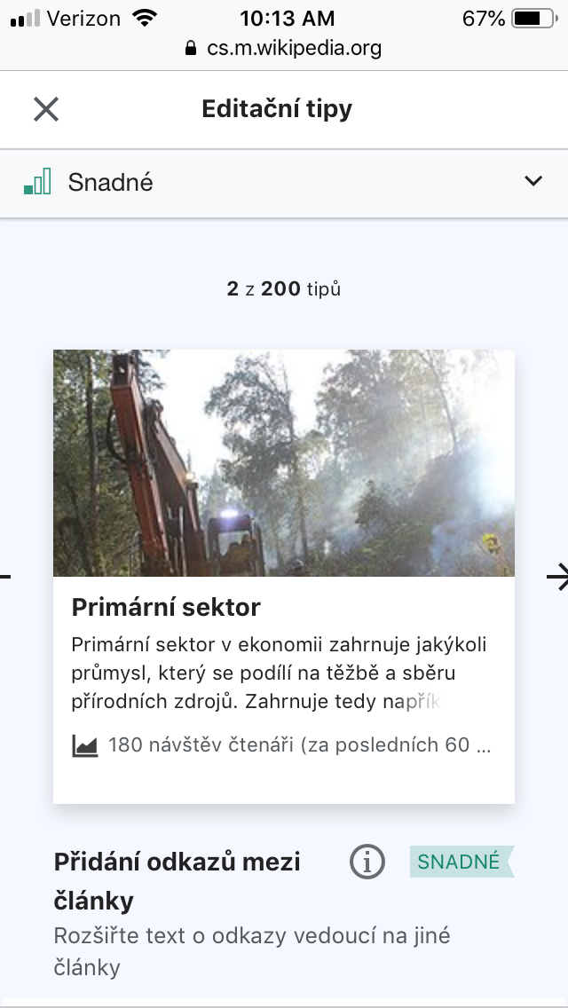
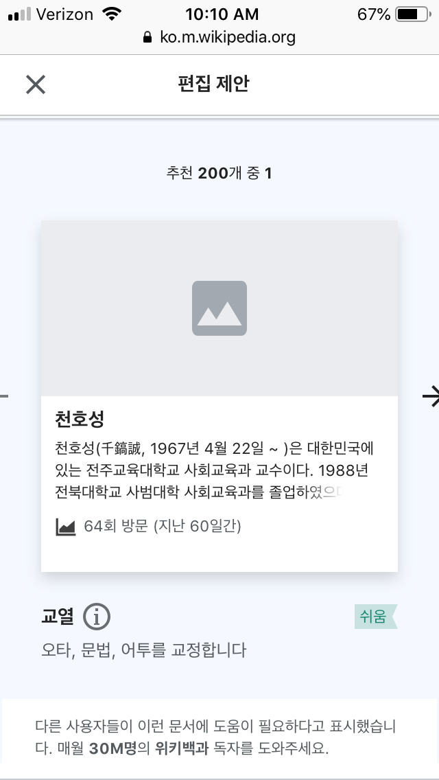
(3) Mobile suggested edits card
- The difficulty level labels should be centered
- Info "i" icon size and tap target should be larger on mobile
- More info card on mobile should be a full width card that appears up from the bottom (similar to how references on articles appear on in Minerva)
(4) "Get suggestions' and 'Cancel' buttons should not partially overlay the last portion of text
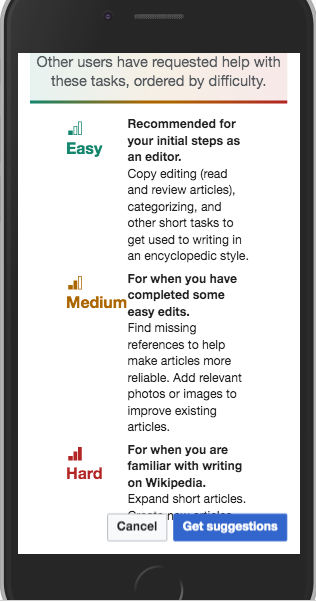
Per item (1), the buttons should be on the sticky header on mobile.
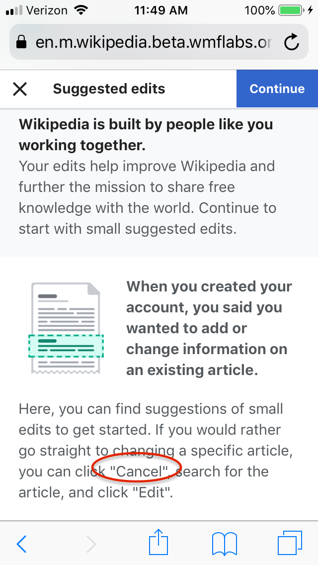
(5) The image should be different on mobile's difficulty overlay (it is Difficulty-landscape-rtl.svg found in T235444) to accommodate the mobile format.


