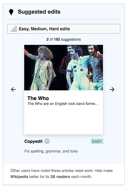
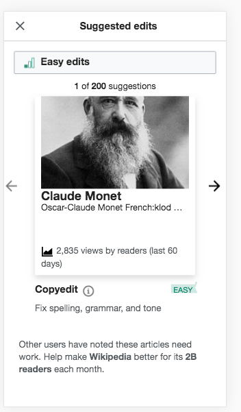
Problem:
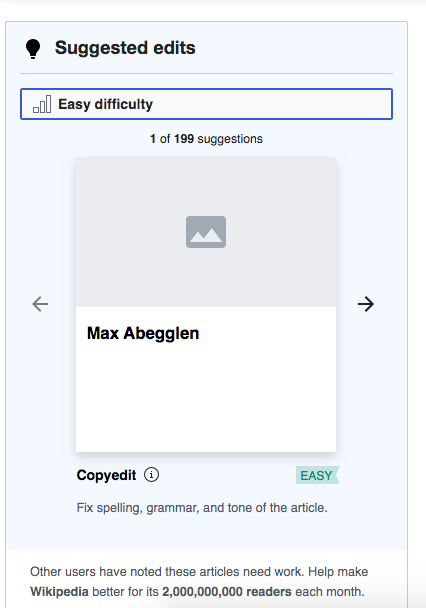
For V1.0 there is only one filter for task difficulty in the Suggested edits module. Currently the filter is shown as a centered button which is unexpected for a filter element:
Desktop
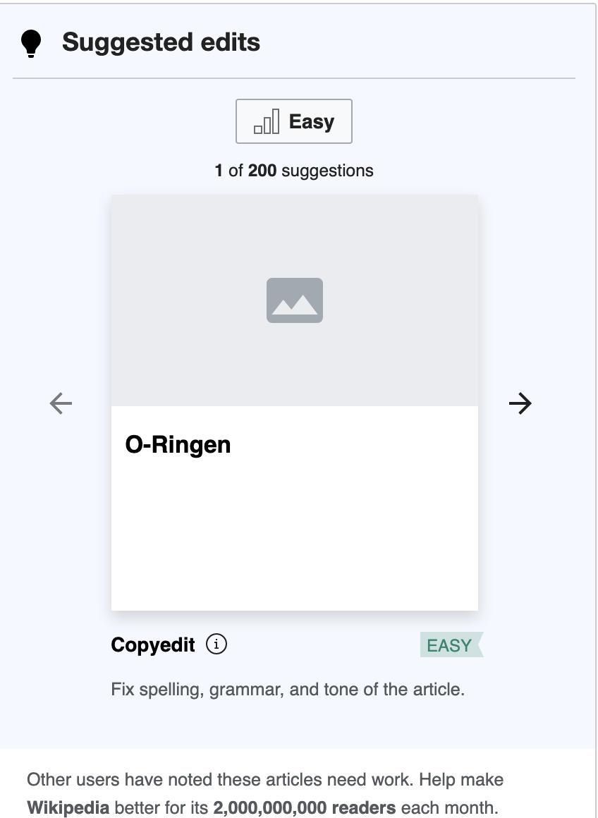
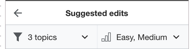
Proposed solution:
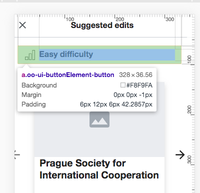
Make the filter button full width inside the Suggested edits module. It should read read "Easy, Medium edits" as opposed to "Easy, Medium tasks" as shown in the mockup.
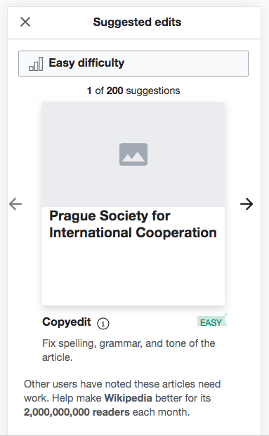
Desktop 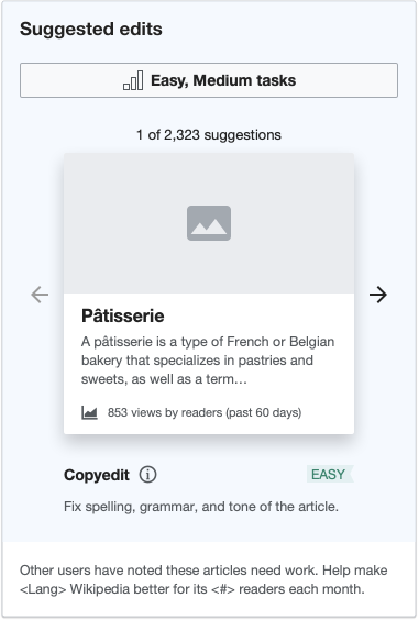 | Mobile 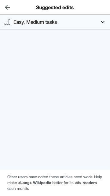 |