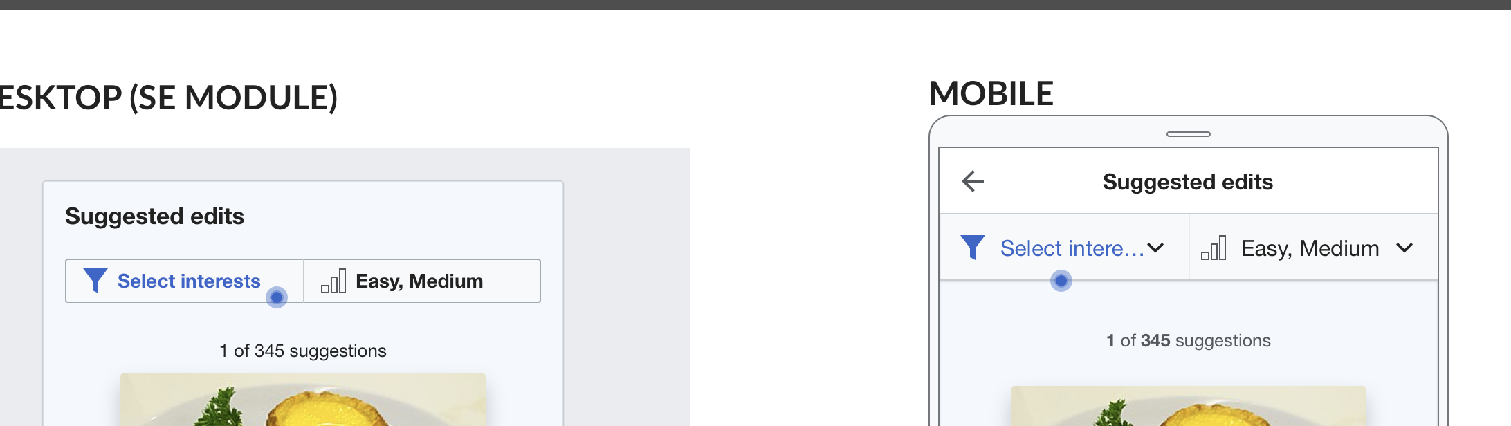
In T236841, we implemented a button to open the "difficulty filter" so that newcomers can change what types of tasks they receive. In this task, we will add a button to open the "topic filter", which allows newcomers to alter their topics of interest.
The specifications below are shown in this mockup and this mockup.
Specifically:
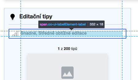
- The button should be adjoined to the difficulty filter button on the lefthand side.
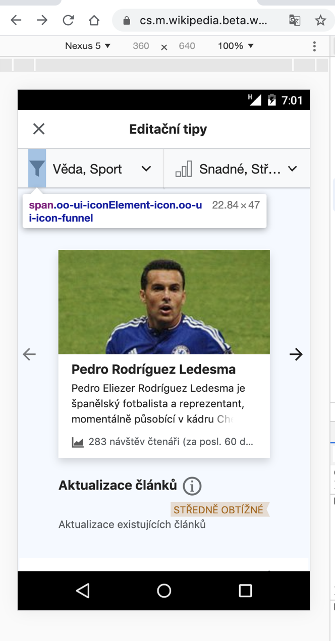
- On mobile, it should not be a button, but rather should be a menu bar with a "down" arrow (see T238460 for more information).
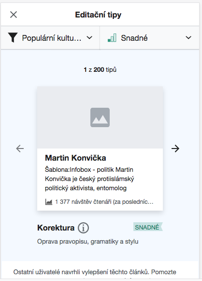
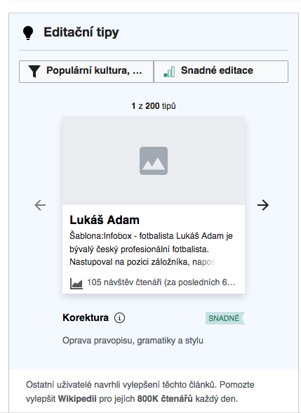
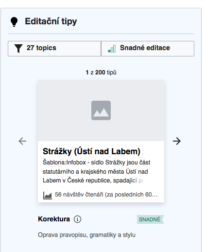
- It has a "funnel" icon.
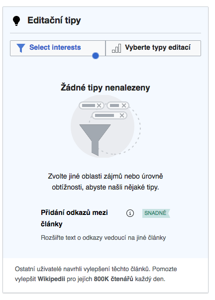
- When the user has no topics selected and has never had any topics selected (i.e. they decline to select topics in the intro overlay)...
- ...the button should read "Select interests".
- ...the button should be styled with progressive blue text and icon.
- ...the button should have a pulsing blue dot.
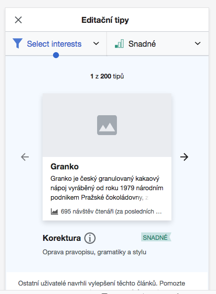
- When the user has no topics selected and has had topics selected in the past (i.e. they had topics but subsequently removed them)...
- ...the button should read "Select interests".
- ...the button should be styled with normal black text and icon.
- ...the button should not have a pulsing blue dot.
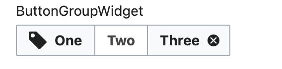
- When the user has up to 2 topics selected...
- ...the button should be styled with normal black text and icon.
- ...the button should state the names of the topics the user has selected until it runs out of space, and should have an ellipses., e.g. "Food and drink, Scien..." The order of topics can just be the order as displayed in the selection experience.
- When the user has 3 or more topics selected...
- ...the button should be styled with normal black text and icon.
- ...the button should state the number of topics the user has selected like this: "3 topics", "7 topics", etc.