Page MenuHomePhabricator

Newcomer tasks: topic filters
Closed, ResolvedPublic

Description

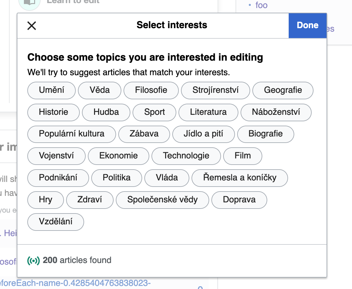
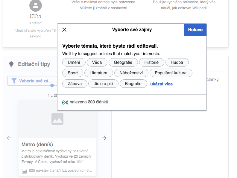
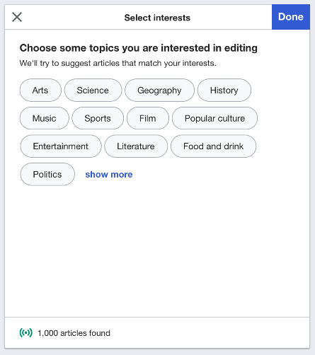
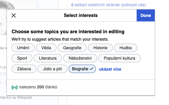
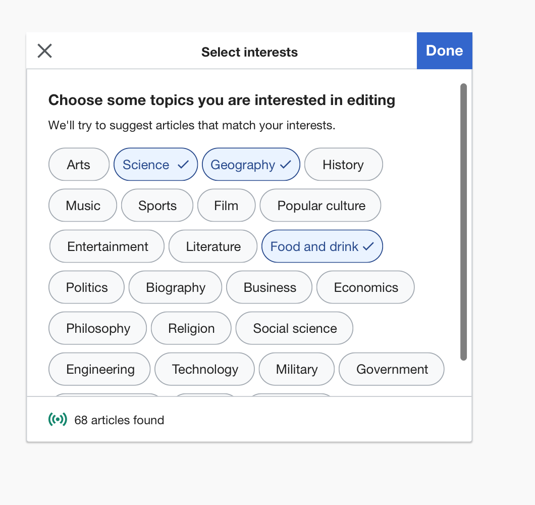
In T235042, we implemented a filter where users can choose the type of task they want to do. The following work is similar, but for a filter in which they choose the topics they're interested in.

This filter should contain the exact same content and rules as used in the bottom half of the intro overlay, specified here: T238610: Newcomer tasks: include topics in intro overlay.

The mockups for the filter are in this screen and this screen.

The only exception is that whereas the intro overlay updated the article count based on the default difficulty level settings for user initiating suggested edits, this filter dialog should update the article count based on whichever task types the user has selected at the time they are interacting with the filter.

Event Timeline

Although this is in Ready for Development, I think it will be easier to do once T238610 and T240512 are wrapped up.

On second thought, since I can't wrap this up before signing off for the afternoon I'll leave it for @Catrope or @Tgr. If it's still unclaimed tomorrow (or someone wants to start it and hand it off) I can pick it up then.

Like Kosta I also ran out of time, so I'll put this back in the pool so that either Kosta can pick it up in his morning, or I can pick it up in my morning tomorrow.

The only exception is that whereas the intro overlay updated the article count based on the default difficulty level settings for user initiating suggested edits, this filter dialog should update the article count based on whichever task types the user has selected at the time they are interacting with the filter.

As I'm looking at this, cognitively, I find it weird that the counter shows 200 articles even when all topics are deselected. The 200 count is correct because it queries by the task types I have selected, but we might want to think about hiding the article counter until the user selects some topics.

image.png (934×1 px, 163 KB)

Change 563453 had a related patch set uploaded (by Kosta Harlan; owner: Kosta Harlan):
[mediawiki/extensions/GrowthExperiments@master] Suggested Edits: Add topic filters dialog

https://gerrit.wikimedia.org/r/563453

Change 563453 merged by jenkins-bot:
[mediawiki/extensions/GrowthExperiments@master] Suggested Edits: Add topic filters dialog

https://gerrit.wikimedia.org/r/563453

Change 564000 had a related patch set uploaded (by Kosta Harlan; owner: Kosta Harlan):
[mediawiki/extensions/GrowthExperiments@master] Suggested Edits: Expand filters if below the fold item is checked

https://gerrit.wikimedia.org/r/564000

Change 564007 had a related patch set uploaded (by Kosta Harlan; owner: Kosta Harlan):
[mediawiki/extensions/GrowthExperiments@master] Suggested Edits: Fix button label from done state

https://gerrit.wikimedia.org/r/564007

Change 564000 merged by jenkins-bot:
[mediawiki/extensions/GrowthExperiments@master] Suggested Edits: Expand filters if below the fold item is checked

https://gerrit.wikimedia.org/r/564000

Change 564007 merged by jenkins-bot:
[mediawiki/extensions/GrowthExperiments@master] Suggested Edits: Fix button label from done state

https://gerrit.wikimedia.org/r/564007

The only exception is that whereas the intro overlay updated the article count based on the default difficulty level settings for user initiating suggested edits, this filter dialog should update the article count based on whichever task types the user has selected at the time they are interacting with the filter.

As I'm looking at this, cognitively, I find it weird that the counter shows 200 articles even when all topics are deselected. The 200 count is correct because it queries by the task types I have selected, but we might want to think about hiding the article counter until the user selects some topics.

image.png (934×1 px, 163 KB)

Interesting, to me "200 articles found" when no topic filters have been selected, make sense actually for two reason - first, because there is a difficulty level is always selected and, and ssecondly, by selecting a topic, users narrow the search since there are articles that do not belong to any topic.
For example - the difficulty level: Easy, the option is selected: "Přidání odkazů mezi články", no topics are selected - the number of fetched articles is 41 (cswiki betalabs) Add to the criteria all topics, the number of articles will be 26. However, it'd be great to hear user feedback on whether the filter logic is clear.

Several things to consider

  • On desktop when "show more" is no clicked, the dialog size is smaller than in the mockup

Screen Shot 2020-01-14 at 1.36.54 PM.png (594×792 px, 96 KB)

Thanks, @Etonkovidova. Since you filed two of the issues separately, I'm putting this back in Ready for Development to address the middle issue about the size of the dialog. Here it is side-by-side:

mockupbeta
image.png (502×445 px, 35 KB)
image.png (354×569 px, 42 KB)

The dialog should be a consistent size, matching the size of the difficulty filter dialog.

The dialog should be a consistent size, matching the size of the difficulty filter dialog.

That's not trivial to do, if you mean that you want both dialogs to have the same height. Both dialogs need to be able to vary their height depending on the contents, which will vary by language. So we'd need to calculate the necessary height for the difficulty filter dialog before opening the topic filter dialog, and vice versa.

If you want to enforce a minimum height for both, that is doable but at the cost of unnecessary whitespace (as is shown in the mockup). That's a lot easier to do though. Which would you prefer?

@kostajh -- I prefer the minimum height route, which @RHo deliberately included in the mockup. I'm not sure what the minimum height should be, though, so perhaps you can choose. But in general we want it to be something like the default height of the difficulty filter dialog.

Do we really care about the difficulty and topic dialogs being the same size, or is it just that the topic dialog should be tall enough to not change when the user clicks "show more"? That seems a lot easier.

@Tgr -- I talked to another designer, who thinks that this size thing is not actually a big deal. I'll pass this along to design review and @RHo can double-check when she's back.

The dialog should be a consistent size, matching the size of the difficulty filter dialog.

That's not trivial to do, if you mean that you want both dialogs to have the same height. Both dialogs need to be able to vary their height depending on the contents, which will vary by language. So we'd need to calculate the necessary height for the difficulty filter dialog before opening the topic filter dialog, and vice versa.

If you want to enforce a minimum height for both, that is doable but at the cost of unnecessary whitespace (as is shown in the mockup). That's a lot easier to do though. Which would you prefer?

@kostajh -- I prefer the minimum height route, which @RHo deliberately included in the mockup. I'm not sure what the minimum height should be, though, so perhaps you can choose. But in general we want it to be something like the default height of the difficulty filter dialog.

Apologies for the confusion but the dialog mock on desktop was using the same height as the intro and topic overlays mocks. The expectation is that the dialog opens at a specific width and height that does not change when "show more" topics is selected. If showing all topics causes them to overflow then the contents should scroll within the dialog as can be seen in the Search widget and Continuous outlined booklet dialogs on the OOUI demo page

This is what the dialog would look like with scrolling:

image.png (1×1 px, 131 KB)

@kostajh @RHo -- I am going to resolve this task, and put these points in T244421: Newcomer tasks: UX changes for ORES topics, because that work will adjust this topic filter dialog again.