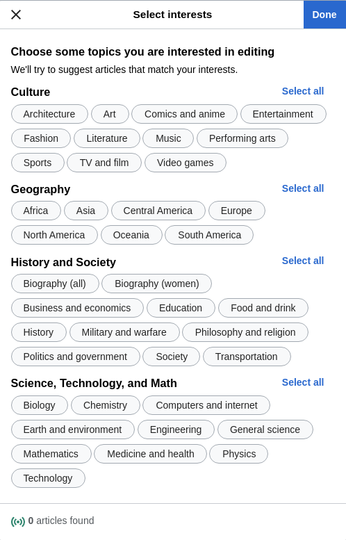
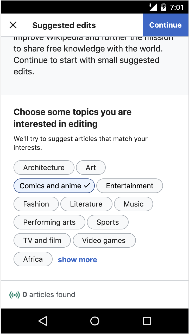
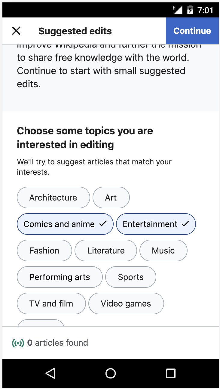
The new ORES topic models have a more extensive ontology than what we originally implemented for the morelike version in T238610: Newcomer tasks: include topics in intro overlay and T238612: Newcomer tasks: topic filters.
In the morelike version we have 27 topics, and we show 12 by default, with the other 15 appearing when the user clicks "show more".
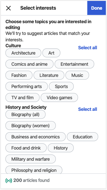
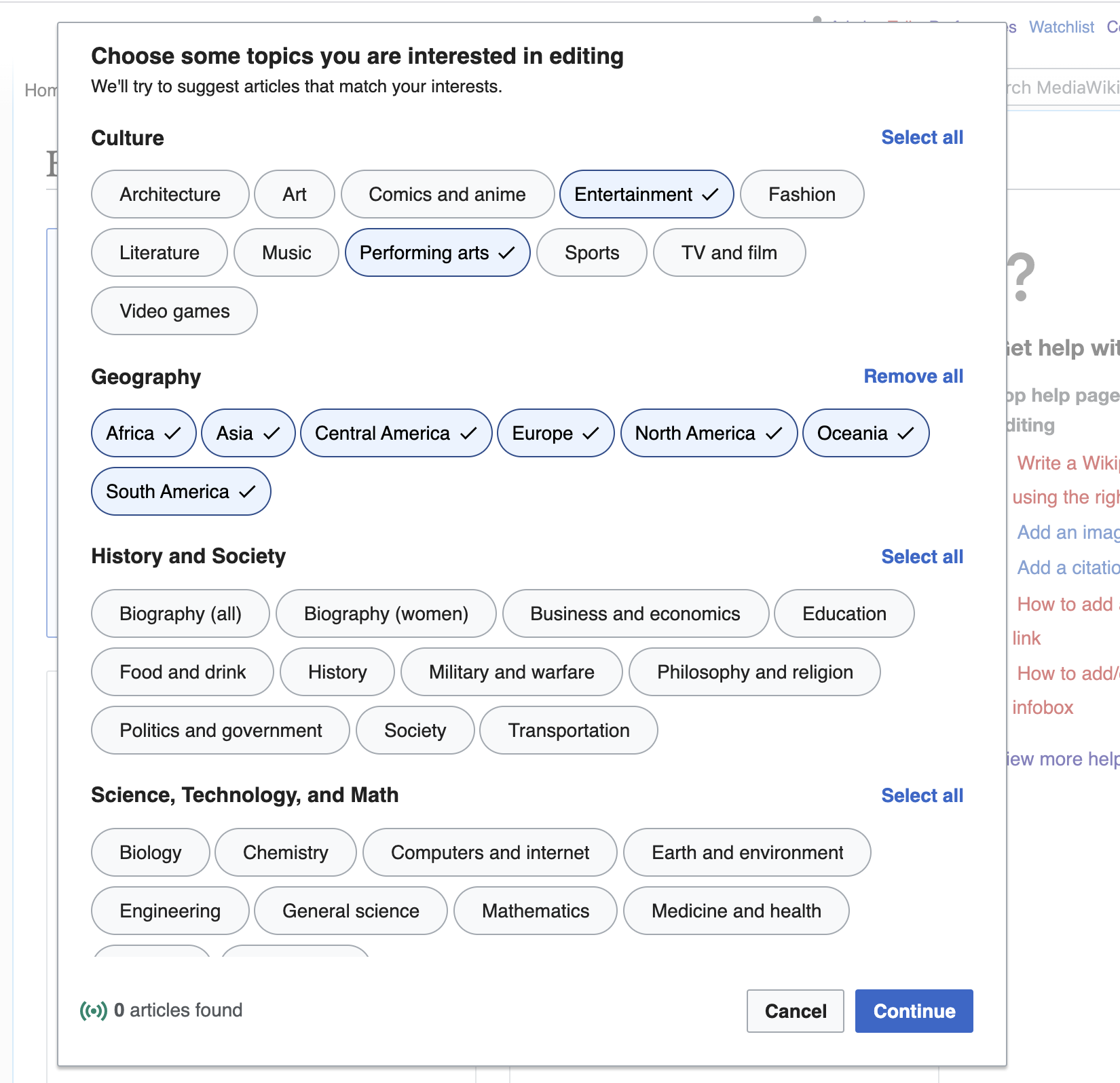
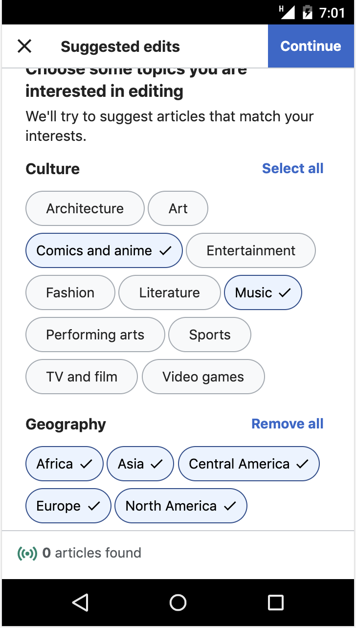
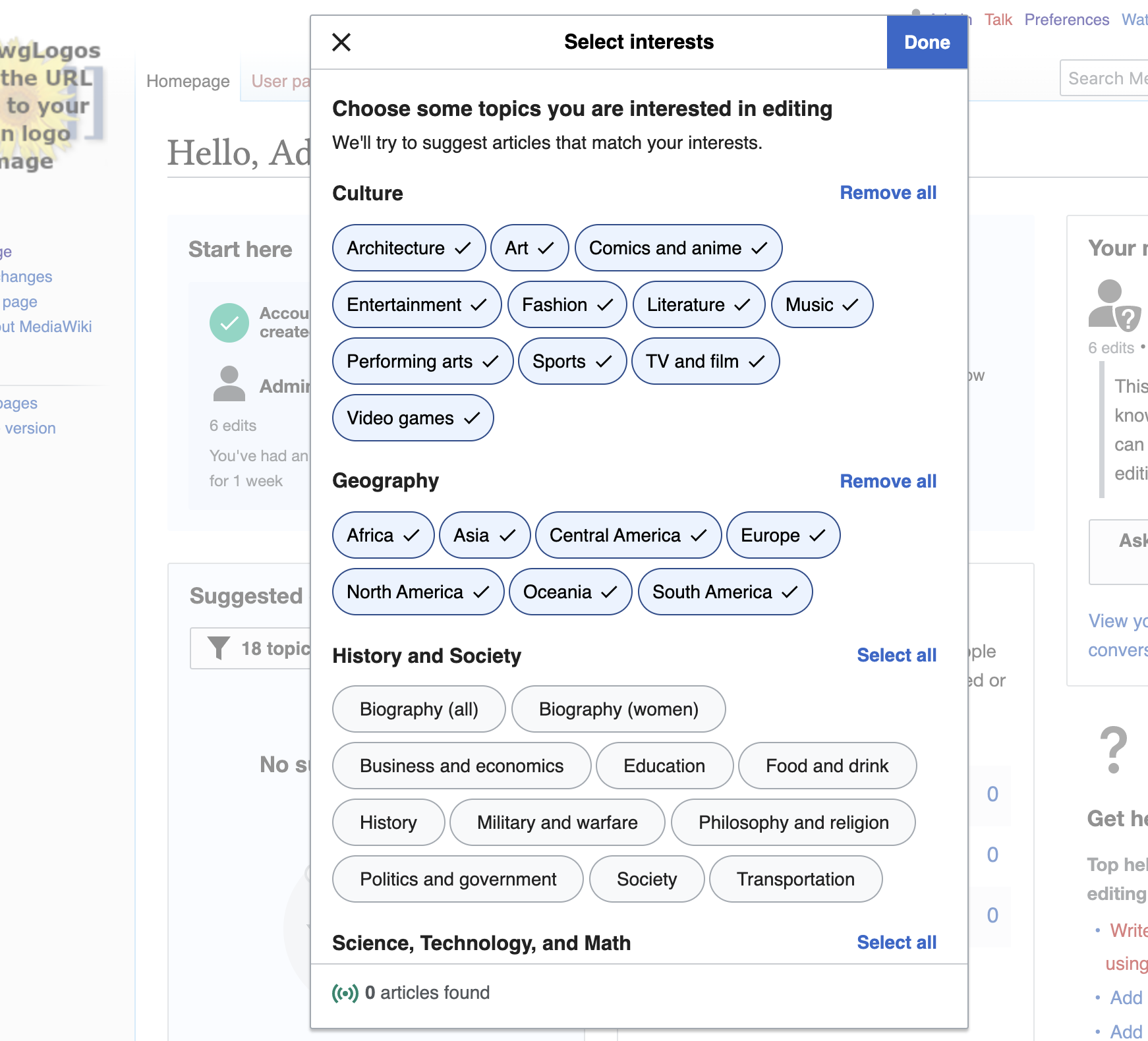
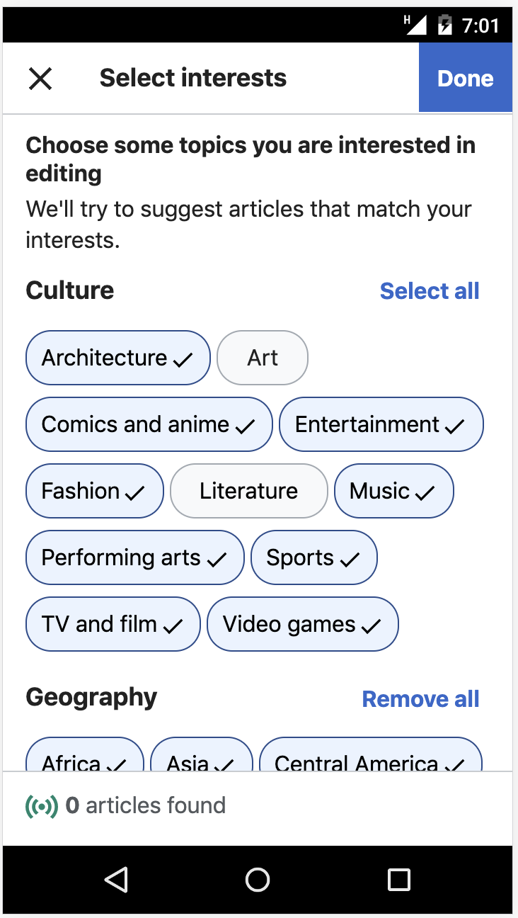
The way we will use the ORES ontology (as described in T244192: Newcomer tasks: ORES ontology mapping and score thresholds) will give us 39 topics, and we have broken them into four headers. Therefore, below are specifications on how we want to change the topic selection experience in both the topic overlay and the topic filter dialog.
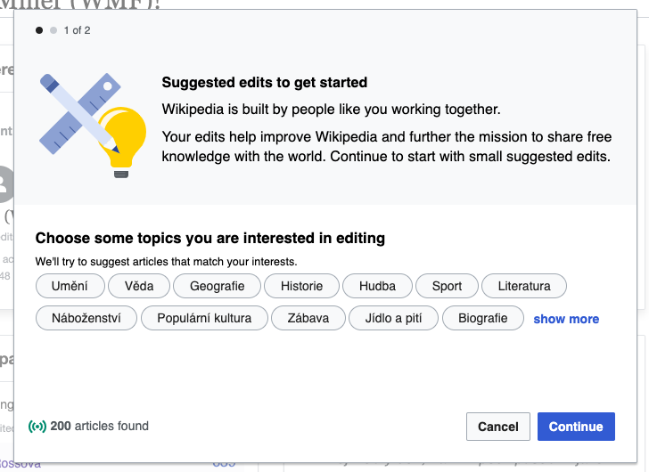
Prototype
This interactive prototype shows how the topic filter should behave with the new topics:
Though the prototype only shows the topic filter, the same changes should be made to the topic overlay, shown when the user initiates the suggested edits module.
And if we want to see how this will look in our target languages, there are also the analogous prototypes below, which are controlled by this spreadsheet (which initially has Google Translate translations, but can be altered by our ambassadors if we wish):
Specifications
- The topic pill buttons should be organized under four headers, in this order (regardless of language):
- Culture
- History and Society
- Science, Technology, and Math
- Geography
- Under each header, the relevant topic pills should be shown alphabetized, according to alphabetization of the language.
- We should implement the "select all" and "deselect all" links that are shown in the mockup. If there are no buttons selected under a header, the link should read "select all". If there are any selected, it should read "remove all". Note that this language is slightly different than what is shown in the mockup.
- These additions will require the topic overlay and the topic filter dialog to be scrollable on both desktop and mobile.
- The topic overlay and topic filter dialog mock should be the same fixed height as each other, and as the difficulty overlay. To display more content than fits, the contents should scroll within the dialog as can be seen in the Search widget and Continuous outlined booklet dialogs on the OOUI demo page.
Visual details
In T238610#5861323, @RHo listed visual design issues with the original topic overlay that contained morelike topics. That task has been resolved, and those outstanding issues are listed below, and should be addressed in the process to update the overlay and filters to contain the ORES models.
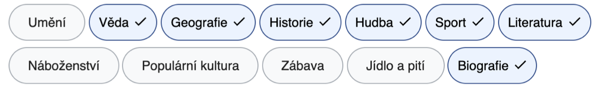
Yes, besides this item, there are other small visual design issues with the topic tags size and spacing.
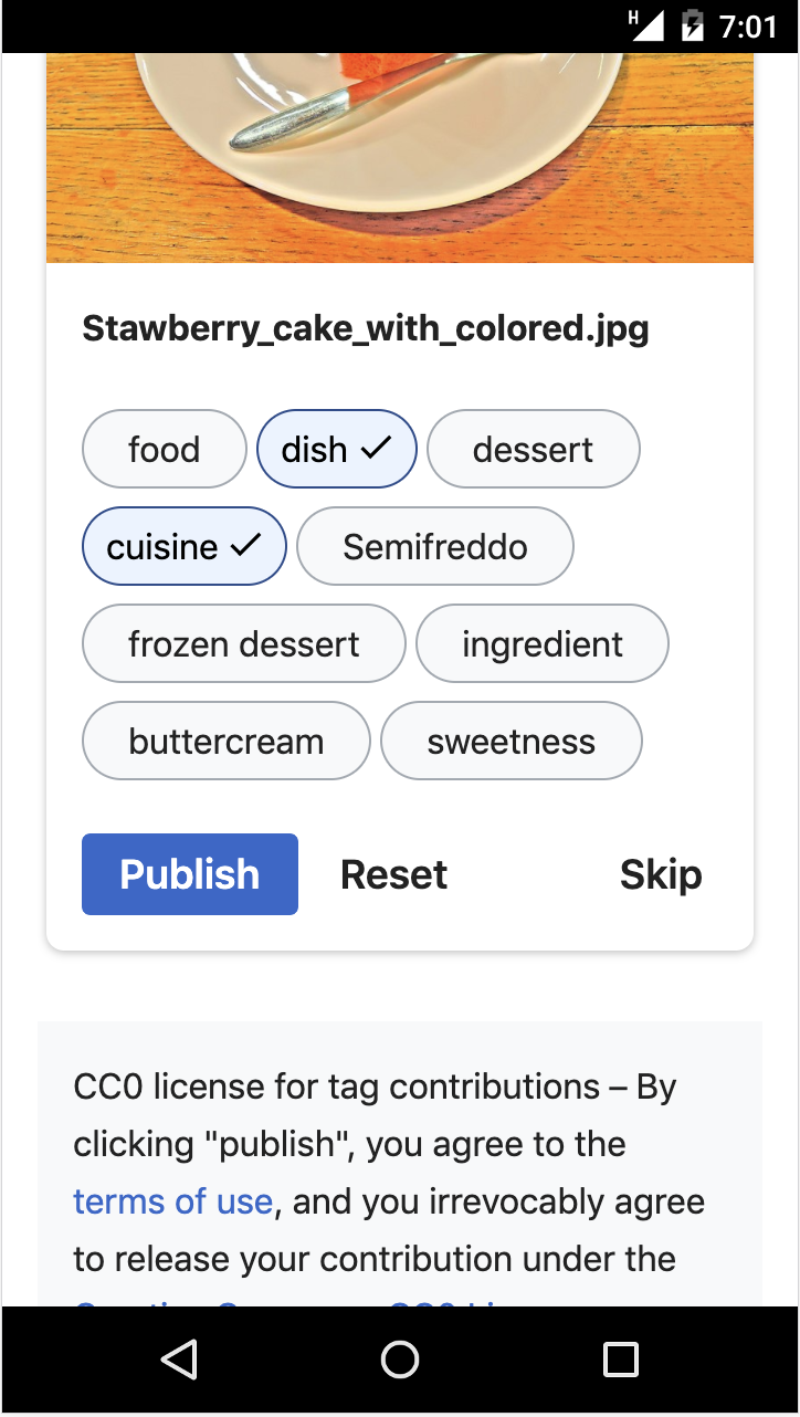
1. Minor visual fixes to the topic ‘pills’
(i) Height of topic “pills” should be 36px (mobile and desktop)
(ii) More spacing around topic text is expected
(iii) When the topic is selected, there should be ore spacing between text and checkmark icon, and icon from RHS edge of pillThe above items can be fixed by changing a few properties on the following classes:
.wbmad-suggestion-wrapper .wbmad-suggestion {
padding: 8px 20px;  // changed from padding:2px 1.25em
border-radius: 20px;  // increase border-radius to account for taller pill)
}

.wbmad-suggestion-wrapper .wbmad-suggestion--confirmed .oo-ui-labelWidget {
  transform: translateX(-10px);  //decreases space between topic text and LHS edge of pill
}

.wbmad-suggestion-wrapper .wbmad-suggestion--confirmed .oo-ui-iconElement {
  right: 10px; // moves checkmark slightly further away from RHS edge of pill
}
Expected result:
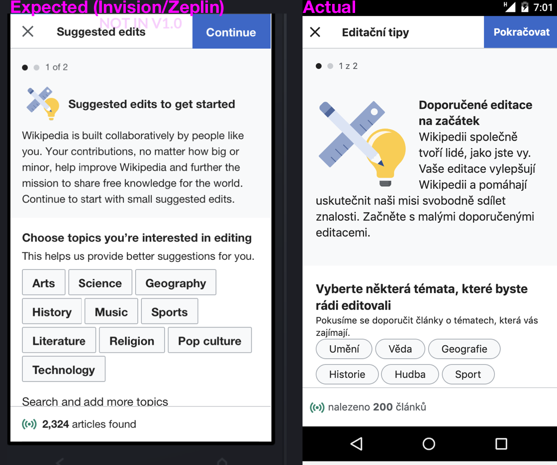
2. Desktop-specific items
(i) Dialog should not change height when “show more” is tapped
(ii) Add an extra 10px space between the topic intro text and the first row of topics
(iii) From T243365 - topic intro text should not wrap underneath the overlay illustration.3. Mobile-specific items
It looks like the mobile version of the topic overlay was not covered in the review, and there are a few differences between expected vs actual.
(i) Size of illustration is larger than expected
(ii) The illustration and topic header text should be vertically center-aligned
(iii) The intro/explanatory paragraph should be left aligned with the illustration and not wrap around the illustration.
(iv) The intro/explanatory paragraph text size is larger than expected.