Page MenuHomePhabricator

[BUG][Regression] Newcomer tasks: Blue pulsing dot on the tasks topics filters is no longer centered as expected
Closed, ResolvedPublicBUG REPORT

Description

This was first noticed during testing of T258005

Steps to Reproduce:
Open the newcomer homepage on Desktop and activate the Suggested edits task module.

Actual Results:
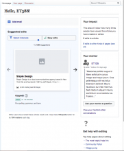
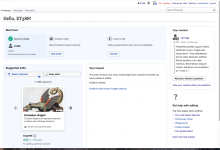
Dot is not centered (on any variant)

Variant A
Screen Shot 2020-10-08 at 10.19.24 AM.png (876×1 px, 291 KB)
Variant C/D
Screen Shot 2020-10-08 at 11.05.08 AM.png (779×642 px, 118 KB)

Expected Results:
Blue dot should be on the centre of the topics filter button
Event Timeline

RHo renamed this task from [BUG][Regression] Newcomer tasks to [BUG][Regression] Newcomer tasks: Blue pulsing dot on the tasks topics filters is no longer centered as expected.Oct 12 2020, 9:33 AM
RHo updated the task description. (Show Details)
RHo added a subscriber: Growth-Team.

This was implemented with right: 10% per T238611#5789718 and T238611#5790124, but I will make a patch to center it on desktop.

Change 633708 had a related patch set uploaded (by Kosta Harlan; owner: Kosta Harlan):
[mediawiki/extensions/GrowthExperiments@master] SuggestedEdits: Center blue dot on desktop

https://gerrit.wikimedia.org/r/633708

This was implemented with right: 10% per T238611#5789718 and T238611#5790124, but I will make a patch to center it on desktop.

Ah yes, I think I missed commenting on this, that in fact both on Desktop and Mobile it should centered. Thanks for the fix, this LGTM:

image.png (558×1 px, 43 KB)

Change 633708 merged by jenkins-bot:
[mediawiki/extensions/GrowthExperiments@master] SuggestedEdits: Center blue dot on desktop

https://gerrit.wikimedia.org/r/633708

Etonkovidova claimed this task.
Etonkovidova subscribed.

Done .
Checked

  • A/C/D variants
  • mobile

Screen Shot 2020-10-14 at 9.13.11 AM.png (568×736 px, 52 KB)