Page MenuHomePhabricator

CU 2.0 - Block: Select users and IPs to block
Closed, ResolvedPublic3 Estimated Story PointsJul 28 2020

Assigned To
Authored By
Niharika
Mar 25 2020, 11:21 PM
Referenced Files
F31943301: filtered_out_user_block_form.png
Jul 21 2020, 4:17 PM
F31941792: narrow.png
Jul 20 2020, 9:55 AM
F31941794: narrow_block.png
Jul 20 2020, 9:55 AM
F31934721: image.png
Jul 14 2020, 6:39 AM
F31934725: image.png
Jul 14 2020, 6:39 AM
F31934719: image.png
Jul 14 2020, 6:39 AM
F31934713: image.png
Jul 14 2020, 6:39 AM
F31934717: image.png
Jul 14 2020, 6:39 AM

Description

Goal

As a user, I need to block sock accounts from the CheckUser interface so I can prevent spread of vandalism on the wiki.
This feature is to bring the existing block feature in CheckUser to the new CheckUser version.

Acceptance criteria
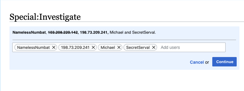
  • There is a Block button next to the usernames on the top (the strikethroughs won't be implemented in this task):

image.png (366ร—1 px, 81 KB)

  • Clicking the Block button opens a section in the blue box with a TagMultiselectWidget. It should be prefilled with all the users that haven't been filtered out, in the order that they're showing up in the text above. The auto-complete should only work for users in that investigation (including the filtered out ones)

block opens menutag.png (300ร—800 px, 36 KB)

  • After a user selects users, IPs and clicks the Continue button, it takes them to the Special:Investigate block page (see T248528: CU 2.0: Blocking - add new Special:InvestigateBlock ) with the "Usernames and IP addresses" input pre-filled with the usernames and IPs selected by the user.
  • The Special:Investigate block will retain the context of the investigation: The multi-select widget will autocomplete for all targets that were in the investigation, even those that weren't selected in the popup.

Event Timeline

Niharika triaged this task as Medium priority.Mar 25 2020, 11:21 PM
Niharika created this task.
Restricted Application added a subscriber: Aklapper. ยท View Herald TranscriptMar 25 2020, 11:21 PM

Following a conversation with @SPoore and @cwylo about whether it is acceptable to have the block targets in the URL for Special:InvestigateBlock, it was decided that it is acceptable, since check users are already careful not to block user accounts and IP addresses simultaneously when using the multiple blocks tool in Special:CheckUser. They already need to be careful because the history of when blocks were made, and against whom, is already available via the block log.

Change 611398 had a related patch set uploaded (by Tchanders; owner: Tchanders):
[mediawiki/extensions/CheckUser@master] Add block form to Special:Investigate

https://gerrit.wikimedia.org/r/611398

Following a conversation with @SPoore and @cwylo about whether it is acceptable to have the block targets in the URL for Special:InvestigateBlock, it was decided that it is acceptable, since check users are already careful not to block user accounts and IP addresses simultaneously when using the multiple blocks tool in Special:CheckUser. They already need to be careful because the history of when blocks were made, and against whom, is already available via the block log.

In the end, I opted for using POST instead of passing the targets through the URL, because I realised that we will need to send all of the targets in order to fulfil this criterion:

  • The Special:Investigate block will retain the context of the investigation: The multi-select widget will autocomplete for all targets that were in the investigation, even those that weren't selected in the popup.

We may need to do more work in order to fulfill this criterion... It's easy to limit the small widget on Special:Investigate to the targets in the investigation, since that widget can be a TagMultiselectWidget, as specified in the task description. That works because:

  • It doesn't need to confirm that the users are valid, because it won't actually be attempting to make any blocks
  • A dropdown menu for autocompletion is unnecessary since the targets are all listed above it (and I assume it would be visually undesirable)

@Niharika @Prtksxna @dbarratt For Special:InvestigateBlock we have a dilemma for the target widget:

  1. Use a TagMultiselectWidget (or more likely a MenuTagMultiselectWidget, if we want autocompletion), which already has a way to limit the allowed values. However, we'd need to reimplement the validation of users, IPs and IP ranges from UsersMultiselectWidget.
  2. Use a UsersMultiselectWidget, which already does the validation we need. However, it's not yet possible to limit the allowed values, so we would need to do that.

(The allowed values should of course be valid users/IPs already, but given that form fields can be manipulated, we need to revalidate.)

My preference is to do (2), since a limited UserMultiselectWidget seems useful, and it avoids a one-time duplication of all the validation code. We could file a follow-up task to this for the UsersMultiselectWidget improvements. That would mean that Special:InvestigateBlock will actually accept any users/IPs (which it currently already does) until that task is completed.

In the end, I opted for using POST instead of passing the targets through the URL, because I realised that we will need to send all of the targets in order to fulfil this criterion:

  • The Special:Investigate block will retain the context of the investigation: The multi-select widget will autocomplete for all targets that were in the investigation, even those that weren't selected in the popup.

We could also pass the token to Special:InvestigateBlock which would at least be consistent with Special:Investigate (and arguably, a better UX). Though I wonder how valuable this criteria is in the first place?

@Prtksxna

image.png (366ร—1 px, 81 KB)

This seems like a lot of extra space (at least on a really wide screen like mine). Why wouldn't it be on the same line as the text?

When the block button is on the same line, does it means that it is taking up horizontal space from the list of users?

When there are lot of users, I don't want the list to take up more vertical space because it is getting lesser width:

No ๐Ÿ™…๐Ÿฝโ€โ™‚๏ธYes ๐Ÿ™†๐Ÿพโ€โ™‚๏ธ
expanded view.png (239ร—800 px, 47 KB)
expanded view.png (239ร—800 px, 48 KB)

@dbarratt, is it possible to have it be on the same line when there are fewer users, and give the list more space when the number of users is higher?

@Prtksxna @dbarratt The position of the buttons/widgets are set via OOUI layouts. To make the design in the task description, it uses a FieldLayout for the widget, then a HorizontalLayout for the buttons, similar to the example at the bottom of this page: https://doc.wikimedia.org/oojs-ui/master/demos/demos.php?page=layouts&theme=wikimediaui&direction=ltr&platform=desktop

The advantage of having all the buttons (block, cancel, continue) in the same layout is that the controls are all in one place, which is helpful when they hide and show.

Another way to solve the gap problem would be to left-align the buttons:

Few targetsMany targets
Left-align
image.png (115ร—1 px, 6 KB)
image.png (146ร—1 px, 9 KB)
image.png (159ร—1 px, 31 KB)
image.png (269ร—1 px, 60 KB)
Right-align
image.png (119ร—1 px, 6 KB)
image.png (145ร—1 px, 9 KB)
image.png (161ร—1 px, 31 KB)
image.png (271ร—1 px, 60 KB)

A couple more questions for @Prtksxna :

  • I can't find an example of the blue background in OOUI. Is there a standard blue background colour we should use?
  • I added the 'destructive' flag to the cancel button, since it makes the form disappear. (Also, since the buttons are items in the horizontal layout, I removed the "or" text in between.) Are those changes OK?

Thanks for the screenshots, @Tchanders. This is really helpful. I think we'll go with the right-aligned option, that is how I had imagined it being. Making it left aligned isn't really giving us any extra space either and putting to many things togeteth.r

I can't find an example of the blue background in OOUI. Is there a standard blue background colour we should use?

This is Accent90 (#eaf3ff) from wikimedia-ui-base. Not sure if its in OOUI or what its called.

I added the 'destructive' flag to the cancel button, since it makes the form disappear

The 'destructive' flag should be used when something is being deleted, not for cancelling out of actions. We (WMF in general) have used it that way in the past though, and that should be corrected.

Also, since the buttons are items in the horizontal layout, I removed the "or" text in between.

๐Ÿ‘๐Ÿฝ

Thanks @Prtksxna, we'll make those changes accordingly.

ARamirez_WMF changed the subtype of this task from "Task" to "Deadline".
ARamirez_WMF changed Due Date from Jul 14 2020, 4:00 AM to Jul 28 2020, 4:00 AM.

Change 611398 merged by jenkins-bot:
[mediawiki/extensions/CheckUser@master] Add block form to Special:Investigate

https://gerrit.wikimedia.org/r/611398

It should be prefilled with all the users that haven't been filtered out...

@Tchanders At the moment, I see it prefilled with all the targets, including filtered out ones. Will this be implemented somewhere else?

On my local, I find the list of targets is narrower than before:

narrow.png (275ร—1 px, 28 KB)

narrow_block.png (374ร—1 px, 43 KB)

Change 614731 had a related patch set uploaded (by Tchanders; owner: Tchanders):
[mediawiki/extensions/CheckUser@master] Filter out excluded targets from Special:Investigate block form

https://gerrit.wikimedia.org/r/614731

At the moment, I see it prefilled with all the targets, including filtered out ones. Will this be implemented somewhere else?

On my local, I find the list of targets is narrower than before

These are both oversights - should be fixed by the above patch. Thanks @dom_walden

Change 614731 merged by jenkins-bot:
[mediawiki/extensions/CheckUser@master] Filter out excluded targets from Special:Investigate block form

https://gerrit.wikimedia.org/r/614731

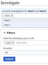
@Niharika @Prtksxna So now, any user/IP in the filters will not be included by default in the block users form. They will be included in the dropdown menu, so you can add them if you want. This is regardless of whether or not the filtered out user/IP was a target in the original investigation.

The only problem I can see is if you have a lot of filtered out users/IPs the dropdown menu might get cluttered with users/IPs you are not interested in.

This is assuming that CheckUsers will make heavy use of filters.

There does not appear to be a limit to the number of users/IPs which can appear in the dropdown (I have had 50+ so far).

filtered_out_user_block_form.png (446ร—332 px, 17 KB)

Also, in case you missed, you might want to take a look at T258488, which is an upstream bug affecting the widget we are using.

Thanks for flagging this, @dom_walden. Since we don't know how often filters might be used, we should hold off on fixing the clutter issue.

Thanks for flagging this, @dom_walden. Since we don't know how often filters might be used, we should hold off on fixing the clutter issue.

OK, thanks. I have nothing more I want to do here then.