Page MenuHomePhabricator

Layout for Wikipedia Preview card
Closed, ResolvedPublic

Assigned To
Authored By
AMuigai
Apr 21 2020, 12:29 PM
Referenced Files
F31933334: Screenshot_20200713-135319_Chrome.jpg
Jul 13 2020, 8:28 AM
F31933336: Screenshot_20200713-135327_Chrome.jpg
Jul 13 2020, 8:28 AM
F31919137: image.png
Jul 7 2020, 3:36 AM
F31919133: image.png
Jul 7 2020, 3:28 AM
F31919082: image.png
Jul 7 2020, 3:09 AM
F31919084: image.png
Jul 7 2020, 3:09 AM
F31860321: Slice.png
Jun 10 2020, 5:39 PM
F31858948: 02. Wiki preview expanded.png
Jun 9 2020, 10:51 AM

Description

Goal

Create a layout for the Wikipedia Preview card
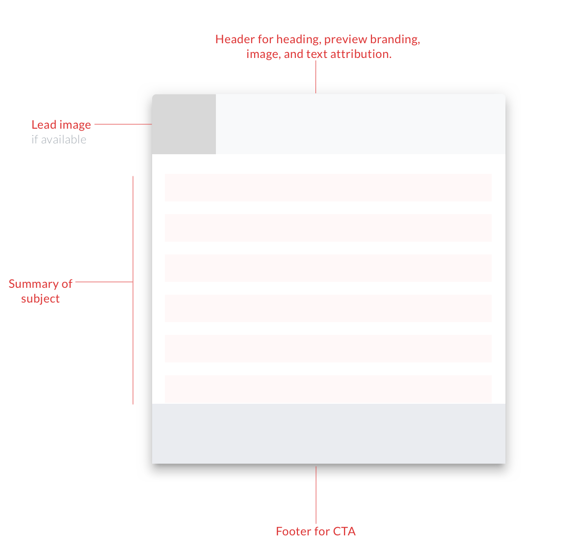
Elements

The card will have the following elements:

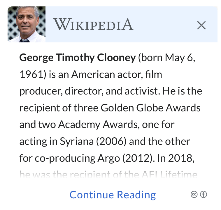
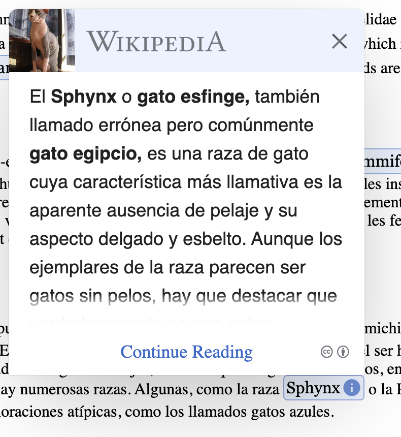
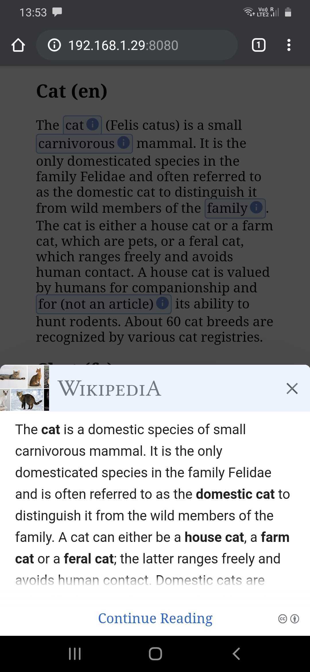
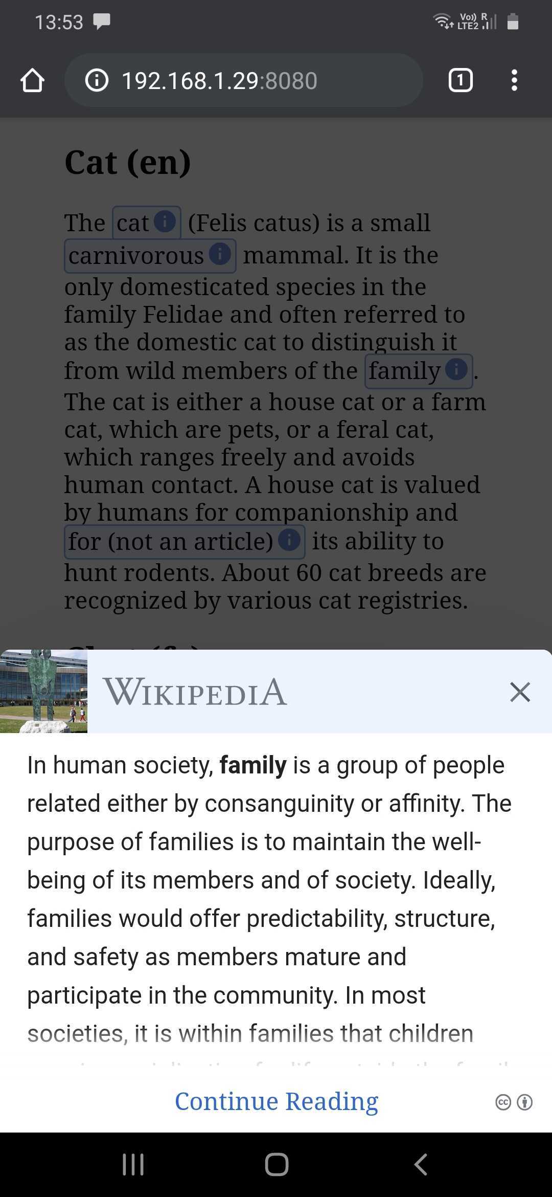
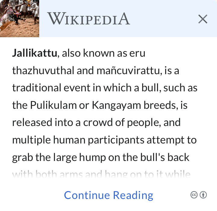
  • Thumbnail image -> This will be the lead image of an article, when available
  • Text from the beginning section of an article
  • Wikipedia branding
  • Attribution and licensing for images

Proposed Design

Layout for Wikipedia Preview card.png (1×1 px, 59 KB)

Preview with thumbnailPreview without thumbnailExpanded preview
03. Wiki Preview with Wordmark.png (700×720 px, 134 KB)
01. Wiki preview without lead image style1.png (700×720 px, 99 KB)
02. Wiki preview expanded.png (1×720 px, 454 KB)

Zeplin ➡ https://app.zeplin.io/project/5edf645eef92dfb2dc2f8ce8/dashboard?seid=5edf660281b300b7fe9863fb (with thumbnail)
Zeplin ➡https://app.zeplin.io/project/5edf645eef92dfb2dc2f8ce8/dashboard?seid=5edf659a8fcb78b97c83c37a (without thumbnail)

Design Details

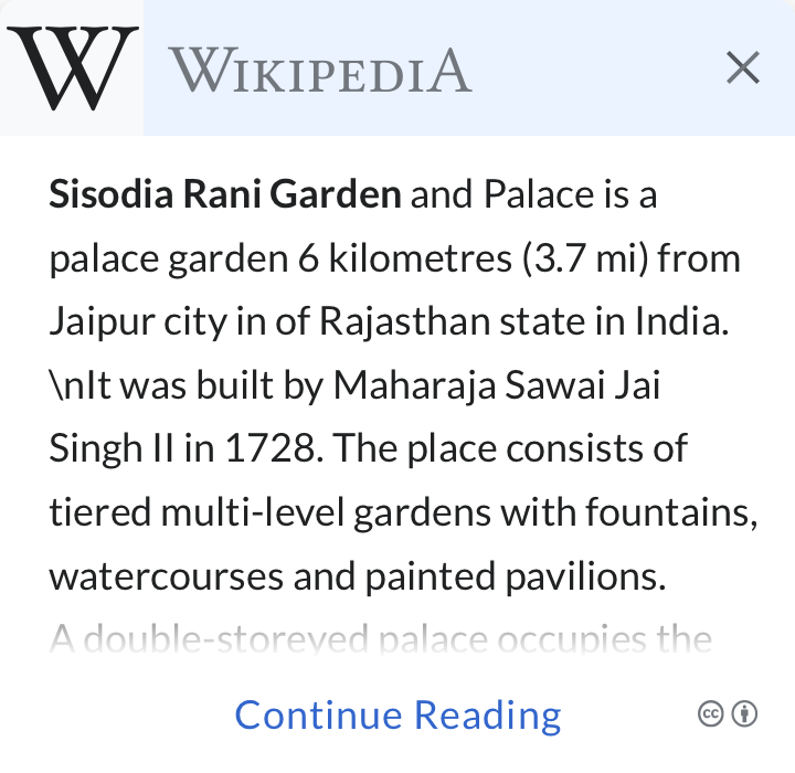
  • If an article summary has long text which can’t fit inside the preview card then show continue reading(CTA).
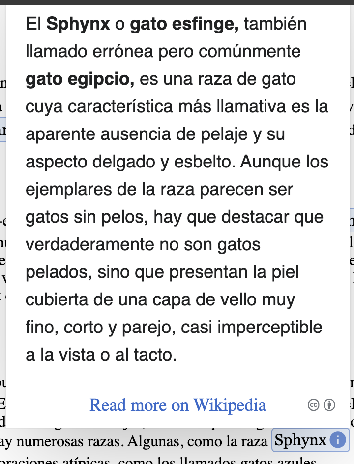
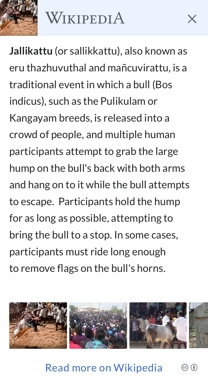
  • Tapping on continue reading will expand the preview to reveal the entire summary of an article along with the images present in the article. At max, it expands up to 80% of the screen height and if there is still more content is available to cover then stick preview header(thumbnail, Wikipedia wordmark, close icon) and enable vertical scroll. It ends with a CTA to read the entire article by visiting mobile Wikipedia.
  • If an article summary has short text then adjust the size of the preview card accordingly without keeping continue reading (CTA.) but still show images related to the article and "Read article on Wikipedia" CTA.
  • In the absence of thumbnail, use Wikipedia wordmark in place of thumbnail.

Note:

Event Timeline

I have updated different variations of Wikipedia previews along with CTA and branding. I will be updating it further where lead images are positioned differently.

From the description

  • Attribution and licensing for images

Please add more details or extract it to another task.

A call to action to direct readers to read the full article on Wikipedia
[...]
If an article(with/without thumbnail) has other images then show them when users tap on continue reading.

What is the "continue reading" link doing, is it navigating to the article on Wikipedia or is it showing more images?

@SBisson I have updated the task with some more information, hope that would clear understanding about "continue reading".

It ends with a CTA to read the entire article by visiting mobile Wikipedia.

Should the article open in the Wikipedia app (iOS, Android, KaiOS(?)) if installed on device?

It ends with a CTA to read the entire article by visiting mobile Wikipedia.

Should the article open in the Wikipedia app (iOS, Android, KaiOS(?)) if installed on device?

I don't think that's within our control. iOS and Android apps try to handle Wikipedia URLs but that's configurable by the users. Deep-linking on KaiOS is not possible.

@SGautam_WMF what should happen to the thumbail when it is not square?

@SBisson we can resize them and align them on the center. I did try with George Clooney's article and this is how it looks like.

Slice.png (722×758 px, 139 KB)

SBisson renamed this task from Layout for Wikipedia Preview card to Layout for Wikipedia Preview card ⭐.Jun 16 2020, 9:13 PM
SBisson renamed this task from Layout for Wikipedia Preview card ⭐ to ⭐Layout for Wikipedia Preview card.
SBisson renamed this task from ⭐Layout for Wikipedia Preview card to Layout for Wikipedia Preview card.Jun 22 2020, 1:11 PM
SBisson reassigned this task from SBisson to hueitan.

@hueitan initial work in on this branch: https://github.com/wikimedia/wikipedia-previews/tree/T250796-layout

Try to think of a way to keep this lightweight but have some sort of component encapsulation so that individual components remain small and unit-testable

The WikipediA logo in the header, is that an image or text?

Do we always use the same image/text, or it changes rely on the language given? for example in french it should be WikipédiA logo

Options :

  1. If it is a text that rely on the i18n language file, then it uses the logo as a text, which means we need a list of the logo text in all the language; OR
  2. If it is a image, then need a list of the logo image given different languages; OR
  3. is there any existing url for us to fetch the logo image?

@hueitan that's an image, I have a list of logo images available with me, I would try to find out if there is a URL for us to fetch it.

SBisson moved this task from Code Review to QA on the Inuka-Team (Kanban) board.

Attribution and Images - Please add more details or extract it to another task.

The ticket on image attribution is here T240007

Jpita subscribed.

Issue when the article expands up instead of down, it hides the image and wikipedia logo when there's still space below the popup.
According to the description, if there is no more space, it should show the image and show a vertical scroll.

12
image.png (860×790 px, 200 KB)
image.png (942×720 px, 136 KB)

this is what I found out related to the view port dimensions.
I first saw the issue on my computer with this dimensions.

image.png (166×528 px, 13 KB)

then i opened the browser on responsive layout and noticed that it starts covering the top of the popup around 800 px even though there is more space below

image.png (1×982 px, 348 KB)

Good catch @Jpita

In a short discussion with @SGautam_WMF, @SGautam_WMF will make the some changes in description to make it clear what/how to show in desktop and mobile.

@Jpita Would you please create a bug report/ticket on the issue above?

@hueitan how are we defining which font-family to use? for instance, in some cases, summary text paragraph is using Lato font whereas in some cases it's Roboto, CTAs(continue reading, read more on Wikipedia) using Noto serif font family. Also, I think our partners might prefer using the same font-family which they are using it on their website. Anyway, I pointed it out to discuss our strategy around it.

Another point I have is regarding the blur rectangle which is there to indicate to read more text, I think visually it looks different, is there any way we can make it look same across the preview? Or if it's difficult then shall we consider using ellipses(...) to indicate more text.

Screenshot_20200713-135319_Chrome.jpg (2×1 px, 152 KB)
Screenshot_20200713-135327_Chrome.jpg (2×1 px, 155 KB)

@hueitan how are we defining which font-family to use? for instance, in some cases, summary text paragraph is using Lato font whereas in some cases it's Roboto, CTAs(continue reading, read more on Wikipedia) using Noto serif font family. Also, I think our partners might prefer using the same font-family which they are using it on their website. Anyway, I pointed it out to discuss our strategy around it.

Good point! The summary text is currently font-family set to 'Lato', sans-serif;, and no settings for CTAs. I agree that our partners might use their own, we can have our own font-family, then suggest partner to change it to fit into their website.

Another point I have is regarding the blur rectangle which is there to indicate to read more text, I think visually it looks different, is there any way we can make it look same across the preview? Or if it's difficult then shall we consider using ellipses(...) to indicate more text.

We cannot 100% guarantee that the gradient will be on the text (either full/half or partial) due to the different font size / height / space. Yes, we can append the ellipses without the problem here.

Alright, thanks for your inputs, I will check it out with Angie and see what we decide on it.

We will rely on system fonts.

Layout is as expected.