| Status | Subtype | Assigned | Task | ||
|---|---|---|---|---|---|
| Resolved | Dbrant | T252556 [EPIC] Implement user talk pages | |||
| Duplicate | None | T204100 Can't open talk page in app | |||
| Resolved | Dbrant | T261222 Conversation list | |||
| Resolved | Dbrant | T261223 Android talk pages UX | |||
| Resolved | Dbrant | T261224 Individual conversation view | |||
| Resolved | cooltey | T260257 [SPIKE] Investigate porting user:talk pages from iOS | |||
| Resolved | Dbrant | T261660 [SPIKE] Support Flow in native talk pages | |||
| Resolved | Dbrant | T267638 Design input for article talk pages | |||
| Resolved | Dbrant | T273244 Instrument analytics and schema for Talk Page edit tracking | |||
| Resolved | SNowick_WMF | T293114 Update Talk page usage metrics |
Event Timeline
I've tried the talk pages in 2.7.50330-alpha-2020-09-09, and I've noticed some "bug"
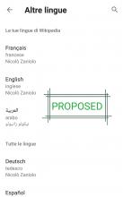
- The translation page should be like an article translation layout and not like when you add new languages
- Subsections are devided from the main topic, and if you try to open it, it opens the wrong section (Go to my Italian talk page, scroll down and open "New requirement for user signatures" [should be inside of "Editing news 2020 #4], it will open "Template E e W"). Sometimes other subsections open the "new topic" page.
Adding @Johan’s comments from Slack here:
So, OK, I don’t think this needs a wireframe, and I don’t know if it’s new or useful or maybe entirely obvious, but this is what I’ve had in mind:Assumption: We’re building for the talk pages we have, not the talk pages we might get but don’t know what they look like.
So the most visually apparent way to distinguish posts from each other is through indentation: :::
Since these pages will have to work on desktop, in the mobile app and on the mobile web we want a way to visualise this that works better on mobile than indentation does, rather than a separate system.
a) We could work with some other visual cue. Very thin lines, for example, for the length of the comment, one line per : and taking up less space than indenting would have done, but filling the same function. Or something else, maybe something that could stack vertically if possible.
b) This could be combined with e.g. what French Wikipedia does where shading indicates where a post starts and ends. This would make it easier to tell them apart.
https://fr.wikipedia.org/wiki/Wikip%C3%A9dia:Questions_techniques
Thx!

