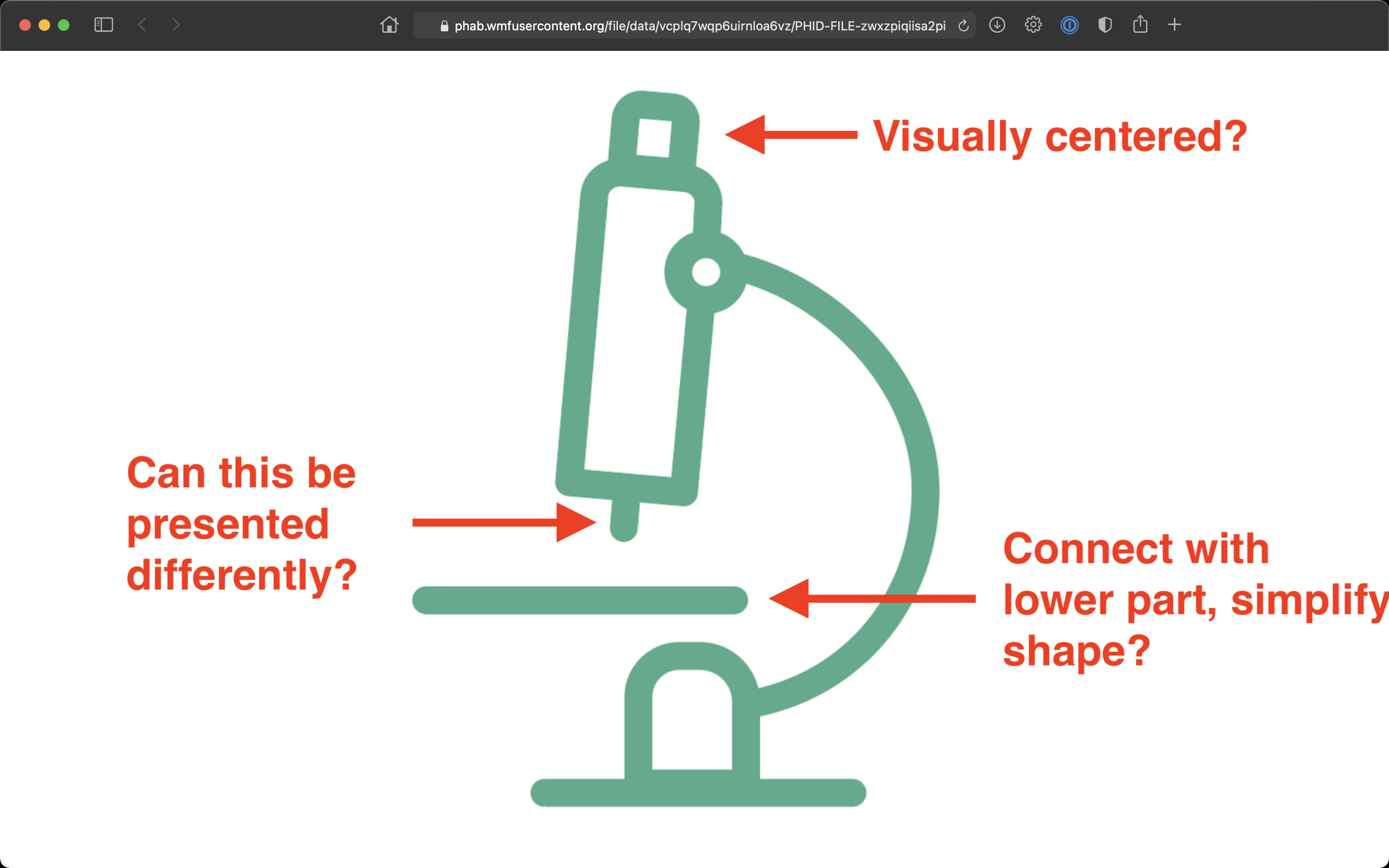
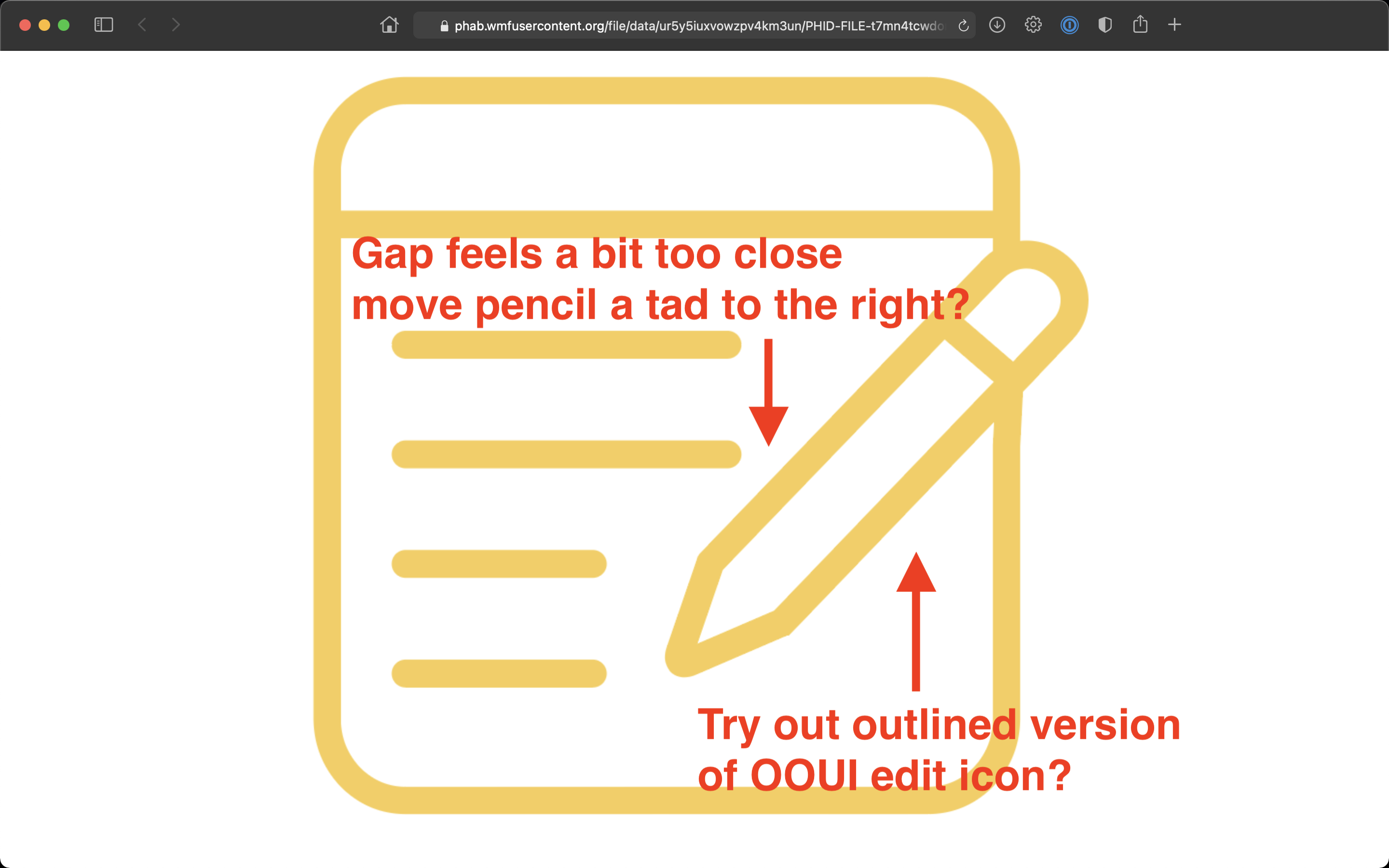
Page MenuHomePhabricator

Design icons and add sections on site for blog and research
Open, Needs TriagePublic

Assigned To
Authored By
iamjessklein
Nov 22 2020, 11:54 PM
Referenced Files
F34974018: Blog Icons_SVG.zip
Mar 3 2022, 5:12 PM
F34974017: Blog Icons_SVG.zip
Mar 3 2022, 5:12 PM
F34940413: Illustrations_PNG.zip
Feb 2 2022, 10:32 AM
F34940409: Illustrations with blue_Final.png
Feb 2 2022, 10:30 AM
F34940411: Illustrations_PNG.zip
Feb 2 2022, 10:30 AM
F34933276: Illustrations with blue.png
Jan 27 2022, 6:01 PM
F34932757: New proposals.png
Jan 27 2022, 11:54 AM
F34914426: New icons-Proposals.png
Jan 11 2022, 2:44 PM
Tokens
"Stroopwafel" token, awarded by Prtksxna.

Description

Background/Goal

All icons in design.wikimedia.org should follow our style guide.

Screen Shot 2020-11-20 at 7.20.06 PM.png (1×2 px, 249 KB)

Acceptance criteria (or Done)

  • Adapt all icons to the Style Guide

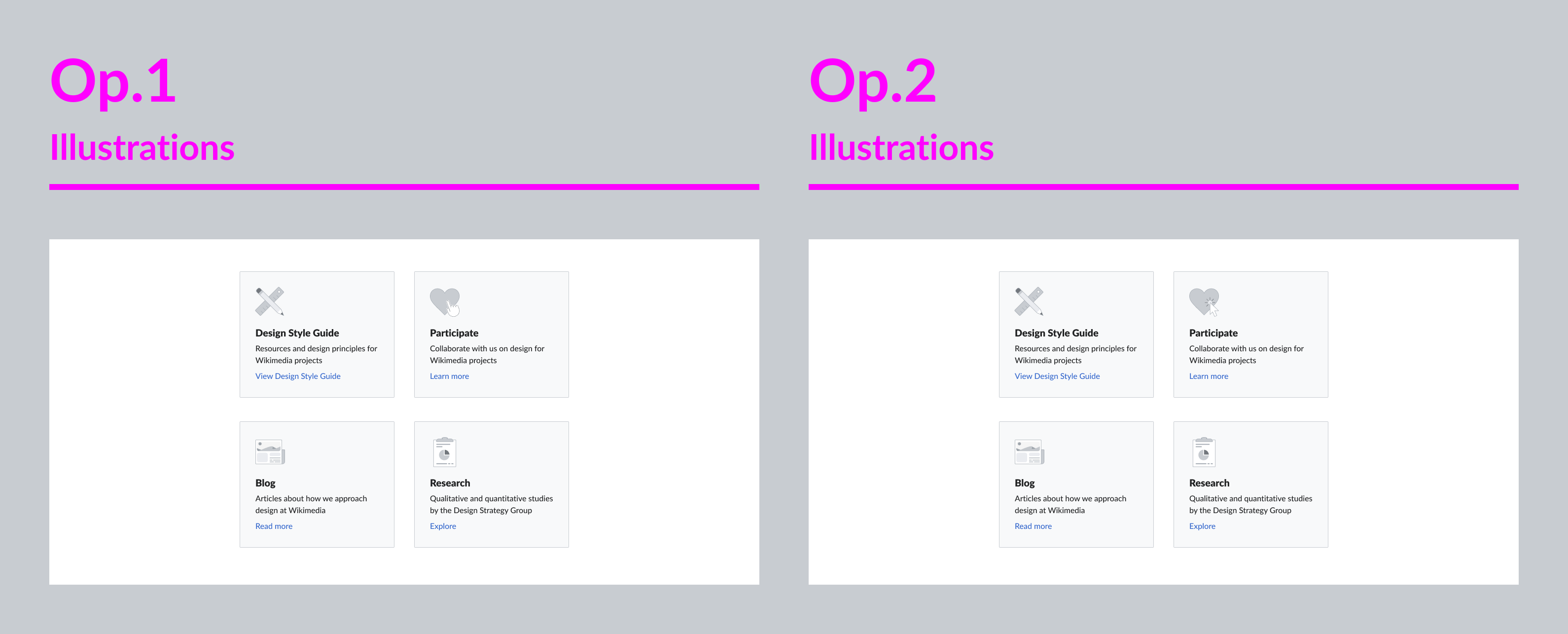
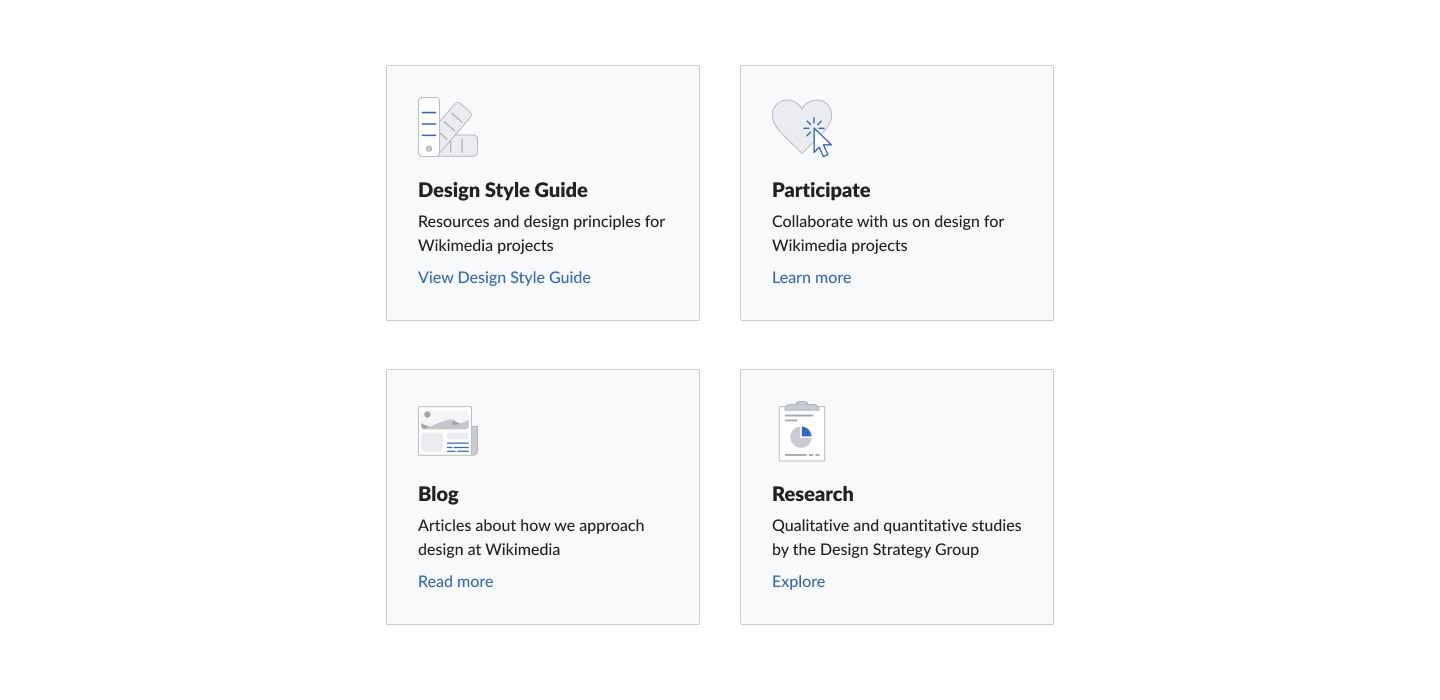
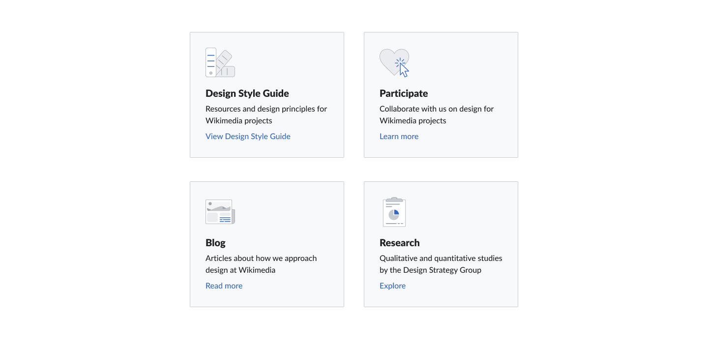
Illustrations of the following concepts

  • Design Style Guide
  • Participate
  • Blog
  • Research

Blog

Event Timeline

I've created the following icons:

Blog:

Screen Shot 2020-11-22 at 7.00.20 PM.png (576×622 px, 61 KB)

Research:

Screen Shot 2020-11-22 at 7.07.15 PM.png (504×500 px, 47 KB)

In terms of colors, the current icons seem to have a slight gradient so I chose the colors from the style guide and added that gradient to make them appear brighter. Let me know what you think.

I'm attaching the svgs for @Prtksxna .


The look well aligned with the existing ones! Like the color choices.
I have a different question to start with though. And it's fine to reject it for the time being :)
I've never been too excited about the special way that these icons have been going when taking our icon guidelines into account. They are a special case across all our interfaces and are contradicting some of the guidelines. Would it be in reach to overhaul and align all of them?

For the ones shared by you Jess, if above is not possible, the blog icon should be reduced, there are too many details. So less lines, less dots, also I'd close the outline paths.

Thanks @Volker_E , I noticed that they didn't match perfectly - they are kind of pictograms or in a class of their own.

Ill start by:

  • reducing lines
  • connect outline paths
  • reducing stroke from 3dp to 2dp
  • converting color from gradient to monochromatic

cc @Prtksxna

Change 643268 had a related patch set uploaded (by Prtksxna; owner: Prtksxna):
[design/landing-page@master] Add Blog and Research cards in projects

https://gerrit.wikimedia.org/r/643268

@Volker_E @iamjessklein, do you think it's ok to merge this so that we have the links on the page, and update the icons in a different patch?

Screen Shot 2020-11-25 at 10.26.26 AM.png (831×848 px, 42 KB)

Screen Shot 2020-11-25 at 10.41.21 AM.png (808×833 px, 44 KB)

How do these revisions look?

I:
reduced lines
connected outline paths
reduced stroke from 3dp to 2dp
converted color from gradient to monochromatic

If these are good I suppose I should do the same to the two existing ones.

cc @Volker_E @schoenbaechler @Prtksxna

they fit the existing icons well @iamjessklein ... a few comments to take or leave:

01) they’re only made to be used at the size you’ve posted in T268423#6648928, right? if yes, they work well – if they’re used in smaller sizes the lines need to be thicker...

02) remarks in regards to the research icon

Screen Shot 2020-11-25 at 18.15.19.png (1×2 px, 371 KB)

03) remarks in regards to the blog icon

Screen Shot 2020-11-25 at 18.21.32.png (1×2 px, 354 KB)

Change 643268 merged by Prtksxna:
[design/landing-page@master] Add Blog and Research cards in projects

https://gerrit.wikimedia.org/r/643268

Already a great step towards unification. +1 to @schoenbaechler's comments.

Additional points:

  • The Design Style Guide icon (color swatches) have a filled connector, I'd recommend trying the same for the research icon microscope.
  • The windows/dialog icons in OOUI all have only 2dp border radius. I'd recommend staying with this.

Thanks @schoenbaechler and @Volker_E!

I am going to do another round of iteration. everything currently is at 2dp radius (I changed from the 3 dp that was originally there).

The Design Style Guide icon (color swatches) have a filled connector, I'd recommend trying the same for the research icon microscope.

@Volker_E I'm not sure that I understand this bit of feedback, can you explain it to me another way?

bmartinezcalvo subscribed.

Hi all,

@iamjessklein asked me to take over this task. I have been reading the task description and comments and I have a couple of questions to you:

  1. Why are we using different styles of icons than those of our style guide? Personally, I prefer these new icons (outline instead of solid) but I think we should be consistent across all of our products

Captura de pantalla 2022-01-05 a las 19.00.47.png (404×974 px, 203 KB)
Captura de pantalla 2022-01-05 a las 18.55.12.png (434×1 px, 146 KB)

  1. Could you send me the web link where these icons are? I want to check all the context.
  1. Do we have a Figma file with all these outline icons?

Thank you,

  1. Why are we using different styles of icons than those of our style guide?

I don't know all the details, but I think the reasoning is that since this isn't part of UI, but a content based web project, there is more freedom (similar to https://wikimediafoundation.org/ for eg)

  1. Could you send me the web link where these icons are? I want to check all the context.

Hey Barbara, you can see them here https://design.wikimedia.org/

@bmartinezcalvo I'm glad to hear that this is tackled now! :)
Could shine a bit of light on this, the icons were designed at a time where we haven't had our icon guidelines completely fleshed out yet.

In regards to freedom: In my opinion the design.wikimedia.org landing page should strongly take into account our visual guidelines as it's highly confusing to me as non-Wikimedia Product design interested person to access this site, then go to Design Style Guide as one of our most important linked resources and immediately find myself reading other guidelines.
IMO it is contradicting, watering down our work from a branding and credibility perspective.

+1 to the replies from @Volker_E and @Prtksxna

This site should really be an exemplar that uses all of the guidelines that we have developed in the style guide.
The files were worked on in Sketch. I was working off of an outmoded design. Please take this opportunity to rethink the problem space.

cc @KieranMcCann for good measure

+1 with you @Volker_E , we should try to use our style guide in all our products and also here in https://design.wikimedia.org/ to be consisten with all our products.

With these info, and knowing that we are all aligned with this, I will work in a new proposal using our style guide to create this new concepts and also adapt the rest of icons with our style guide, so I will work the following concepts:

  • Design Style Guide
  • Participate
  • Blog
  • Research

@iamjessklein @Prtksxna Do we have in any place the Figma or Sketch files for the https://design.wikimedia.org/ designs? I would like to have them to work with the whole screen design. If you have the Sketch files I can also import them to Figma.

I am sending you my proposals for adapting the icons to our style guide. I have tried to use the same icon concept as in the currents icons in design.wikimedia.org

  • Option 1: using icons from our icon system (icons painted in a gray neutral color)
  • Option 2: using icons from our icon system (icons painted with colors as we have in the current icons in design.wikimedia.org. Icons here are using colors that are used also for destructive, warning and success, so may be is not the best option.
  • Option 3: using illustrations form our style guide.

New icons-Proposals.png (1×4 px, 104 KB)

In my opinion, Option 1 is the proposal most unified with our style guide, as we use system icons in a neutral way.

I send you the Figma file where you can find all the options: https://www.figma.com/file/mifUMdjjQlWsJV3VliKDya/New-icons-for-design-blog---T268423?node-id=301%3A1545

cc: @iamjessklein @Prtksxna

cc @KieranMcCann - please review these designs.

I prefer the illustrations over the icons. I think that the "participate" illustration could use a little more work. Perhaps a cursor arrow on top of the heart could help add some dimension and movement to design? Here is a reference from vector stock.

@iamjessklein I have done these 2 new proposals for the "Participate" illustration. I think the second fits better with our illustrations style guide.

New proposals.png (1×3 px, 67 KB)

What do you think?

cc: @KieranMcCann

+1 to illustrations. My focus would be to provide a color highlight per illustration, that's in alignment with our current guidelines and helps to identify and reorient about the sections easier. In both latest proposals they blend too much in to really support the sections.
And on specifics, I'd want to have the DSG illustrated differently, more modern than with a ruler and a pencil.

@Volker_E I have added a small highlight with blue in the illustrations and I think now they work much better, allowing the user to focus on the concept of each one. Also, I have updated the DSG one with this new illustration based in the one that we currently have in the web.

Illustrations with blue.png (700×1 px, 36 KB)

View Figma proposal here.

cc: @iamjessklein

Hi all. Apologies for coming late to this. I agree with the consensus that illustrations work better than icons – at this scale they require a bit more detail than our icons afford.

My preference is for the latest version with the blue highlights. Nice addition @bmartinezcalvo :)

@iamjessklein as it seems that everybody agree with the proposal of illustrations with blue highlight, I send you the illustrations exported in 2x PNG.

Illustrations with blue_Final.png (700×1 px, 37 KB)

The next step now is update these illustrations in the blog. Who is going to updated them? Tell me if you need something more.

bmartinezcalvo updated the task description. (Show Details)

I was talking with @Volker_E and he will take care of updating the illustrations in design.wikimedia.org

@bmartinezcalvo Picking this up again, would you also provide them as SVGs, I think we would make a wider group of users even happier. :)

@bmartinezcalvo Picking this up again, would you also provide them as SVGs, I think we would make a wider group of users even happier. :)

Hey @Volker_E I send you the illustrations in SVG.