Page MenuHomePhabricator

[S] Media Search: Adjustment of filter selects / dropdowns
Closed, ResolvedPublic

Description

Original report

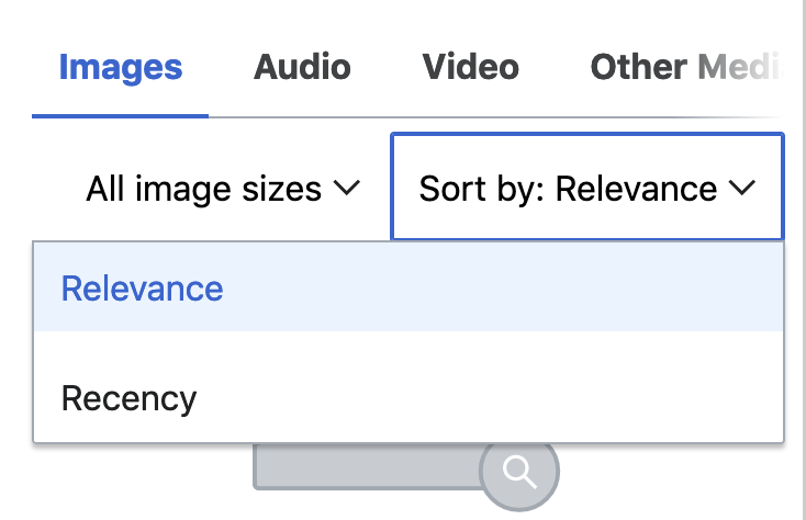
Was noticing that the handles / arrows for the filter drop downs feel a handful of pixels too far off to the right.

Screen Shot 2021-01-08 at 10.13.47 AM.png (292×1 px, 122 KB)

After checking OOUI, instead of adjusting this implementation, it looks like we could swap these for the button widget which have a nice hover state as a bonus.

Screen Shot 2021-01-08 at 10.14.27 AM.png (148×626 px, 17 KB)

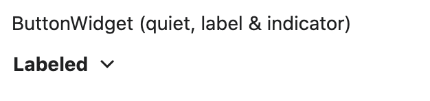
The only thing I'm unsure about that we might have to see in the implementation before making a decision is if we should keep the text bold like the widget.

Implementation

Adjust the styles of the Select component to fulfill the criteria defined here:

  • Adjust the spacing of the handle icon to match OOUI exactly. This will probably involve reducing the padding-right of the .wbmi-select__content div, and reducing the rightvalue of the .wbmi-select__handle element.
  • Review the hover behavior of the OOUI button widget (which should already be replicated by our Button component), and implement these hover styles on the label of the Select component

Acceptance criteria:

  • Select handle placement matches OOUI
  • Select hover styles mimic those of the Button widget/component

Event Timeline

CBogen renamed this task from Media Search: Adjustment of filter selects / dropdowns to [S] Media Search: Adjustment of filter selects / dropdowns.Jan 13 2021, 5:59 PM

There are two options for implementation here:

  1. Just adjust the icon spacing and add a hover style similar to the button widget, but don't actually use a Button component within Select
  2. Swap out the span and icon within Select for a Button component

I'm leaning toward option 1, since it's quicker, the Button component doesn't seem quite right for this use case, and using the Button here might entail undoing a bunch of Button styles when it's used within Select, which seems like a waste of itme.

Option 1 works for me! If adding the hover state starts to get annoying, just adjusting the spacing resolves the majority of issue with this.

Change 670336 had a related patch set uploaded (by Seddon; owner: Seddon):
[mediawiki/extensions/WikibaseMediaInfo@master] Media Search: Adjustment of filter selects / dropdowns

https://gerrit.wikimedia.org/r/670336

@mwilliams awesome. I'll finalise the patch and get it ready for review.

Change 670336 abandoned by Seddon:
[mediawiki/extensions/WikibaseMediaInfo@master] Media Search: Adjustment of filter selects / dropdowns

Reason:

https://gerrit.wikimedia.org/r/670336

Change 670336 restored by Seddon:
[mediawiki/extensions/WikibaseMediaInfo@master] Media Search: Adjustment of filter selects / dropdowns

https://gerrit.wikimedia.org/r/670336

@Seddon The new select list styles made me realize that there's an existing problem with the gradient that we're showing at the end of the filters on small screens to indicate that the user can scroll for more:

Screen Shot 2021-03-19 at 11.46.18 AM.png (464×730 px, 41 KB)

The gradient is supposed to go away when the user reaches the end of the filters, but it's not because the Intersection Observer we've stuck on the end is never intersecting. This can be fixed in the SearchFilters.vue component by wrapping each search filter in a div, and placing the observer element inside that div with the last filter. The key attribute will need to be moved to that new div, since it has to be on the first element inside a v-for loop. Once you do this, you should see:

image.png (474×734 px, 32 KB)

You can also see the Tabs component for an example of this actually working the way it's supposed to!

Change 670336 merged by jenkins-bot:
[mediawiki/extensions/WikibaseMediaInfo@master] Media Search: Adjustment of filter selects / dropdowns

https://gerrit.wikimedia.org/r/670336

Etonkovidova subscribed.

Checked on commons wmf.37 - the UI matches @Jseddon's screenshots in this comment.