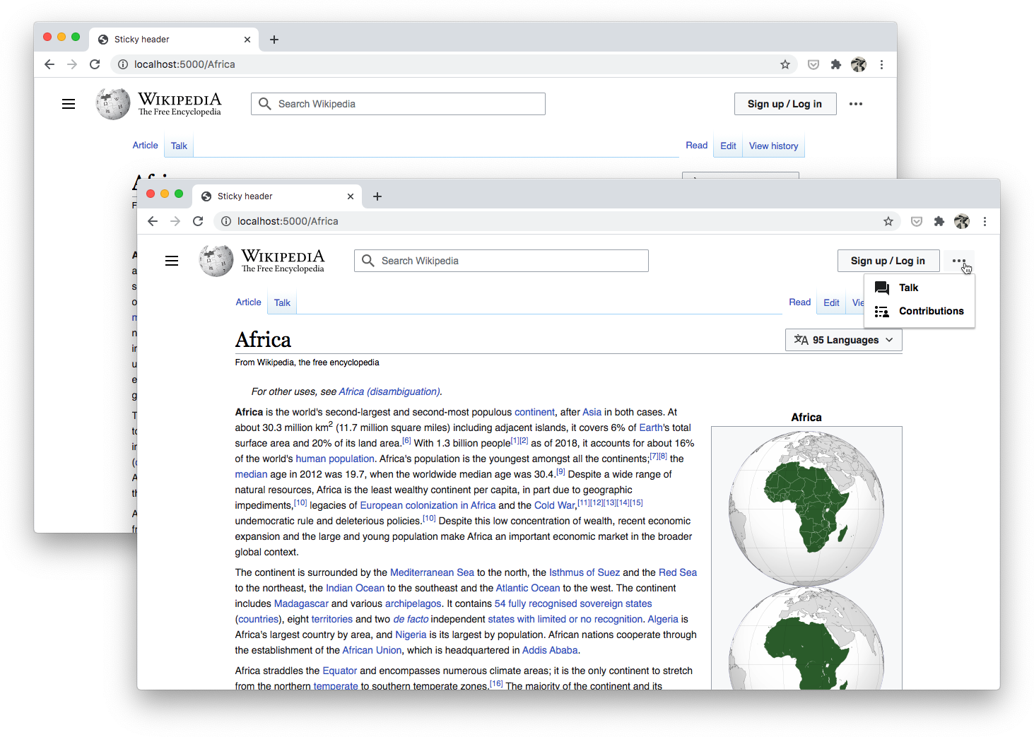
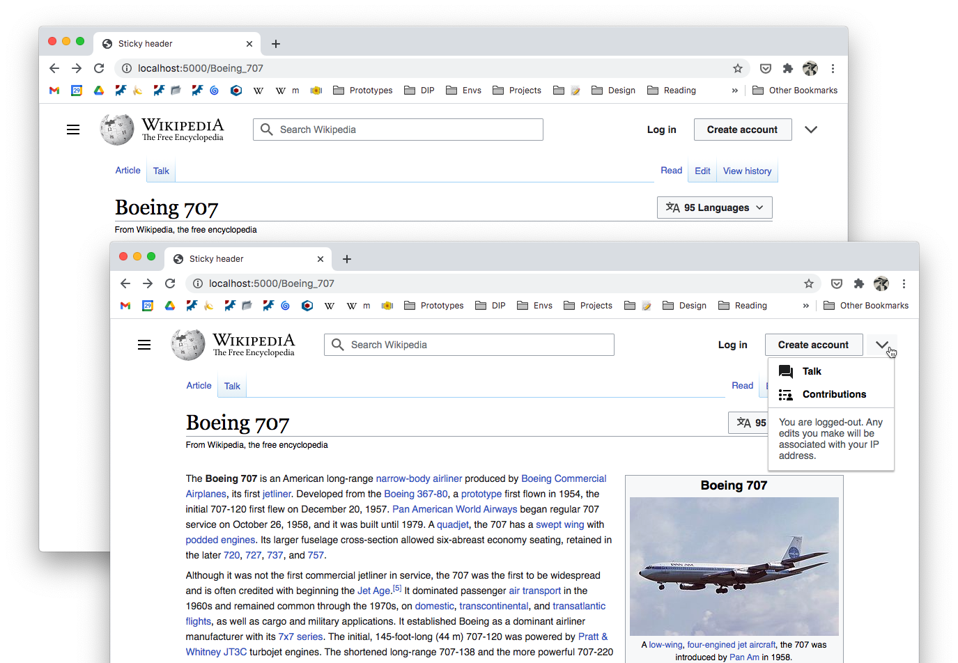
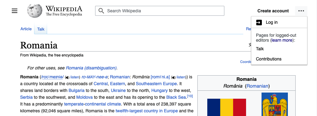
Description
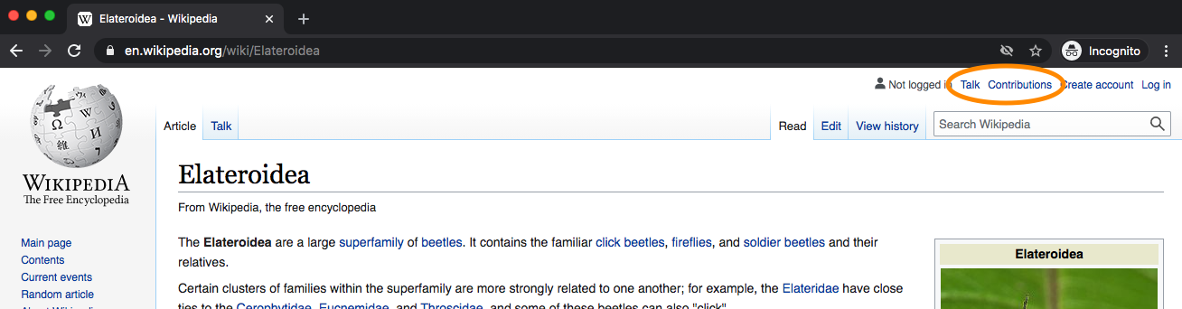
When you are logged-out you have access to the following "user" pages (based on your IP address):
- talk
- contributions
Currently there are links to both of these pages at the top of the page, alongside the Create account and Log in links:
As part of the updated design of the site header we are planning to consolidate these links into a menu (please see parent task for context - T274292). The purpose of this task is to discuss whether or not that menu should have an icon, and if so what the icon should be.
Proposed solutions
| option# | icon | mock | pros/cons |
|---|---|---|---|
| 1 | user icon | 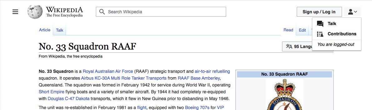 | seeing that icon possibly suggests that you are logged-in |
| 2 | down arrow | 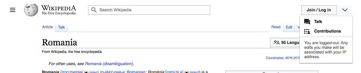 | generic, doesn't suggest anything in particular |
| 3 | more dots | 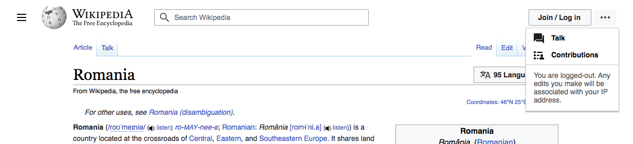 | generic, doesn't suggest anything in particular |
| 4 | browser | 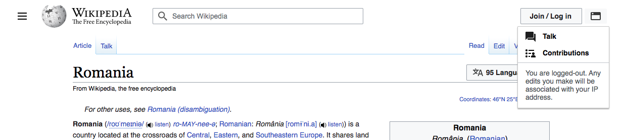 | unfamiliar |
| 5 | anon user | 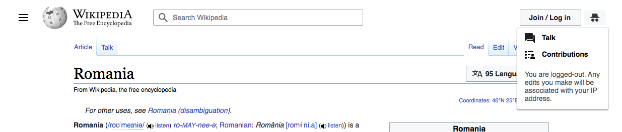 | unfamiliar |