Page MenuHomePhabricator

Add a "share" icon
Closed, ResolvedPublic

Assigned To
Authored By
Pginer-WMF
Mar 19 2021, 9:06 AM
Referenced Files
F34378326: share.svg
Apr 13 2021, 5:59 PM
F34184850: share.svg
Mar 24 2021, 11:42 AM
F34178063: image.png
Mar 22 2021, 11:40 AM
F34178014: m.youtube.com_watch_v=nHTDeKW3hV0(iPhone 6_7_8).png
Mar 22 2021, 11:08 AM
F34173467: share-wikipedia.png
Mar 19 2021, 4:19 PM
F34173426: share.svg
Mar 19 2021, 4:19 PM
F34172613: share-grid.png
Mar 19 2021, 9:06 AM
F34172607: share-icon.svg
Mar 19 2021, 9:06 AM
Tokens
"Like" token, awarded by Lens0021.

Description

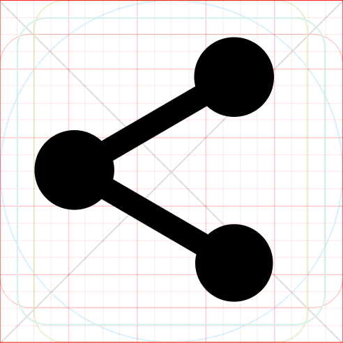
Sharing is a common action, especially on mobile devices. While Android and iOS have their own platform-specific icons, for KaiOS there was a need for a generic "share" icon which was not available among our icons.

The proposed icon is included below:

OriginalSVGO and manually optimized

share-icon.png (20×20 px, 345 B)

A right-to-left version should be generated by mirroring the icon.

Design details

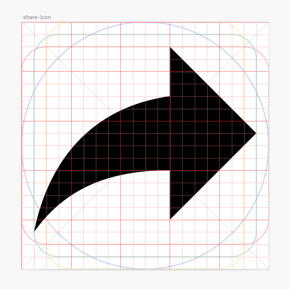
The arrow pointing forward (right or left depending on language direction) has been a common shape used for sharing in many popular web products.

Larger sizeon the icon grid
share-icon.png (200×200 px, 3 KB)
share-grid.png (576×578 px, 55 KB)

SVGO & manually optimized

Possible overlap
A different arrow style is used to distinguish it from other arrow-based icons in our repo. The "redo" icon is the closest but we consider it to be rare for both to share the same context.

right-pointing-arrows.png (40×200 px, 1 KB)

Acceptance criteria

Event Timeline

Pginer-WMF renamed this task from Add "share" icon to Add a "share" icon.Mar 19 2021, 9:06 AM

Hello there,
I'm wondering why not going through what the modern web is going with?

We have the Web Share API (example here: https://web.dev/web-share/) that seems to be using the same icon in all the existing example I see, this one:
https://material.io/resources/icons/?search=share&icon=share&style=baseline

The one proposed here is really confusing since it also represent "reply" (mirrored) or "forward" in some context, meaning that it's not really self-explanatory (an icon is never self-explanatory though).
I don't know any other context of use for this share icon :

share-wikipedia.png (493×492 px, 35 KB)

I also usually like to see the occurrences in research on Google image. It offers a good tendency of what people expect.

Of course this proposition and reflexion make sense only if the implemented feature behind that is close to the Share API, or mimic its way to function.

What do you think about that?

Sorry if my message isn't well formated, I'm kind of new here :) (not on Wikipedia, just at contributing in design)

What do you think about that?

"Share" is a common functionality but there is no universal symbol for it yet, at least none as universal as the "X" could be for closing, for example. If one gets established over time, we'd be happy to align with it. for now, we have to pick a solution that will be familiar for some and we expect others to be able to interpret correctly.

The one you proposed is common in Android, but may be less familiar to people using other platforms.

The arrow proposed can be found on widely used products such as Youtube (even on their Android app), and the concept of "forward" on email and messaging apps seems also consistent with the meaning of sharing, so I'd expect those to help interpret the purpose of the arrow.

m.youtube.com_watch_v=nHTDeKW3hV0(iPhone 6_7_8).png (1×750 px, 207 KB)

Different people may have different experiences depending on the different webs and apps they use. Based on how this works for our audience we can definitely consider a different symbol.

Hello, and thanks for your answer :)

Sorry if you thought that my answer was only about my preferences.
It's more about avoiding confusing solution. An arrow is used for all the different purposes of answering a mail, reply to all, forwarding, sharing screen, send to someone, upload, download, external link, etc. the idea was to not add another arrow in this icon series.

image.png (239×580 px, 49 KB)

What I wanted to highlight is that confusing meaning despite the user's habits.
This is a survey that shows users mostly don't know what's their OS icons for sharing means. iOS 6's isn't used anymore.
Android's one seems to be best understood though.

Also all the common library (dashicons, font-awesome, icomoon, material) use this 3-linked-dot icon.
I'm highlighting a tendency here. It's also a problem that I already tackled down during previous research with users for a product dedicated in online sharing 😊

Finally, and for sure, icon will never be enough alone :D (without a proper label)
But sure, let's A/B Test :D (just a designer joke :p)

@GeoffreyCrofte Thanks for your input Geoffrey. The data you shared is useful context.

We chose the right arrow share icon as the best fit for KaiOS users, relatively new internet users, because not only are there a limited number of apps on the OS so far, there are even fewer that provide sharing options. The apps used the most on KaiOS phones are whatsapp, youtube and facebook, so we chose to mirror icons that were already familiar to them.

We also tested other icons with them in the past within the app experience that ended up being confusing, so that gave us additional input to provide an option familiar to them.

@Pginer-WMF With above, share icon as is seems good to go to me.
Thanks for the inputs, @GeoffreyCrofte. We'll keep them in mind, depending on context of application and might revisit the icon style.

And one more thing, how's the appearance in RTL languages? cc: @Amire80 @Ladsgroup

Change 674566 had a related patch set uploaded (by VolkerE; owner: VolkerE):
[oojs/ui@master] icons: Add 'share' icon

https://gerrit.wikimedia.org/r/674566

I was asked about my opinion on RTL. While being a native speaker of an RTL language, unfortunately I'm so used to the three connected dots mentioned above (as an android user) that I can't give a feedback on the RTL version of the arrow responsibly.

I don't have much to add. Like other people are saying, there's no universally recognized "share" icon, so I cannot recommend a shape. In any case, to be sure that as many people as possible understand the function, it should probably have a written label somewhere and not just an icon.

The RTL handling of this icon is also not universal. YouTube in Hebrew shows an arrow pointing right on Android, but an arrow pointing left on the desktop. I, generally, don't see any connection between the concept of an arrow pointing in any direction, and the "share" function. It can have a direction; for example, if you choose the shape of one dot connected to two other dots, you can say that in RTL the single dot should be on the right, and the two dots should be on the left, but the general shape is much more important than the direction.

(I should note that I tested positive for right-left confusion. Even though I'm one of them, I can't speak for all the people who have it, but I'm pretty sure that I confuse left and right precisely because by themselves directions don't have any inherent meaning.)

Alright, thanks @Amire80. With above considered, I propose to go ahead with just the current right pointing share icon for all languages and wait for language group or user feedback to possibly revisit the icon decision.

Alright, thanks @Amire80. With above considered, I propose to go ahead with just the current right pointing share icon for all languages and wait for language group or user feedback to possibly revisit the icon decision.

This was a bit surprising to me. I think that the arrow pointing "forward" contributes to the meaning (like in email forwarding or undo/redo), and the forward concept is very dependent on writing direction (it would look weird to point left in English, for example). So I was expecting the arrow to point left on RTL languages.

Yes, I can understand this line of thinking, but only if I ponder it. It's not something that comes naturally.

Change 674566 merged by jenkins-bot:

[oojs/ui@master] icons: Add 'share' icon to 'content' pack

https://gerrit.wikimedia.org/r/674566

Change 684859 had a related patch set uploaded (by VolkerE; author: VolkerE):

[wvui@master] [icons] Add 'wvuiIconShare' share icon

https://gerrit.wikimedia.org/r/684859

Change 684859 merged by jenkins-bot:

[wvui@master] [icons] Add 'wvuiIconShare' share icon

https://gerrit.wikimedia.org/r/684859

Volker_E claimed this task.
Volker_E triaged this task as Medium priority.
Volker_E removed a project: Patch-For-Review.

Change 697700 had a related patch set uploaded (by Catrope; author: Catrope):

[mediawiki/core@master] Update wvui to 0.2.0

https://gerrit.wikimedia.org/r/697700

Change 697700 merged by jenkins-bot:

[mediawiki/core@master] Update wvui to 0.2.0

https://gerrit.wikimedia.org/r/697700

Change 713803 had a related patch set uploaded (by VolkerE; author: VolkerE):

[mediawiki/core@master] Update OOUI to v0.42.0

https://gerrit.wikimedia.org/r/713803

Change 713803 merged by jenkins-bot:

[mediawiki/core@master] Update OOUI to v0.42.0

https://gerrit.wikimedia.org/r/713803