Page MenuHomePhabricator

'legacy' skin feature is not backwards compatible with itself, with new content from other features, and missing other content it previously had
Closed, ResolvedPublic

Description

There are, like, several problems here and I don't even know how to split them up properly:

  • Several styles previously found in 'interface' or 'elements' or 'content' or something (I'm not really sure which, as I've never really used any of these to begin with) are now in legacy. This includes the toc-style catlist box and thumbnail icons that now override any skin-specific icons (T280292).
  • 'legacy' loads by default and needs to be explicitly disabled, so even if one wasn't using it previously it still suddenly shows up and applies all this?
  • Some styles previously in legacy apparently... just aren't there anymore? I assume this is where .plainlinks support was previously coming from? (T279693)

Related: While the toc styles themselves are not part of 'legacy' (I don't even know where they are, but the ToC remains messed up with monobook-esque styles (T280285) even when disabling the 'legacy' feature) ...which would be good, except where is it, and why is it also now default on?

This affects most skins, and I'm have some difficulty seeing how this wouldn't break any given skin that isn't specifically, intentionally working around it...
Event Timeline

Restricted Application added a subscriber: Aklapper. · View Herald Transcript
Isarra added subscribers: ashley, Jdlrobson.

Possibly slightly better tag? Not actually an issue with RL in general.

Not gonna tag every affected skin, because it's like half of all of them...

Several styles previously found in 'interface' or 'elements' or 'content' or something (I'm not really sure which, as I've never really used any of these to begin with) are now in legacy. This includes the toc-style catlist box and thumbnail icons that now override any skin-specific icons (T280292).

The thumbnail issue looks backwards compatible to me in that the content is perfectly readable. The fact that the default styling has changed is expected. The legacy feature contained a few styles for thumbnails and we decided it was important that we applied those styles consistently. If those are not wanted in Timeless, the usage of the legacy feature should be removed, or more explicit overrides should be provided. I don't see this as a problem for 1.36.

In short: the default has changed for 1.36.
FWIW: Now we have a standard definition for the thumbnail it would be awesome to rethink the borders on thumbnails for all skins.

'legacy' loads by default and needs to be explicitly disabled, so even if one wasn't using it previously it still suddenly shows up and applies all this?

Legacy only loads if you add a ResourceLoader module that doesn't define the features key. That will be changing shortly as part of 1.37, once 1.36 has wrapped up.

Some styles previously in legacy apparently... just aren't there anymore? I assume this is where .plainlinks support was previously coming from? (T279693)

This shouldn't be the case and that's a bug that needs backporting to 1.36 as it breaks functionality rather than changes. I'm tracking T279693 and will have a patch up later... watch this space.

e the toc styles themselves are not part of 'legacy' (I don't even know where they are, but the ToC remains messed up with monobook-esque styles (T280285) even when disabling the 'legacy' feature) ...which would be good, except where is it, and why is it also now default on?

The toc styles are in a feature called toc. https://www.mediawiki.org/wiki/Manual:ResourceLoaderSkinModule#Features
Help changing the defaults to more sensible ones is appreciated. The use of % font-sizes for example seems a little odd. Perhaps explicit font-sizes would be better. You can disable the feature if the CSS rules are not helping (that's what Minerva does)

Also what even is the right component to tag this as? What's this stuff even called?

This component is fine :)
You can also use MediaWiki-User-Interface

The thumbnail issue looks backwards compatible to me in that the content is perfectly readable.

That... really depends on the skin. And looking really bad while still being readable doesn't really seem 'backwards compatible' anyway...

The legacy feature contained a few styles for thumbnails ...

None of which were previously visual styles that would conflict with the visual styles of non-monobook-style. It was pure positioning. You have introduced both iconography (the expand link, which actually would be good to have a default for) that overrides specific skin styles (unfortunately this exceeds the scope of what 'default' normally means - either the selectors are too specific, or the load order needs to be fixed to ensure this is added before the skin's css/less), as well as visual styles (borders, padding, etc) that are very much not appropriate for any skins not implementing monobook-type visual styles, which is particularly disappointing given this feature was originally the direct conversion of the only core skinning module that didn't include monobook-type visual styles.

and we decided it was important that we applied those styles consistently.

As much as I'm all for consistency, this issue concerns skin-specific visual styles that really only apply to a small subset of skins (particularly monobook, and subsequently vector). Are these visual styles applicable in Minerva? No. So why assume they should apply to all other skins, either?

In short: the default has changed for 1.36.

Then that was a regression.

FWIW: Now we have a standard definition for the thumbnail it would be awesome to rethink the borders on thumbnails for all skins.

I recommend starting with rethinking this before applying any such styles. If we want consistent global styles, start with Minerva, as that skin depends on generally far more subtle and visually-agnostic styles to get its point across than... well, monobook. All styles in these modules should be generic enough to apply to skins like Minerva or monobook, and not include any visual styles that aren't pure functionality (position on page, icon appears, remove list bullets, etc) unless we're specifically loading some sort of 'core-mediawiki-content-styles-currently-based-on-monobook-may-change-later' and want that. Because otherwise, odds are, we're doing our own thing (greystuff has no background, just a line at the bottom for some separation; splash uses box shadows and a subtle background change, or just let the padding do the work for browsers that didn't support that), or nothing in particular (as minerva shows, we really can just let the padding do the work here), and this is going to conflict, potentially drastically.

Help changing the defaults to more sensible ones is appreciated. The use of % font-sizes for example seems a little odd. Perhaps explicit font-sizes would be better. You can disable the feature if the CSS rules are not helping (that's what Minerva does)

Do you not have anyone with experience with UX or creating templating or extensible systems working on this? I'm sorry if I seem really annoyed here, but I kind of expected 'sensible defaults' to be part of a skillset you'd have represented on such a project. If not, er... fuck. No wonder this is so hard. Sorry.

Basically... size changes need to be a skin decision. It's style, not functionality. Unless you define a way for skins to tell these features and junk what their generic resize amount is (it could be nothing, it could be that they're resizing the toc, nav, catlinks, thumb, etc all down by 15%), no value is going to apply correctly/consistently with the rest of the skin's interface, and there's no real need to, anyway.

Other skin decisions:

  • Borders - aside from things like the .thumbimage itself, which should always have a border to define where the image is, all css borders should be optional or may be implemented in various other ways in any given skin to achieve similar effects. This includes header underlines and all monobook tocstyles things (toc, thumb, navigation blocks, catlinks, etc).
  • Background colours - same as above, with (framed) thumbnails again being a particular exception, as like the thumbimage border, having a background to show transparency falls more under basic functionality rather than style, so if a skin cares about the exact style they can then override it, but they should definitely have something there.
  • Text alignment - whether or not text is justified or centered or regular align right/left is stylistic, not functionality.
  • Exact icons - we should set defaults for things that are only icons, for sure, but make them easy to change. Otherwise, leave it up to the skin.

Some visual styles that can be applied generically that skins will still usually override are another matter, and could also be included in such things. These include:

  • Inline catlinks, if they appear within the page content. No framing, just positioning - if they're in the content block, we probably want them inline.
  • Hidden bullets for the table of contents - this is basic and common. Exact indentation, not so much, though turning it down probably won't hurt anything either.
  • Padding for various items like the toc, headers, thumbs, the content in general, etc. Medium values (in other words, probably more than monobook etc have currently) for all of these across skins should still work with skins with harsher styles like monobook while also providing a sane default that can be upped if needed in other skins that may or may not be using framing, like minerva, such that there's a good visual distinction even before they apply any specific (other) styles.

If you want to also have common visual styles for skins like Vector and MonoBook, the answer isn't to put them in the main features and then disable them to reinvent the wheel in Minerva, Timeless, GreyStuff, etc etc etc, it's to have a separate feature for these visual styles for these particular kinds of skins. If you want to put that in legacy... well, I really don't recommend that, given legacy is based on the one RL module that specifically didn't contain any of this... but a separate feature (or set of features) like that would be very useful too, especially for the skins that are using these styles (MonoBook, BlueSky, all the wordpress conversions, etc)

But you should really just be starting with only the stuff that skins probably won't have any visual stylistic reason to override, and should always apply. For the page content, this is stuff like:

  • General positioning - trights float right, tlefts float left, centered stuff is centered
  • Unsetting the default header styles from editlinks so they're not all gigantified (specific skins may need to unset more, but at least the hard work should be done at this point)
  • Hiding stuff like the 'retrieved from' line from screen view
  • Things like .plainlinks, .noprint, .nomobile, .visualClear, and other classes users may expect to be able to apply to control output
  • No bullets on the toc items, why would anyone want that
  • Generic, consistent handling for mobile, if there's some way to actually tell it what the hell the skin's mobile cutoff is - stuff like thumbs going full-width, table overflow handling, collapsible sections, etc. A lot of what MF does, I suppose?

Basically, a bunch of stuff that was previously in 'legacy', plus some other things that probably should have been in some generic baseline module/feature from the start. These should still probably all be in the same feature, because the only use cases I can think of for not having any one of these at all are, like, something really weird. Maybe have the mobile one be separate because people are weird about mobile, though?

And other things that we still need that make sense separately are more like...

  • A pile of generic monobook (for now, may migrate? :DDD) box visual styles for toc, thumbs, catlinks, etc
  • Wikitables and datatables, probably matching the generic monobook (or whatever) box styles, but as a separate thing because this is far, far harder to roll one's own in a way that plays nice with the contents, collapsing, etc, so skins that don't use any of the rest will likely still want this...
  • Some generic page styles for the content with some sane defaults for all the really boring stuff like line-heights, paddings everywhere, header sizes, link colours, how we handle lists, etc - easy to use as-is, override, or just not use and roll our own.
  • Special handlings for particular special pages? Like file pages, let's face it, they're kinda sad.

Some that totally make sense as they are include:

  • logo, because, yeah, we're kinda migrating away from that, but some definitely want it
  • content-links, it's kinda specific, some skins do want, some don't
  • normalize, because everyone and their dog did this their own way back in the day, ugh
  • I honestly have no idea what the other current ones actually do and couldn't find any documentation, so I'll just stop here...

I honestly have no idea what the other current ones actually do and couldn't find any documentation, so I'll just stop here...

https://www.mediawiki.org/wiki/Manual:ResourceLoaderSkinModule#Features in case you missed it.

I understand your frustration, it's always annoying when stuff changes unexpectedly. The legacy stylesheet had grown to epic proportions and should have been split up several years ago so some pain/friction is to be expected here. I assure you this is all worth the pain in the long run.

And other things that we still need that make sense separately are more like...

This is exactly where I'd love to steer the conversation. Now legacy is on the way out, we can make meaningful bundles for these styles. With the work Volker has been doing on skin.variables we will also be able to make this configurable - e.g. skins using a simple LESS variable will be able to add opinions like "thumbnails should not have borders." or links should be this color.

The ResourceLoaderSkinModule should be thought as a boiler plate for building skins that you can pick and choose from.

Then that was a regression.

If you feel like anything is a regression please open a task for it and we'll get to it in good time. I remain open minded but given the scale of this file it's easier to look at things one by one. :) Perhaps in the case of thumbnails the default is wrong, and we just need to patch Vector to retain the status quo. I have quite a few things in flight right now so I appreciate your patience here and I appreciate you (and others e.g. Jack, Mainframe) caring and keeping my compass aligned in the right direction!

This whole thing feels like a regression. I wouldn't even know where to start filing tasks, as the whole approach just seems wrong. I can try to spell it out, but please, please, get an actual designer on this. Learn how to cascade your features, like how css cascades styles. You're separating out particular content components into their own features when you should be separating out particular levels of styles. Every skin should float trights right, and tlefts left, because that's a basic assumption of them being what they are. Every skin has editsection links, and probably wants the sizes standardised regardless of header size. Every skin with a category block in the content block probably wants the category lists inline. Users expect things like .center and .visualClear and .noprint and .nomobile to work regardless of skin, because why in the world would basic content styles and affordances be specific to a particular skin? These are all first-level features, and shouldn't even be separate features at all, aside from the category one, because not only are they common to all skins, aside from the categories, none of them are even placed by the skin.

Do your research. What do skins control the placement of, but still generally do in a consistent way? These should be separate features. What is always placed according to the parser/special page/whatever? This is the page content, which can all be assumed as a single feature (and then each one probably actually adds itself to the correct RL module, I hope?). And how does it cascade? Because it must cascade to be useful:

  1. Necessary styles: basic assumptions of mediawiki as a whole, and of users familiar with mediawiki. This shouldn't even be an option to disable. [[file:whaytever.svg|thumb|right]] should always float right. The ToC should indent, and probably collapse, without having to add anything. This is not style. This is function.
  2. Either same level as the necessary features, or immediately after: layout features that may or may not apply to a given skin, but govern basic, very common layouts for components that a skin may place elsewhere, but usually doesn't. The bottom-of-page category block is a good example of a specific feature here. Putting the lists inline and adding separators sets it up for most skins to box however they want, or not, and be done. No clashing with specific styles. If, however, a skin has their categories in a special breadcrumb output in the header, or sorted in the sidebar, even this will not be wanted.
  3. Likely common styles load after this. Most skins, regardless of specifics, want things like, say, at least a particular amount of padding around the thumbs, headers, etc. This won't clash with most, but also isn't needed for basic functionality. There may be several features on this level for particular things: padding for blah category of things, overflow handlers for tables, mobile whatnots for article content, mobile whatnots for special pages, collapsible sections, etc.
  4. Specific visual styles last. All those monobook-style boxes for the catlist, thumbs, toc ('tocstyles' on at least some wikis/skins)? Specific fonts or font sizes, whether or not to centre certain headers or content? Underlines on the headers? This is visual. This is last, and needs to be separate. This also likely will have the most separate features, for all the specific random things that you can style special, or not. But this is all visual detail. It's not needed, and in many cases, the defaults as the are will not even be wanted (see: minerva and timeless). But a lot of skins do want to use the same. We should absolutely have some canned defaults folks can use when making new skins. They simply shouldn't be required for basic functionality.
  5. Any css the skin adds needs to load after all features. The above should be using the loosest styles possible, too, so as to not override in specificity if at all possible...

It is also worth noting that #4 especially would be far more useful moving forward if it could eventually be adapted to take variables/settings: some way to quickly set the box styles to match the overall skin standard, as well as variables such as font-(re)sizes and junk. We're not there yet, but it would go a long way toward standardising how other kinds of content and extensions could also consistently support specific skin styles without extra effort as well, and greatly simplify maintenance of the skin over time. (May also apply to #3.)

Several styles previously found in 'interface' or 'elements' or 'content' or something (I'm not really sure which, as I've never really used any of these to begin with) are now in legacy. This includes the toc-style catlist box and thumbnail icons that now override any skin-specific icons (T280292).

The thumbnail issue looks backwards compatible to me in that the content is perfectly readable. The fact that the default styling has changed is expected. The legacy feature contained a few styles for thumbnails and we decided it was important that we applied those styles consistently. If those are not wanted in Timeless, the usage of the legacy feature should be removed, or more explicit overrides should be provided. I don't see this as a problem for 1.36.

Perfectly readable, and very broken:

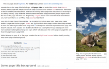
image.png (692×1 px, 445 KB)

Jdlrobson claimed this task.

legacy has not yet been deprecated (that will hopefully happen within the next few months). For now the goal has been to re-organize it into separate modules. Everything that was there before is still there.

Nothing has regressed as nothing has stopped using legacy CSS yet. There have been some design changes sure, but those have been done with the intention of organizing styles better.

The problem we are running into is that most skins override defaults, assuming that the defaults are static and will never change. This is the crux of the issue IMO, there should be no need to override defaults, where overriding is happening that points to bad defaults.

What will be better going forward is working out what skins actually want. If skins want the layout styles of the table of contents for example, but not things like background/borders, then let's separate those 2 concepts so skins can load the layout, but not the rest of it. T283836 and T283396 are 2 examples of those. Would love your input on other places we can improve on defaults. You've mentioned lots about separating layout, perhaps a layout feature makes sense for all of the styles. Let's split that out while keeping the existing features backwards compatible.

Reading through your comments, I think we want exactly the same things, I just think I need to do a better job of including you earlier on in the process and communicating the roadmap. The focus now is reaching the milestone of getting The ResourceLoaderSkinModule "legacy" feature phased out from Wikimedia-deployed skins.

This is how I see things working now:

  • For each skin we will audit the impact of dropping the "legacy" set of styles, making use of the smaller bundles that have been spun out. Tasks will be created for each challenge encountered.
    • If styles are inherited that Timeless doesn't want (for example lead you to including a set of legacy styles, let's work together to work out what we want to cleanup in the default styles e.g. T283836)
  • When all the production skins have migrated over and got the styles they need, we will officially deprecate the "legacy" module inside core. Legacy code should always be deprecated :-)