Page MenuHomePhabricator

Echo notification icon in responsive version of MonoBook
Closed, ResolvedPublicBUG REPORT

Description

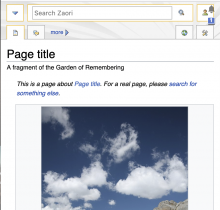
While QAing a MonoBook related change, we noticed that Echo icons appear in a strange visual position with bullet points

Screen Shot 2021-08-11 at 2.53.14 PM.png (346×894 px, 48 KB)

I'm not sure whether this has always been broken and how this is meant to display.

The bullet points can be explained and I'll post a patch.

Event Timeline

Restricted Application added a subscriber: Aklapper. · View Herald Transcript

Change 711739 had a related patch set uploaded (by Jdlrobson; author: Jdlrobson):

[mediawiki/skins/MonoBook@master] Drop double skin-responsive class

https://gerrit.wikimedia.org/r/711739

Change 711739 merged by jenkins-bot:

[mediawiki/skins/MonoBook@master] Drop double skin-responsive class

https://gerrit.wikimedia.org/r/711739

The issue is present on mobile with Monobook skin ( Desktop view) when the "Enable responsive mode" option is enabled. Before the option was introduced, there was no issue with misplaced Echo badges.

Before the option was introduced, there was no issue with misplaced Echo badges.

I don't think that's true. The option has been around for 3 or so years (T195625). The preference is not new, it just recently got renamed/moved in T285402.

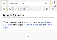
https://wiki.zaori.org/wiki/Special:Version is on 1.36 and looks like this:

Screen Shot 2021-08-11 at 7.34.26 PM.png (864×902 px, 398 KB)

So it's either like this by design or broken sometime before 1.36.

I don't know when exactly the Echo integration broke but it would be good to know

  • what it is supposed to look like
  • how many users the responsive mode has
  • how important it is to fix.

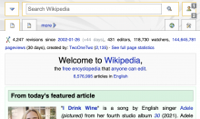
Looks like it's always been like this. Here's a screenshot of 1.35 for example:

Screen Shot 2021-08-12 at 9.34.39 AM.png (638×894 px, 77 KB)

The difference between the first and the last pictures is the bullet points, which are new. Whatever was changed has made it very difficult to click the "tools" button that is behind the notification icons (the bullets make it very easy to click the notifications instead of the button behind them). This makes it much harder for me to access my watchlist on my phone (Chrome, Desktop Wikipedia, responsive monobook, which is usually the most comfortable for me).

Actually, the display of the notifications after you click the button is also broken. I see them for a second, then they disappear and I just see a large white frame.

Jdlrobson renamed this task from Echo notification icon in MonoBook to Echo notification icon in responsive version of MonoBook.Nov 19 2022, 12:38 AM
Jdlrobson edited projects, added MonoBook; removed Growth-Team, MonoBook (Tracking).

I'm not seeing the list bullet points raised above, this is what I see:

Screen Shot 2022-11-18 at 4.40.27 PM.png (594×994 px, 166 KB)

Is this how it's always looked? If so perhaps this should be closed as "invalid".

I think this should probably be declined unless responsive Monobook is still in active development. @matmarex do you have any idea how this is supposed to look?

I think the original bug was fixed soon after it was reported. I still use Monobook (and the responsive/small screen version on my phone) and this problem has gone away. I think crosswiki notifications are still broken in responsive Monobook, but that's a different issue.

Looks fixed to me.