Page MenuHomePhabricator

Implement a responsive layout for MonoBook
Closed, ResolvedPublic

Description

This is a retroactive ticket to track Isarra's implementation of a responsive layout for MonoBook, so it will have a mobile optimized layout for smaller devices, while still retaining the desktop look that we all know so well. It can be tested on https://en.wikipedia.beta.wmflabs.org/wiki/Main_Page?useskin=monobook.

Commits:

Previous discussions:

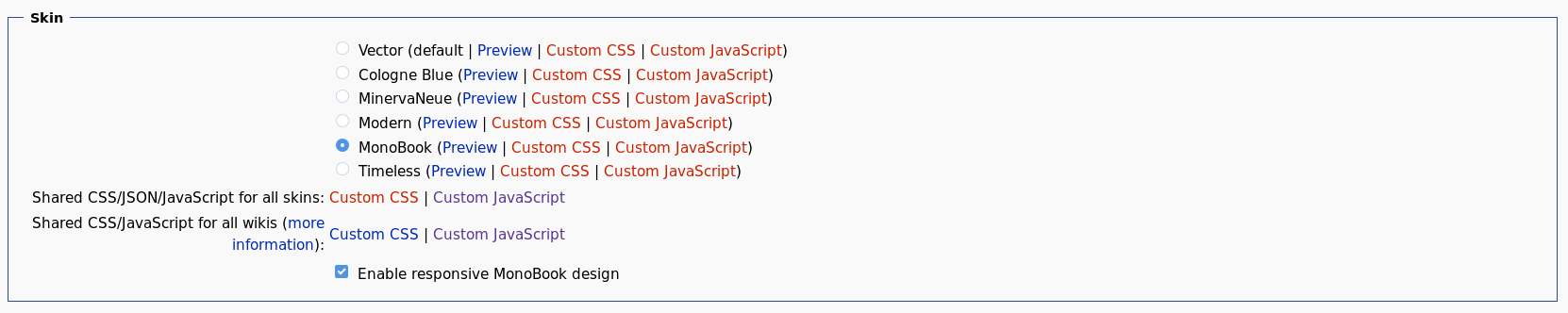
If you want to opt-out, there is a new User Preference.

Screenshot-2018-6-6 Preferences - MediaWiki.png (332×1 px, 41 KB)

Mobile device users can use your mobile browser's "Request desktop site" option (Firefox documentation).

Event Timeline

There are a very large number of changes, so older changes are hidden. Show Older Changes

Lego wanted to do a late inclusion in Tech News, but rather than marking it for translation Saturday evening UTC when many translators were done with the issue I opted to move it to 2018/23. This might have been bad judgement on my part. Either way, earlier notice would probably be good.

"If you want to opt-out, you can use your mobile browser's "Request desktop site" option" ?! This is happening ON A DESKTOP computer.

I've read through the full English Wikipedia discussion, as well as the German and French discussions linked above via Google Translate. I think the response can be broken down into:

  1. Icons are unclear.
  2. Some people work with images turned off and don't see any icons.
  3. Why is this showing up on my desktop computer (seemingly related to high zoom levels / small screens)
  4. Problems with access keys, potentially related to usage of a screen reader
  5. Lack of announcement/confusion about change
  6. Confusing desktop/mobile footer links from MobileFrontend
  7. Just want the normal desktop view, and opting out using a browser feature isn't sufficient for them.

Out of those 2-4 are revert worthy. 5 was a screw up on my part regarding timing of Tech News and not planning earlier. Some of these were tested, but apparently not across enough devices/varieties (e.g. if you use Firefox's data saver -> block images always option, the MonoBook icons still show up).

Moving forward, the revert worthy issues will need to be fixed before we redeploy this. I'll make sure each thing has its own blocking task. Long-term, I would expect that responsive MonoBook will be the default. There was some discussion about forking into classic and responsive MonoBook, but I don't think that's practical. In any case, it would be a decision for the volunteer maintainers of MonoBook if it's something they want to support. We'll continue to investigate ways to mimic a desktop viewport on mobile devices, but that mostly depends on it being technically possible.

Change 436972 had a related patch set uploaded (by Legoktm; owner: Bartosz Dziewoński):
[mediawiki/skins/MonoBook@wmf/1.32.0-wmf.6] Temporarily remove responsive support

https://gerrit.wikimedia.org/r/436972

Change 436972 merged by jenkins-bot:
[mediawiki/skins/MonoBook@wmf/1.32.0-wmf.6] Temporarily revert responsive support

https://gerrit.wikimedia.org/r/436972

Mentioned in SAL (#wikimedia-operations) [2018-06-02T07:36:52Z] <legoktm@deploy1001> Synchronized php-1.32.0-wmf.6/skins/MonoBook/: Temporarily revert responsive MonoBook (T195625) (duration: 00m 58s)

Implementing this as a forced change would be entirely unacceptable. This change must be reverted, and going forward must be solely opt-in. If you will not fork into "classic" and "responsive" Monobook, then this change needs to be stopped and rolled back entirely. Otherwise, please explain why it's not "practical". If third-party Wikimedia users want this change, they can write their own Monobook any way they like it, even using your code, but what you're doing here is NOT appropriate for the English Wikipedia and that is the flagship user of Mediawiki.

Community consensus should be reevaluated prior to deploying this to production projects as the default.

Krenair subscribed.

This is within a skin and not a wiki configuration change.

Implementing this as a forced change would be entirely unacceptable. This change must be reverted, and going forward must be solely opt-in. [...]

Opt-out would be perfectly acceptable as well. Forcing this on every one is however a complete dealbreaker.

@ashley if I'm reading the logs correctly, this got implemented based on your approval (+2'd) <anyone please correct me if this is wrong>. Can you explain your reasoning for how this satisfied the normal requirements including the need to "socialize high impact changes within the development community"?

@ashley if I'm reading the logs correctly, this got implemented based on your approval (+2'd) <anyone please correct me if this is wrong>. Can you explain your reasoning for how this satisfied the normal requirements including the need to "socialize high impact changes within the development community"?

It was well socialized within the development community. wikitech-l was notified a month beforehand, in addition to a post on the English Wikipedia's technical village pump. After it was merged, I sent out an email to wikitech-ambassadors, and but missed the Tech News deadline by a few hours. Aside from Tech News, were there places you were expecting to see a notification of some kind and didn't see anything?

Implementing this as a forced change would be entirely unacceptable. This change must be reverted, and going forward must be solely opt-in.

Could you explain why an opt-out is not acceptable?

If you will not fork into "classic" and "responsive" Monobook, then this change needs to be stopped and rolled back entirely. Otherwise, please explain why it's not "practical". If third-party Wikimedia users want this change, they can write their own Monobook any way they like it, even using your code, but what you're doing here is NOT appropriate for the English Wikipedia and that is the flagship user of Mediawiki.

The practical part is the maintenance burden. Responsive design *is* the direction that MediaWiki and Wikimedia development is moving in, whether it be in MobileFrontend, Timeless, OOUI, etc. Making MonoBook responsive is a pretty small part of that overall. It would be helpful if you could articulate the problems you've had using responsive MonoBook, especially if they're not mentioned in T195625#4250286.

@Legoktm thanks for the reply - are you referring to this posting asking for feedback about a change "for mobile" that was actually put in to production for desktop? Event the latest post on :w:en:WP:VPT was titled "for mobile users".

There isn’t a way to deploy responsive layout only ‘for mobile’. Our current mobile site is, and I hope no one will hate me for this, a kind of a big hack. It stays here because we can not, at this moment, implement a proper responsive layout due to amount of older templates etc. that would be rendered completely wrong in the desktop version. But it is a same ancient tool like a WAP version of a site was not too long ago, so eventually we should get rid of it.

Implementing a responsive layout for one of the most used skins of editors is a good step in this direction, so more people would care about having responsive layouts and different screen sizes. It was not the best idea to not discuss this more beforehand, but the change itself is a change in the better direction.

And, frankly, English Wikipedia’s opinion on it should not matter on this one bit if no one else would be asked. The special relationship that English Wikipedia has with developers and WMF looks, frankly, extremely awful for anyone outside of that community.

@stjn unlike some "third parties" that supposedly wanted this change (each of who can evaluate changes and decide if they want to actually promote them to their production environments) - the WMF managed implementations accept all current code changes to their (our) production environments - so of course there is a special relationship with the volunteers who carry out the foundation's mission; just as there is a special relationship between volunteer software developers and the WMF.

The We made some neat new software changes that leads to Hey you thousands of volunteers that produce and manage our content: we changed your interface, take it or leave it is where I see the friction coming from here.

There isn’t a special relationship with ‘volunteers who carry out the foundation’s mission’. There is a special relationship with the vocal Anglophone people in English Wikipedia that get the 99% of the attention from WMF and developers despite the global nature of our movement.

@Legoktm thanks for the reply - are you referring to this posting asking for feedback about a change "for mobile" that was actually put in to production for desktop? Event the latest post on :w:en:WP:VPT was titled "for mobile users".

Correct. I think I said it somewhere else (maybe not explicitly), but the fact that it showed up for desktop users was entirely unintentional and a bug. T196213: Set mobile breakpoint smaller for responsive MonoBook tracks lowering the threshold for determining whether a screen is desktop or mobile. Some people with high zoom levels are actually looking at the site at basically the same resolution as modern mobile devices - to the point where the sidebar might take up as much room as the content. There was also a suggestion about introducing a middle tablet mode, similar to the one Timeless has, which kept the standard tabs but collapsed the sidebar (IIRC). What @stjn said about not being able to deploy the layout just for "mobile" users is correct. We're just measuring the size of your screen and adjusting the layout accordingly.

There isn’t a way to deploy responsive layout only ‘for mobile’. Our current mobile site is, and I hope no one will hate me for this, a kind of a big hack. It stays here because we can not, at this moment, implement a proper responsive layout due to amount of older templates etc. that would be rendered completely wrong in the desktop version. But it is a same ancient tool like a WAP version of a site was not too long ago, so eventually we should get rid of it.

Implementing a responsive layout for one of the most used skins of editors is a good step in this direction, so more people would care about having responsive layouts and different screen sizes. It was not the best idea to not discuss this more beforehand, but the change itself is a change in the better direction.

I am in full agreement with everything you said :)

And, frankly, English Wikipedia’s opinion on it should not matter on this one bit if no one else would be asked. The special relationship that English Wikipedia has with developers and WMF looks, frankly, extremely awful for anyone outside of that community.

Fair enough. I've tried my best to keep up with the linked German and French Wikipedia discussions as well, but really I depend upon help from tech ambassadors to bypass the language barrier. If you know of more discussions about the feature on other projects, I'd appreciate if you could post links to them :)

Why is this showing up on my desktop computer (seemingly related to high zoom levels / small screens)

Yes. Also, as a user of Timeless, where I most run into it in my own workflow is that I will work with the wiki page on only half my screen and some other relevant program/page on the other half of the screen. (I have the benefit of Windows 10 which allows me to play easily with the sizing of two windows on one screen, which is nice--not sure which other non-Windows OSs behave similarly.)

Just want the normal desktop view, and opting out using a browser feature isn't sufficient for them.

Having direct access to certain working-use links in an always-consistent location rather than needing to fight with flyouts is a better description for some of the concern here--we're not dealing with concerns of normal readers here but actual editors, whom are really the only ones to be using either Timeless or Monobook, and whom are the least afraid to edit on whatever platform they're using (especially since I know of no browser which actually allows you to 'return to normal desktop mode' [possible discoverability issue over which you have no control]).

@stjn it is just where the volunteers are, a quick current statistics breakdown of the largest projects (wikipedia's with 1,000,000+ articles) show active volunteers of:

enwiki: 130285 active users

frwiki: 19102
dewiki: 18668
eswiki: 17592
jawiki: 13397
ruwiki: 11242
itwiki: 8926
zhwiki: 8048
nlwiki: 3891
plwiki: 4202
svwiki: 2592
viwiki: 1612
the next 11: 109272

enwiki has more active volunteers then the next 11 projects combined - its not about what language it is, it is just where the volunteers are. And notably, number 2 frwiki was also in the list above reporting issues.

Fair enough. I've tried my best to keep up with the linked German and French Wikipedia discussions as well, but really I depend upon help from tech ambassadors to bypass the language barrier. If you know of more discussions about the feature on other projects, I'd appreciate if you could post links to them :)

There is one at https://ru.wikipedia.org/wiki/Википедия:Форум/Технический#Новый_вид_стационарной_версии_в_смартфоне, but it’s mostly subjective.

enwiki has more active volunteers then the next 11 projects combined - its not about what language it is, it is just where the volunteers are. And notably, number 2 frwiki was also in the list above reporting issues.

I am not into dick-measuring contests, sorry, and by starting them you completely missed my point.

! In T195625#4251048, @stjn wrote:
I am not into dick-measuring contests, sorry, and by starting them you completely missed my point.

Please remain civil and respect the Code of Conduct. There simply are an extraordinary larger number of volunteers that contribute to enwiki compared to other projects. It should not be surprising that they are vocal when an unexpected change impacts them.

@ashley if I'm reading the logs correctly, this got implemented based on your approval (+2'd) <anyone please correct me if this is wrong>. Can you explain your reasoning for how this satisfied the normal requirements including the need to "socialize high impact changes within the development community"?

It was well socialized within the development community. wikitech-l was notified a month beforehand, in addition to a post on the English Wikipedia's technical village pump. After it was merged, I sent out an email to wikitech-ambassadors, and but missed the Tech News deadline by a few hours. Aside from Tech News, were there places you were expecting to see a notification of some kind and didn't see anything?

That's not "well socialized". Monobook is a heavily used item on the English Wikipedia. "Well socialized" would be a full-on, heavily advertised RfC closed with a consensus to make the change.

There isn't some end run around that. Major changes require consensus gained by actively ensuring people actually want the change. Period.

Thanks Legoktm for the accurate analysis and for being highly responsive to the users' concerns.

Now that the change has been reverted, I think it's completely misguided to continue this discussion on what kind of approval/consensus such a change would have required. The code was experimental and not ready for mass deployment, that's it. Mistakes happen.

For the future, I repeat my suggestion that responsive MonoBook be made a configuration setting, similar to $wgVectorResponsive, so that it can be tested on select wikis and willing third-party wikis. After 6-12 months (at least one release cycle), the default can be reassessed based on the improvements and how disruptive the change ends up being.

If you want to opt-out, you can use your mobile browser's "Request desktop site" option

This is demonstrably false. For most mobile users, they cannot use their browser's "request desktop site" option, since it has been documented that this option does not increase the viewport beyond the magic 850px number in Chrome and Safari (which make up 70%-90% of mobile web users, according to https://en.wikipedia.org/wiki/Usage_share_of_web_browsers). In fact, the only browser that this has been documented to work on is Firefox, which makes up less than 1% of mobile web traffic.

I don't have an iDevice to test Safari on, but using the latest Chrome from the Google Play Store, it works for me:

Screenshot_20180603-144603.png (2×1 px, 550 KB)

Does it not work for you on Android Chrome? What device / Android version are you using?

It did work for me on Chrome on Android, but only apparently per session. Every time I'd open a new window (which I do frequently when, for example, reviewing discussions, doing speedy deletions, etc.), I would have to go hit that once again. When I'm talking about an opt-out, I'm not talking about something I'll have to do again and again, I'm talking about something I can set once.

Does it not work for you on Android Chrome? What device / Android version are you using?

I was going by Isarra's comments at https://en.wikipedia.org/wiki/Wikipedia:Village_pump_(technical)#Issues/problems/questions

I have an android device with a1440x2560 screen, so it works for me, but other editors on Wikipedia with older devices (such as the Samsung Galaxy J-3 with a 360x640 screen) or using Chrome for iOS reported that it didn't work.

It did work for me on Chrome on Android, but only apparently per session. Every time I'd open a new window (which I do frequently when, for example, reviewing discussions, doing speedy deletions, etc.), I would have to go hit that once again. When I'm talking about an opt-out, I'm not talking about something I'll have to do again and again, I'm talking about something I can set once.

Ack.

OK, so based on all of the provided feedback, we're going to lower the mobile breakpoint to something around 500px (T196213) so people mostly shouldn't see it on desktops, and I worked out how to add a user preference to fully opt out of responsiveness, and just get the classic desktop styles: https://gerrit.wikimedia.org/r/#/c/437150/. Will that take care of most peoples concerns right now?

That would address mine. I'd still prefer opt-in, but a well-publicized and easy to set opt-out would solve any immediate issues.

! In T195625#4254813, @Legoktm wrote:
and I worked out how to add a user preference to fully opt out of responsiveness, and just get the classic desktop styles: https://gerrit.wikimedia.org/r/#/c/437150/. Will that take care of most peoples concerns right now?

So would this be only for logged-in users with preferences, that is regular readers/anonymous editors would have no "view desktop version" capability?

Correct. No Wikimedia wiki has MonoBook as a default skin, so that's not an issue. In the commit message I explained that the normal methods of controlling preference defaults will work, and can be used for changing what anonymous users get.

Status update:

Responsive MonoBook is being deployed again this week with MediaWiki 1.32-wmf7:

This time there will be an opt-out preference (https://gerrit.wikimedia.org/r/#/c/437150/). This change missed the deadline for wmf7 by a few hours (poor coordination on my part, sorry); I will be deploying it separately soon (at 20180606T2300).

Can you please announce how to opt out? I use Monobook a lot for administrating (I *need* an option to delete a page in one click from mobile), I see it deployed again on a non-Wikipedia wiki (uawikimedia to be specific) without any opt-out settings

Can you please announce how to opt out? I use Monobook a lot for administrating (I *need* an option to delete a page in one click from mobile), I see it deployed again on a non-Wikipedia wiki (uawikimedia to be specific) without any opt-out settings

It's a user preference:

Screenshot-2018-6-6 Preferences - MediaWiki.png (332×1 px, 41 KB)

I think in the long term there is a sense to make this preference skin-agnostic and provide for users the means to disable responsive design on any skin instead of just Monobook, especially since any future efforts would likely go into the same thing.

Is the default value for the "opting" something that can be specified at the project level?

Why was this change deployed again so quickly without warning the editors? It really is not urgent and there are many unsolved problems.

Is the default value for the "opting" something that can be specified at the project level?

It surely can be changed, I just opened T196721: Make non-responsive Monobook the default for German-language Wikipedia.

There isn’t a way to deploy responsive layout only ‘for mobile’.

There is. We do so for Vector. https://en.m.wikipedia.org/wiki/Vector_(mathematics_and_physics)?useskin=vector

Our current mobile site is, and I hope no one will hate me for this, a kind of a big hack. It stays here because we can not, at this moment, implement a proper responsive layout due to amount of older templates etc. that would be rendered completely wrong in the desktop version. But it is a same ancient tool like a WAP version of a site was not too long ago, so eventually we should get rid of it.

@stjn I don't hate you for this, but as someone who helped build it I don't agree and don't think it should go away. WAP went away because it was a dying technology.

I've always felt it's important and powerful that we provide different mechanisms for viewing and editing our content - as if we don't other sites like Wikiwand will and people will go there and there will be no mechanism/incentive to edit. The fact we provide a variety of ways via tools such as wikidata games; mobile apps and responsive and non responsive layouts is important and powerful part of who we are. Mobilefrontend (which provides the en.m domain) gets a bad rep but more or less all it does is allow you to have a different skin on mobile with simplified mobile friendly content if you want it. Not everyone does want this, and that's fine - and equally not everyone needs a responsive skin - but that choice is important and powerful.

Responsive design is not a magical solution nor is it always the correct answer. I'm yet to see a responsive site that does not sacrifice user power, something of great importance in our community. That's kinda the beauty of it - I love both Github's mobile and desktop site and I often find myself switching to desktop mode on Github mobile to perform certain uncommon functions.

As far as i can help at WMF, I will personally push for more instrumentation and data around skins and user needs. I think this would be very helpful to have. Right now we have no idea about how users use skins and why and it seems there is a lot of guesswork going on.

Yeah, I am not trying to say that the intent behind MobileFrontend, especially when we see the editors react so much about good ideas to do something that other sites did some years ago now, is bad or anything. It is a tool of necessity, but we shouldn’t think that all mobile development should be pushed to mobile as soon as possible (and I think the people that ask this new development to be disabled on their community level are somewhat overreacting).

The point you’re making about reading and editing is important one: in my experience, most users that object to MobileFrontend object to it on the grounds that it doesn’t provide enough abilities to users. Strange to see then when the same users object to making the desktop layout more friendly on mobile, when it should be something they should support in the long term.

The more adaptive features Wikipedia will have (esp. with tools like TemplateStyles), the more apparent would it be that non-responsive layout provides existential problems. (As an example, we made Russian Wikipedia’s main page responsive not long ago and multiple users on iPads were frustrated by one-column layout on desktop because our desktop site is not responsive and their screen gets detected smaller than it is because of it.)

Vvjjkkii renamed this task from Implement a responsive layout for MonoBook to a9baaaaaaa.Jul 1 2018, 1:06 AM
Vvjjkkii removed Isarra as the assignee of this task.
Vvjjkkii triaged this task as High priority.
Vvjjkkii reopened subtask T196212: Revert T195625 as Open.
Vvjjkkii updated the task description. (Show Details)
Vvjjkkii removed subscribers: gerritbot, Aklapper.
Xaosflux lowered the priority of this task from High to Medium.Jul 1 2018, 3:46 AM

I deny all responsibility.