Modified design to resolve the issues identified in the usability tests for v1 prototype and other feedback gotten.
Participant Registration
Option 2(Main Option) - Organizer Flow
Option 1(MCR) - Organizer Flow
Open questions:
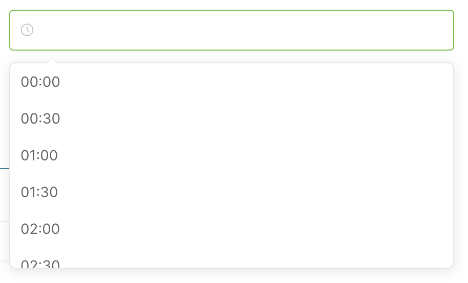
- Are we keeping date/time/timezone within the same field, or separate fields?
- Engineering notes: date+time in the same field would be preferred, because that's the widget that MW provides when you need both a date and a time, and is used consistently across the interface (whereas I couldn't find any usage of a time-only field). Also, a single field is slightly easier to handle on the backend, and it's less work for message translators.
- Design answer: answer here
- Are we keeping date/time/timezone within the same line, or separate lines?
- Engineering notes: what we get out of the box is separate lines. It is nonetheless possible to put them on the same line with some CSS hacks; for instance, core's special contributions does that (see how it looks like, code). It's not the cleanest solution, but it should be reasonably fine if having the fields on the same line is important.
- Design answer: answer here
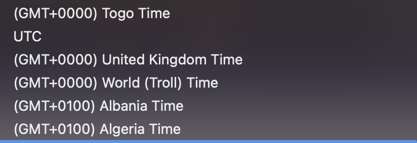
- Timezone fields: Is it okay if the organizer can only add time in UTC?
- Engineering notes: it may be possible to make the timezone customizable within the datetime field, but that's an OOUI core change. Alternatively, we can have a separate field for specifying a timezone, which would be easier to do but potentially less clear.
- Design answer: answer here
- Timezone fields: how might we circumvent the “Z” (which is UTC)?
- Engineering notes: Unsure about the meaning of this question.
- Design answer: answer here
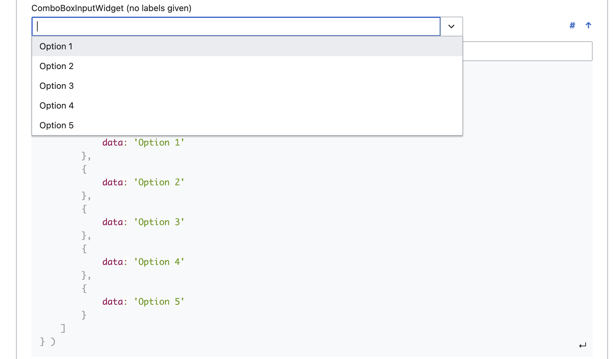
- Radio button for event type: no empty state – is that ok? It will, by default, select the "first" radio button.
- Engineering notes: This behaviour may or may not be a bug. There's already a task for it: T207475. I don't think this can be fixed without a core/OOUI change.
- Design answer: Can you confirm if it is intentional or a bug? The description in the task you linked seems to suggest a bug. We can go ahead with selecting the first option as default pending whenever this is resolved or if we get negative user feedback from V0. If we are going with using Physical event as the default option then it should be made the first so users can easily notice it has been pre-selected when scanning the form.
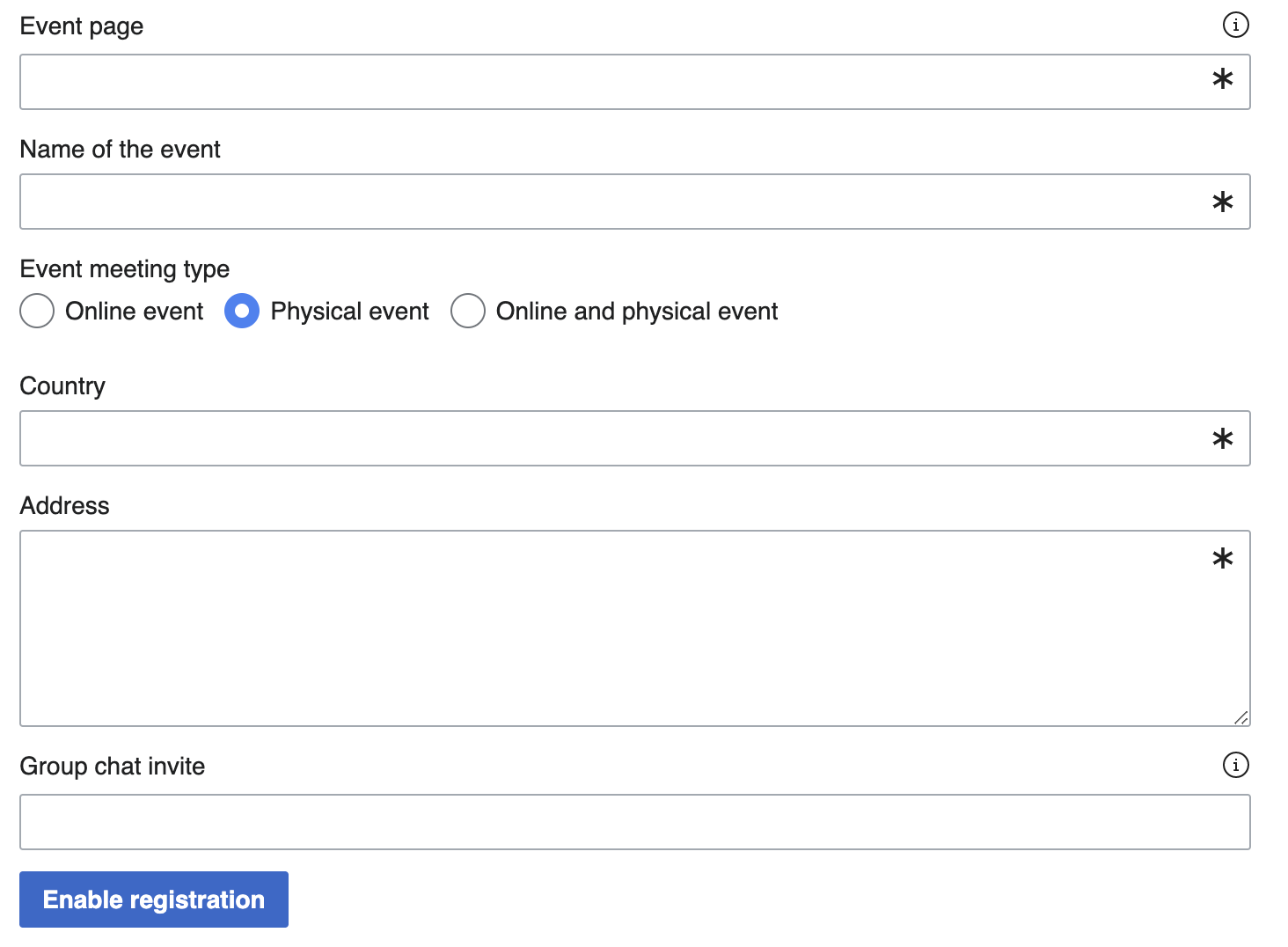
- Does design approve of how the engineers will be changing the UI of the sections in the form?
- Engineering notes: Personally, I don't think we have a proposal. Instead, I'd like to know from design how should the section look like given what we can do. For reference, you can find an example of form with sections here (you need to have some pages from different namespaces in your watchlist to view it properly).
- Design answer: Having rectangles separating each section will make the UI look clogged up and more difficult for users to easily process the information on the page. I have two suggestions:
- Use bold free text
- Use sections but hide the rectangles and remove indentation
- Final Answer:
- Use bold free text
- Use sections but hide the rectangles and remove indentation
- Do we need to change the special change the special page text to be something like event center?
- Engineering notes: This is doable with a hack but I'd recommend against that. Namespace tabs are there for a reason, and they appear on every page of the site. Hijacking their content seems inconsistent with the experience that user gets everywhere else. If we need a navigation menu, we can add that separately. In general, if we need more elements, we can add them. But changing the nstab sounds wrong to me.
- Design answer: answer here
- Do we need the "preview event page" feature for V0? (CC @ifried too)
- Engineering notes: This seems fairly hard to implement, especially the way it's presented in the prototype.
- Design answer: The Preview feature shows users what their event page is going to look like when they enable registrations, this helps them cross-check and confirm the information they entered. Preview is also important since Event Center is a new tool, users will be exploring this tool with curiosity, with questions and judgment on whether this will meet their needs and what it will look like. Giving them a glimpse of what it will look like and how it will meet their needs will motivate them to jump in with both feet confidently. Since it is difficult to implement, it is okay to move it to V1.
- Icons in the text fields (URL and address): are they important?
- Engineering notes: This is currently not possible, but the needed core change should be relatively easy to write, so we can do that if design thinks this is important for V0.
- Design answer: Icons are especially important for the input fields that do not have labels on top (URL and Address). Icons will help convey visually what users are expected to input in addition to the placeholder text (which normally disappears once you start typing).