Page MenuHomePhabricator

Evaluate quiet normal and progressive buttons in contrast to links
Open, LowestPublic

Assigned To
None
Authored By
Volker_E
May 25 2022, 7:21 AM
Referenced Files
F35237411: image.png
Jun 13 2022, 8:34 PM
F35237503: image.png
Jun 13 2022, 8:34 PM
F35237371: image.png
Jun 13 2022, 8:34 PM
F35237334: image.png
Jun 13 2022, 8:34 PM
F35237369: image.png
Jun 13 2022, 8:34 PM
F35237409: image.png
Jun 13 2022, 8:34 PM
F35237336: image.png
Jun 13 2022, 8:34 PM
F35237345: image.png
Jun 13 2022, 8:34 PM
Tokens
"Love" token, awarded by alexhollender_WMF.

Description

Background

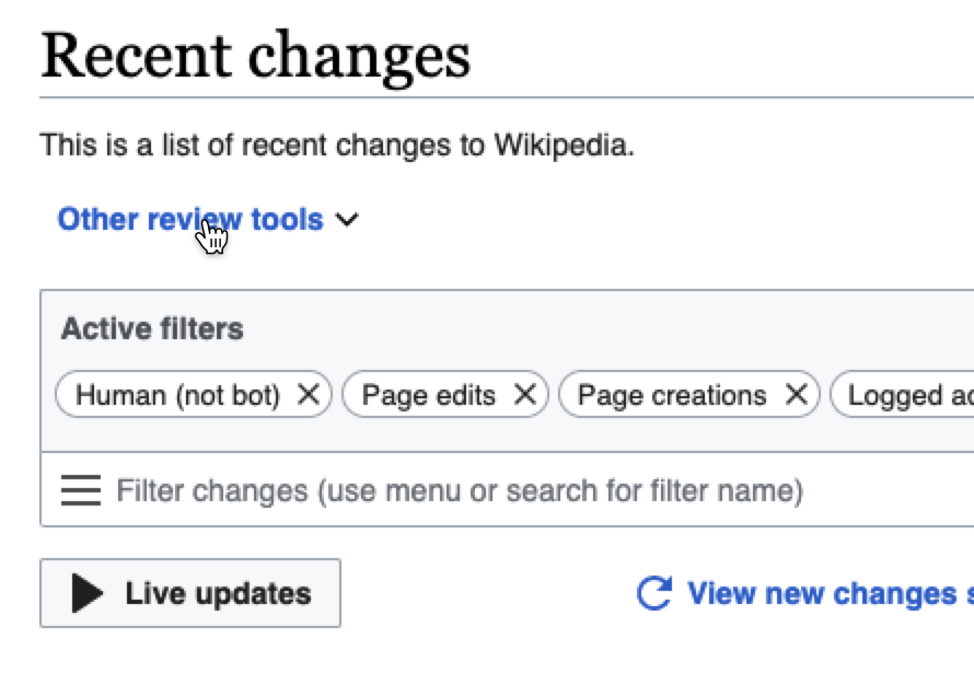
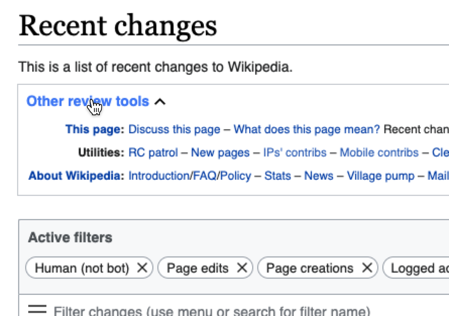
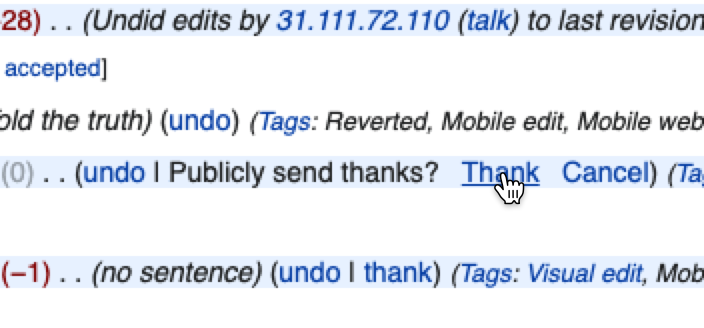
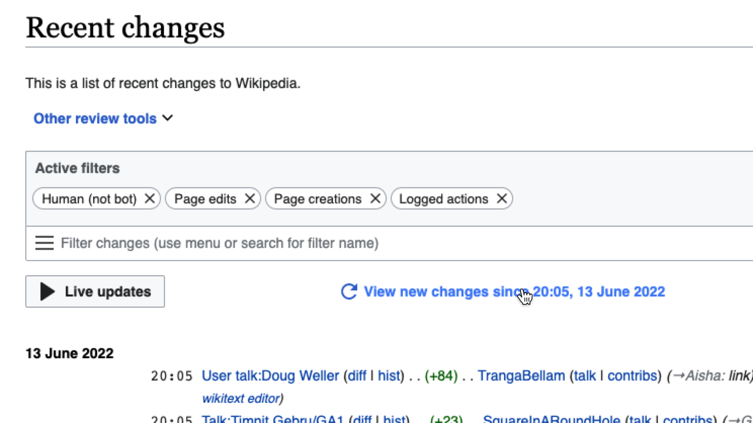
The current button visual appearance together with an unclear/mixed implementation crashes in quiet normal (boldened and Black), quiet progressive (boldened and Blue 600) and links (sometimes normal, sometimes bold and Blue 600)

We don't have a clearly documented and acted on approach:

image.png (316×842 px, 59 KB)

Button types and variants Codex: https://doc.wikimedia.org/codex/main/components/button.html

Goal

Find a path, solution for the Design System with Desktop Improvements project as most important current project to provide a path to untangle this inharmonious and unclear mix.

User stories

As a user, I would like to know what elements are interaction-able while also not getting too distracted by them.

Acceptance criteria for Done

To be defined around

Design

  • Document all use cases and real examples of:
    • Links (Regular, Bold, Blue...)
    • Quiet buttons
  • Evaluate if we should update our quiet normal/progressive buttons
    • If yes, update them in our Figma library

Design Style Guide

Codex

  • Update buttons in Codex (if needed)

Technical and usability concerns

There's a crucial usability benefit in differentiating links from buttons.

Differentiaton from a standard web user-interface/user-experience POV

LinksButtons
Links are one of the most basic, yet deeply fundamental and foundational building blocks of the web. Click a link, and you move to another page or are moved to another place within the same page.Buttons are for triggering actions. When do you use the <button> element? A good rule is to use a button when there is “no meaningful href.” Here’s another way to think of that: if clicking it doesn’t do anything without JavaScript, it should be a <button>.

Further resources and activities

Event Timeline

@Volker_E @Sarai-WMDE:

Problem 1: we do not have consistent styling for "quiet" buttons
Problem 2: quiet buttons styled with bold, black text may not be discoverable
Problem 3: quiet buttons styled with bold, blue text may visually clash with nearby interface links (which are styled in non-bold, blue text)
Problem 4: quiet buttons styled with non-bold, blue text may be confused for links

In order to further investigate these potential problems I think it might be helpful to break this concept of quiet buttons down into the following categories:

  • menu triggers
  • toggle switches
  • other quiet buttons

By defining more specific categories/use-cases I think our conversations and possible solutions might be more specific. Outside of menu triggers and toggle switches it might make sense to strongly discourage the use of quiet buttons (as we've discussed @Volker_E). If we limit quiet buttons to these two cases then perhaps the problems above become more approachable. For example we could say: menu triggers must always have some kind of arrow icon following the text, to indicate that they are click-able, and will lead to a menu opening. If we did this we might avoid the issue of them being confused with links, or alternatively we might be able to justify styling them in black.

I think as a next step it would be helpful to:

  • collect additional examples of quiet buttons in the interface
  • consider whether we actually need quiet buttons (outside of the cases of menu triggers and toggle switches)
  • mockup various options for a variety of examples of menu triggers, toggle switches, and other quiet buttons

Menu triggers
The thing that you click on in order to open a menu. Sometimes they are text, sometimes they are icons (though the icon case might be outside the scope of this inquiry). For example:

texticon
image.png (806×1 px, 154 KB)
image.png (640×398 px, 74 KB)

View toggles
The thing that you click on in order to show/hide content. For example:

image.png (880×566 px, 172 KB)
image.png (880×566 px, 319 KB)
image.png (626×890 px, 120 KB)
image.png (626×890 px, 165 KB)

Other quiet buttons
Harder to define, but more like "buttons" in the traditional sense. When you click them some kind of action (more like a data-action, than a interface/layout/view action) happens. For example:

image.png (328×704 px, 112 KB)
image.png (836×1 px, 224 KB)
image.png (668×1 px, 224 KB)
image.png (720×498 px, 101 KB)

i've created a task that specifically addresses the question of quiet buttons used as navigational menu handles/triggers: T311306: Evaluate navigational menu handle/trigger styling