Description
In an attempt to simplify our interface we are going to reduce the number of different styles we use for links (currently there are some links that are using non-standard styling).
To-do
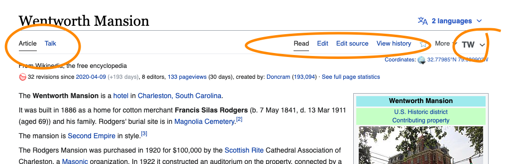
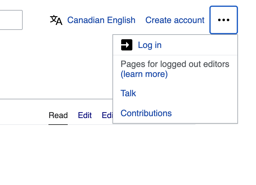
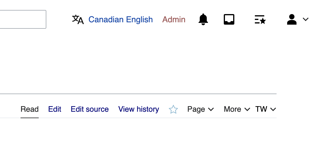
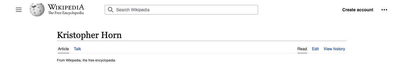
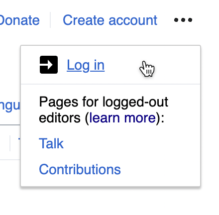
- the two main links in the site header — "Create account" when logged out, "Username" when logged in — should be styled as blue links, rather than quiet buttons (link to prototype)
| before | after |
|---|---|
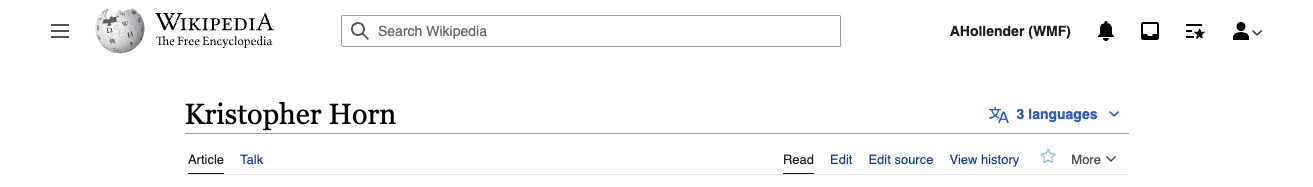 | 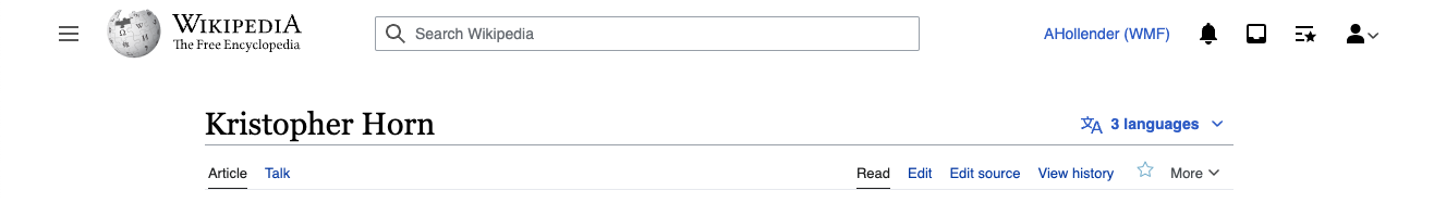 |
 | 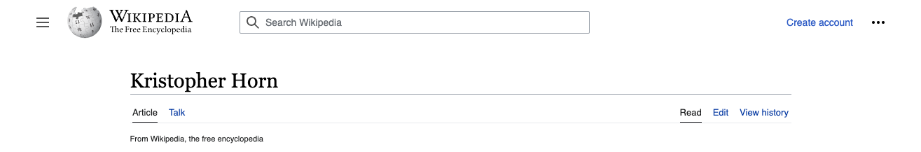 |
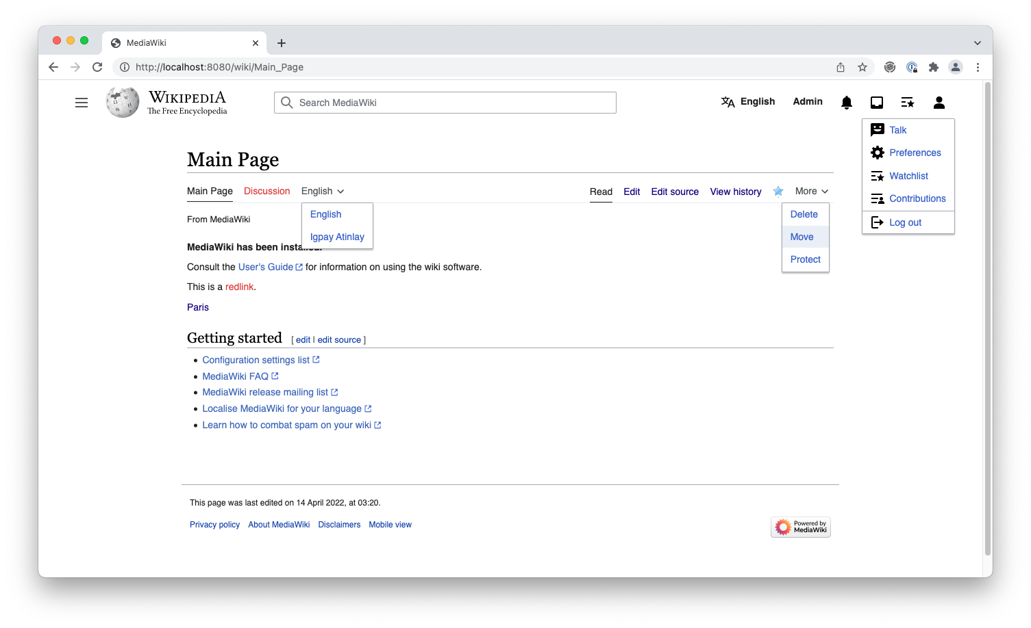
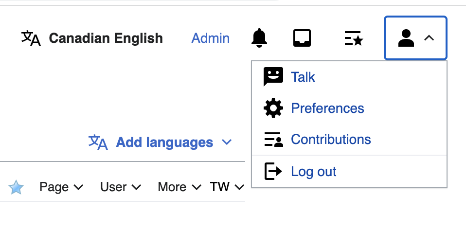
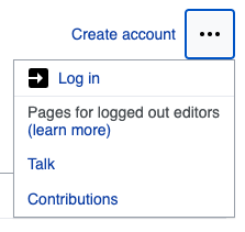
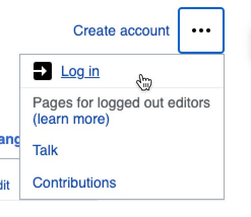
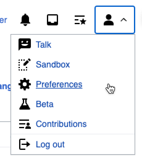
- the links in the dropdowns should be styled as blue links (link to prototype)
| before | after | after (:hover) |
|---|---|---|
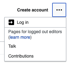 | 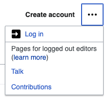 |  |
 |  | 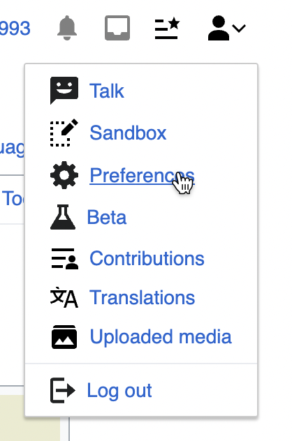 |
QA
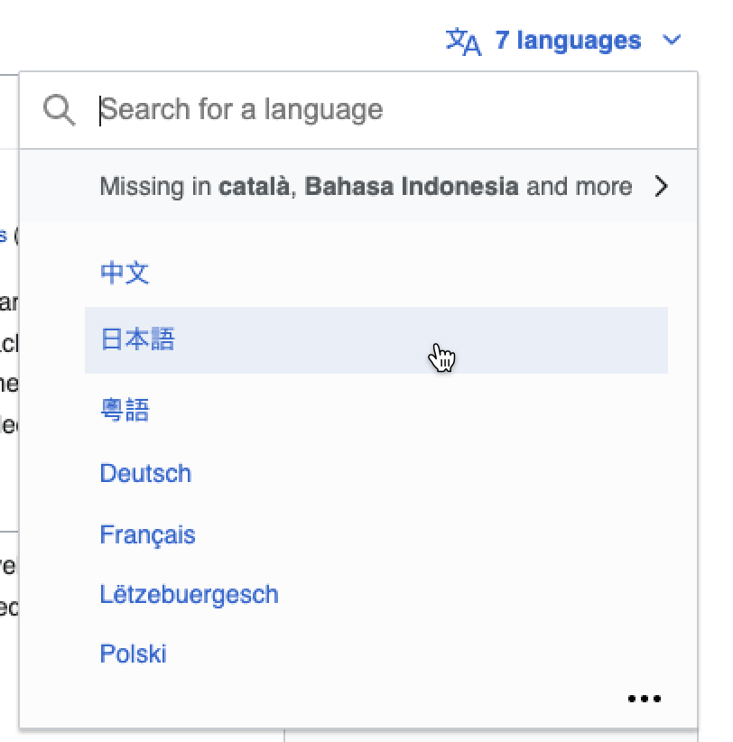
- The styles for the language button should not be impacted (language name should be black)
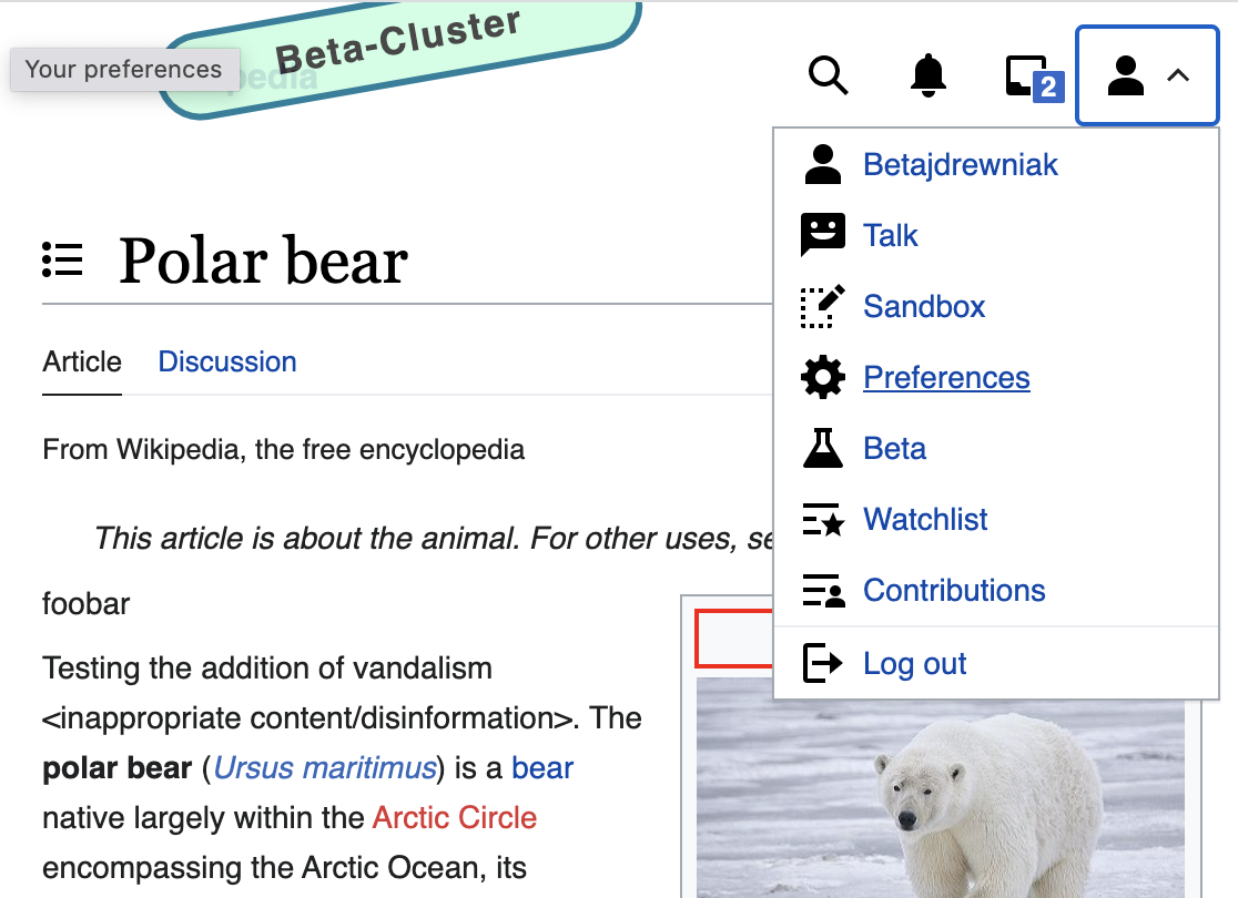
- Click the user item. Items in the dropdown menu should be blue links
- Username when logged in should be a blue (not black)
- Create account should be a blue (not black)