Description
See parent task for general information.
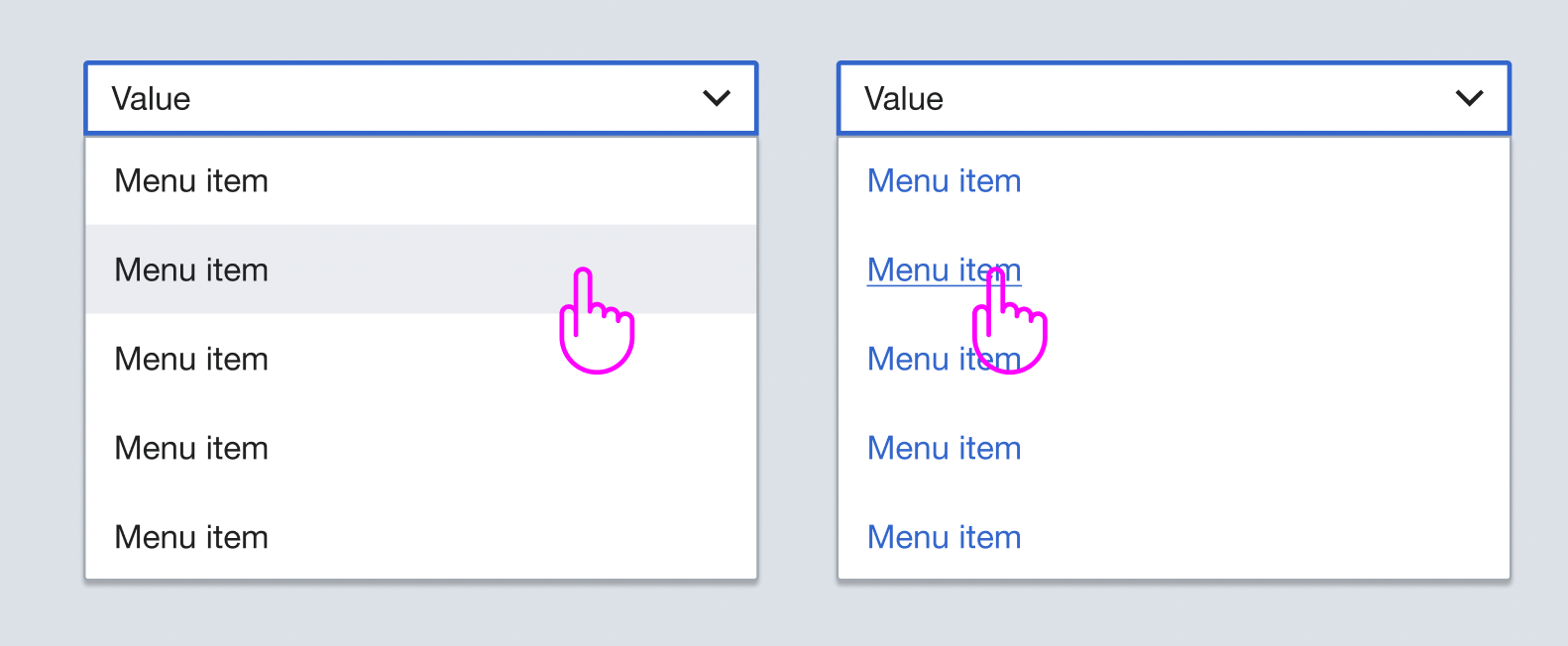
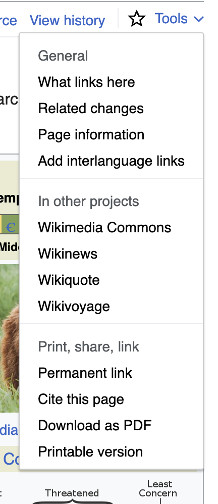
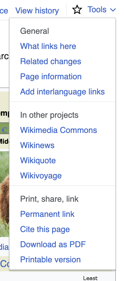
Navigational menus usually consist of two parts: 1) the menu handle/trigger (i.e. the thing you click on to open the menu), 2) the menu links/items (i.e. the things inside of the menu). This task is specifically about the styling of the menu links/items.
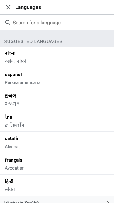
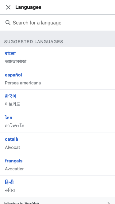
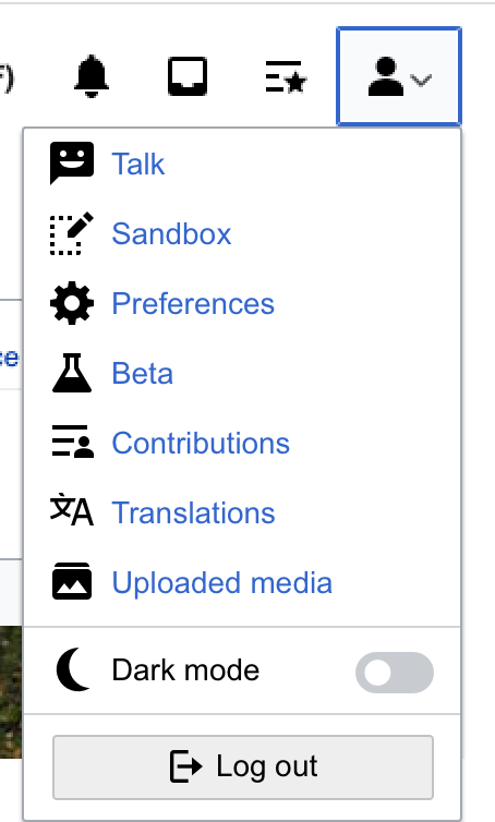
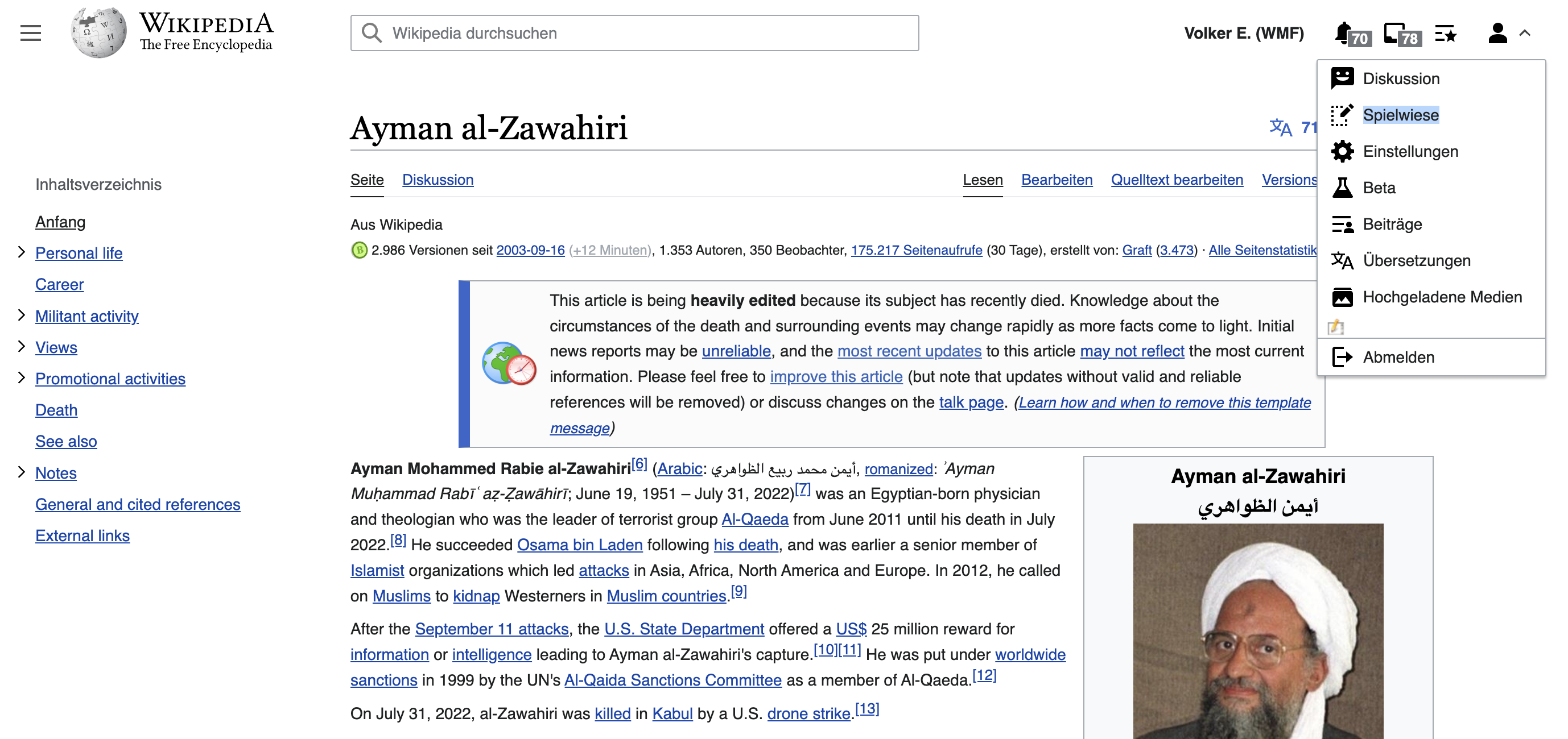
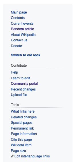
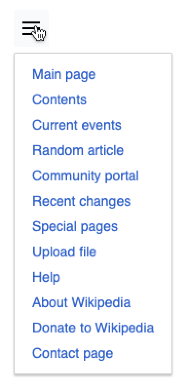
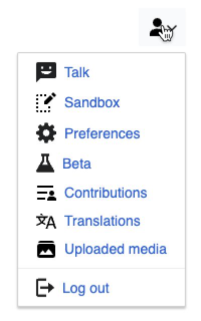
The links/items inside navigational menus are links (both from a user experience perspective, and from a technical perspective). Currently these links/items are sometimes styled in black, and sometimes styled in blue. For example:
| blue menu links/items | black menu links/items |
 | 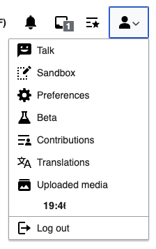 |
 |  |
Proposal
We should style navigational menu links/items as we style other links: in blue. The reasons are:
- by default they are blue, and unless we have a strong case for overriding the default styling we should not
- blue links set a clear expectations for people using navigational menus & links
- links can be opened in new windows/tabs
- links can be copied & shared
- links will navigate to a new page
- in the case of a navigational menu with headings it makes the links/items easier to distinguish from the headings
- this simplified our interfaces from a design and code perspective by reducing the styling of links to one styling
- this allows easier scanning of navigational menus in cases where the links/items have subtext (like the descriptions in the search menu)
- this is aesthetically more aligned with our minimalist approach (i.e. less CSS)
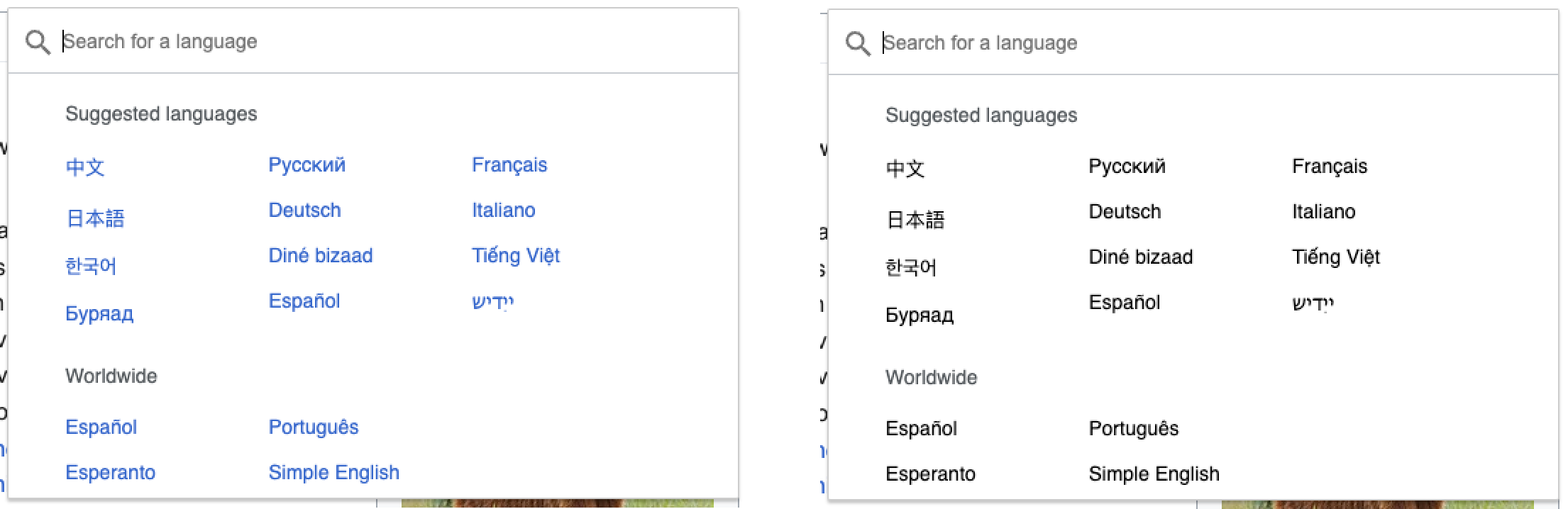
Prototype: https://di-visual-design-menus.web.app/Zebra
(using the options panel in the bottom left corner you can toggle between option 1, which styles the navigational menu links/items in blue, and option 2, which styles them in black)
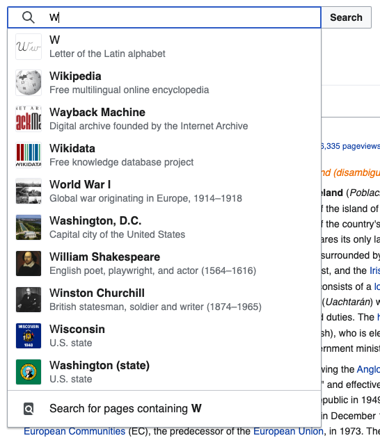
Examples
Examples of different types of navigational menus, with the links/items styled in blue:
| simple | with headings | with icons | with descriptions | with search input |
 | 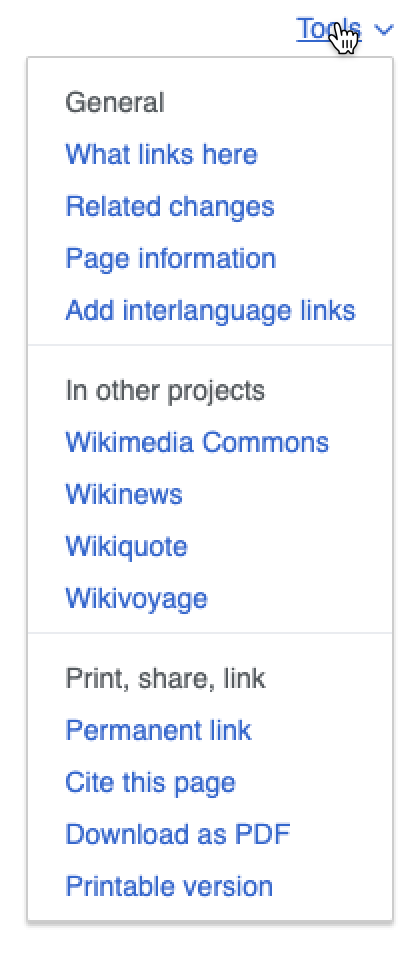 |  | 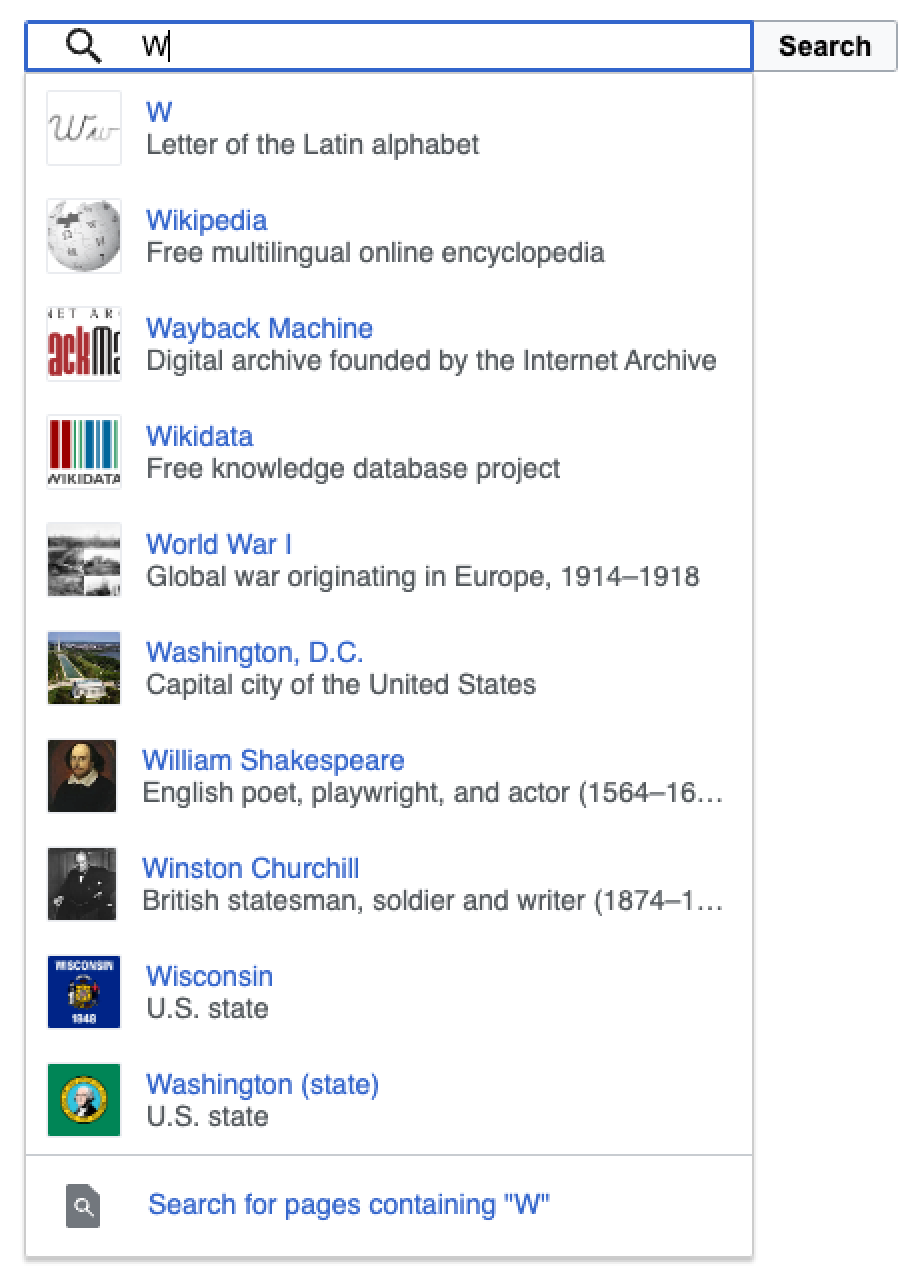 | 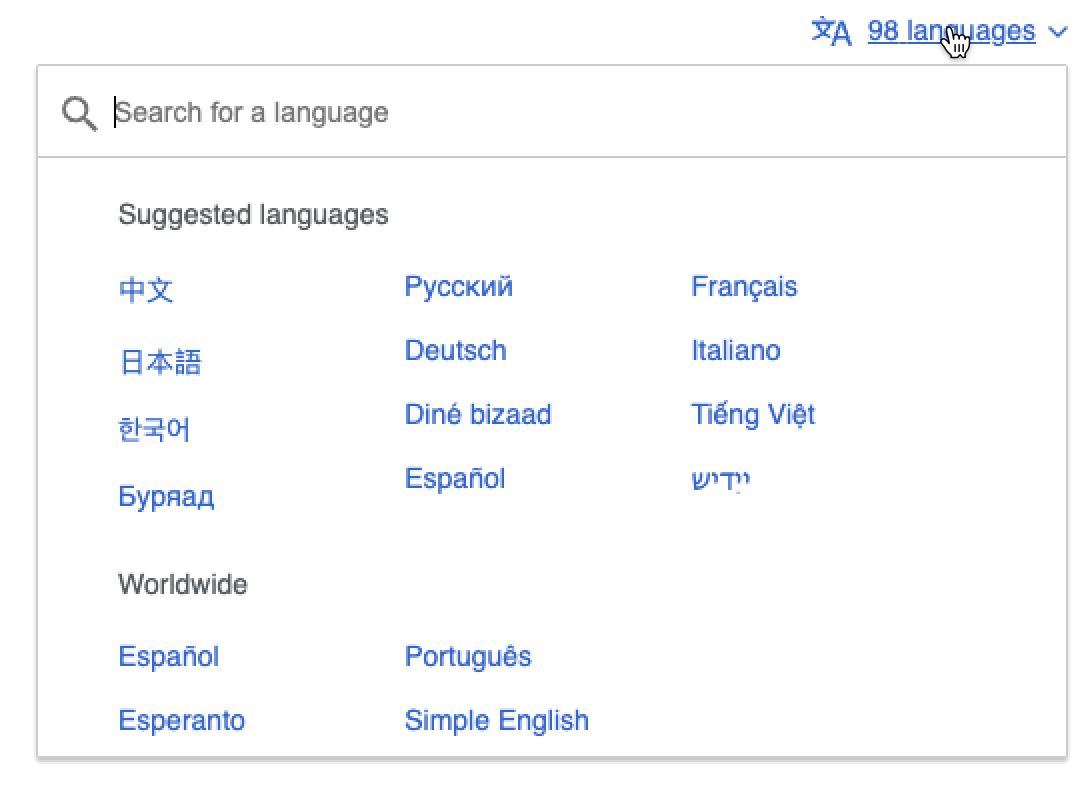 |