Page MenuHomePhabricator

[ edit ] link for lead section is too high on the page in Vector 2022
Open, Stalled, Needs TriagePublicBUG REPORT

Assigned To
None
Authored By
Jonesey95
Dec 13 2022, 3:09 AM
Referenced Files
F35864946: Screen Shot 2022-12-14 at 5.50.29 PM.png
Dec 14 2022, 10:51 PM
F35864890: image.png
Dec 14 2022, 9:15 PM
F35864306: image.png
Dec 14 2022, 4:50 PM
F35864308: image.png
Dec 14 2022, 4:50 PM
F35864302: image.png
Dec 14 2022, 4:50 PM
F35864310: image.png
Dec 14 2022, 4:50 PM
F35864298: image.png
Dec 14 2022, 4:50 PM
F35864300: image.png
Dec 14 2022, 4:50 PM

Description

Steps to replicate the issue (include links if applicable):

  • Enable the gadget called "Add an [edit] link for the lead section of a page". Disable Visual Editor.
  • Open a normal article with a lead section and other sections using Vector 2022.

What happens?:
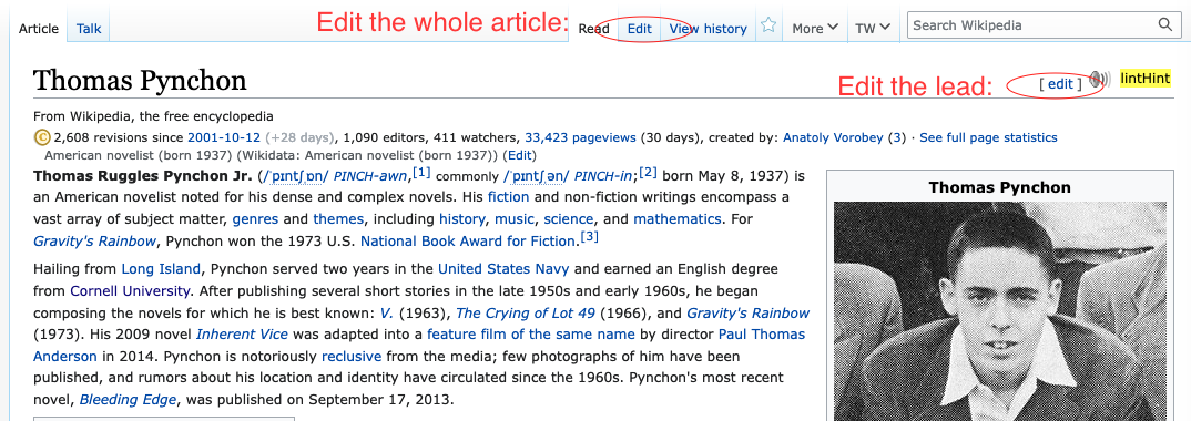
The [ edit ] link for the lead section appears on the same line as the article title, *above* the plain-text whole-article "Edit" link that lives in the Article/Talk row.

What should have happened instead?:
The [ edit ] link for the lead section should appear below the whole-article "Edit" link, at the top of the lead section.

Software version (skip for WMF-hosted wikis like Wikipedia):

Other information (browser name/version, screenshots, etc.):
Firefox 107 for Mac OS.

Event Timeline

TheDJ subscribed.

Gadgets are wiki specific and are thus primarily a local wiki concern and can be fixed by any script developer willing to maintain them. It does not necessarily require WMF intervention.

Aklapper changed the task status from Open to Stalled.Dec 13 2022, 11:16 AM

Enable the gadget called "Add an [edit] link for the lead section of a page". Disable Visual Editor.

Hi, on which website / example URL? I fail to see any such link displayed on https://en.wikipedia.org/wiki/Wiki_software . Please always include links.

https://en.wikipedia.org/wiki/MediaWiki:Gadget-edittop.css is probably the file to edit if this is about English Wikipedia.

The [ edit ] link for the lead section should appear below the whole-article "Edit" link, at the top of the lead section.

I think a central question becomes.. where SHOULD it be ? Especially considering. that section 0 is not really a distinct part of the page, it includes things like amboxes, infoboxes etc, so its difficult to have a consistent spot to add the edit link to if it is not the page title.

Screenshot 2022-12-13 at 13.38.34.png (640×2 px, 154 KB)

@Jonesey95 can you please include two screenshots in the task description:

  • how it looks in Legacy Vector
  • how it looks in Vector 2022

https://en.wikipedia.org/wiki/Thomas_Pynchon

Legacy Vector (good placement):

Vector legacy edit lead placement.png (380×1 px, 254 KB)

Vector 2022 (confusing placement):

Vector 2022 edit lead link misplacement.png (371×905 px, 201 KB)

@Jonesey95 thanks for the screenshots. two things:

  • for me the edit link appears where it is in the screenshot posted above by @TheDJ T325038#8463177 — I wonder why there is a difference
  • more importantly, can you explain what the value is of this setting Add an [edit] link for the lead section of a page? I would like to understand the use case better before making any further suggestions
  • more importantly, can you explain what the value is of this setting Add an [edit] link for the lead section of a page? I would like to understand the use case better before making any further suggestions

T2156: Add section edit link for 0th section of a page/article has long existed that you should consider reading, without comment on how Jonesey values it.

  • for me the edit link appears where it is in the screenshot posted above by TheDJ T325038#8463177 — I wonder why there is a difference

I wonder if blanking custom https://en.wikipedia.org/wiki/User:Jonesey95/common.css may create any differences. (And/or https://en.wikipedia.org/wiki/User:Jonesey95/vector.css .)

The difference in the screen shots is that TheDJ's edit link immediately follows the section title instead of being (sensibly, IMO) aligned at the right side of the page. I have enabled the en.WP gadget called "Move section [edit] links to the right side of the screen" because I like to know where the edit link is going to be for every section instead of hunting left and right for it. In any event, TheDJ's screen shot shows the same thing as mine, which is that the lead section edit link, confusingly, appears higher in the page than the whole-page edit link.

T2156 sums up the value of a lead section edit link nicely. For large pages, editing the lead section alone is sometimes the only way to edit the page. See, in particular, the comment at T2156#7799395.

In response to Aklapper, you can see in TheDJ's screen shot that it is not likely to be my CSS files that are causing the lead section edit link to be rendered on the same line as the article title, and above the line where the whole-article edit link lives.

OK, so some ideas for alternatives. If anyone else thinks of something, I'd love to hear it.

Screenshot 2022-12-14 at 15.07.55.png (398×1 px, 206 KB)

Screenshot 2022-12-14 at 15.05.53.png (396×1 px, 201 KB)

Screenshot 2022-12-14 at 15.05.37.png (396×1 px, 205 KB)

The first one is interesting. The "edit the lead section link" is a gadget for now (pending a real implementation of the 2004 feature request), so putting something in the More menu is not a bad option.

The second one seems the most standard to me. It would have to be tested on a variety of page formats and in different namespaces to see where exactly the link should go. It might look a little odd for people whose edit links sit immediately to the right of each header text.

The third one made me run away screaming. I like that you are being bold and trying things, though.

@Izno @Jonesey95 thanks for that context.

OK, so some ideas for alternatives. If anyone else thinks of something, I'd love to hear it.

I also like the second option. Exploring the second option from above a bit more (hopefully I'm understanding the proposed placement correctly), and adding a fourth option.

option 2 (from @TheDJ above)option 4
image.png (1×2 px, 871 KB)
image.png (1×2 px, 874 KB)
image.png (1×2 px, 1 MB)
image.png (1×2 px, 818 KB)
image.png (1×2 px, 782 KB)

not sure if we're considering wikis aside from English here, but here it is on a wiki that doesn't have the From Wikipedia... tagline.

option 2 (from @TheDJ above)option 4
image.png (1×2 px, 1 MB)

possibly helpful questions:

  • how much does the technical correctness of the placement matter? for example, if you can edit the ambox templates, hatnotes, coordinates, etc. as part of the first section, should the edit button should be above those things?
  • how easy is the element to find / can it consistently appear in the same place?
  • how much do we care about the horizontal alignment of the first sentence with the top of the infobox?

Option 4 looks wrong to me.

I think that the Option 2 placement is reasonable. If we were starting from scratch, we probably would not have placed an "edit the first section" link on the same line as the page title, since you're not editing the whole page.

Trying to place it at the top right of the hatnotes and mboxen is probably fool's errand and would probably look worse than having it to the right of the first bit of text. People who have enabled the gadget will click the edit link, find out that it includes the hatnotes etc., and learn that slightly adjusted workflow. I can imagine some weird edge cases; we may only find out about them after deployment.

Option 2 has as downside that it will push the infobox down, and put a line of the lead above the infobox though. There isn't really an easy way around that (because floating elements are the worst thing there is). I don't think this can be built

image.png (1×2 px, 1 MB)

At least I wouldn't know CSS that would allow you to achieve that.

how easy is the element to find / can it consistently appear in the same place?

The best you can do is: "Find first top level paragraph and insert element", which likely will work 99% of the time for articles, but undoubtedly there will be pages where such an expectation for the lead is incorrect and/or unlogical. I'm thinking especially on Talk pages for instance, which are a complete mess in terms of structure.

This probably will cause a layout change upon load as well, as I don't think you can reserve space for it with CSS only.

@TheDJ right, I was kind of wondering about the difficulty of the positioning there as well.

Perhaps something like this might would make it easier to achieve consistency:

image.png (922×2 px, 562 KB)

also curious what @Jdlrobson thinks

Let's not forget about Option 1, putting the link in the More menu. We can probably get away with it since it is a gadget.

Let's not forget about Option 1, putting the link in the More menu. We can probably get away with it since it is a gadget.

as a reminder, our team is currently working on moving the page tools menu, which includes the more menu (see: T317897), and the default state of the menu will be pinned. so just to clarify, that would look something like this:

Screen Shot 2022-12-14 at 5.50.29 PM.png (847×1 px, 764 KB)