Background
This task collects possible improvements to the component guidelines in Codex.
High impact:
- Review the content in each component's demo page and make sure the information is not duplicated in the Guidelines and Demos sections
- The link to the Figma spec sheet in each "Specifications" section is a bit hidden (an example). We could emphasize it.
- Button > Content > Progressive button: the current example is wrong ("Discover more articles") since Buttons are not used for navigating content but for actions instead. We should rename this using actions instead (e.g. "Accept").
- Card: in the "Interaction states" section just the with link version is currently represented. We need to represent both default and with link cards.
- Combobox:
- The images in the "Specifications" is wrong since the menu displayed needs to be the same width as the input. Update image with this new one combobox-specifications.svg
- The "No results" state is missing in the "Interaction states". So we need to update the image combobox-interaction-states.svg and its text description and alt text (updated them in the doc).
- Link: we refer to the blue link as "Default link" in the component's guidelines while we refer to "Standard link" in the demos. We need to unify its name.
- Lookup: the "No results" state is missing. So we need to update the image lookup-interaction-states.svg and its text description and alt text (updated them in the doc).
- Menu: menu orientation upward is not represented in the component's guidelines. We need to include both downward and upward orientations.
Progress bar: elevated image asset is slightly misleading with the very hard to recognize scaled-down size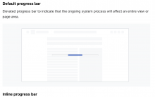
Radio: There is an erratum in the Specifications > Label text (missing space in "withthe")- Tab > Content: we need to update the Do and Don't images since the lines below the selected tabs are wrong. Also, this content recommendations could fit better within the Tabs component instead, since "Tab" is just for the tab items.
- ToggleButton: include the "Content" section to explain about how to write content for these Toggle Buttons (as we do with Button component). "Use short, precise verbs, ideally with fewer than 38 characters for English. The average character length of language translations is 42 characters."
- T355415: Components Guidelines: Explore solutions to make its images easier to maintain
- T357429: TextInput Guidelines: fix the error in the Error focus state
- T359647: Improvements to the Read-only and Disabled guidelines

Medium impact:
- Color's documentation: decide if we want to use the option token's name (e.g. Gray200) or the decision one (e.g. background-color-disabled-subtle)~~ To be discussed in a future DST Design/Eng sync instead of creating a task
- Evaluate if we want to remove the "Interaction states" section from the guidelines
- Evaluate if we want to rename the "Specifications" section to "Anatomy"
- Ensure that we only use DS components in our imagery. We currently feature buttons (and illustrations) that are not part of our DS


Low impact:
- References section: just the components moved from the DSG contain a "References" section. We need to review the new Codex components list and include references when needed
- Also decide where to put the References, if we continue with it. Right now it's hanging in the air underneath Guidelines, where the more natural expectation would be to have it end of page.
- If References, then add direct link references, not links to the heading. For satisfying UX and a11y needs: See https://gerrit.wikimedia.org/r/c/design/codex/+/959603/14/packages/codex-docs/component-demos/button/button.md for example. We put in a enumerated list of Reference ids, otherwise the link is no semantic connection. We can leave this for post MVP.
- We could improve the component's guidelines by adding:
Acceptance criteria
- Evaluate each one of the items in the list above and create subtasks if needed
- Update the components guidelines in Codex